Reviewing Portfolio Images
Lesson 3 from: Creating a Portfolio with Impact: From Shoot Through PrintJoey L
Reviewing Portfolio Images
Lesson 3 from: Creating a Portfolio with Impact: From Shoot Through PrintJoey L
Lessons
Lesson Info
Reviewing Portfolio Images
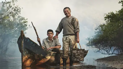
So the next page is actually the first spread in the book, and this is from the exact same project for Lavazza Calendar. These are agriculturalists who live in a place called Zahira in Colombia. And, uh, it's an agricultural project that supported by slow food. And I think the reason why I wanted to change from this to this was because it's still a portrait environmental, but also just give it a sense of action. So this picture to the left is actually not lit. It's natural light. Andi, this is lit. So I just want to give a little more depth as to what I'm capable of. And not every single image I do is like someone standing by like a prop that represents them could also have a little bit of spontaneity. Um, the other thing I'll say about the counter is that every subject like that the theme of it. It was called from father to son show it means mother to daughter, grandmother to granddaughter and every single person is actually related. So this is the Mandera family. This is his son gene...
ration of oyster farmer. Uh, forget the this lovely woman's name, but this is her and her mother. So even though she was like, I blurred her and, like, put her in the background there still a connection? Yeah, for the theme of the calendar, the next page is also from that project again. I think one of the mistakes I made in the past with my portfolio was I did have the images arranged by color, kind of like knocking straight on the head where I would look at this and I would say, Well, this is a neutral image with a lot of blue tones So there has to be something beside it in that same color palette. While that's true and it works for things like this, it's equally important to just sort of like break it up. So there's more vastness in your work. So there's a connection here because it's part of the same project. OK, this guy is harvesting salt. This guy's harvesting coffee. It's part of the Labadze calendar, but it just gives a little bit more vastness. The other thing I want to say is this is ah, medium close up in terms of framing, you know, we see their face and hands, and this is a wide shot. If you had a spread with two medium close ups, Human Eye doesn't really like it. I think of it like a movie like cutaways like coverage. You take a wide shot, you jump into the close up like that kind of thing. I even have this in my mind when I'm editing and choosing the order of my images. And you know, there's some interesting stories even deeper with these images. For example, at the launch event to the calendar, they flew a lot of these farmers to Milan to be part of it, and I have a lot of the calendar. So if I do a meeting, maybe as a follow up, I can send them one of those calendars and then they'll be reminded again that I exist. That's a whole other topic of conversation in the portfolio, plus leave behind. You know all of those things as well. But having I wouldn't work connected, Yes, sorry to cut you off. I wouldn't really give it then in there because it's a little awkward, but, you know, maybe maybe it's a gift or something. If we worked together, because I only have so many of them. But I have to get rid him before the year ends. Because it's a calendar. Good points. It devalues s O. This is the This is the last spread of Labadze Calendar project. We actually have to coffee farmers here, Uh, and again, the color tones don't quite clash with one another, but they're not the same. So this one is like, cool blue. It's like semi wide. And this one is super wide, so it works, Okay, this one's posed right. He's like standing stoically in place with the younger generation of coffee farmer. And this one is like an action shot, so it just gives a little bit of death and fun. Fact behind this image is that we had actually done some initial planning before the shoot in order to find charismatic subjects or people who had a connection to their place as community leaders. And we actually didn't know about this family's garage until we had a break in the shoot. And we just went there and I was like, Holy shit, why didn't you tell me like you had this amazing location to shoot in? So then I was like, What do you do here? Well, we load these huge bags in the back of trucks like that. Sounds good. Can we put some light beams through the window? OK, so that's that's yeah. And again, it's a father and son here. Gorgeous. So that was five total five total images from that project, I don't know, but you raise a good point 374 Yeah, it's a lot, but I think on some assignments, it's not good to have so many images of the same thing, but because we shot you know, five different countries. It's still different enough, and I think even as part of the calendar, when I originally started talking to them about it, it's not all coffee because they have connection with, like, oyster farmers and things like that. I told them from the beginning, we shouldn't just focus on all coffee just to give a sense of vastness to the project.
Ratings and Reviews
a Creativelive Student
Joey's work is amazing and this class is extremely informative but what I really appreciated the most is his humility. He has worked with so many people and on so many projects yet his humbleness shines thru it all. A great lesson for all of us. Thank you for this class.