Album Design & Final Product
Lesson 40 from: Creating a Successful Wedding Photography BusinessYervant
Album Design & Final Product
Lesson 40 from: Creating a Successful Wedding Photography BusinessYervant
Lessons
Class Introduction
12:07 2Client Focused Wedding Business
05:43 3Marketing for the Wedding Business
21:55 4Pricing & Sales Strategies
29:28 5Wedding Client Interaction
11:01 6Find Your Photographic Style
28:40 7Gear, Lighting & Camera Settings
11:40 8Capture the Bride Getting Ready
03:30Bride with Dress
05:13 10Connection with Family
04:00 11Bride Dressed with Bridesmaids
06:25 12Detail Shots with the Bride
04:02 13Putting the Veil on the Bride
03:42 14Bride with Family & Bridesmaids
09:34 15Leaving the House for the Ceremony
04:02 16Arriving at the Ceremony
04:49 17Capture the Ceremony
03:56 18Formal Pictures After the Ceremony
09:13 19Detail Shots at the Location
05:08 20Bride & Groom with Bridal Party at Location
10:18 21Bride & Groom on Location
03:52 22Street Location Shoot with Bride & Groom
15:29 23Demo: Bride Interaction
14:04 24Shoot: How to Pose Your Brides
17:48 25Capture the Wedding Reception
16:16 26Shoot: Capture Reception Look
12:41 27Equipment & Accessories for Post Production
13:21 28Lightroom® Workflow
15:02 29Client Image Proofing Online
23:55 30Retouch Images in Lightroom®
04:31 31Photoshop® Editing Overview
14:41 32Photoshop® Workflow
08:49 33Color Correction in Photoshop®
10:27 34Soften Image & Retouch Skin in Photoshop®
14:57 35Black & White Edit in Photoshop®
07:45 36Remove Distractions & Extract Details in Photoshop®
16:11 37Edit Outside Bridal Party Image in Photoshop®
27:04 38Printing Your Images
10:45 39The Power of the Album
11:17 40Album Design & Final Product
23:17 41Graphi Album Design
20:02 42Create an Impactful Slideshow
08:12 43Paper for Printing
03:07 44Yervant & Anie Workshops
14:48 45Final Album Layout
06:48Lesson Info
Album Design & Final Product
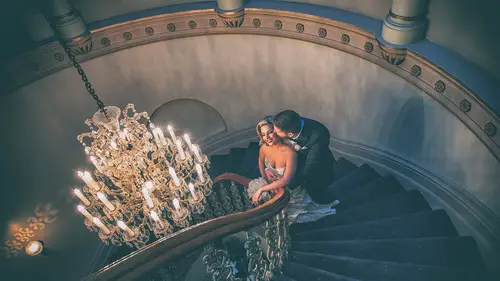
This is the book I use the most, 90% of the time, Young Book. I'm gonna show you this because Dani's album is converted. Why I like Young Book? When I started digital books, it was the traditional big, bulky book with mats and everything. So it was okay, but it was opening then things created by album maker, and it just didn't fit the way I want to present my album. So I started to design digital albums. Then I didn't have a choice but push my digital pages in the mats. It looked okay, different, but it was not fun. Then we started designing the digital book, which was spread, staged edge to edge. Then because we have this new technology we try funny things. We can put pictures on each other. We can put wide pages, then multi-pictures, one tilted, one there, one colored page. I did that at the start because I had the tool. So let's try. Then slowly, slowly, I'll start to see oh, this is so busy, so ugly. And I learned with my mistakes that the best album is the simple album. A lot of s...
pace around it, a lot of mats, a lot of white around it. Not too much color. If you're gonna put color in the background, black, white, or very soft earth colors, you know? Soft sand color, anything like that, just enough, or silver or gold-looking. You can achieve the silver and gold if you put printed or metallic paper. Metallic paper, laminate it. It's gonna give you that feel of gold and silver. So now, Graphistudio prints on HD quality. HD is king of printing outside the Canon printer because it's printed by Canon, it's printed on high definition, so it's Adobe RGB profile, so 99.9% alpha Adobe profile. So what I see on my screen is gonna be print produced. And then I get a beautiful lamination done on it to protect the pages. Why I like the Young Book, I'm gonna show you the real one is it's very square, very simple and comes in a box. Although this is not still trendy in U.S.A., I don't know why, guys, this is trendy, it's the number one seller in Australia and Italy. Italy is the world of fashion. We should move on, guys. This is so beautiful, so simple. So it just gives my picture, if you give a big bulky stuff, doesn't mean you're giving a better product. This looks like a book that I can buy off the shelf, art books and things like that. So this is what I use. Graphistudio also has samples colors. I'm gonna go through this quickly because I'm not here to advertise many things. You can contact Graphi and get details from them. This is what I use quite a lot. Okay guys, can I have the sample books, please? This is what I order for my clients to give it to their bridesmaids or to give it away. But this is also what I use as a promotion for my business. Every time I design an album, I will create one of those, few of those. So there's my address at the back, the album, the finished album, and you're a client. Hi sweetheart, how are you? Here, you like this album? It's for you, take it home and have a look. This is such a great promotion. I've got one for every one of you. Thank Graphistudio for printing us. This is Dani's album. She doesn't have, you have it. (audience laughing) So I've got more I've given you. I'll give it to you guys. So you see, it's a book. This is a promotion for me. This goes everywhere, to the bridesmaids, to the new customers, everywhere. And they can take this home instead of a brochure. Now, the next thing. So this, when I order an album, I always end up ordering a few of those. Okay, now which format I design? You saw that square. Why do I design square? This is a vertical album. This is up, it's enlarged to the actual sizes. When I say actual size, nearly actual size because it depends on the screen. The vertical album, same size prints. Okay, but vertical album is better for bigger prints because horizontal on the spread can't be bigger than this. So this can go bigger, but this can't go bigger. Horizontal is the same in reverse. That can go bigger, but this one is, that's the maximum. Where a square, I can have the same size on both sides. Square for me is the best format. Plus, I can get square pictures on a page. What does square pictures do on a page? Hasselblads, Rolleiflexes, they had square images. Such a great format. So I can use square, I can use vertical, I can use horizontal. So 80% of my books are created as a square. It looks bigger. The album looks bigger. It is better to lay out, and also, if I... What was the difference? Album format, so the square, what I've done, oh, I know what I've done. On the vertical, I'll stretch this. I'll stretch this to fill up the paper. On this one, I'll stretch this to fill up. But this one, both of them, you see how, comparing the pages, that looks always bigger. So square is quite a nice format. And even also better for two pages because this is the vertical album. Okay, if you see the edges, that's where the frame is. On a horizontal album, we've cropped quite a lot of the picture to do double spread, whereas on the square album, it looks like a beautiful panoramic and you've got enough space to go up and down to fit it. So even white pages, square works better. So I really recommend square format. I think horizontal is the most popular, but square is also much nicer on the table. It doesn't take as much space. Printing. Okay, now let's go to creating an album. We'll go to that stage later on. Okay, now let me open the software I showed you before. Where is it here? So I'm gonna create a new album. This is the SmartAlbum. I'm gonna create a new album. So automatically, you see different companies in there. I've selected Graphi because I use Graphi. I'm gonna select the Graphistudio book, the square one. And I usually design the 14 by 14. I don't make the big albums. I don't want my albums to be bigger than the table. So 14 by 14 is a good size, or if you're going to do horizontal, I will do, where is it? I will do the 13 by 9.5. Okay. So I'm gonna design a square album. And we'll go to the next page. Start, and import, then name this album. So I'm gonna create a new folder on the desktop, Dani, and Dani. Okay. I'm gonna import all the pictures from Dani. So I think I've got them on my desktop. So let's go to desktop. Finished JPGs, this is the one, import. So I'm gonna import all the pictures that I've selected. There's 200 images there. What I'm gonna do next, I'm gonna divide them into groups. Home, groom's house, bride's house, church, reception, location. So I'm gonna divide it into groups. Nearly there on my, oh, you've got my screen, okay. These are full resolution files. Okay, 200 images, there it is. Just a second more. Here we come, okay. Now I'm gonna create folders for, so first, 001 Bride. Let's create another one, 002 Groom. (mumbles) I put numbers so it keeps the order I want, because if I go alphabetically, it's gonna be all over the place. Church. Then after church, she had location one. So 004 location one. I've put location, okay that's, what happened? 004, one. location two. Let's stop there. I don't want to waste your time and do all these things. So now, what I'm gonna do is all the images that belongs to bride, I will drop it into Bride. Groom. Bride. So we keep on going like that. So when I click on the bride page, I've got the bride pictures. I can do it also a bit faster. Let me see, All. Where is it? I will select all the pictures like that. Just drop it into the bride. Groom. Bride. Let's go past this. And I'm not gonna design the whole album here, just few of those. Let's drop this. And let's go to the bride page now. Oh, how come I have only two? I did something wrong. Okay, let's go, bride. Bride. Yeah, that's better. Okay now, this picture here, for example, I'm just gonna start approximately, not 100% because it will take too much time. Okay, just one picture by itself. Okay, let me roll into the layouts. Okay, that's not too bad. Click on it and just center Dani. 'Kay. Next, back. Okay, I'm gonna drop those two pictures here because they're similar to the next page. Okay, that's quite good, but I want to modify this. This is what the good thing about this software. I double click, I click over there, and I will resize that picture because I want it slightly smaller. And I like this template so I can save it as a new template. And then maybe I want to replace one over this side and the other this side. I can update this template. So save, so if in the future, I need to send layout, I'll save it as new. So let's go back to it. And now, all the ones I've used are highlighted, so I can hide them. Let's go into groom's page. So let's have two pages there. Maybe just one because they're not the same. Okay, that's not enough. That's okay, but it's gonna cut too close to his nose. I can crop it a little bit. Looks something like that. Okay, leave it like that. So basically, it's that easy. Let's go to the old images. Cancel. Finished JPGs. Okay, let's go to these three pictures here. All the same location. Okay, that's nice, nearly nice, but I want to really rotate this, change the (mumbles) size. I can easily change the template. It takes me a second and back. And then all I have to do is export those all as a, where is it? Export. And it says in the same order. Export, we'll export it as PSD because I want to keep all the layers so I can modify them. And Adobe RGB because that's what Graphi prints their pictures on. Okay, now it's processing. It's creating the Photoshop layers and it's creating me a folder of albums from one to the three. So, I'm gonna close this. I'm gonna close this and go back to the original design, okay, which I have already here. I showed you how it's done, the software. You can experiment. I think there is a free download, experimental one. Let's close this and let's open the finished. This one, I designed it in Melbourne. This is the actual album. So let's go back. Where was it? Here. This one. Okay, there's Dani's album. There's the design. So if I double click, it opens. Okay, it's looking for the original files, obviously, because I don't have the original files. Anyway, that's the design. But what we should do is, now the design is done. Here are the JPEG files to the PSD files. The PSD files. So I've created a text. This was Dani's invitation text, so their names. This is page one, then this is page two. So all the pages are there. If you see, this is all black and white. But originally, if I hide the changes I've done to the layout, there's there and there's there. So these were the pictures. So eventually, what I did was, let's go stage by stage, convert it to black and white, darken and lighten here and there. You see, I'm trying to finish it for the album. Stretch that one a little bit, bring out the details. And there it is using all the action. This is the final picture. You see, I did on the page. The adjustment was done on the page. I'm gonna open another page and I'm gonna show you how I did it. Let's go maybe location. Let's go somewhere here. Okay, let's delete all the effects I applied to it. When the software did the layout for me, this is what happened. You see, I've done the color correction, but some of them are not correct because the middle one is more blue and the other ones are nearly correct. So I click on the middle one there and just correct the color. Just correct the color and then I will go to the one on the outside, correct the color. This one is gone too red here, the middle one. So basically, individually, I will work on them. And I will try to match. I'm not doing well here because my screen is not right. But basically, let's assume I've done this. Go to the next one. Let's get a picture with faces. Let's see. Okay, yeah, that's good. Alright, let's hide all the layouts. And this one here. Okay, this is the way I imported it from Lightroom. Okay, the first one, this one here, I will apply a bit of color adjustment. Make it warmer, that's quite a warm sky. And then I will apply one of my actions. So let's delete all this other stuff that we don't need. We don't need all this. So I've corrected color B. And I'm gonna apply the Yervant matte two to this image. So what I'll do is, to save time, also, I will select the one I want to apply. But still, it's on a layer. And then I will go Yervant matte two. Okay, it did it. But look what happened. Because it made matte, it's also made the background gray because it softened the colors. So because it's in a folder, if you go to the top folder, and it's past two, if I do that normal, that should have been the, oh, hold on. No, I did mistake, sorry. Okay, let's select the picture, inverse, and delete. There's a fault in my action, so I need to upgrade it quickly tonight. There's a fault in my action. It's flattening everything. These couple of actions have a fault. Okay, I have a question for ya. Sebastian from Hungary asked, "Could you explain more about "how you focus on storytelling "when you're building your albums? "What element does storytelling play?" Yeah, I'm gonna go into that. Okay, okay. I'm gonna go into that. Yeah, I'm gonna go stage by, I'm trying to fit everything in. So let me finish the post-processing, then we'll talk about that. Perfect. Okay, now the next one, when I designed this album already, I created the story in my head. That's why there are so many pages. Now the next one, it's not matching. So this one, I'm gonna do a sepia toning. Here, I want sepia. So that's nice backlighting. And that looks quite nice. I don't mind if two pages, one is black and white, one is tint, because one has a nice effect, the other one has less effect. Let's create a bit of contrast into there. Just a bit there, like that. And the sepia, also, I want to add a bit of contrast. So let's bring a bit of white into that. Okay. Now, this is how I modify each page. Do you want me to show one more or you're okay? Each page, I will apply the effect, whatever I want to do, black and white or whatever, and that's the page. The next, the next, the next. Yes. So each time that you're gonna apply an effect to that, are you making a selection on that particular photograph, or does it know, you just have it, the layer selected? It's on the layer, but the reason I do selection is because it's a wide page. If I do selection, Photoshop works less. It doesn't imagine the rest of the page. All that's blank. But it's better to apply the effect just on that selection. So it's always better. So you make a selection and then apply the-- Apply the effect. Okay. Okay. So that's it, I save it. So each page, I open and I modify it. I modify it to where it needs to go and then save it. So this is basically what happens. So let's open another page, which is already modified. Okay, you see, I've matched these two prints to each other so the colors are perfect, everything is perfect. A bit of applying effect. You know, I like to design also a page, heads to be nearly the same size or full-length against portrait. So I try to match as much as possible. I have one question. Do you save as the same file or do you create a new folder or a new file? No, I save it as Photoshop, PSD file. So I save on top of that. Once we have approved, I flatten it and send it as a JPEG, send it as a JPEG. So I've done the correction. That page looks nice. So next page.
Class Materials
Bonus Materials with RSVP
Bonus Materials with Purchase
Ratings and Reviews
Claudia Montero-Kubli
I love it!!!!!! I am so inspired, I learned a lot! thank you Yervant for sharing your Talent with us this two amazing days! Thank you to all the CREATIVE LIVE staff you are awesome!!!! best time! I want to come again!
a Creativelive Student
I am SO grateful to CreativeLive as well as Yervant for taking the time to put on this class. So many times while sitting in this class I thought to myself "what have I been thinking?!" I have so much to learn! I loved hearing about Yervant's process for creating images, but what inspired me even more was his advice on how to view, and treat yourself as a professional. I completely agree when he said photographers are creative but we are "terrible business people." But I aim to change this in my business from this point forward, thanks to this class! Yervant's advice on how to value, protect, and sell your art is priceless. I have always valued printing and creating products clients can hold, but I don't think I understood the real emotional value in it until this class. When he pulls those images we just watched him create for the last two days, off of that printer, and they are there before our eyes, I had an emotional reaction to it. I want my clients to experience the same, so I must value it and create opportunities to educate my clients. Thanks for the kick in the pants that we all needed Yervant! And I hope this will not be the last time I get to experience your education in my life. I said this many times to other students during the class, but I will say it again here, I want to carry a mini Yervant with me every where I go! Thank you Creative Live and thank you Yervant!
a Creativelive Student
Yervant’s ardent love for wedding photography and capturing his brides in their best light is unquestionable. His love for this photography community and his regard for our respect in the world hierarchy is without reservation. Yervant’s willingness to share his knowledge and skill for all these things to come together is beyond generous. These are some of the things that help Yervant to effortlessly stand out as a photography master and this is exactly what this class is about… plain and simple.
Student Work
Related Classes
Wedding Photography