Edit Outside Bridal Party Image in Photoshop®
Lesson 37 from: Creating a Successful Wedding Photography BusinessYervant
Edit Outside Bridal Party Image in Photoshop®
Lesson 37 from: Creating a Successful Wedding Photography BusinessYervant
Lessons
Class Introduction
12:07 2Client Focused Wedding Business
05:43 3Marketing for the Wedding Business
21:55 4Pricing & Sales Strategies
29:28 5Wedding Client Interaction
11:01 6Find Your Photographic Style
28:40 7Gear, Lighting & Camera Settings
11:40 8Capture the Bride Getting Ready
03:30Bride with Dress
05:13 10Connection with Family
04:00 11Bride Dressed with Bridesmaids
06:25 12Detail Shots with the Bride
04:02 13Putting the Veil on the Bride
03:42 14Bride with Family & Bridesmaids
09:34 15Leaving the House for the Ceremony
04:02 16Arriving at the Ceremony
04:49 17Capture the Ceremony
03:56 18Formal Pictures After the Ceremony
09:13 19Detail Shots at the Location
05:08 20Bride & Groom with Bridal Party at Location
10:18 21Bride & Groom on Location
03:52 22Street Location Shoot with Bride & Groom
15:29 23Demo: Bride Interaction
14:04 24Shoot: How to Pose Your Brides
17:48 25Capture the Wedding Reception
16:16 26Shoot: Capture Reception Look
12:41 27Equipment & Accessories for Post Production
13:21 28Lightroom® Workflow
15:02 29Client Image Proofing Online
23:55 30Retouch Images in Lightroom®
04:31 31Photoshop® Editing Overview
14:41 32Photoshop® Workflow
08:49 33Color Correction in Photoshop®
10:27 34Soften Image & Retouch Skin in Photoshop®
14:57 35Black & White Edit in Photoshop®
07:45 36Remove Distractions & Extract Details in Photoshop®
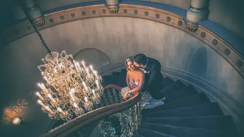
16:11 37Edit Outside Bridal Party Image in Photoshop®
27:04 38Printing Your Images
10:45 39The Power of the Album
11:17 40Album Design & Final Product
23:17 41Graphi Album Design
20:02 42Create an Impactful Slideshow
08:12 43Paper for Printing
03:07 44Yervant & Anie Workshops
14:48 45Final Album Layout
06:48Lesson Info
Edit Outside Bridal Party Image in Photoshop®
This is the wedding we shot. Initially I have run an action on this pictures. I have run the frequency action on it. It's all flat, it's all ready. But the picture, this is nearly out of camera. It's been softened. That's all that's been done. So I run this on all the pictures. You know how to run an action? Going to automate, find the folder and run action so you can select which action you want to run the action. Once the action done, you go in individual pictures and make it look better than what it is. This is one of the ones we're gonna print. Okay, first of all let's have a look. Sky is okay, but I think we might bring a bit more details in that area, but there is no detail. It's winter, the sun is coming from behind the building so there's not much details. The other thing is a bit more details on Dani's dress. If you see one of the girl here, because it is blue light this girl here, her chest has become a little bit blue so she's not sick. All we have to do is 50 and bring the ...
color back. Because she's behind Dani, the shadows has created a bit of blue tone into her. Let's hide the selection. The layers of of... I've run the frequency of burned in dodge a little bit. Color. So do this. So if we make a new layer of all this, let's see before and after. Okay, there it is. Now if we hide all the layers and let's go to the original, what I've done, I've darken a bit on the edges and... Stretch it out so a little bit. Okay. Now what I'm gonna do, I'm gonna delete all the actions and do it for you again. So let's delete this, let's go to the original picture. Okay, that's nothing done to it. The first thing I'm gonna do because it's a quite a wide lens. This is a 1635 lens. The reason I used this lens, it's a beautiful place. Why don't utilize the place? Okay, now it's a bit blue tone, but the girls also are quite suntanned so I'm gonna warm it up just a little bit. Just a little bit there. Okay. Now the building in the background here, it's blue because it's again in the shadow. Maybe bring it to the same tone as the front building. Feather 100. Let's do this. Sorry, let's... Level, just lighten it up a little bit. And then color. Option and move the selection there. Go to that layer and try to match to the outside building. It's the same walls. Just in the shadow doesn't look as good. Okay. Now the top part of the building is different because of the way the light is hitting so I will go first this area here. Feather 100 or let's make it 200. It's a big selection. And levels. There you go. Okay. Now we select the other side of the building. There's a bit of different tones there so let's feather 100. Let's warm this up a little bit so go color balance. There it is. Okay. This area here I want to warm it up again. It's green a little bit. Feather 200. Color. When you do stage by stage, you can see the picture being painted. Don't try to do everything in one go. We are painting this picture. Now her dress, her flower, I need it to go a bit darker. Select it, feather 50. Levels. Okay. Her dress had a bit of pink into it so it's gone quite blue here. The light didn't... So I'll keep this selection. So let's do color. And let's warm up her dress. I see all those details because if she has pink in the dress, I can't print it blue. Then she's gonna say why isn't it not right. Specially this happens in white areas. In shadows the whites become blue. Okay. Now let's go this part. I'm doing it one at a time because things are changing when I'm doing changes. So I'll pick that area 100, levels. Just darken it like that. Okay. That back building is slightly more orange so the building is like that so it's fine. Now inside the building, there's beautiful arches and everything so select those areas. Just bring out the details. Feather 50. And levels. So lighten it up so use... And I don't mind it to warmer because it is inside so a different light. Select this area here. When it is wedding and it's different pictures, the work becomes slightly more involved. Feather 100. Levels. So let's lit up that arches there. Somewhere like that. Okay. This girl here, did it happen now? No. This lady here, she's a bit lighter comparing the other girls. I like to balance. Sometimes she could be orange because she put fake artificial... Sometimes she could be. So I try to balance so she doesn't stand out. Feather 50. I'm gonna darken her. There. Okay. Now the top of the building, again we need to do more. Another layers. I'm gonna go more darker there. And let's do levels. Something there. Okay. The bottom part of the picture, the tiles, the flooring, I'm just gonna go darker. I don't want it to be dominant. Feather 100 and it has a bit of blue into it so let's level that. When I even go darker it's becoming more blue. That's gray, shouldn't be blue. But it's the way the light is coming there. Now I keep that selection and go into hue/saturation layer. Move that selection into the hue/saturation. And let's adjust it. So with hue/saturation click this on blues, select the middle tool there. Eyedrop tool. Click on the blue areas. It's cyan more than blue so automatically Photoshop will find the correct color. It's cyan blue. And I desaturate that area. So only that area has been desaturated to the area that I touched. Nothing else has been desaturated. So this is quite a nice technique. Dani's dress needs a bit more warmth. So it was this one here. Yeah, that's it. Beautiful pink. Okay. Now let's see what happens if we rotate this picture. What's bothering us? So rotation was somewhere here. I think so or no, here. Image rotation 180. Okay. Have a look at the picture now. What's wrong? What's the sky? The sky is dominant. The sky is competing with the bride and groom. So we need to do something about the sky. Okay, we can bring fake skies there, but it's not gonna look as good so what I'm gonna do is I will select that area, the top area approximately, including a bit of the building. A bit of the building there. Create a new layer on top, empty layer. I'm gonna go to the gradient tool. There's blue and white. I'm gonna select color, something like a blue sky, and the white sky, something like that so it's blue and white. Then pick up the gradient tool, select the default setting there. And on that empty layer... Hold on, let's make... We have a selection there. Let's make sure that selection is there. I can't see. Let me do a new selection. Let's do an approximal selection there. And I'm gonna fill that selection with the gradient tool. Let's do the reverse so the blue area is more into the top so it's matching the actual area. I deselect my selection. Okay. That's beautiful. I like it. Special effects on the building, they're collapsing. Okay, no. What I'm gonna do is multiply. When you multiply, the building comes up. And now what I'm gonna do is blur and gaussian blur so soften that so it blends even better. So if you can soften that image, it blends into... The only thing I have now is the top of the building. It has a bit of blue into it. Don't worry. What we'll do is just select that area, feather 200 and let's warm it up a little bit. So let's do hue/saturation. Okay. Stage one. We're gonna adjust it more. I got rid of that blue a little bit, but we need to do a bit more. But what I've done is I've added a bit of magenta texture into the sky. Okay. Now when I multiplied, what happened, it's the top file merged with the bottom file and it's merged so you can see the building. This is too heavy blue. Because it's a layer we will reduce it. Somewhere there. Okay now there's more blue in the sky, but it's not dominant and it's looking good. Because you can see that blue also in the windows, the sky is blue on the other side, but because we have the sun behind the building, it's a little bit over-exposing the sky. But now it's looking more realistic, better for the eyes and I'm gonna create a new layer, flat layer so command+option-shift+E so now it's a flat layer. I will be traveling on top of the building now again. And feather 100 and I'm gonna add a bit of color, warmth into that area. So color balance and let's warm it up. That's it, a bit of yellow. Okay now this wall has gone a bit green. If you work one by one, you start to bring it out the way we want it. Okay. Feather 100 and let's warm that area right here. Okay, nearly there. Okay, we've added a nice sky, we brought out the details in the background. It's coming together. Okay. Now let's create a new layer again, flat layer and add noise. So if we go to the Yervant... Oh, before we do that we haven't softened this so let's flatten this. Let's flatten this and let's go and do the frequency contrast. Yervant frequency, sorry I'm... Okay, that's it. Okay, I've done it so it gives me a nice softness. Now I will add a bit of color to the whole picture. Make it even warmer because I like warm tones and everyone likes warm tones. You don't want it to be cold. And then I will go into detail extract. Yervant detail extract so those buildings, I want them popped out. Dani's dress should come out. So we need to give up those details, bring out those details. The girls' face, it's quite good, I want it soft. So I'm gonna delete out of the selection. Once we do this. Okay. Let's have a look. Before and after. You see how the breaks have come up. It's not two dimensional anymore. Even look at Dani's dress, you can see the laces and everything. So I'm gonna reduce this just a little bit and make a selection around the girls. And delete this effect. I don't want them to look harsh. And select the masking layer, feather and fill with black. Because it's a masking layer, 80% is good. Okay, that's it. Now we create a new layer, flat layer again and add noise. So noise is under here. Just you see, they look a little bit flat so I'm gonna put about 3% so I put texture to it nicely. And that's that. Now I want this to look a bit sepia-tonish, but the girls' colors to be out. Before I do that the girl on the right side, just take a bit of her weight so she'll be happy. Don't tell her this. A small liquefy tool, just enough for a back side. Just that's it and push it, her arm. That's it. Okay. She will be very happy with me. And now those windows, this is quite a nice blue. I want to darken these windows. 40, levels. That's it. But this one has a bit of magenta into it so I'm gonna bring a bit of yellow into it. So color. Let's bring that there. Yeah, that's better. Alright now we've done that. We've added the noise, we've added that corrections. Let's see what else we might like to do. This lifts their... I like autumn leaves or winter winds. This was winter. Let's give a bit of highlighting to them. Feather 50. Levels. So create levels. And lighten them up. I did also the back green plant. Okay. It's an old fashioned building, but there's this ugly railing which upsets me. So okay it's to protect disabled people, but we don't need it into the picture so what I'm gonna do is healing brush. Go around it and clean it up. So we don't need that into the picture. Now what I'm gonna do is select the square marquee tool. Just go around there and Yervant vignette. so it's in the red. We'll go do a quite a nice strong vignette so let's select 400 pixels. And darken the outside. Okay. Now we're gonna introduce the sepia toning into it so Yervant sepia's very nice. You can use it also just as a individual sepia so click on it. This one was in my old action so my old actions have changed a little bit. This used to be in the old action. Now that's quite a nice... Layer. What I'm gonna do is I'm gonna... Blend it with the background. Something like this. So get rid of high bright colors because it's winter, it's romantic, the leaves colors. I'm bringing dull picture into that live color. And basically that's it. A bit of contrast maybe. Levels so let's do this. Yeah, that's better. So let's just say you did this image and then you have on your... You're envisioning on your spread that you wanna do another two other images that are similar to this edit. You did so many different things. How are you tracking, are you basing it off the tone or basing it off... No, this is where I'm doing the effect as an individual picture, but I don't do this as an individual picture. I do it on the finished layout. When the layout is done, each picture I will do the effect then. I will show you that also in a minute. Okay. So I know exactly what you're saying and it's important. How do you decide... You use feathering a lot. How do you decide 50 versus 100 versus 300? It depends, depends from the file size and the area I'm selecting. The only way you can learn about that is experiment. Okay. What you should do is select part of the picture and feather... Hold on, let's go on a picture so we can feather 400. So at first let's feather zero. Okay, when you feather zero, adjust levels, you're gonna see all the lines. Let's hide the selection. You're gonna see these. Okay. I don't want to see straight lines like this so cancel this and now let's feather 500. Adjust levels. So you hardly see where it's feathering. The size of the file, the size of selection. If we do less feathering so let's go under feathering. Let's feather maybe 100%, 100 pixels. And adjust levels. You will see more detail, but still the edges will be nice. You see? But you can start seeing here that there's a bit of difference so if I did 400 it will blend even more. So it all depends area on so experiment is to see what it gives you the result. Okay. Another question. Robert asked how do you keep your colors constant through a whole album? Okay, that's during Lightroom. Okay. That's during Lightroom because one location, I correct one picture and then I synchronize the other pictures which were shot in the same place. Then we go to another place and synchronize. But this is not gonna work perfectly when you design an album because different lighting, different things. So when you do the album layout, we're gonna go there next so I will show you how I will match, then I will decide which one is gonna be black and white, which one is gonna have effect. If I do have effect I might leave that as an effect and then the other pictures I might keep them in black and white so they don't... Sometimes the effect you want to see it once, not on all the pictures. I don't want every picture to have a effect. Can you reiterate real quick how you made the sky less blue? Somebody asked. Yeah, yeah. So what I did was... Less blue or more blue? Less blue, but I guess it's the same either way, right? No, there was no blue in the sky so I added blue into the sky. Okay. So what I did was I create a new layer, select approximately, create a new empty layer. I've done a selection of the two colors blue and white. Go to the gradient tool, fill with the colors, multiply. So we go multiply and then I will blend it. If it's too much just reduce it, reduce it and to make it soft I will gaussian blur it also. Blur, gaussian blur. So it fades into the building so you won't see the edges. So basically that it I made the sky blue, more blue so there's details in the sky. So this is too much. We reduced it. Okay so now I've added a bit of sepia toning. Let's make it a bit less, some right there. And what I'm gonna do is let me duplicate this page. Hold on. If I have, yeah. Okay, one of those need to be going to history. Okay, this one here. Go there. Let's go back to the original picture. Original picture and flatten this. Okay. So let's see the before and after. Let me close the... So you can see only the picture. Hold on, let me do F, okay. Alright, original. And original and the finished. When you want things to happen it doesn't happen. Okay, let's do this. Let's do it 20% and let's do this 20% so you can see exactly what's happened. Okay. Original, finished.
Class Materials
Bonus Materials with RSVP
Bonus Materials with Purchase
Ratings and Reviews
Claudia Montero-Kubli
I love it!!!!!! I am so inspired, I learned a lot! thank you Yervant for sharing your Talent with us this two amazing days! Thank you to all the CREATIVE LIVE staff you are awesome!!!! best time! I want to come again!
a Creativelive Student
I am SO grateful to CreativeLive as well as Yervant for taking the time to put on this class. So many times while sitting in this class I thought to myself "what have I been thinking?!" I have so much to learn! I loved hearing about Yervant's process for creating images, but what inspired me even more was his advice on how to view, and treat yourself as a professional. I completely agree when he said photographers are creative but we are "terrible business people." But I aim to change this in my business from this point forward, thanks to this class! Yervant's advice on how to value, protect, and sell your art is priceless. I have always valued printing and creating products clients can hold, but I don't think I understood the real emotional value in it until this class. When he pulls those images we just watched him create for the last two days, off of that printer, and they are there before our eyes, I had an emotional reaction to it. I want my clients to experience the same, so I must value it and create opportunities to educate my clients. Thanks for the kick in the pants that we all needed Yervant! And I hope this will not be the last time I get to experience your education in my life. I said this many times to other students during the class, but I will say it again here, I want to carry a mini Yervant with me every where I go! Thank you Creative Live and thank you Yervant!
a Creativelive Student
Yervant’s ardent love for wedding photography and capturing his brides in their best light is unquestionable. His love for this photography community and his regard for our respect in the world hierarchy is without reservation. Yervant’s willingness to share his knowledge and skill for all these things to come together is beyond generous. These are some of the things that help Yervant to effortlessly stand out as a photography master and this is exactly what this class is about… plain and simple.
Student Work
Related Classes
Wedding Photography