Mother and Daughter Storytelling Double Exposure Image
Lesson 8 from: From Shoot Through Photo Editing: Creating a Double Exposure in PhotoshopAaron Nace
Mother and Daughter Storytelling Double Exposure Image
Lesson 8 from: From Shoot Through Photo Editing: Creating a Double Exposure in PhotoshopAaron Nace
Lesson Info
8. Mother and Daughter Storytelling Double Exposure Image
Lessons
Class Introduction
01:58 2Simple Portrait Shot for Double Exposure
35:23 3Shooting the Texture for Double Exposure Image
13:45 4Shooting Portrait of a Mother for Double Exposure
15:14 5Shooting Portrait of a Daughter for Double Exposure
14:05 6Combining Model and Fern for a Simple Double Exposure Image
19:46 7Coloring with Curves and Levels
31:25 8Mother and Daughter Storytelling Double Exposure Image
32:48Lesson Info
Mother and Daughter Storytelling Double Exposure Image
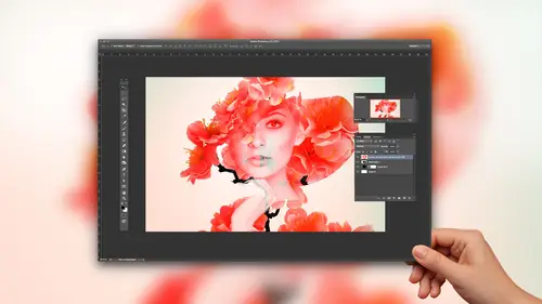
All right, so now it's time to bring our next images into photo shop. So again, we still have our, uh, finder here. We have our different Here we go here. We have all of our different exposures from our mother daughter series. So we're gonna right click here. Actually, we can just click and drag them straight into Photoshopped. All right? This is cool. And again, this is like we're starting from. I have never done this before. So do I know what this is gonna look like? Not really. But you guys get to watch me do it through the entire process, which is cool. All right, Now, these image, I'm really excited about it. I think we're gonna get something, really? Quote, I'm gonna hit, shift and click on all of those images. And now we can adjust our, like, contrast on all of them. We can adjust our exposure. I'm gonna bring our exposure down just a little bit, because we're gonna be kind of adding to these a little bit. And we're gonna bring our vibrance up and bring our clarity up a little b...
it as well. And I think I'm gonna lower color temperature down just a little bit there. Know what? Wondering why exposure back up just a little bit too. Okay, Now, if you shift, click a bunch of different layers in adobe camera raw, you can actually edit all of those layers at the same time, which is kind of nice. All right, Now we're gonna hit open images, and it's gonna load these all up as separate documents, and then we're gonna be putting those back together again. So again, this is gonna be playing around a lot with, like, blending modes. We're going to be playing around with capacity and seeing what we could do to get these, uh, to portrait's looked like they kind of came together. And we do have a few different options here as far as our images go, I think these are gorgeous. I really do. All right, here we go. And this one. So now that we have those all loaded up his layers, I'm just going to close out the original documents. I don't need him open, and they're just gonna slow Photoshopped down a little bit. So it's a good idea to go ahead and close those out, all right? And we're gonna hit F for a full screen. All right. I think this is just a such a cool portrait. You can see who she is. You can make it out. She looks she's got, like, some smile movements in it, but it still looks like I don't know. It just it looks very, uh, artsy fartsy. My mom would say Aaron is so worth the fartsy. He just comes up with the RTs parties things All right, so we're going to start off basically just like lowering our exposure and lowering our rapacity rather and seeing how these things, how these different images combined together. All right, now we're also going to start working with are different blending modes. So again, I'm gonna hit V for the move tool. I wanna hold down, shift and click the plus and minus that kind of work through these images and see how they blend together just naturally without me doing you know anything to the images themselves. Now you're going to get some that obviously, like our total knows. Um but then we'll get some stuff with, like, lighting and screen that combine really well together. Let's go ahead and bring our opacity up to 100% there and see how lightning screen work really cool. Now, we do have this set to a screen blending mode, but and you can see how much lighter it makes the image. But we can also change the exposure on this layer, which is gonna help bring it a little bit darker and kind of blend the two together a little bit better. So it sets the screen blending mode. I'm gonna create an adjustment layer. We're going to go down to levels. Okay? And now I want this levels adjustment layer to Onley effect layer five. So we're gonna use a clipping mask here. We're gonna right click on her levels and go down to create a clipping mask. And now you can see it's got an arrow pointing down to the level layer five. And that means this level suggesting there is on lee going to effect layer five. So it's just it's a really cool way to have an adjustment layer only affect one layer. Okay, Cool. And now, with our levels adjustment layer, I could just make this image a little bit darker. So even though it is said to like a screen blend mode. It's just gonna be a little bit darker, allowing us to kind of like play with this, uh, and the combination of those images together. All right. And now I wanted I want to see you, actually, about combining a few images of our subject as well. Just to kind of sorry of each of our subjects. Rather, we have two subjects in this case, um, just kind of see, you know what we can do with playing around there and again. We're totally freaky, like, use different parts of different blend modes, Right? I'm gonna make a black salted color layer under everything here, and we're gonna lower rapacity. And again, my goal here is to create, like, you know, basically like a fun piece of art. I'm not so concerned about creating, like, you know, something that's incredibly like hyper real. Um, I think that was probably pretty apparent from the beginning of the photo shoot, So All right. Very cool. And then we have some options with there. We go with Mackenzie. Kind of like looking in a few different directions. Here. We have some kind of like looking in the same direction. Um, and Weaken. Try flipping these around to so getting hit control or command t right click and go to flip horizontal there. And now we can kind of, like, load these up as like, a back to back mother and daughter thing, which was kind of like the original concept was to have them be back to back there. So we have our looking that way, and the lighting is actually mirrored in this case because she was looking the same way so that we have the orange light on her face, the same as her mother. But now we have these other portrait's where she's looking that way, and she has the purple light on her face, which actually is like the same same light that is on her mother. So that's really cool as well. All right. And at this point, basically, I'm just kind of working through these different images and, you know, seeing like what what becomes, like the most striking and to be really cool. Let me see if I can flip this around horizontally. Oh, that's that's really cool and creepy. They're going for maximum creepy. That's, um, but, yeah, that's actually really cool. What do you guys think? It's something like that. Do you like that? I think it's super cool how you can see detail from both mother and daughter there. Let's see about bringing a detail there underneath of, um, there we go of mother and try lowering the opacity here too. So this might be ah, like a triple exposure. I don't Can't even do that in camera. Um, all right. Yeah, that was kind of cool. Brought up there. So again, I'm totally in play around mode, guys. Um, but this is definitely, like, if you're gonna play around, you know, like photo shop is a really good play place. All right, I'm gonna bring this up and try adjusting our levels just a little bit darker there. All right? I'm also gonna try. Let's change this later. No mode back to normal, and then just try lowering. There are rapacity here. No, I liked it better on screen. All right? And we'll just kind of make this a little bit darker there. Do we have any questions or comments from the audience? So I just kind of play around here in a photo shop. Yeah, we have one. Sure, this is from Lake Humped. Who says what Keyes did? He used to get all the images in one doc as layers. So going back to when you first open them. Yeah, When I opened the mob up, I just used the shift. Sorry, the shift. Keep. I use the move tool. So the move to here, let's say I wanted to bring in like my double exposure, grabbed your move tool and then just hold down, shift and click and drag from one image to another, and it will bring it in as a new layer. Cool. Good question. And then I just have ah comment from photo maker who says this could be a really cool way to give the impression of someone ageing if the parent, the child, look alike. And that's what I kind of love about the about when Kensi and her mom is that they do have some money. Similar features? Yeah, do. Let's see. Yeah, they really do end it. It does, like, kind of give that effect, which is like, Yeah, it's super super cool. All right. And this I can kind of use my layer mask your as well. If I like, you know what? A little bit more. Let's see definition here on our face. Here we go. That looks really cool There. All right. And then, Yeah, I think that's that's nice. Just like a really simple like, you know, just a really simple. I mean, you could go in here and start like adding mawr and Mawr exposures, like as he wanted to, but I think just so it's like a simple you know, portrait and the a little bit of like motion Blur helps to add, like that nice artistic touch. I think that's really nice. So we're gonna crop in to work on our framing? No, it's so fun to get to create this, like, weird stuff. All right, cool. That's super cool. And we can try playing around with our opacity here as well. And then So we have, like, basically what I would consider, like a base image here. I mean, it's definitely like two exposures combined together. You can see detail for both the mother and the daughter. They kind of overlap, and it's really, really cool. So from here, I'm gonna shift. Click all of those layers. I'm basically gonna start this is like consider, this would be, like, one my first frame. So after I'm done creating, like, any type of double exposure, any type of composite or any type of effect like this in photo shop, I'll get the effect. Like what? How I wanted. And then I'll start actually working on the image. Start with, like, my curves adjustment layers, my color, balanced layers and things like that to actually like, you know, bring the image, like to the next level. So I always treated as like, Okay, this is now my starting point. And now what I'm gonna do is make this image look better through my adjustment layers, things like that. So, um yeah, that's kind of where we're gonna start now. And I'm gonna shift quick those layers and just go ahead and delete them, cause we don't need those this. Doesn't you guys like this image? I think it's really cool. I mean, it's like not at all like a standard portrait. Um, I'm glad you said yes. It was like, No, um um cool. So we're going to start off with a color balance adjustment layer, and I can work on my shadows, my mid tones and my highlights. So let's start off with our shadows here. We can just pull our shadows towards any color we want. And that is gonna, you know, start affecting them the rest of our images. Well, so our shadows, let's go to our mid tones. And I love color balance adjustment layers because they're so easy to use. You can see like Scion over here, red over here. Visually, it's easy. And you can just click on any of these layers and just like, Do you like it more like that? Or do you like it more like that? It's It's a very, very easy tool to use. And, um, I think it makes color correction a lot easier and photo shop, and it makes it more fun. Well, that's kind of nice with that blue in there. You guys like that? It's kind of cool. All right, Great. Now I'm gonna grab a levels adjustment layer, and we're gonna go over to our blue channel. I'm gonna put some blues into our shadows here and then some yellows into our highlights. There we go, and we'll go to our Red Channel. CVA putting some reds into our mid tones there, maybe too much blue and our shadows there. Very cool. I'm gonna use a curves adjustment level adjustment layer. Rather make this just a little bit brighter. And then I'm gonna focus in again. I'm gonna use that same technique where I just grab the lasso tool and just kind of do it regular selection right around there in the middle. And it just helps things look a little bit more natural. Um, hit command I on that selection there, which is going to invert that and then de select and then hit command I on the layer. So basically, we have just a layer mask that brightens up that area, and we're gonna go to filter blur, and over 2000 blur cool. Just to give, like, a little bit more brightness in that area. We'll bring that down just a little bit. All right, now we're gonna add up. And yet, and I think with the vignette, I'm in ads and color around the edges as well, cause it's it's just a really nice application. Um, the image lends itself to be colored really fantastically. So having a do it and I'm actually gonna focus this vignette around our subjects here. There we go. Rather than just making it in the center, I'm gonna make our subjects in the center of it. Then yet and that's, you know, we're working in photo shop, not in camera, so you can put it. And yet wherever you want, which is really nice because, you know, a vignette. At this point, the whole point of it is to, like, help draw more attention to your subjects. All right, there we go. Bring that down a little bit, and then we can start playing around with their color. Like if we wanted to bring some red in there or some scion just kind of nice also. All right, so let's see the before in the after what they're it just kind of helps bring a little bit more brightness into the center, your photo with your subjects. And then, as always, I'd recommend, like going in here and turning these layers often on and seeing like, do you actually like the things that you did like? Oftentimes I find especially that, like, all over do things by quite a bit. You know, I think they look great. And then I'll like, take a break. I'll go get some coffee, would ever come back. And I find that I overdo things all the time, so I definitely recommend, like, get it to where you think it looks good and then, like, back it off a little bit. You have a question? Yeah. Erin, when you're creating your vignettes, I noticed you're using the curves layer adjustments. Is there a reason that you choose to do that instead of just using a black circle and moving that around where, like, you know, you could dark in the edges very easily by just using a black circle. But is there a preference? Do you have a preference when you're using the curves to do that instead? Yeah, I guess. You know, with curves The nice thing about curves is you can affect color at the same time. Like here. I can affect, you know, like my lightness really easy using the RGB channel. But I could go into like, my blue channel now, and I could ADM or blue around the edges. If I wanted to do that, I could take that down and add more yellow around the edges if I want. I kind of like the with the blue. Um, I don't know what I don't know what it's gonna look like, so I like that I can affect color at the same same time. Um and this also gives me a lot of flexibility with my layer masking, like, you know, if I want to paint back like my layer mask here at any point in time, I can do that again with my brush tool. Um, I can also like, in this case where I brightened up. You know, that area around our subjects there. See about frightening that up a little bit there, too. If I brighten that area up, you know, and if I decide later, it's too bright. I can just go in here and the curves adjustment layer and bring it down a little bit. Or I can make it darker if I want to. Um, so I like the flexibility that it gives me. Um I find that using curves, adjustment layers and levels adjustment layers in this way. Just kind of like it. It allows me toe continually edit my image even after I've made the layer like I could go back in, You know, 20 minutes from now, I can be like, Okay, you know what? Maybe I didn't like that blew so much. Let me go back to my blue Channel and let me just even that out. And I'm back to where I started with back to what I started. Um, so, yeah, I just finally gave me a lot of control and flexibility. Cool. Good question. I want to just keep playing around here. I have no idea what this is gonna look like, what I do, but I'm gonna duplicate all my layers and, uh, hit command t and make these a little bit larger there and tried lowering our opacity. So we have just, like another, like, another type of factor, And then I'm gonna flip through my layer blend modes just to see if we can get anything that really stands out. And I don't need it to be like, amazing in every part of the image. Like sometimes I do this for, like, inspiration to If I'm like, Oh, man, that looks really, really cool in like that one part of the image, like all totally. Just use this as like, ah, way to kind of get some ideas flowing like this. Saturation. Yeah, The saturation is kind of cool. If I bring the opacity up here, that's kind of cool. Like, not everywhere, necessarily. I don't necessarily want it in the faces, but I'm gonna hold bolt or option, give it a black later mask and then paint white over here. And it kind of gives it, like, a little bit of, like, a neon Hayes look which, like, honestly, I didn't expect something like that, but I kind of like it. It just gives. Look, make sure you're on your layer mask, Not your layer. Um, like a little bit of like, that neon look to the image. It's again something that, like I could never have, like, planned or like predicted to do. But like having it on there is like, Oh, that's actually kind of cool. And it's just a layer so you can decide later on. Like, Do you want that to stay? Or do you want that to go like Aiken? Always. You know, I always make sure to save out my files as like, a JPEG when I'm done or a PNG depending on where they're going, as well as, like, a layer tiff or a Photoshopped document. PSC. That way, at any point in time, I can come back and be like, Oh, you know what? I like this little neon think, but my client said they didn't like it. Just turn this layer off, save out another version. Yeah. Question. Yeah, just a few people are asking, Can you tell us again how you're flipping through all the blend mode so quickly? Is, was there a short kind of people are Tarkett eso? First you want to make sure you're on your layer, so hit your move tool. So hit V for your move tool. That's important because different tools actually have blending modes. A swell like the brush tool has different blending modes. And if you're on your brush tool, you're gonna be flipping through the blend modes of your brush rather than your layer. So the first thing you want to do is hit V for your move tool. Or you can just click up here for your move tool, and then you hold down the shift key and just click the plus and minus on your keyboard. and that'll flip through your different blend modes. And it just does like exactly what you saw there. It just gives you, like, okay, here all of my options for blending modes. And it often times could be, like a little bit of a stir for creativity. Like you might see something that's like, Oh, man, that was actually really cool. I'm gonna make sure to include that. Good question. I'm gonna add some white to my highlights. I'm gonna see what that looks like here on this image. So, um, on a new layer, I'm gonna go to our, uh I'm gonna go to a solid color adjustment layer. Fill that with white. There we go. And now I'm gonna double click on this layer and hold Olt or option and click and drag from the underlying layer to make this invisible where the underlying layer is darker and see about adding some white to the highlights of my image and then lower on rapacity here. Just kind of like help cut the yellow just a little bit. We had so much yellow in those highlights. Just want to put a little bit of white in there to help cut that down a little bit. So there's the before and the after with that. All right, That's cool. All right. Maybe make a little bit darker there. I'm gonna hit command I on that layer mask, and then I'm gonna use my Grady and tool G for my Grady and tool. And I'm gonna paint with, like, a white radiant just to kind of see about. Sometimes I'll just play around like darkening some corners or lightning is from corners and see what they do. I mean, my goal is to, you know, bring my subjects eyes, Whoever's looking at my image to focus in on the center so anything that kind of, like distracts from that. Like, sometimes you have areas in your image that, like, actually wind up distracting you from that that you don't know about. So, um, sometimes I'll just bring a curves adjustment layer in and, like, do something like that, which will help, like, bring the attention back to our subjects just a little bit more. All right. Cool. And then from there it's again turning off and on some layers and then going back in here and, you know, like this layers I could probably bring the opacity that down a little bit as well. That's what's so fun about doing this in photo shop is like, you have so much control. I made it one on one side. You lose like the randomness of it. Like you lose the fact that, like, you don't know what you're going to get. But on the other side, if you're looking for, like, something just, like, kind of play around and have fun with this is it's, you know, it's like, the perfect opportunity to just kind of, like, play around here, um and see Might see, I like the crop. Where was I think that's really cool. Nice square image. Alright, guys. What? We've got a couple different versions of double exposure here that we shot all the way through, edited this morning. And, um, you guys can see this is a little bit more of like what I would call the traditional double exposure Look here on the left. But here on the right, we have something completely different and also really, really cool. So photoshopped sections down will be open for questions and comments and things like that. Um earlier this morning when we were using the gels with the incandescent modeling lamps. Do you have any experience using gels with led? Um, you know more constantly raising emus. Constant lights. Yeah, um and so I was thinking your your comment about burning the gels made me think, like I wonder if there was a way not to do that. Led is obviously, but were those strong enough, or is it is there Are they too blue to white to really use with the jails, but using gels, it doesn't really matter any just opinions around that topic. Yeah, that's actually a really great question. Um, a buddy of mine who shoots video. He's a videographer. Hey, actually has, like, led light panels, said he uses, but like, straight out of the box there a little bit too blue, like they don't have, like, a supernatural color. So he actually tapes. He puts a green and like a magenta gel on his led lights, and he just leaves them on there like all the time mawr for color correction. This was a lot more like like the creative part of it, but definitely for, like, color correction. I mean, that's that's what gels are like originally intended. Four is like correcting, like if a you know light has, like a green color, casts on it. You can put a magenta gel on that light, and it'll magenta being the opposite of green. It will cancel out that color cast, so if you do notice if you are using an led light and it has like a really strong blue cast, you can put like a CTO or an orange gel on that light source, and it'll cancel out your color cast to get a little bit more natural color. So in the that's what gels air like, you know, you can use gels for creative reasons like we did today and like a lot of photographers dio. But in the industry, gels are usually used as, like color correction to, like, you know, help with, like, color matching itself. Yeah, so, Erin, I just want Teoh reiterate, sort of the creativity aspect of what you're working on here. Earlier you talked about how everything doesn't need a photograph, doesn't need to be perfectly lit and, you know, perfectly settings. And all of that CPR had said, Does it bother you that the subject's eyes are not tax sharp. At least on the fern girl. Everything feels blurry, and I'm not used to that. So could you just comment on what you were going for? Yeah. So I actually on the girl with the fern? I actually added blurred to that. I don't remember if you guys remember that, but, uh, yeah, you know, I would say as like an artist and as a photographer, I've gone through a lot of waves. You know, I would say early on I wanted everything to be tax sharp. I wanted all my portions to be, like, perfectly exposed. I would use a light meter. Every time I busted out lights, I would spend like hours getting everything right. And what I found is, like, the more I focused on getting things technically perfect, the less life my images had. They kept getting like Mawr like technically perfect. But like stale looking like I'd be like, Oh, that is a beautifully lit shot. It's perfectly lit, but I didn't like the shot at all. It was just totally, like boring. So I think and that was just kind of my own journey. So I started getting away from being more technical now. I think you know the perfect balance is having that technical mastery, but also like capturing photos that have a lot of life in them. But I would say if if one of those things can let slide, I would say, Let the technical slide a little bit because like having some life in a photo is a lot, it's a lot more important. I mean, I I think about the photos that I really love and the photos that have, like, really influenced history. And none of them are tack sharp, you know, there taking on cameras. Usually a lot of them are black and white, with crazy amounts of grain and, like, you know, crazy blown out highlights. But they capture a human emotion. They capture events, they capture things that, like, you know, that make you feel something. And for me, that transition of the photographer of going to like, technically perfect toe like feeling something through an image that that's been something that I've been working on over the last couple of years. So, um, I'm not super bothered by some things being, you know, a little bit on the blurry side. Just, uh, personal preference. But, you know, again, if you guys at home are like, I want everything to be tack sharp, then yeah, for sure. Shoot with a strobe shoot with, you know, prime lenses, like, make sure your focus is nailed on everything. And, um, And again, there's a big difference between shooting something for art's sake and shooting something for a client. And, you know, if your client wants it to be tacked Sharpton? Yes, Most definitely. Uh, you know. Please, your client, you can Well, thank you. That. I mean, that's why I ask that because I know that that this is about the creativity and pushing forward. So thank you on that vein. Actually, one more question, because a couple people are asking about where you do look for inspiration, especially for these types of things. Um, and especially when you are all about experimenting and do you have a method for if you see something you really love, like, do you write it down? Do you keep things or what is your artistic inspiration? Yeah. Good question. Um, I guess when it it varies, if I know I'm gonna be doing a photo shoot. Let's say I'm doing Ah lifestyle photo shoot in the city. What I'll do is I'll search everything I possibly can. Old church through Google images search through different stock websites. Search through like Pinterest search through Instagram. I'll use keywords and basically try to find all the shots that I can. And if I can save them out to my computer, I'll do that. And then I'll create like a light room catalogue and bring them all in there. And then usually I'll pick the shots that I really like. So I'll start off with, like, 100 shots of like Lifestyle City shots. And then I'll say, Okay, these air, the 30 that I really like. What of those have in common? And how are those different from the ones that I don't really like it? Maybe it's the time of day they were shot. Maybe it's like, Oh, man, all these have, like a beautiful like sun coming from, you know, behind the subject backlighting them. So I'm like, OK, I'm not going to shoot it noon because I don't have that light that I really liked having a shoot closer, like six or 7 p.m. And try to backlight my subjects. So if I see that in common, maybe Elsie like okay, these air all tax sharpened focus where everything is, you know, from front to back and focus. Maybe I like the shots that have the background a little bit out of focus. So maybe I'll know, like, Okay, maybe I want to be shooting it like F 2.0 or F 1.4 so I can knock my background out of focus. So generally I gather a collection of images, find the ones that I like and then kind of try to, like, nail down what I like about each one of those. And a lot of the time it's, you know, it's totally random. It's It's not always like the most perfect lighting or like the you know, like most beautiful person in front of the camera. Sometimes it's like, Oh, I like that I could barely see their face. It's like totally a silhouetted shot, Um, and then during a photo shoot, will build out a shot list and try to do like my own version of those things and then, you know, if I like that, then I kind of just like add that to my tool belt of like, Oh, man, I created the like this my own version of that shot I liked way back when and it came out great. So, you know, a year later, all I'll bring those same concepts and techniques that I learned from that into my current shoots.
Class Materials
Bonus Materials with Purchase
Ratings and Reviews
Pamela Richardson
I LOVED Aaron's presentation style, his wonderful humour, his gentleness and humility, his creative eye, and his extensive skills with both the camera and with Photoshop. I learned a great deal from this class, and highly recommend it. It was both fun to watch, and very informative. Aaron's friendly and casual presentation style was a delight, and helped to make a very complex subject seem quite approachable. I appreciated his willingness to share his knowledge with his viewers. I understand that it is a huge challenge to create something in front of a live audience, and maintain composure, but he managed it. Aaron's use of motion-blurred images of the mother and daughter for the composite was just very creative, and was something that would never have occurred to me. I also watched Aaron's compositing class on Feb 22, which was truly remarkable. He paid close attention to every fine detail in the scene that he was creating through compositing, including size and color tone of the light source, scale, perspective, and every last detail of the shadows to make a believable and magical image! He was very good in directing and encouraging his models during the shoot on both days, and very courteous with all the assistants. I have been involved with photography on a semi-professional level for almost 40 years, and have been doing photo editing with Adobe and Corel products since 2002.
AmandaReese
Super inspiring, great class!