Importance of Details Shooting with Color Gels
Lesson 4 from: Creating Impact with Color GelsAlexis Cuarezma
Importance of Details Shooting with Color Gels
Lesson 4 from: Creating Impact with Color GelsAlexis Cuarezma
Lesson Info
4. Importance of Details Shooting with Color Gels
Lessons
Class Introduction
01:22 2Why Use Manual Mode?
07:52 3Shoot: Manual Model with Gels
05:36 4Importance of Details Shooting with Color Gels
03:02 5Different Between CTO & CTB Gels
03:45 6Shoot: CTO & CTB Gels
07:06 7How to Use Gels to Create Impact
05:21 8Shoot: Creatively Use Gels
19:56Lesson Info
Importance of Details Shooting with Color Gels
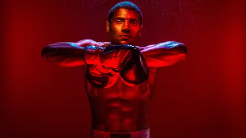
So the importance of color we're gonna do. I'm gonna kind of shoot that again, but I'm gonna shoot it with strobes and then the strobes are going to look a lot cleaner than just the available light. So the color palette on a lot of my images, so this is your color wheel right here. Monochromatic images, I use that a lot, that gives your image visual impact. So monochromatic is you have the same color throughout. However you just have different values to the same color. So you're over-exposing or you're under-exposing. Or you're adding white or subtracting black. But since we're talking about photography as exposure, so kinda over-exposing and under-exposing it. And then the other one that I use too is analogous colors. So its colors that are next to each other on the wheel. And they go well in harmony together. So all these images right here, if you look, the white balance on all these is not neutral. Its done on purpose swayed one way or another. So if you look at this boxer one right...
here. What kind of mood does that give you? How do guys think this one was lit, anyone guess? Theres just a box behind him. No, and the reason why you should know its not a softbox is you can see the light rays here. This is actually a RA light, a Fresnel lens, shooting straight at him. And that's a Tuscan balance, its like the modern light here and I shot that at about 8500 Kelvin just to make it even extra warm and give that look. Again same exact thing. Like the white balance is not neutral in here again. And with intent, I made it extra warm. Same exact thing with this one. This was a personal project I did with Jaylen Brown. Again, not a neutral white balance. Again, its done warm on purpose. It kinda gives you the feel for it. And just imagine how much different the mood and feel would be if this was just neutral. Right, it would give you a different feeling to it than it does here like this. And then the other kind of color scheme that I love using personally, is having complementary colors, which is the opposite on the color wheel. My favorite one is warm/cool. You don't have to use warm/cool, you can use other colors that are opposite on the wheel, that works well. But this is just one that I use often in my images. So you can see here in this one. A boutique used this image earlier this week on kinda doing you know cutting it out. but again this was shot, what we were gonna do earlier or what we're gonna do in a little bit. That's just regular strobe with no jaw on it and that turns blue and then the light on her has a bunch of CTO gels on there. And again, same exact thing, here we're playing with color. I'm doing all this on purpose, its not done by accident. Its tone, it's lit like this. I'm using color and exposure too, to create it. So if you look you have the warm/cool and then you have slightly over-exposed right next to under-exposed and it gives it visual contrast. So you want to do that in-camera with light. So when I say visual contrast, I mean purposely doing it again with light, not going to the light-room and increasing the contrast. You're putting opposites next to each other and when you put opposites next to each other, that creates visual contrast which creates visual impact and grabs the viewers attention. And again, I'm doing all this with light and not a shallow depth of field. These are often shot with a F-16 and I want everything in focus and I'm doing that again to get visual impact. Same exact thing here, again everything is in focus. And again everything is kinda done, its just one light over here in this corner, bare bulb its equivalent to having this light in the corner. Just shot all the way across the room. That's regular right here is shot at 2700 Kelvin and then two lights share a beauty dish and have a snoop with CTO gels and they're usually that warm/cool palette. Same exact thing here, like right? Come on this stuff's easy guys, I do it over and over again. I do the same exact thing right. This is a little bit more complicated lighting setup. Its five lights. I actually shot this live in a workshop that I was doing in front of some students, but boxing was then my bread and butter. This is a beauty dish on the top with a snoop and then the softbox underneath. And then its just selectively gelling some lights to create this mood. So the light, everything that's lighting the environment doesn't have a gel on it and is shot at 25 or 2700 Kelvin depending how moody I feel that day. Yeah, question. How do you pose? Cause everything seems super natural in all your photos. Well boxers are athletes, its super easy. I usually tell them, like I give them a scenario when I'm doing stuff like this. For boxers I usually tell them, give me a stare-down like you're doing a face-off with an opponent. Or when they're doing something like this, the combination, I say okay, boom. Well he's an experienced boxer so he's fought a lot, So I tell him if you were in the seventh round and you stung a guy really hard and you knew you could finish him off. What three punch combo would you do to finish him off. Right, I say show me, boom and do that. And then I'll say give me right hook, give me a three punch combination and give me a left hook on the final one. And I'll have him do it over and over again and I'll say on the last one make it like a haymaker, right. And then I ask him to do it and show me and then I just get the timing down and he shoots it and we do it like that with athletes. So again, same exact thing with this image. This is one of my favorite images, right. Its done on purpose, but like I said, its kinda like the same thing. The stuff, once you get it down, if you don't know nothing about color, if you pay attention its easy, right. Its like I do the same thing over and over again on my images. This is a light in the corner and then I strike that light right here and that has no gel on it. Shot again at 2700 Kelvin. This is just another light on the boom, right here. Lighting him like that and you get, luckily this is a polished floor you get a little bit of kickback light. And he's wearing white and you get in and it works out perfectly. So with this image, this is a perfect way to explain how or why I put up lights. I put up lights for three reasons. The first reason I put up lights is to throw shadows. So you put up one light, you strike it, it will throw shadows and you'll see how it'll throw shadows on your scene. Right so in this one, the first light I put up was way in the corner right here, there was a boxing ring right there. I love those shadows there and you could make the conscious decision to make that neutral, like this. Like you'd shoot a regular daylight balance or however you want. But I wanted to have color make a visual impact for this image so I decided to make it warm/cool. So I put it at 2700 Kelvin and I have it over here right. The second reason why I put up lights is to quiet shadows down, right. I didn't do that here because I wanted a nice dramatic image. But if you're doing a portrait. If this was actually a person instead of visual stuff here. And you wanted to see their face you'd put a light to quiet those shadows and fill them in. And then the third reason why you put in lights, or why I put up a light, is to throw a highlight. So on this one, that's why I did that here. We did this one right here to throw shadows and this one to light him. And its just a light with a 40 degree grid on top and then its just blasting him right here like that. So that's kinda like my thought process whenever I shoot an image.
Class Materials
Bonus Materials with RSVP
Ratings and Reviews
Barrie
This is a great class on the use of gels although I don't like the abrupt editing between segments as it always leaves the impression something valuable has been missed. The photographer has a simple approach to gels that produces outstanding images (although he could use imprecise language like 'this' etc a little less). As a teacher, I have viewed many of the CC Live classes and almost all are well produced with great information. (It is admirable and worthy of support that many of these are presented for free.) This class is one of the best and is a great investment if you want to give your photography extra impact. By way of coincidence, I was watching the movie Marshall the other day (the story of the great Supreme Court jurist Thurgood Marshall) and was struck by the use of color in almost every scene. A great inspiration for using it in still photographs. Get this class, it is outstanding.
JennMercille
Alexis Cuarezma is hilarious, very talented, and a creatively energetic instructor and artist! If I hadn't been attending Photo Week, I wouldn't have chosen this course, but boy am I glad I was in it! Gels have been an enigma to me for years (in the way that studio strobes used to be), and I was surprised at how easy and useful they were when Cuarezma explained and demonstrated them. His creative process is a joy to watch and learn from. I highly recommend this course to ALL photographers!
Xavier Finch
This class is still super impactful 1 1/2 years later!! I really hope to see more of Alexis at CreativeLive. He has so much insight and is an excellent teacher. His explanations are clear and concise with ample context.
Student Work
Related Classes
Lighting