Using Color Efex Pro to Manipulate Color
Lesson 22 from: Creating Your Reality with Composite PhotographyRenée Robyn
Using Color Efex Pro to Manipulate Color
Lesson 22 from: Creating Your Reality with Composite PhotographyRenée Robyn
Lessons
Class Introduction
09:16 2Why You Should Sketch Your Composite
03:25 3What to Look for in Your Background
10:51 4Posing Your Model
08:23 5Communicate with Your Team
10:34 6Elements of Compositing
31:36 7Learning from Failure & Criticism
12:27 8On-Location Safety Tips
03:42How to Nail the Right Perspective for Your Composite Photo
07:15 10Gauging Light & Exposure On-Location
03:49 11On-Location Posing
18:37 12Cliff Shoot Location Final Thoughts
12:03 13Tips for Culling Images
09:41 14Culling Images Q&A
11:29 15Preparing Your Image for Composite
07:18 16Composite Image Cleanup
11:01 17Adding Background Image to Composite
17:04 18The Difference Between Flow & Opacity
05:41 19Composite Sky Elements
20:58 20Using Curves to Color Match
05:43 21Adding Atmospheric Depth to Image
17:08 22Using Color Efex Pro to Manipulate Color
07:37 23Using the Liquify Tool
05:15 24Color Theory & Monitor Calibration
10:35 25Adding Smoke Layer to Image
07:55 26Selective Sharpening
05:18 27Crop Your Image
02:29 28Goal Setting for Digital Artists
04:39 29Review of Location Composite
01:57 30Understand Angle & Height for Your Base Plate Image
06:15 31Base Plate Focus Point
04:45 32Base Plate Lighting Tips
06:10 33How to Use a Stand-In for Base Plate Image
03:47 34Capture On-Location Base Plate Image
05:57 35Student Positioning Demo
09:05 36Base Plate Sketching
07:33 37On-Location Sky Capture
01:53 38What to Look for in a Base Plate Model
14:30 39Building Composite Model Lighting
10:03 40Composite Model Test Shots for Angle Matching
19:48 41Composite Model Shoot: The Art of Fabric Throwing
13:34 42Composite Model Shoot: Working with Hair
05:45 43Composite Model Shoot: Posing Techniques
21:26 44Composite Test with Final Shot
06:12 45Lighting Setup Overview
04:52 46Culling Model Shoot Images
03:35 47Adjusting Skintone Colors
04:54 48Merging Background with Model
04:54 49How to Mask Hair
09:49 50Creating a Layer Mask with the Brush Tool
14:23 51Creating Shadow Layers
07:10 52Removing Visual Distractions with Stamp Tool
07:11 53Replacing Sky with Layer Mask
05:15 54Drawing Hair Strands and Atmospheric Depth
10:30 55Creating Contrast in Your Composite
12:23 56Adding Atmospheric Elements
06:43 57Using Particle Shop
11:47 58Selective Color Adjustments
07:58 59Cropping, Sharpening, & Final Touches
10:29 60Closing Thoughts
05:52Lesson Info
Using Color Efex Pro to Manipulate Color
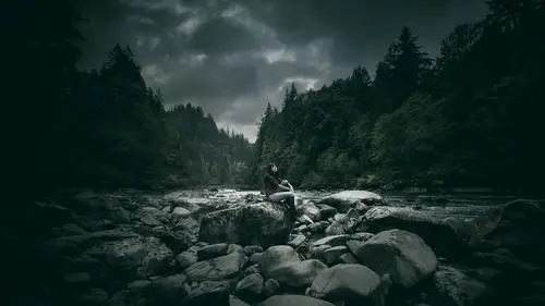
I'm going to do Color Effex Pro, it's Nik's software, N-I-K software. It's by Google, it's a good time. I am going to jump into Color Effex and start playing with it here. I'm going to click on Color Effex Pro Four. I might change my mind on a couple things first, going in, but we'll see how it looks. And Runi, while this is opening up and processing a little bit, I just wanna reiterate something that you said yesterday which was, I get it, you're using Nik. Oh yeah. Right? Yeah, people are usually just like, Holy crap that's a lot of Nik Software. Right, you really do subtle uses of Nik, right? For your own work, just wanted to. Yeah, a lot of times people use plug-ins. We can tell. Somebody who uses a plug-in a lot, when I first started using Nik Software, like most of us do, I was so over-the-top, I was like, "Oh my god, cross processing is like the greatest." I was like, "98%, all the way through." my old artwork is online so you can see it, it's pretty awful. You can t...
ell the day that I discovered that plug-in. It's the same thing with any plug-in. If you overuse it, it's really obvious. It's the same thing. When you're using retouching, try to make it subtle. Try to make it so people can't really tell what you did. You just want people to enjoy the image. In this case here, I like to use detail extraction. It's way too strong. I know some people who use it like this and I'm like, "Whoa, that's a lot of detail extraction." I just want it to be a little bit more subtle. I might increase the contrast a little bit. We're basically kinda blending this together. It's too saturated, I'm going to desaturate it a tiny little bit. See here we can still see that tiny little bit of orange glow, it's very subtle, the starts are a little strong. We are spending more time in the sunlight when I spend a little bit more time making them more staggered, more layered, whatever else. We only have x amount of time today. Detail extractor, a little bit, I'll increase the contrast a little bit and the saturation is just kinda bugging me so I'm just going to turn it down a bit. That's a little use of detail extraction. I'm gonna just hit okay. We can do all of this stuff all at once, if we wanted to, but I like to have my independent layers so I know what I did. This case here it says detail extractor. I can see what I did. If I zoom in here, I go before, after. It's a little strong in the clouds, I don't like it up there as much, so I'm gonna create a layer mask, I'm gonna paint it black and I'm gonna kinda just pull that out of the clouds. There are techniques to do this in Nik Software, but I'm a control freak and I change my mind a lot so I'm gonna do it manually. I also might take it out of some of the stuff that's a little bit further away because remember, things that are further away have less detail, have less saturation and less contrast. I'm very loosely doing this because I can get away with it, if I don't have to have a perfect mask, then I'm not going to. Before, after. Looking not too bad. From here, I'll probably will, let's see here. If I go into this little half-circle thing here, go select color and play with my neutrals. This is where things get a little interesting. I spend so much time on color, it's just rude. Play with blacks. I'm just sliding on feel. I'm just like eh, let's move this around a little bit here, let's move this here, well that looks terrible, that looks awesome, whatever. Let's just try the things. The reason why I'm making this adjustment here is because there's an adjustment in Nik Software that I'm gonna do. If I go here, back to Nik Software, it's gonna do a color tweak that I quite like. But, I know that because I just spent a lot of time moving color sliders around, being like, "How do I make it suck less?" I go cross-balance here, some people like it, oh my God I like the blue, it's pretty. Eh. Let's see. It's looking kinda green. Clicking things. It's looking not too bad. Let's go ahead and filter and totally sliding around here, a little bit. It's not too bad. Once again, we're getting a little too much yellow on her skin and I'm like eh, I don't know and we've lost some of the orange, but some of it's still here, it's nice and subtle. Let's try that. I don't know, I'm just totally guessing right now. That's not bad actually, slide that down. Nope, it's too strong. I'm gonna stick with that right now, I'm gonna go okay. Her skin is still too yellow. I'm gonna go into Color Look Up. Color Look Up is super fun. If you haven't heard of a LUT, you can actually make your own. If you're familiar at all with it, this is definitely for the more advanced Photoshop users out there. If you're familiar with working in different color profiles like LAB color, CMYK, so on and so forth, you can tweak colors differently than you can in RGB. When you're making an LUT, you can make a color profile that is in a different color space and then apply it to an RGB image. I'm gonna go through that today in detail. But, in any case, I'm just gonna slide through some of these here, these color strips. It's not too bad. Playing with it a bit. Do-at-do. There's so many ways to tweak with color. I mean, like I said, this is one of hundreds of ways to play with color and to get it how you want to. I'm just sliding through these guys. There was one that I liked. That's actually not too shabby. I think I'll, desaturation. I'm running on instinct here. If something looks really weird. Often times when I do workshops my color kinda goes a little but weird because I'm not just full-on in my head. In any case, this is looking not too shabby in my mind. It's just kinda hanging out, it's a little bit flat in color and I'm probably going to do some other tweaking first and then I'll come back to the colors. Sometimes this will sit there and I'll look at and it and I'll be like eh, I kinda hate it. (laughs)
Class Materials
Bonus Materials with Purchase
Ratings and Reviews
Dino Maez
i have to say, the class was AMAZING! in every way from the tricks and technique's of mastering this art form to the personalized attention given by Renee. through the class you are able to learn information that would normally take the average person years of trial and error. Renee gives you the gift of benefitting from her her experiences and what she has learned THE HARD WAY! Renee is an outstanding instructor full of passion for what she does, and with a strong desire to not only improve the art, but more importantly, pay it forward, by sharing her knowledge with others. I was fortunate enough to be able to attend the event in person, truly a once in a lifetime experience for me, the staff at creative live were THE BEST! they are helpful in every way and really made this event something special, i can't say enough about the experience i had and would highly recommend that anyone who has the opportunity to go down for a class, it will be an experience that you will never forget. but the best part of creative live is that wether you are there in person or wether you are watching from the comfort of your own home, you are involved in the class in REAL TIME, you have the ear and attention of the skilled artist giving the instruction, being there myself i can tell you that Renee was regularly given questions and comments from the viewers via the creative live staff and she would respond to them as they came, in that way you are very much apart of the class you are never left without getting that personalized attention of an amazing artist or that specific question you have answered, and even better you have the option to purchase the class and have it as a constant resource in your tool kit that you can refer back to at any point that you need a refresher or want to recall that special technique that was demonstrated. thank you thank you to renee and all the staff at creative live you have a life long member in me. and i would recomend that everyone take advantage of this valuable resource dino maez
stephen lenman
I have completed many creative courses. This is by far the best so far. Quite the most amazing and inspiring presenter with a true passion for their craft. The core information is excellent, but the thing i liked most were her subtle tangents, dropping incredible information completely on the fly. A complete real world honest view of business and practical side of the industry. Especially her advice on how she started to her business. Saving up enough in her day job so she could pay the rent, and do photography for 3-6 months.
Sheldon Carvalho
Awesome class. I've been following Renee for a very long time. I love her work and to finally see her work and get an image done from start to finish was quite something.. I love the way she sees things and the way she treats her work and all fellow creative. I would recommend this to everyone interested in getting into composting. Looking forward to creating and making my own art work. But it now :) Have fun creating. :)