Lessons
Lesson Info
Class Introduction
I think one thing that is very vital to the process of post processing is color, and when it comes to color, it's It's a science, but it's also very subjective. It's almost like a religion. I think people fight over color. There's Is there a good way to color? Is there a wrongly do color? You see it online you seen on forums. You know there's a diverse style, but also what makes your image your own is the decisions you make not only with the retouching, but your color decisions. And how does that physically impact your final goal? And today we're going to explore a lot of those elements into what tools can be used to make it easy on ourselves to color toner images or color grader images, whatever you want to call it, as long as we're on the same page of what we're doing today Now there are a few things only mention first as kind of mentioned, I retouch or by trade, I full time retouch. Er I teach not because I have to necessarily teach, but because there was a avenue in which people wa...
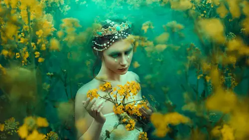
nt to know this information, you know, when I started, there wasn't a lot in terms of post processing in terms of how to color tone. And as I learned going through the process of this industry and talking to clients and working on jobs, I learned a lot more than I would have if I had just stuck to doing my own thing. If I just worked on my own images without keeping an open mind, I wouldn't have picked up a lot of the tools that I learned today. And I think that's really important to know is that the first step is keeping an open mind because we may feel very passionate about a specific color toner. We may all have a favorite color, but that doesn't necessarily means going to translate or images. Let's say your favorite caution blue and you're working a series of images and subconsciously you want a color tone things to the blue side. It might not work for everything. There's boundaries which come into play when to use that specific color. How issues that color today? I want to talk about one main thing. It's going to be the application of it now. The reason I say application and not theory is because we theory angle, hole, bunch of ways. There's books on it, both the application of it. I want to give people tools in order to make it easier for themselves to color, turn their images. So whether it be, whatever colors you like specifically is great. But having these tools will be easier for you to apply those colors into your injures, and I want to show you a few ways to do it. Not just one, not just two. Quite a few quite a few ways to do it. So the first thing I want to mention before we get into the tools itself is the actual emphasis of why we decide which direction and going. When you take a look at this image that I have opened now, I have Photoshopped CC 2017 but it doesn't matter what version you have as long as you're able to fall along. There are some things that are not available in previous versions, so keep that in mind. If you don't see it, it's because it's in a newer version like mine, and these are things have updated through the course of time to help people apply these specific tools. Also, if you have any questions during the process, I'm gonna call in you because I want to make sure that you're getting things answered. I mean, what good is it to watch someone do something if you're not following along? Or if you have a question that's on attention to whatever I'm showing you, and we all have our own specific needs that basically just adds to what we're going for. So this image was shot by Belloc Attack, who is my partner? And we just finished a class of your own crew of live as well, which she goes into a lot of the theory of color toning and how she has a specific Palin how to go about that as well. The reason I bring this image up is there's two things that we look for when we color tone an image number one. It's the emotion that goes with the image you have to consider. What kind of emotion are you going for when your color toning color toning isn't just based on? I like this color. Someone apply it directly to the image. It's about what direction you're trying to push the image to. So you have one. You have the emotion of the image in this particular image. I remember Bella mentioning that she want to create something that's really evocative and mysterious, really engaging. The second thing is going to be, um, the colors that are predominantly in the image because what happens is sometimes when you color turn an image, it can't be overpowering to the shot itself. You know, you have this vision in mind where when you're on setting, you're taking these images. You see the pallets that are already had play. I think the easiest way to go about this is referencing some of the colors that already there on set that day, for example, when we shot this particular image, um, the back everything was green, as you can see. And it was very dark, very dark green. And so we used that kind of theme to enhance what was already there. Which is why the whole image has a general green subdued cast. So it kind of tied to get like a package like, you have a gift and you're wrapping matches with the gift. This that's kind of how you like to think about it. So that's number two. Number one with emotion. Number two is Look at the colors that are already there in the frame are on scene and use that as a as a reference.
Ratings and Reviews
Amy Vaughn
Pratik gave a nice range of tips for ways to color images creatively. I especially liked that he went over a workflow with Photoshop and CaptureOne, since that's my workflow too and it's sometimes harder to find those classes. His tips for adjusting skin tones were especially useful and something I'm always thinking about now when I edit photos of people. I also appreciated the way he explained the differences between hue and color, and I even learned a couple of new tricks with blend modes. His teaching style was engaging and I'd love to see more classes from him.
a Creativelive Student
basic info but nice artist, enjoyed the work flow