Creating a Color Palette
Lesson 2 from: Creative Application of Color Through Post ProcessingPratik Naik
Creating a Color Palette
Lesson 2 from: Creative Application of Color Through Post ProcessingPratik Naik
Lessons
Lesson Info
Creating a Color Palette
The next thing I wanna mention is, let's say that you have a color tone or color palette in mind. How do you actually select that pallet and applied to your images? First, I'm going to show you how to create a color palette physically. OK, there's a couple of ways to do this. And I think this is very interesting because I didn't actually come across this till I saw a few people talk about this. And how many of you are familiar with adobe? Dark color dot com? Yeah, no, that's great. So basically, what adobe dot co dot com is is. It's a website, as you can see here, colored out adobe dot com, which has an easy way to get a visual sense of complementary colors. Analogous colors, monochromatic colors. So if you want to experiment and see what colors and how they look on your images, this is a good starting point when you come to this website, and if you have a creative cloud subscription, you can log in as I have here and the other thing we move this over to the side here, I'll move this o...
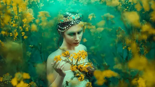
ver to the side here. If you go into a window and you go to swatches. There's going to be little swatches like you do with paint samples, right? We're going to actually take some of these colors and makes watches out of them. And the reason for that is we're going to use those swatches to combine with the tools I'm going to talk about to make a color palette and tone. Your image is essentially so. The way this works is quite interesting, and it's really fun, actually. May expand this for a moment. Let's say we stick to something really simple. Let's go to try it here. So we're going to culture on a new image, going forward into three main sections or highlights our shadows that are midterms. Okay, What happens is if you move his color wheel around, you see the complementary colors associated with whatever you're deciding. So, with this area here, this is gonna be a this is gonna be a primary color. So, for example, let's say that we wanted to create this ah color tone here. All we have to do is when we come over here and we go towards watches, we can actually is the color picker inside of photo shop to pick these colors. And people sometimes don't know that you can actually use a color picker outside of footy shop. Didn't exactly. Maybe you go causes over. Dismissed was kidding. Okay, so first thing I want to do and I apologize, it's the resolutions because we're on video, but normally you'd have a bigger screen size, and it's easy to fit things side by side. Okay, the first step you have to do is once you put them side by side, I have the color picker icon, and this is gonna allow me to actually pick the colors that we want. Actual, Norman. Actual term is I drop it'll It's not the color picker eyedropper tool, Click on the eyedropper tool. Now, this is really important. I'm going to click anywhere on the image itself or outside of it. It doesn't matter, but I'm not going to click and unclipped. I'm gonna hold it down, and without letting go, I'm gonna drag the cursor over to my browser. So click on the image or the document I'm gonna drag without letting go. If I over hover over here, you'll notice. And when I let go. This watch registered on this top bar here are basically temporary swatches. That way, if you decide to pick, you know quite a few of them you don't have to save them. They're just they're temporary. It's like history for color swatches. This wasn't in all versions. I don't remember when it started, but I know it was fairly recent in comparison to how long Photo Shop has been available for. So if you don't have it, all you need to do is when you do sample a color that you like, you just hit, use, watch and hit. OK, so that's a work around by, like, these temporaries watches, because I don't have to save them all because they start adding up. I don't really want that. So, like I said, you know, we have our first color selector here. We'll come over here and do another color, and you can hover over any place in the browser some going over of these big boxes. So have this, like science color. And then finally, I'll come over here. So there I have are three color swatches. Pretty neat, right? This is just beginning. So, aside from that you have this watches, you have the color picker. Now I want to show you a little bit more about how to go and and use these tools to apply these swatches. But before I do that, I want to show you quickly some war reference images to show you what I meant by using colors to be referenced by the scene or the motion. Okay, I'm going to come over down to my catalogue, which I've loaded. Capture one. Now, Chris Knight has also graciously allowed me to work with these images. So he trust me quite a bit, apparently. But I wanted to use his image is not just to demonstrate on, but to show you an example of how color Tony should be done because Chris is a master off color and Chris is a master of light. And he also has, as you've seen the class here on three of life with his photo shop week as well. He has amazing book coming onto with photography, and of course, so he's somebody to look up to if you haven't seen his work before. What I like about Chris is he's not only able to execute his vision when it comes to lighting, but also matched that delicate balance when it comes to color in this specific shot here, you notice that the mood that is specific to the image is this very. She has a mysterious look about her. She's either scared or she, you know, it's a moment of suspense. Do you think A moment of suspensive movies and you look at the color tones that are in movies and you see what what color's they've selected. You get a good idea of what direction you should go. And Chris did something similar in that sense, where the emotion played a role in how he was color Tony's images. I'm I'm guessing that's what he did. But I feel that coming through as an artist when you communicate with colors as well, because he could have went with warm colors and happy colors. But it just wouldn't make sense, right, So that's what I mean. You might like specific colors prove it doesn't make sense in a scene. Don't let it override what the emotion ISS. This is also good point, because when you look at this image, you'll see that aside from the blue tent. There's really no a lot going on. There's no scenery happening and anything like that. So using motion to direct the direction you're going, it's quite important. Okay, No. Let me show you how to use some of these colors in our image. We are going to, um, first and foremost give you a quick before and after off one of the images in the set that we did with Bella. So this is our image. And this was another one from the scene. Me. Go ahead, pick that one. That one, and put it side by side. So, you see, what I meant was this the shoot itself had a really rich color tone in terms of how green everything was and going in that direction with the mystery really added to it. Okay, so that was just a quick little tip I wanted to show you now, going into footage up. Let me go and minimize this. I'm gonna expand this human close. It's not really quick. I'm going to open up one of Kris's images to show you my first technique. Let's go and actually at it this one still need to bring this into photo shop really quick. No, let's say, for example, we take a look at this image and this again goes back to example of, you know, Chris specifically decided that, you know, with the set itself, he was a very similar color palette to begin with, and that also lends to how the final image looks. You have to think about color beforehand before you start working in Photoshopped. The biggest question that I get asked is, How did they make this image look like that? And I told them before thinking about what colors? They didn't photo shop, look and pay attention to the colors in the seat because a lot of photographers like Bella on Chris will be very specific in their mood boards and what color dress they're going for. And, like the classy did with Bella, we purposely picked a red dress who picked ah, red colored week. We picked the red backdrop we picked, ah, foliage. Richards green and dress had green in it, and so once we brought that into post processing and you tweet and push those colors, you noticed that what happens is that things tend to homogenize little better, and and they blend better. So think about that, because you can either fight with your images or think about it beforehand before you color tone, because I think color turns shouldn't override your photography, necessarily, is your complimented like backup singer does.
Ratings and Reviews
Amy Vaughn
Pratik gave a nice range of tips for ways to color images creatively. I especially liked that he went over a workflow with Photoshop and CaptureOne, since that's my workflow too and it's sometimes harder to find those classes. His tips for adjusting skin tones were especially useful and something I'm always thinking about now when I edit photos of people. I also appreciated the way he explained the differences between hue and color, and I even learned a couple of new tricks with blend modes. His teaching style was engaging and I'd love to see more classes from him.
a Creativelive Student
basic info but nice artist, enjoyed the work flow