Tool 2: Color Range
Lesson 4 from: Creative Application of Color Through Post ProcessingPratik Naik
Tool 2: Color Range
Lesson 4 from: Creative Application of Color Through Post ProcessingPratik Naik
Lessons
Lesson Info
Tool 2: Color Range
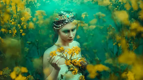
The next process that we're going to talk about is something called color range, and I want to mention it's really quickly because it's it's very similar, but it allows you to make the selection first and then creating adjustment layer. So under select, we have what is known as color range. Color range is really cool because allows me to focus specifically on the area that I sample so I can click on the background and it picks up the color. That's predominantly with the color that I've selected. Because the background is green and the dress was green, he noticed that selected everything so didn't really focus on Where's the Shadow? Where is the highlight? It focused on Where's that specific color you're going for? So it's kind of like a blended mood. Four color for selecting colors. So if I selected you know the body, you noticed that it picked up those skin tones so I can say you know what I want. It's like those skin tones, but maybe on a select on a feather, it's I can increase the ...
fuzziness. I don't know why it's called fuzziness, but its its fuzziness. Okay, so I can increase the fuzziness and select mostly skin tone. The hair I could see. You know what? Yes, let's go for that. And what it does want to hit? OK, it makes a selection. This is really cool, because now it doesn't even matter if that area that I selected was a highlight or shadow it based it off of the predominant color that was in the image. Now, with the selection, I can come in with any of these adjustment layers. I can do courage. The suit curves to keep it to eat fresh, and it made an adjustment layer with a mask. So if I hit Ah, controller, I mean option altar and click on the mask. You'll notice that this is my mask. I didn't have to hand paint this. It was all done automatically. Who? Color range, Um, area. So what do you do with this? It didn't do anything physically. But now that we have an adjustment layer with that mask, we can come into our different channels and adjust the color. Specifically, we can say, Hey, you know what I think Chris needs blue skin. I think that would make it. I mean, just look really good. So sorry. Chris, Do you get the idea? The range of control you have with these two things are very similar, which is why I paired them together. But they're different in the way that once Lex specific total ranges and once select specific color changes as well. And so it gives you that full control of doing whatever is that you want. Even cooler is now that I've selected my skin tones. If I start working on my curves here, I give them cross process specifically for my skin tones. So I can say, You know what? Let's add, Let's pull down, um, the blues here in the skin, in the mid tone range. Maybe just a little bit here, but where it gets really bright, let's add some warmth so you get like it's a metallic effect happening across the skin tone reach because you made your selection first and then you're fiddling with colors. And because it's all adjustment leaders, you can easily just go and say, You know what? I don't like that. I'm gonna hit delete. On that point, I'm gonna head Billy On that point, Maybe we can go to another channel and so forth. And so one. For instance. Maybe you're like, you know what I want this mask, but not on that adjustment layer. I want something else. All you need to do is hit, command and click on the mask. It makes that selection for you again. You have to go back into color range. Then you can pick any other one you want. You can go to hue, saturation, vibrance, color, balance, whatever. For example, I think color balance is another favorite one of mine because it's all slider based. You know, you just have to figure out what you want and then adjust accordingly. You can say hue saturation, and it made that same ask again. You can sat trade or de saturate that specific ranges well, So if you wanna cool down the skin tones to read, skin cools down to, and this goes for environment scenes. It goes for anything. It doesn't have to be just specifically skin tones, but that's a perfect example of what we're going for. One last thing on mentioned as a side point is that with color range, you can also use that to apply different levels of, say, sharpening right, so you can sharpen an image. Let's say a duplicate this. Let's say I go to sharpen and let's say on sharp mask for effect, I'm gonna increase this a crazy amount. Okay? You would never do this. So if you're just tuning right now, I'm really sorry. But let me refuse. You never do this. Go back a few seconds and watch what I just said. OK, now that I've done that again and say you know what, don't apply that to a specific area. I can either use color range wrecking his blend if modes and when I could do is say you don't only want that sharpness specifically to the highlights. So if I do blend if modes, I'll just like that layer blending options again under Langley Air and you can see the sharpness is fading away. As I move my slider left and right, I can feather that in say OK, so if I zoom in here, that really sharp, disgusting skin is only implied that area. But you get what I'm saying, right to get away with a lot of things soon for the shop. What are some other examples other than skin that might use that last tool that you taught us? Absolutely. So let's see that I have one of Bella's images here. Let's go back to this one with Judy. We'll bring that in to finish up real quick. I'm sorry. Wrong one. There we go. So let's say that we decide that we want some of these. Actually, let's go with her hair. Let's see if we can select just her hair. Because hair is usually air. That's really hard to select. And in a situation like this, you can get away with selecting the oranges of the image because the hairs orange. It also gives you indicators into what other colors are similar in the image. So you can use this tool to figure out. You know what? There's a dominance of green. You can clearly see it's white. That means it's being dominating the image. If I select the skin, you can see the ratio right, the composition, if you will, the color composition. I'm just making terms now, and you can see the oranges in the image, so oranges have a more balanced palette. The skin is more concentrated. The greens is the overall impact, right so let's focus on the one that's more balanced. I'm gonna focus on the hair so I can select the hair. I can bring the fuzziness down. I'll say, You know what? OK, I think that's a good selection point. I want to make the hair a little bit different. I wanted to change the hue of that. When I change it little bit more red, Maybe so. I'll go in and click on Hue saturation. Then I can just adjust the slider here and Suzy just like that. I'm able to push colors so that they're more complimentary with each other, because maybe the color of the week that you used doesn't match specifically with the complementary color that you picked in the foreground. So you can then tweak it so it's automatically aligned to your swatch. So that's a really good good tape. Yeah, aside from that, there's a lot of other tools that Photoshopped does have. But I wanted to mention those two first because of the fact that they are very powerful, and as you can see, they could do a lot. You combine them with adjustment, there's you can combine them with different color palettes and their adjustable. So you're not married to anything that you've picked. So she visit your file back at a later point in time and you decide. You know what? I hate it, right? Because it happens. I mean, for me, I retouch an image, but then I come back to it, you know, in a few days, or maybe like the following evening. And like, I hate what I did. I can adjust those colors. Maybe you were working for a client and they want to adjust. Whatever is that you did, you could then come back and bring it back.
Ratings and Reviews
Amy Vaughn
Pratik gave a nice range of tips for ways to color images creatively. I especially liked that he went over a workflow with Photoshop and CaptureOne, since that's my workflow too and it's sometimes harder to find those classes. His tips for adjusting skin tones were especially useful and something I'm always thinking about now when I edit photos of people. I also appreciated the way he explained the differences between hue and color, and I even learned a couple of new tricks with blend modes. His teaching style was engaging and I'd love to see more classes from him.
a Creativelive Student
basic info but nice artist, enjoyed the work flow