Creating a Double Exposure Album Cover in Photoshop
Lesson 7 from: Creative Effects in PhotoshopAaron Nace
Creating a Double Exposure Album Cover in Photoshop
Lesson 7 from: Creative Effects in PhotoshopAaron Nace
Lesson Info
7. Creating a Double Exposure Album Cover in Photoshop
Lessons
How to Combine Images using Blending Modes in Photoshop
17:44 2Advanced Blending Modes in Photoshop
08:03 3Adding Text in Photoshop
13:34 4Working with Stock Images in Photoshop
04:52 5Accessing the Blur Gallery in Photoshop
02:08 6Learning to use Blend If in Photoshop
06:59 7Creating a Double Exposure Album Cover in Photoshop
32:34Lesson Info
Creating a Double Exposure Album Cover in Photoshop
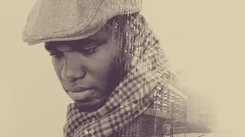
We're gonna move on to our fourth and final inish this gonna be a lot of fun. We've got an album here and I'm gonna be combining through four different images together for this album we've got a few textures and then a portrait of a subject and then we're gonna we're gonna give it like a album cover name, enough it's something I'll say one sort word and then it'll wind up being served california server again way yeah, that was so I want everyone to start thinking now, it's got to be it's got to be cool name it's going to be it's going to wind up being on this photo seemed like little rockets right into it that's it now. All right, so let's talk, we're going be combining these together and just a couple ideas in the background because, you know, watching me do this with pre chosen textures and things like that that's one thing, and I hope you have fun with that, but I'd also like to help you guys when when it's time for you to pick your own textures and you're at your house or whatever,...
you know, and you're like, I don't know what would, what would combine and what would look cool and things like that generally what I'm searching for here are things with really interesting like textures that are going to wind up showing on my image and then a good difference between light and dark like we've done previously so this this is a good area because we do have this really light area a cz well is the blue also keep in mind what we did earlier with the hue saturation changing that color whenever we wanted to so it wasn't if this is blue and you're like man, my images red are I need something red it's very, very easy to change this blue to red if you wanted to, so don't let things like that color you know, keep you from using a texture that you may happen to like and then finally play around if I if I'm thinking, you know, I maybe want one or two textures to wind up on my final image, I'll try like fifteen or twenty oh, I'll try as a bunch of them because sometimes you you get something and you think it's going to be great and it just looks horrible, it doesn't just doesn't work on ben sometimes things surprise you, so be open for those surprises and try out a lot of different things be my suggestions all right? So we're going to close the zone and then this one's kind of cool I think it just kind of matches what we got going on there all right, so we're going to bring these together and basically just make this a little bit more of a, a kind of grungy type of it, but it it's a cool image to start with, like we're starting with the cool photo and that that helps, right? Like, yeah, it's like it's like taking a pizza, you want all of your ingredients to be quality, all right, so first thing I'd like to do, we're just going to scale this a little bit larger and then, you know, we're not getting super technical with this. This is like, artsy my mom calls artsy fartsy this is like, you know, this is arty farty, so have fun with it flipped their bloody moons, we're going to do, we're going to do that right now, so I'm gonna hit the for my move tool shift, and I'm gonna hit the plus and minus, and I'm just I'm interested in seeing how this combines like, you know, sometimes you get something like that and that that's a way too much, it doesn't look great, but sometimes you like something about it so you can always change these things to if I wanted to just lower the capacity, I can keep the same, you know, I can keep the same. I can keep the same one first in this yeah you can lower the opacity you can apply like a levels adjustment layer to these to these as well so keep in mind that you don't have to use them just as they are by default this hard light that looks cool that looks really cool because we have the reds and the yellows air mixing day they're gonna create that really nice orange having I'm a huge fan of color like you know mixing of colors and playing in this case we want to stick with a mostly warm color panic palette so we're going to be using reds and yellows and oranges and that's going to give us a nice warm feeling so I like that but it's on top of her face so we're just going to rotate it around or flip it so let's try flipping this minute control of manti right click and go to flip vertical and then you know what? I'm gonna flip that horizontally as well um and we're just going to scale this a little bit larger there all right that looks cool no hard line is pretty good but remember these these are all in the same category so if I like hard life there's a decent chance I might like overlay too so I want to see what over there looks like not that great soft light okay so linear light looks pretty good too looks cool. Yeah, I like that one, too. Didn't I say earlier that I only used been, like, like, once ever? All right, well, it is working so, you know, don't don't write something off just because he barely ever use it. So I like this and I think you guys too, uh, due to there's one thing that I think could be improved and that's it's to light in this area that red is not allowing me to see enough detail of my subject. So what I'm going to do is I want to bring this red and I want to make it darker. I want to make it black, which is going to allow me to see more detail of my subject, so not hard to do. We're going to use a levels adjustment layer so let's go to levels. Yep, we can add black, we can take the mid tones and make them darker, lighter, or I can add black with levels. I also want to clip this because I only want this to be visible on the texture. So right now I'm changing just the texture I don't need to change my background image. So clipping this right click go to create a clipping mass there we go, and I couldn't bring my black point up which is going to add black, but I like this more than a layer mask because I'm not completely I'm not just if we had a layer mask here and said, right, which I think is what a lot of people would do and there's nothing wrong, you know, everyone's got different strategies, but if I just let her mask this away, the texture was away and you're always left with this, like, just blur from no texture and total texture, and that it doesn't look is refined to me, as you know, making it a little bit darker because then you still get the texture, but you don't get the part of the texture you don't like. Um, not only that, but I've got a levels adjustment later on on this later now and the levels justin layer, it has a layer mascots well, so if I want this to be visible, just a tw, the top and I want to keep the bottom, I can do that. I could have just the late levels blending mode visible at the top, and I could bring it back on the bottom to be a little bit more visible there, all right? And then we can click on the texture of the hole, and I can paint this away from just areas. Like her face all right, there we go. We may wind up putting a little bit of texture on her face but generally if I can get away with it I generally like to avoid too much texture on people's faces even when you're doing images like this because it it kind of this kind of usually looks like they have a skin problems more than anything else you know it's like ok does not look as good um but that looks good. I like that. What do you guys think? It's already pretty cool, right? And it took almost no time and I'm also thinking trying to go through in my head I'm like ok album cover I need a place for text right here it's a good place for techs. Yeah, we got a question. Is there a way to put a little bit more of that texture back in the red? Because I think when you took it out when you did your slider yes, it slid a little bit too much texture out of the red around her face. Yeah, how david this orange neon glow? Yes, you can definitely change it at any point. And the great thing about using these layer blend modes go a little bit more. So if she's got a little bit more separation between the background, the great thing about using your adjustment layers and layers and clipping masks is if I say, this is a psd, I've got access to these layers so I could deliver this of the clients and the clients and say, you know what? Let's, can we bring that red up in the background, or can we take that down? I don't have to go in my original j peg and trying to read re fix it, I just go into my levels adjustment layer just changes a little bit and we're good to go so it's a really quick nondestructive way of editing could this looks? I mean, that looks like it's been destroyed, right? But it's not it's it's, a very, very simple at it. All right, let's, bring this guy into command or control t to size it up just a little bit. And as I looked through this, I'm thinking to myself, all right, I need differences between light and dark. I'm always looking at light and dark because that's going to create those really nice natural transitions because I don't want to just grab the soft ground brush and fuzzy it out. So this area here is dark in this areas like, so if I wanted just this, like dark texture stuff to show up over top of my image. I could have that, or if I wanted just the light so let's see what that looks like. So for the light stuff, we wouldn't want to change a blending mode to lighten or screen. Now, in this case, because so much of our of this image actually is light, you can actually you can use a levels adjustment layer to change it, just like we did so let's try that. I'm going to duplicate this layer. This one is still stuff to screen noticed I'm duplicating any time I'm going to apply a levels adjustment layer or make a big change going to duplicate that layer it's just going to make sure I've got another copy, so now we're gonna hit controller command. L remember, we're on a screen blending mode, which will lighten things right now. I've got this blue is lightening things, which I don't want I just want the white to be there, so I'm gonna take my dark point and I'm gonna make it darker, which basically makes the blue darker, which basically makes the blue disappear. Does that make sense? Kind a lot of a lot of mental steps, but there we go now we can just have the white visible is not cool. And, you know, put this wherever he wanted if it can go is multiple air I can do this multiple different times aiken, you know, bring that in is like, you know, maybe we'll put text over top of that um this time instead of screen, I'm going to go up to multiply, ok? And now I'm gonna hit controller command l for our levels and I'm gonna take my white point and I'm gonna bring that up so more multiply again it's good a feather off nicely and it's only gonna be visible in the areas that I want it to be visible all right? And you can lower your passage and things like that, which this is adding a little bit of green into the image that's it's going to be a taste in a preference thing? I like the simplicity of keeping it in that color skill if you like the green, you khun obviously stick with green if not, we said earlier that it's always easy to change colors just eight controller command you, which is going to bring a pew saturation and now I'm able to change that. I couldn't change that green into a red very quickly, so not a problem at all if you like everything about something except a color don't give up on it because that color is super easy to change all right and I might put this just at the very top so let's put a black player mask on there and then I'm gonna paint white at the very top here to kind of give it a little bit of like a texture vignette to a sort of thing and I'm using my brush will now to paint this in for time's sake but if you really wanted a great selection I'd recommend taking care of that edge with the pencil I love the petals of course I would say that everyone's like well I'll stick with brushed way go and if you wanted any of this visible on the bottom is well you could definitely have that be visible that's what tonight's about having your clients in the room with you here okay, you waste no time all right and then we have one more layer and keep in mind I've got these together here as options we don't have to use these we don't we're not stuck with any of these things these air these air just options for us when I was doing the mock up for this I used I used this layer over top of her over top of her hood I'm not sure I'm gonna like it I'm not sure if you guys are gonna like it but we we will have some more options all right so again we're just flipping through blending modes and you know if this were like a lady gaga album or something it would be you know I would this kind of look would be a little bit more appropriate because it is like that like edgy legal what what happened um but with that you've got a car got happened um we're going to try hard light looks pretty good uh let's just bring our light source just up a little bit more here we go okay and we can lower the opacity here um and then this layer I can choose to have be visible in certain areas of the photo we'll see if we like this let me let me play around for like two minutes and then you guys can tell me you know if you like it or if not we can just we can just get rid of it because it's it's no big deal either way but what I was kind of thinking is if some of those textures we're visible on the hood but they followed the actual you know, they followed the direction of the hood I was thinking that that could be kind of cool there so you have some, you know, kind of coming up some kind of coming down like that so it's all it's all this is playing so that's you know, when I'm when I'm back in chicago and I'm coming up with episodes to teach on floor in dot com and I'm you know, I'm working on new images and things like that this is a lot of what I do, you know, the manager my company isn't fully understand sometimes it's like I was working I promise I dicked around a better shot for like, an hour and a half you know, sometimes this is just what you have to do it's like you really just get in there and play because again a decent portion the time you're not going to really love the end result but some of the time you're going to stumble upon upon something you really like and that makes that makes the whole process worth it so um yeah, I can't stress that enough just have some fun and, uh and play with play with photo shop all right, what do you guys think about that texture so far? Is that worth going or yeah, we got kind of me some people are yes is some people are nos okay well let's group them together we'll keep them on their for now we can always decide later to turn that off if we'd like to do so ok, we're going to group these together we're going to go ahead and name this and then we're going to take some questions so you guys want to start prepping some questions there we go so this is going to be our texture group texture all right? And then we have our hood. All right, very cool. Let's. Play with some text because I'm thinking about a name for this artsy fartsy. Well, rockin robin r o c k I n rockin robin you know what now we're yeah, now we're getting there rockin robin all right, I want to do one. Can I get one more suggestion for a name? It may take just meditate. She doesn't I put when I was working on this are put alchemist because I thought she looked like a welcome guest. So maybe we'll list. Do you guys want to alchemist? Could you arguments, monk? All right, we're doing alchemist and then you went on a different layer I'm gonna do I'm gonna do monk all right, let's, start off with the alchemist. Monk, this is, um it has to be fun. So if you have something like this you want to make look, we know you want to make look fancy and look like you know what you're doing graphic design, which I do not, by the way, for the record, one of my best friends is here an amazing graphic designer. And every time I look at his work, I'm like, oh, yeah, I don't know what I'm doing good to know keeps you keeps in line all right so let's make this a little bit larger here that's maybe two large one big tip here ah lot of people will come into the type tool and they'll see abounding box there and they'll use their move to and you can you can stretch it around and you could make a larger and smaller I would actually recommend for the most part staying away from using just your transformed tools to make things larger and smaller the reason being if I were to make this really small and then try to adjust like the spacing between my letters it actually it's based on the original size so oh you really want to try to stick with stick with this guy over here for keeping your image for keeping your sizing now a lot of the time we'll get it pretty close and then I'll just a just a little bit but I find if you're making large adjustments especially with size stick to this so let's go ahead and central this is unit commander control a which selects everything my image and now this a great tip for you guys anyone who needs to align things like text or type in the images commander control a selects everything in my image and then we're going to click on our move tool which will bring up my alignment controls okay so now because everything is selected it's going to align this text for my whole image so I can click on the top and it'll put it right on the top I can click on the middle here and I'll go in the middle I can click on the middle vertically and it'll go in the middle you can put it on the bottom so any of these areas that I need so I don't have to kind of guess around that's too, where the middle would be if I wanted in the exact middle just click on that and click on that and we're going to go or you can just move it down if you hold the shift key down, it'll keep it from from moving left to the right or the top of the bottom of the hill it'll go just in the direction that you pull it all right they're school all right are we calling this monk alka mr alchemist monk this monk all right let's bring that a little bit thinner and then bring that I don't like playing around with type especially when I can like make it make it connect in weird ways and you know, like all k goes origins t you know I think it's fun um all right, so arguments monk there we go it's hard to figure out where that's gonna go okay casey and so also will change from thin let's try light regular it's starting to look that starting look cool you know what I think we could even pump it up a little bit all right cool do we like that? I don't know I think I may be just like that just alchemist what do you think is more simple yeah ok the name of the album then banned yes the name of the album so that can go somewhere else that could go that could go you know appear all right definitely not all right now the cool thing about this and we said earlier that you know using using things like our clipping mass is so nice and especially when you're working with text clipping last could be a lot of fun so what I'm going to do here is I'm going to see if I can make this alchemist if I can make the textures of my original image go right over top of that type I think it might be really cool so we're just gonna give it a shot it won't take too long we'll see how it goes so we're gonna make this invisible I'm gonna make a new layer and then I'm going to shift option plan e which is their stamp visible layer makes a copy of everything you see ok so let's put that over top of our alchemist type and now I'm going to clip it I'm going to right click and I'll go to create clipping mask so now we've got our image over top of the alchemist type, and instead of just black, I've like, instantly got a really cool texture that fits with the actual image because it is it's, the it's, the image itself and, you know, getting down here that's I think, getting a little bit too much detail, but right around there all right, like that. What do you guys think? It's? Pretty cool, right? Um, it might it might benefit from being like a little bit tucker here towards the edges. So let's, just grab a curves adjustment layer option command g to clip that when we click here and just drag it down just a little bit. Hey, command I on that later mask and then we're going to paint white in just a couple areas so we can really see it all right. And just like everything else, this is all very, very changeable. If I want to move my type, I can I can move this at any point in time. I like to tell you there a little bit better waken do any of this stuff end? You know, I do want to do one more thing, um, let's, try making another stamp visible air over top of this. And I want to see if I can bring a little bit of this texture on over type over top of the type again, I don't know if it's gonna work, but I think it's worth trying so let's, try double clicking here because this is my stamp is a blair, remember, which is just like a copy of everything we see and I want to make the dark areas disappear just so I could maybe get some like scratches. It already has scratches, but if it could blend right in, like especially with the teeth that be cool, so let's double click here I'm going to hold the alter the option key and click on this later this time because I want to choose this layer to make this layer invisible where it's darker and just visible words later did, like, hopefully something that looks kind of like gold flakes right on top of the yeah, right on top of their um yeah that's pretty cool and you know what? Because of blend if is its image wide right? Like I can't just blend if this part of the image so if for instance, I really like where these sliders air at, you know, for half of the image like I like where it is over here, but it's too much over there I can just duplicate this layer and I'm gonna have two different versions I can have one version let's do that here um one version that's later matt asked to only be visible there okay and then another version that I'm gonna have only visible on the left side but this time we're going to just adjust this a little bit more so it's a little bit less visible on that side all right? So it's playing back up black on that later mask and then paint white just over there all right very cool. So these layers now they bring the actual texture which I think is nice because you can you can see the scratch continue over top of the tea and you know, go right through that see their gives a nice little uh at a detail that I think that um yeah, I kind of like that. All right, so we'll call this alchemist did I spoke amiss, right? By the way I just realized I don't know how to spell that word and let's hope that's right um and I think that looks great. Would you look let's? Give it a round of applause? I think that it's a great job guys, right? Well, like we got a couple of closing questions here and then we'll kind of finish up for the segment first of all j d m a fork given on three other people say I would like to know howto flip through blend modes like you did you've shown it a couple times but maybe one more time to show people how to really quickly scan through and sheriff, thanks yeah, and I'll just give you one more example of a time when I actually may do that sometimes I'll fill an entire layer with the color oftentimes a very random color just to see what it will do in this case we have like a nice deal so you want the first thing you want to do is hit the for your move tool that's important because if you're on your brush tool it'll actually flipped through the blending modes of your brush, which we don't want unless you do want that then that's how you do that so v for the move tool then hold down the shift key and then hit plus and minus on your keyboard and in this case it's going tio blend this coloring in with the rest of my image and probably look horrible for the most part but you will get some interesting things like that there we go that's a hugh saturation color we'll just call her the whole thing so good question yep cool google on another really quick one solu and a couple of people want to know how do you make a copy of everything you see ok, good question that is a stamp visible air, which you can get to by holding shift option command and hitting e you can also go to image and then down to apply image, and you want to choose merged channel, rgb blending mode, khun b multiply or it could be normal and then hit ok, and that does the exact same thing and just violence and to other people, they found final question let's, there's, anything in the room says, do you ever worry about scaling textures too much in the sense of a damaging the quality of the image? Or is that not really an issue? Great question, I would say, you know, as with images, scale textures as little as you possibly can in I found that for the most part you can get away with scaling textures mohr than you, khun skill on image, because if you do lose a little bit of the detail, it usually won't affect the final image. We'll just zoom in here to about one hundred percent, and you can see it has been scaled. It doesn't have, you know, the super fine edges, maybe I would like that, but as a whole, it doesn't degrade the image on dh, yeah, so I would say fine finding textures. At the highest possible quality you can if you can't find any online that air to your standard you khun you can photograph here on there they're very easy you know like a picture of this table would would make a great texture over top of an image so um yeah good question great thing in the room in the middle you know this beautiful you know exploration I'm just curious in your workflow do you stamp visible layers us or do you use later cops to really keep track of where you're going um I noticed that you know he'd do a stamp visible than you've got that hierarchy but layer cops I'm just wondering which which makes more sense to you yeah really good question ok, so if I'm if I'm trying out different variations if I'm saying like ok this this option might be a good option something else might be an option I will actually I'll do something a little different look let's say I wanted to take this on a little bit of a different road maybe try different texture type treatment and things like that I will actually just hold downshift and click on all my layers and right click and I'll just go to duplicate layers onto a new document and I just start playing around on this new document in that way I can I can do whatever I want on this new document and I don't have to worry about you know, saving this one where it is and going back to the place and everything like that I'll just, you know, also say this is, you know, alchemist one and then this khun b alchemist too, and very, very simple to do, and I will have multiple copies not only that, but if if I'm going to be re sizing something dramatically, I learned this lesson the hard way. By the way, I finished like an image and it was like, you know, full twenty megapixel out of the camera and I was like, ok, it's done it's awesome! I saved the psd out and and then I needed to save version for the web, so I resized it down to, like eight hundred you know, pixels wide and then I say that and then I closed it. It was like done it was stuck in daytime pixels wide and I you know, I had to redo the photo shop the original so on that same idea if I am going to be re sizing something that's important, most of the time, we'll do a stamp izabal off this duplicate that to an entirely new document, and then I'll just resize that new documents, so I know for one hundred percent, you know, one hundred percent of the time that this is going be you know this is the small version and this is my original so as with creating a lot of layers can be very helpful sometimes creating a lot of documents could be helpful too where do you find most of your textures that air like high enough resolution and good quality? Yeah, good question I've actually photographed a lot of textures I don't want to seem like too self promoting but we have a lot of texture packs available on floor in dot com federal you know twenty one or more megapixels in this class I usedto photo leo dot com their stock image website adobe just bought them a swell so they're I think they're going to be rolling out a ton of support here coming relatively soon and and I like photographing textures you know it's it's a good time to just grab your camera, go on like a walk around the city or wherever you go and you know, I feel like personally when I pick up on camera a lot of the time I have pressure I gotta like create this great portrait and I got to be serious about it and I got to do something of note but going around and just like having the goal of capturing textures is a lot of fun because it's just gets out of the house and you could go like you can photograph of a brick wall and it's good like that's what? You wanted to do it like it's a stupid picture of a brick wall anymore. It's like, yes, I'm going to use this like it's a good thing. So everyone in this room make sure that before you leave, you get a picture of that wall right there that would actually because it's an amazing texture really, it really is. Yeah, that would be and get some far away, take some pictures far away where you can see the whole thing and then get get up close and takes him. Of course. Because on this alchemist image, any one of those squares would have made this image look cool, you know? So yeah, get out there in chicago is great because everything is like, you know, rusting the pieces and falling apart. So everything looks great for textures in chicago, but yeah, little things like this the carpet I took a picture of my granite countertop one time which is very dark it's a very dark ground come on top and it has little like light flex in it. And when the light hits it it's cool, I took a picture of that it was very dark with little light flex, and I turned it into a night sky because they look like stars, so you never know
Class Materials
bonus material with purchase
Ratings and Reviews
D Kelly
Excellent Class. The instructor is down to earth and he feels like just a good bud who just stopped by to teach you PS. It is very fast so working knowledge of PS is a must! I learned some neat tricks and love being able to be creative. I do a lot of photography so it will be fun to start collecting my own images. in which to be more creative with.
JOSEE DECARIE
His classes are very well explained, very interesting and he is dynamic, I love the courses of Aaron Nace.
Edward Ries
The course content is excellent. However it appears that the instructor assumes the online class are already experts. He zips through actions faster that can be easily followed so the how to value is lost. The results are evident but the various steps to get there are lost in the speed with which they are executed. This diminishes the value of the course except for those who are already extremely versed in photo shop actions.