Lessons
Class Introduction
05:06 2Composition, Props & Angle
14:28 3Shoot: Cake with Flowers - Creating a Story
29:11 4Shoot: Waffle with Syrup - Capturing Movement
23:53 5Shoot: Granola - Simple to Complex
11:06 6Image Review - Crafting Your Story
25:16 7Culling Images
11:11 8Editing Images in Lightroom
18:37Lesson Info
Image Review - Crafting Your Story
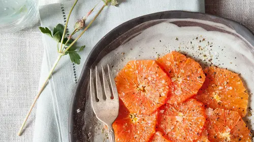
Here we are. We have shot these images. And now what we're going to do is post processing, which is just as important as what you're doing in the camera. It's the finishing touches. It's like if you're going to a ball, you would have to put on your makeup before you walk out the door. So think of it that way. Or, straightening your tie, or tying your shoelaces. So, before we get to the images that we just shot, CreativeLive asked me to show you a series of images that I've already done, and explain a little bit about why I'm picking them, and why I would use them in the sequence that I'm choosing. So before I even begin post processing, I'm already thinking about the story that I wanna tell. And that story is including composition, color, shapes, light. Am I telling a color story? Am I telling the story from beginning to end of the process of gardening, and growing the vegetables, and putting them into the restaurant? The delivery system, and then the chef cooking them, and then the pl...
ated dish, and then the customers enjoying them, and then the interior of the image. What story am I conveying? So, I'm going to show you a little bit about that first, and then we'll get back into the images that we shot today. So here, as you can see, is a grid of some images to choose from. Big variety of things. And they won't all make the final cut, but let's say I was on location, and ... Let's say I was on a trip somewhere, and I wanted to get some imagery for my social media. So I'd be taking a variety of things. We have a process shot, right here, which is the maker of the dish. It's really important for me to include where do you get your food. Where does it come from? It's not from a package in the grocery store. Before that package, the food came from somewhere. So it's always important to me to show hands. To show the form of a figure, even if I'm not showing a face. So, I am going to use my increase rating bar right here, the little shortcut, and choose that one, because I think in this story, it's important to me that I'm telling you something about who's making the food, and where is it coming from, and how is it getting to the table. So I'm going back to view all of my image in the library. Before I even start to edit an image, I'm making my selects. Well that's a nice image here. And I know through my rough cut, that I don't need to look at the details of each image yet. I can go back and do that after I've made my selects. I'm just gonna go through and pick some that I think we'll work with later. So I'll select that one. That's a plated image. I like that. So we have our process shot, our ingredient shot, we have a final plated dish. The pool shot, that doesn't really make sense to me in here. This is a restaurant. So great, I'll include that, maybe, you know? Here's the exterior. It could be a restaurant. I'll include it, and see if I like it. Here's another dish of ingredients. Here's a resort. Am I telling a resort story? If I were telling a resort story, I would include the pool image of the water, but really the focus isn't about the setting, the focus is about the actual food for this story. So then here I have someone enjoying the food. Okay, I'll include that. This surfer girl, I like her, but she doesn't have anything to do with the food. She's not making it. She's not plating it. She's not eating it. So let's skip her. This does not look like a restaurant, so that doesn't fit in. Again, I love her on the beach, but she's not making the food. She's not eating the food. She's not part of the restaurant scene. We'll skip. Same with this man. Shoes, no. Palm trees, if I were telling the resort story, I'd put the palm trees in. Table, yep, table tells a story of food. Not really a food image. Not really a food image. This is a food image, right, because it's what you're eating the food on. So I'll include that for my rough, and see what it looks like. No, no, no. Nope. Some of these are just resort story. That doesn't really tell me a food story. This could. This could tell part of the food story. It could be the growing bit, so I'll include it just in case. I think we already did that image, so I'll skip that. We've got closeups of ingredients. This is a farmer, maybe, but can I tell he is a farmer? I'm not really sure. I'll include him just in case. And then we have some plant life growing, right? That's something vibrant. It's alive. It's the very beginning of our food story. We have somebody in the field. That's the next step to our food story. Winter, doesn't really go with the feel. Maybe we have a closeup of a plant. Even though I love the apples, the other stories were light and bright, and they felt summery, so I won't include this one. And then I'm also not gonna include the sky and the snow. So, alright, we've made our selects to go through, the preliminary selects. And now I'm just going to look at all of the images with the one star rating. So when I'm making my selects, I usually go through the overall imagery with just one star. And don't worry, I'll blow them up. I can see you squinting. It's just to give me an idea of overall, does this look and feel cohesive? If I were to arrange it, do I like the colors together? Do I have enough elements that are conveying making, eating, plated? Well, it doesn't quite fit to me, so I definitely know that I would have to reorder the images. And that's a little bit difficult to do in Lightroom, but it is easy to do in Bridge. Adobe Bridge. So, for the sake of our class, so we're just working with Lightroom today, because that's something I use everyday, and so I know that, if I wanna use the blue, I have to order the imagery so the blue doesn't just stand out on it's own. It doesn't quite make sense. But I do like it together. What I think in this image category that doesn't fit is this image here. This bright red image, really it takes away. So if I just remove that, it's a nice soft color palette, right? So everything now flows together quite a bit more than when I had the red image just jarring, sticking out, right? So, that can work together, if I were to rearrange things. And I can tell a story. And the story doesn't have to be in a sequential order. It still will convey the message, if you put the chef first, that's fine. If you wanna tell a sequential story, that's great too. That really helps your audience understand what you're talking about. But sometimes I'll mix things up based on color and texture, depending on how everything looks together. It's still telling a story. You're still understanding that what I'm talking about is a restaurant, the person who's making it, the person who's growing it, and the person who's enjoying the food, and then what the items are in the food. So, we can go through and we can look at each of these close up, and decide, do I wanna use this? This one's a yes. So I'm gonna star, I'm gonna increase the rating one more time. This is my second edit. This, closeup of those mussels. Yes, absolutely. I like the colors, I like the detail. It's plated, we need a plated image in there. This is a shot of the restaurant. This shot I don't think it goes with it anymore, so I'll go back to the restaurant, yes. This doesn't tell me it's a restaurant. She's eating a dish, absolutely. Interior of the restaurant, yes. Now, did these kind of stand out? Maybe, but let's see what it looks like when we have it all together again. That doesn't make any sense. It's not really showing anything growing. Detail of food, yes. Oops. This could be nice in there too. And now, this man smoking a cigar, I don't think it really fits, so I'm gonna take it out. I have this green. I have this green. And I have this green. So I probably don't need all three of those images. So, I'm gonna get rid of this one, because I don't think I need the closeup of the leaves. So there we go. Let's look back at our collection together, right? It's not important to see ... We're not looking for details of the images right now. We're looking to see if they feel cohesive, if they feel like a collection. And so you really only need a small thumbnail to do that. I could blow it up to see the images more. Do I like them together? I think if I rearrange them, I can make it work. I can put the blues near each other. With the blue apron, what I would do next is go into the blue berries, and then I might go into the blue plates. I wish I could rearrange it easily for you. I don't think it will scoot over though, let's see. Oh, what do you know. Okay. Great, so let's see how we can rearrange and play with this. And it's okay if you don't get it right on your first try. Sometimes the arrangement of something takes longer than the shooting of something, and that's totally okay. So, what I'm doing is I'm grouping everything that has a blue or a cool tone together, and I'm seeing how that feels. And after I get my blue and cool tones, then I'll move into my colorful tones. That might not work in there. That's kind of a nice transition between those colors. And then I think this shot now becomes unnecessary. So I'm gonna take that one away. And also this might be unnecessary, but I'm gonna sit here and play with it for a while, until I get the right combination. Once I have the right combination, then I'll go back to each of images individually, and decide, okay, I think that the highlights are too much on this image, or the shadows are too much, or I wanna sharpen it. So I go into develop mode on the individual image, and I love the presets to start with. So, I love to see, if I add medium contrast, what happens? If I punch the image, what happens? If I sharpen the scenic, what happens? So I usually just go through kind of a few Lightroom general presets to get an idea of what does it look like, and then I can remove them. So you can always go back in Lightroom, which is really ... What I love, you're not altering the actual image, you're altering the copy of the image basically. So, your original image is always intact. So if I don't like that, I can just start from scratch, and I can go back to the import, and that's what it looked like. But you know, I really like how some of that brings in more detail in the hands, but it's a little bit dark in the food for me. So I'm going up to this brush here. And what did I say before when we started? My favorite tool is dodge and burn, because highlight and shadowing is so important to me. So what I would like to have is some more highlight in this area, so the focus isn't just the hands, but it's on the food. So I'm gonna take my brush, and make it a little bit bigger. And what I wanna do is add a nice highlight in here. So, I'll brush over the area. And then I'll take my exposure, and I'll bring it up just a little bit. So I like that. So, to show you what it was before, you really couldn't tell, are those berries and peaches? They got lost in the shadows. But here I've just brightened them more, and I really like that. So, it's just a tiny little ... See, it's just a very minimal change, but it makes a big difference. And I wanna show you where the image began. It was this, which is fine. And now that I've played around with it, I can see the difference. The contrast makes it pop a bit. The sharpening makes the hands really come to life. And then the brushstroke of highlight really brings out the vibrant peaches and berries. So, here's the beginning, which is great. And then you see this and it's better. So it's okay to play around, and you have your nice history over here. So let's say I didn't like that additional last brushstroke I used, I could just remove it. And I could go back. Oh, the sharpening was too much. Or the punch was too much. So they're really simple. That took me 15 seconds maybe. And the image looks so much different from how it came right out of the camera. So, I'm really doing minimal adjustments on my imagery, because like I said before, it's so important to get it right in the camera, and I'm not a computer expert. I don't wanna spend my time in the computer. I really wanna spend my time outside with my friends and family. And so, after I'm finished shooting, I wanna do as little as I can on the computer. So, I already composed this scene the way I wanted to. I made sure that we didn't have too many distracting elements in it. And now I'm just doing the final finishing touches. I'm tying the bow. Or I'm tying the shoelaces before I walk out the door. So if I were to get on Photoshop, which I'm not going to right now, I would just get this little bit of red out of here. And since I don't wanna get on photo- because I think it's distracting. Your eye goes up to it. And since I don't feel like getting on Photoshop right now, because I want this to be really quick, I'm just gonna go over the red, and I'm going down to saturation, and I'm just gonna see, what does that look- so much better, right? So my eye isn't going up to that point anymore. My eye is still really coming around this area of the image, which is the focal point, and the most important part of the image. So before the brushstroke, there was this distracting bit of red. And then after I desaturated that small area, you can really see, your eye goes back to focusing on the fingers, and the dirt under the nails, and the salad, right? So that tells a story. That tells a story right there. That image alone tells a story. But if I wanted to add the story, and make it a whole entire, whole entire compilation, then we can go to our next image. I brought, we've got the navy of the apron, and I brought this image to be the next image, next to it, because I like the blues. So, here we've imported it. I'm in develop. And I'm gonna try some of my favorites again. So we've got medium contrast curve. Ooh, that makes it really dark. So, I'm getting rid of the contrast, but well, before I do, let's try punching it. What happens? Let's try a little sharpening of scenic. Oh, now I like it. So let's look at the difference. It really looked vibrant before, but now it looks flat when I compare it. So I added a little contrast. That makes the highlights brighter, the shadows darker. The punch really adds a little bit of saturation. It adds a little bit of contrast. But that's a preset. So it's great, great to use, and then I sharpened a little bit, because in digital, most things can use a little bit of sharpening. So now I have a bright, vibrant image of an ingredient shot, and it's next to, we've got our guy here with his lovely hands. Okay, and now I wanna tell the story of what will we plate these things on? Okay, so I have this shot that's styled. It's the pottery. And let's develop it again. Let's try just some of our quick, 10 second fixes, and see if we like them. So a little bit of contrast, a little bit of punch, a little bit of sharpening. I still think the highlights are a little bit bright, so I'm going to just see what adding a vignette ... Well that was easy. Look at the difference between what it's like before a vignette. It's really kind of bright. Your eye goes out of the image so much, but I just added a vignette, and you really get focused back in. Now, if I wanted to do a little bit more work, I could take my dodge and burn, and I could bring down this highlight, because this is what's getting distracting for me. My eye is really drawn to that highlight, and I really want my eye to be focused on the image in this area, where you're seeing the beautiful pottery. So, that brought that down a little bit. It's a little too much for me, but you can just bring it back up. You click on the focal spot, and that let's you change it. Okay, so here we are. Do you wanna see before and after? We have that's what it was like before with the highlight. And that's bringing it down, just a little bit. So this is the image, how we started. And that's how we finished. And that really only took 20 seconds. Less than that, if I hadn't been talking to you. Okay, so then we have another ingredient shot, which I think is really important in food photography, to show, again, where did your food come from? How did it look before you cooked it? What did it look like? What are the details? People love detailed food closeup shots. So that's a great way to please your audience, to always have some of those. And it's okay, you can decide that you want more of that kind of imagery, or more of a plated dish, or more of the making. It's really up to you what balance you use in your social media. So, let's say you're really enamored of people cooking. You can have most of your shots behind the scenes, but then make sure you have enough plated shots, detailed shots, to make it really feel balanced. So, I would say you could do a third, a third, and a third, or you could do 60 to 40, something like that. Okay, so here we have this. We're going to do our little fast fixes, and see what we like. We've got some contrast. We've got a little punch. We've got a little sharpening. I think the edges are a little hot, so okay, I'm bringing them down, and that brings my eye back into here. So, that was really fast. Really fast. And look, that's what it started like. Big difference. Just a little bit of contrast. It adds a little bit of saturation, and a little bit of sharpening. So, there we go. We've tied our shoes. So the next image is showing where the food came from. Alright, so let's try our same quick tips with this. We've got our contrast. We have our punch. This guy, we're gonna sharpen the face, instead of the scenic. I like it. It feels like it's a little bit too cool, so maybe we'll add a little warmth up here in the slider, the color slider. You can really play with, and it changes the image so much. So you pick, kind of this is where you're talking about your white balance. Making it custom, or changing in post. And this is why I'm changing it in post, because I'm determining the color of this image based on the overall story. So this is, this image, if it were just standing alone, then I could do a custom white balance in the camera, auto white- but auto white balance is fine for this purpose, because I am custom white balancing it with my sliders here in post production, because I'm talking about a cohesive project. So, I like that. I think it looks warm and inviting, and it tells a story. So, let's get this image to match this scene. So here we have our contrast, we have our punch. We'll sharpen our scenic. I think the blacks in it are a little bit harsh. So I can come over here to shadows or contrast. I can take the contrast out a little bit, or bring it up. You can really play ... See, that's crazy. That's not enough, right? So we'll find a happy medium. We'll make it match, so we can put them kind of, look at them a little bit side by side. He's got a little too much contrast too, so we'll decrease the contrast. And that's the great thing about Lightroom, is you can go back, toggle back and forth between images, and change things ... If I wanted to make this image completely red, if I wanted to make it this color, retro 70's Polaroid, then I could go into this image now, and do the same thing. Oh wow, but I don't wanna do that on either one. So, we can go previous. Great. Previous just takes you back to what you had before. Here we have another detailed shot of ingredients, so I'm gonna go again, try my contrast, my punch, my sharpen my scenic. This image looks a little bit muddy to me, because it's so much yellow. So, I'm gonna play with my temperature slider here. And then also I love clarity. Look at what happens. Oop. So, the clarity really brings out the details. You don't wanna do too much of it on a face, because clarity is adding basically black lines, and it's too harsh on a face. So, here's the temperature change. Here was the sharpen. But then the clarity really gives you some of the details of the fish, which I think is important. So here we've imported it. And here we have now with the clarity. Does that look like a cohesive, does it fit? I don't know, so I have to go back and look. Yeah, I think it fits now. And we still have three more images to go. So, let's get back to them. We've got our plated dish. It's important to have some of those in your story. So we'll go back into develop. Do a little contrast, a little punch, a little sharpen, and see what we feel. So that's a lot of contrast for me, for this plated dish. And I also, I love it on the plates, but it seems like it makes this area a little bit muddy. So we can use our nice highlight brush again, and instead of changing our exposure there, we can just on that isolated area, we can make it less contrasty. There you go. So, we didn't have to do a global change. We could do a local change. So, that works. And then we have our person enjoying the food, which is a really important part of any meal. So let's try our normal sharpening, and our normal contrast and punch. So I like this image, but this space right in here does nothing for me. The table isn't a texture that I particularly love. It's not telling a story, so I'm gonna crop in a little bit. And remember what I was saying was, if you're shooting square particularly, you wanna give yourself ample room in camera, so that you can crop in for your square. So most of my imagery is not going into a square format, because I'm photographing for books and magazines and the like, and so I need vertical or rectangle imagery. However, this is still too much negative space down here, unless I was going to add some text that said, viva, or something, bon appetit, or something like that. So, the story's really about the enjoyment of the food. So it's okay to crop into the dish. Now, if I were to shoot it again, I wouldn't like this spoon that was jutting out of the image, so I would change that. But, because I'm here, I don't have that option. So I'm cropping in. This really tells what's happening. It's a person eating. It doesn't have so much table. That feels a little tight for me, so I'm gonna play around. And remember, the image isn't altered. And so I have the opportunity to change as many times as I want right here. That feels better to me. Okay, let's try our punching, and our facing, and all of those things. Okay, that works. I think that's better. I'll show you the before and after. So this is how we were. Light and airy. But that's kind of not the look we're going for. The story we're telling is punchy, it's contrasty. If I wanted to tell a light and airy story, that would be fine too. I would just make sure everything, I would take the contrast out of everything a little bit. So that was how we came, and that's where we are. And then this restaurant. It might not work with the other images, but let's try. So, medium contrast, punch, sharpen scenic. And what else can we do to it? Maybe we'll add the vignette, to bring it down in color a little bit, because so many of the images have so much black. And then maybe, let's try darkening this bit of the table a little bit, so our eye comes back to the front. So I'm just gonna go up to here. Oops. What I did was I went brighter, so let's bring the slider down. So I think that's better. Now we'll go back to the library, and we can go to the grid view, and really see if everything works together. So, let's rearrange a little bit. Maybe we start with the setting. Okay, here we are in the restaurant. Here's the chef. We've got detailed shots. We could even start out in the field. We could start with an overall shot of the field. Let's try this. So it's okay to just keep playing until you feel like you've really got what you're aiming for. So, then we've got the plate, and then we have a restaurant. Maybe we have ingredients before the restaurant. So just keep rearranging until you have the story that you want.
Ratings and Reviews
JennMercille
Liza Gershman is not only an amazing artist, she is an excellent educator. In this course, she goes beyond teaching the basics of interesting composition. She factors in the connection between food and culture, and the role that it plays in storytelling as a visual artist. She demonstrates how to draw upon the story of a dish, to showcase it with an authenticity that will set you apart and elevate your art. This was a wonderful class, and absolutely worth owning! Thank You Liza!
Florence Grunfelder
Liza gave a good overview of the steps involved in shooting food - from choosing the props, selecting the pictures to editing in Lightroom. This is a good course for someone getting started in food photography.