Lessons
Day 1
1Day 1 Pre-Show
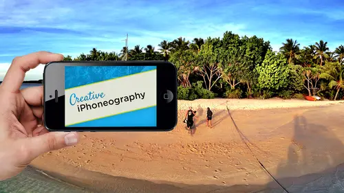
06:32 2Why iPhone Photography?
30:03 3New Possibilities
29:25 4New iPhone 5S
26:14 5Gear and Accessories
39:27 6Shoot: Panarama, Bracketting and Other Tools
28:34 7Syncing Photos
29:41Camera+ App
37:27 9KingCamera App
16:41 10Snapseed App
35:10 11Snapseed App Continued
42:01 12Day 1 Wrap-Up
04:43Day 2
13Day 2 Pre-Show
06:23 14Additional Gear Review
14:46 15Sharing and Syncing
19:32 16Embellishing Apps
49:40 17Retouching Apps
26:27 18Retouching: Panarama and HDR
32:46 19Printing Your iPhoneography
33:46 20Compositing and Graphic Design
38:13 21Thanks + Credits
01:46 22Painting Apps
34:12 23Video Editing
55:34 24Day 2 Wrap-Up
04:24Lesson Info
Printing Your iPhoneography
before we go anywhere else, I was able to put up some images that were sent a Zai mentioned before by Natan Daria from I phone art dot com case that came out as I photo art It's not. It's obviously not associate with my photo. It's IPhone. So IPhone art dot com is an excellent group that has a lot of things going on, one of which is the printing of work. And they do an amazing job of Prince, as you can see here. They did this exhibit in Los Angeles last year. Were they? They printed all the pieces for the exhibit together exhibit, and because of that, it was probably seen as one of the most serious presentations of mobile photography ever because it was all presented so absolutely mind bogglingly beautifully in terms of these prints, especially, Ah, lot of them were being done with this bamboo extended bamboo frame. So anyway, they sent me some samples so I could show it. And when we talk about doing this concept of printing, so I wanted to make sure we do that Another a couple people,...
not a couple, but a group of people. Bob Well, and Nikki Fitzgerald. I just got this yesterday. This came out just a little bit ago, but I picked one up because I heard that it finally had reached the bookstore's The Art of IPhone photography. And actually, Daria from my photo Art wrote the forward to this, which I read last night, and she did a wonderful job of an overview of the industry. Excuse me, and I highly recommend it. Also, as a resource it has. I can't remember if it's like 45 different artists, but basically it is a lot of the mover and shakers of this very, very early industry and some of their favorite pieces and some of the acts that they used for it. So it's a wonderful overview there. Little snippets. It's not ah, long in depth on any one particular piece, but it is beautifully done in terms of the images it has. Some galleries of some absolutely beautiful are working her as well, and so it's just a resource that I think is excellent. It's one of the most beautifully done ones, and again I photo Art, um, and its associated groups, I highly recommend. I'm sure there are all sorts of things you can find online in terms of what they are up to. I plan on getting connected with them because they seem like, really meet people. I've heard nothing specifically about Nate in diarrhea. I've heard and they're printing services for nothing but absolutely, you know, fantastic stuff. So this this is actually on a metal print as well as on a metal frame. You know, your traditional kind of shadow box shadow box, print these. They're also beautifully finished. Each one is is gorgeously finished on to a brushed metal, which are really nice when you're going to a hike image. One thing that's nice about high key is if you can let the metal show through, then you're taking advantage of this wonderful reflective surfaces. I was actually printing on two, um, brushed aluminum. Probably. I like to say, 10 years ago when we actually were working with a real brushed metal plate that we're really doing and then laminating on a transparency, bonding it onto the surface, which is not how it's done anymore, but going way back. This idea of printing on the middle, especially for monochromatic prince, is just gorgeous. So these air. All prints from I phone art dot com. And I think they are awesome. And I appreciate them sending the samples, and I will be sending in samples for them to work on two. And I think that they're great because they're associated with these different competitions and gallery exhibits there. Probably one of the best groups to get associated with if you're wanting to share your art in a competitive environment. Okay, so there we go speaking about printing. Let's actually touch on that before we get too far, because I keep mentioning it. And if we come to the tail end and don't actually share that, I know that will not be good. So, um, let me go back to our photo manager pro and will go into our teaching. And that is where we have our creative live. We already. Now you are all experts on the use of sharing images from one device to another will leave that up in the background. Printing What? What? What do you need? What can you print for these mobile devices? And this actually, at lunch, we had a great discussion about megapixels and the new cameras. The new Windows based cameras that are doing, you know, very large pixel count in terms of their sensors. Um, in brief, I'll just say that one, um, it's the quality of the image as much or more so than the amount of pixels that are going to give you the quality that you need. Sometimes having a large pixel count is only beneficial because the images so bad at a pixel level in terms of noise and pixel artifacts that you need a lot of pixels to hide the fact that it's really a crummy camera. If you have a good camera, then you don't need to hide the pixels a matter of fact, every time you look at an image you know on your IPad, if you think about it, you're looking at it. And now these air retina displays, your IPhone and IPad, but you're looking at the actual pixels in the sense of that have made up on the screen you're not. They're not squishing down the pixels as you would on a printed page, so our images look great on our devices. And how come we need so much more information when we do a print and um print is much less forgiving than a screen. The gamut, which means the reproducible range of colors of a printed page, is dramatically less ink, especially Pigmented Inc. Which most of the inks that are used for some sort of archival G clay environment are gonna be. Pigments and pigments have less dynamic range than it die. The early inkjet printers Our world died base, which has a much wider gamut because of the gamut and because of other things of translating pixels, which is using the emitted light. Primaries were going blue into the reflective light primaries of Salyan yellow and magenta, and now the various colors that printers add to try and extend the gamut you need more than what you have on screen. How much do you need? Well, that's a good question. If you're going to something that has an inherent surface to it, something like a gallery wrap, this has kind of, ah, muted. This particular print here has a muted texture to it. In other words, irregularity of the surface is gonna refract the light over it, so you actually don't see this every pixel in the same way that you would on a metal print. Let's say so. Gallery wrapped watercolor paper, watercolor paper. Ah, traditional uncoated stock is gonna have what's known as dot gain. And again, that dot can come in and kind of smooth. The transition between pixels. It's very forgiving. A gallery rap, because of the exaggerated texture of canvas, is also gonna be very forgiving because it's gonna hide the subtleties of individual pixels. That being said, if you have pixels per inch, what's known as P P I, that would be fine. For most uncoated stocks, Textured services is great. Um, basically, in the olden days, pixels were thought of it 75 pixels brains. That was the original screens. So 1 to 1 ratio of your of your image at looking at it 100% um, half that size you can print it at. So if you were at your desktop monitor at home and you're 100% and it's showing you this big half that size is what you can get away with on a printed page that was, you need to cram more pixels together than what you're seeing on the screen, so it's a rough idea of it. If you're going out to traditional printing process like a magazine that's using what's known as offset lithography in the half tone dot 225 is kind of a minimum range of pixels per inch. That's the number of pixels that would be squished together when you hit print. So 225 that formula is 1.5 times the half tone screen, which traditionally is 150 line screen for most magazines. When you're going out to a coded stock, especially a metallic, um, you can get away with less. But an optimal resolution is when you start moving from the to 25 after 300. The thing with each of these resolutions is each time doubles the file size. So if a a 10 megabyte file at 1 50 DP I it's gonna be a 20 megabyte file at 2 25 and it's going to be a 40 megabyte file at um, 300 FBI each time. You know, 300 um, verses 1 50 is four times the space of it. So, um, that's an issue, as you don't want more pixels than you actually need, because there's no reason to have that much overhead in a really big picture. So really easy way of determining how many pixels that you need is looking at your image it 100% which we can't do on your eye mobile devices. You really can't tell what 100% is on the devices. Like I said, most of all of these abs are doing a truncated, reduced view of it. Even when you zoom in, you notice that you can't zoom in very much use only in one time, and it stops. That's why I want some things like Filter Storm and others take so long to do their final output, because then they're actually doing all the work on the rial image. That's the only time they're actually generating the real image. Everything else has been this kind of a proxy, a low resolution proxy. So, um, when it comes to printing, definitely recommend doing this on a desktop, if you can, doing a check of your image. Also, that's where you can go into something like photo shop and image size, and you can tell it you can turn off the sampling and I'm a pull up our laptop at the very end of the day to so we can see those settings. But if you're going to image, size and photo shop, it tells you what your pixels per inch of the file is. And if you turn off re sampling, you can say, Well, I wanted eight by 10 and then it will tell you. Okay, By 10 you only have, you know 78 pixels per inch PP. I at your disposal and you go well, it's got to be 1 50 it's gotta be 10 inches. Then you could say re sampling and it will generate the new pixels. You'll say, OK, scale it up. I'm giving you permission to scale it up and you'll notice that the file size will change as well. Also, as I mentioned, the new photo shop, Sisi has an excellent new algorithms for scaling up so much like the big photo app that I showed you. It can do that on. There's no problem with it. It can scale up to that minimum resolution. That's why some people are doing I photography and doing tooth foot by three foot prints and getting beautiful results. Usually they're going out to something like a gallery rap that's very forgiving for to a watercolor paper. And they are going to, uh, prez it to take advantage of this interpretation of the pixels to generate more information. Typically, do not recommend going out without the interpolation, because then you will see those individual pixels. If you're PP eye drops down to something like 70 or 50 or something, because you're getting so greedy you'll start seeing the pixels. So you might as well soften up that transition by doing this interpretation of the image. So I would say 1 50 would be a minimum if you go well, I want to do it on metal and night, you know, don't have it and do it at 1 50 But do make sure that you have, you know, some pixels. A lot of the apse are doing a reduced version of the file. It won't work it for resolution. Some of the painting app. So I'm going to show you this is really cool. One called sketch guru. That's just really beautiful stuff, but they're down to, like a megapixel. So if you wanted to do that, you're really gonna do really tiny print or you're definitely gonna try and interpolated up using something like Photoshopped. So, um, and I would keep that in mind with if you if you go. But I needed big, then go. Gallery round, Go. You know, watercolor paper. Don't go for the really cool metal prince. If you're tryingto do something over the mantle, the other thing that you can do is you can do, um, up prez it bring it back into the IPhone and that at that increased resolution since the IPhone can handle a lot of the apse can handle up to the 18 megapixels that the panorama built in camera can shoot. So a lot of these abs can work at 18 Mega pixel. So you're shooting at eight. If you really want to be the purist, you can shoot it. Eight, take it out to photo shop, blow it up to 18 bring it back and muck about with it on your IPhone. And it's an original IPhone shot. You just increasing the reds. You know the best way you can. You can also use something like that. Big photo, some maps. Um, nice app out there for painting called glaze. glaze actually has built into it and, uh, press asses what was part of the process? Knowing that when you're doing all this exaggerated painting on the edges, you can get away with murder. So if you did a glazed painting, I think the built in app will raise it up to 4000 by 4000 pixel image. So there's some maps that because they know they're doing such an exaggerate effect, actually build in the upper is process into it. Okay. And one last thing of that, the issue I'm using the term PP I vs dp I just technically dp I dots per inch of the dots of a device. A printer has a certain dot prints that it can print 1440 dots per inch Monitor has dots per inch pp eyes. How many pixels per inch are squished together when you hit print, so dp I actually, um is associated with the device what you really want when people want to know resolution. It's this idea of maker pixels. What's the dimension X and y of it? That's the real thing to say. Something is 300 peopie. I tells you absolutely nothing about the quality of the file. You can make a file, you know, that's this big original. You've cropped it down. It's this big and you said it to 300 peopie. I doesn't mean that it's any better quality than if it was 72 PP. I It just means that when you print it out, it's gonna print out this big because it's gonna shove 300 pixels together. Perlin, your inch, you know. And at 75 pixels, you said it to 75. It'll actually print out bigger than it was originally shot. So peopie I really has nothing to do with the dimensions of the file. It's just how maney you're gonna squish together in the final printed page and you need 1 50 at the lower end. And you could go up to 300 would be, you know, your maximum what you would need. Okay, so that's still three p p and DP. I questions what would be because we're getting into the papers? What would be the best way to determine with the image that you have with the quality that is because I've looked at various online resource is for printing and there's like 50 different kinds of paper that you can get. What's the best way to really determine what you I want to be able to print on for what your purpose is? The easiest thing is this difference between a coded or glossy stock versus a mat or textured stock. Really simple. Those are the two things, like I said, where they Matt, uncoated or textured stock. You can get away with much less pixels because it will hide the pixels in the refraction of the light of the texture. Or there will be a dot gain where the dot the little spurts of ink will actually go into the surface and also hide pixels. So the one tip would be When you're speaking out what media you want to print to? How many print pixels do you have at your disposal? How much is it? How important is it that you hide pixel artifacts and that it is looks absolutely razor sharp? And what look, are you going for the brushed metal? I mean this print right here, especially when you have a high key image where you're seeing a lot of the white of the paper quote unquote, that's beautiful. But since this is a metal print, the ink is sitting right on top of the surface and you will see every single pixel. So this would be a case where you would want to either Make sure excuse me, make sure that you had the pixels to begin with, or that you upraised the file and then did a little sharpening. That's another thing that comes into this equation. And as I've mentioned all along, why I don't sharpen in the IPhone is because you can't see the pixels. And every image that you shoot is actually significantly sharper than what you will always see at the onset. Because every image is taking these red green blue pixels, and then they purposely blur them to create full color, much like mixing paints on a pallet. So, um, they're purposely blur. The demos aging process of how we create digital images is a blurring process. Most cameras have some sharpening built into it. When you shoot raw, you have the ability to use that sharpening or not into your own again. I would, um, save that. If you are going out for beautiful prints, I would do that on your desktop where you can one see the pixels and then to use things like on short mask or even better, the detail portion of adobe camera raw and light room is infinitely better even than the un sharp mask built into Photoshopped that we've been using for a 1,000,000 years. That tab, because it also has a mask where you can isolate it out. So it only sharpened edges and doesn't sharpen the flat areas where noises gonna hide. Um, is excellent. Also, you can paint in sharpening with brushes in photo shop in adobe camera raw. So, um, one, no matter what you're gonna do that the other thing that's part of that printing process. When you talk about medium brings up the issue of soft proofing and you're right, This could be a whole week long seminar, which I love again. My background wasn't traditional graphic design and printing. So, um, a real good printer and I I should expect it out with the folks here at IPhone art dot com. Um, really, your color space that you're working on in all these mobile devices is what's known as S RGB. Most printers are gonna print on that default setting because every camera in the world defaults to s RGB, which is a shame because it's actually an awful color space. But don't get me started, so they've probably backwards calibrated their system to taking to that account. Some printers will also come up and profile a specific printer paper and ink and create what's known as a printing profile. And you can actually load that profile, download that from the printer, load that into something like photo shop and say, Would you please show me what this will look like printed on this printer paper and ink based upon this profile you can download, Um, and that would allow you to do what's known itself proofing. So you actually see on the monitor what you would get based upon the, um, substrate, the medium that you're printing on. So that's when you get really want to see detail because each printer paper and egg, especially if you're using some sort of, you know, really cool, funky paper for you to be able to get a approximate station of what's possible is really cool. So that soft proofing is something that you would do it again do online. I don't know. With IPhone art dot com What services provide if they're doing an auto color correction is an option or if they have custom profiles or what. But the end result is that their work is the best that I've seen, so it's excellent. But that does. It's a very good question. And then again, the main thing would be whether you need to hide pixels or not uncoated and textured or whether you can get away with glossy or metallic. Okay, you the questions from the studio audience wasn't sure if we were finished with printing or we're going. Keep going with printing. I had a printing question from before. Yes, please. OK, I didn't want to sidetrack you. So this was from Douglas Guliyev, who wanted to know going back to the content aware crop. So the question is, are the content aware fills high quality enough so as not to be detected when you do print them by themselves? I would say no and yes, um, what I mean by that is you're always responsible. Never used an automated process of anything and trust that it's gonna be good enough. A Pano and HDR a selection, a extension all of those, especially on a mobile device. Since you can't see individual pixels, you can't see the full Raz file. It's only a few APS that allow you to do that. I would never trust those because that Z actually it's perfect question because if you go, this is cool. Looks great on my device and you can't really zoom in. And then you go to the time you do a beautiful print like this. That's the last thing you want to do is go. Oops, You know, I didn't realize that that seem, was showing or that repeated pattern is noticeable. We talked about this yesterday, talking about even things like texture. If you're using texture and your image and doing a Siri's being able to random randomize that texture so that scratch in the upper left hand corner is an identical in every single image where you kind of go, you know, it's it's you're losing the organic feel. So no matter how you're doing your image, I would say that you're responsible for doing that final pixel peeping as it's known, and again that's where the desktop comes in. You know. So I would I would do that. I would not trust any of them. And if you noticed the sky, it did a pretty good job. But the water If I did you know any too much on it, it's gonna be noticeable. Also, if you're going to a desktop in any way, shape or form, which I recommend and you have Photoshopped photo shop is going to do a better content aware fill. It's going to be able to extend that canvas. We could do a whole class on it if you want. I have a class here and creative life on light room, which is an excellent one that Costa covers photo shop integration. But, um, at some point when you're getting into that extensive retouching, even though we have it and there's some really cool ones, I would always check it on the desktop. That's just me. You know, it's good to know, thank you. You're investing in a print, you know it's worth it. And again at at 100 20 bucks a year, which is the new creative cloud for both light women, Photoshopped, the latest one, and Photoshopped Sisi is awesome. The brand new adobe camera raw that ships with it is awesome if you're if you're this passion about it. What I'm hoping is that mobile photography is giving people reigniting their creativity, reigniting this idea that actually I am an artist. I can create art. I love doing this. This brings me more joy than I've known for ages. Um, and you haven't been in photo shop or light room because it's too scary, I would say go for it because actually, light room is really elegant. And then there are some great instructors out there on light room. It's probably 50 instructors teaching light room here. Creative life. All of them are wrong, except for me. All of them are excellent, aside from me, and there's great areas of getting training, and there's plenty of stuff if you're also part of the crowd. Creative Cloud Adobe has a ton of free training you also automatically part of with a subscription to the creative cloud. Yeah, um, I may have missed this, but on printing tiff versus J peg, I think right before break you were talking about, you'd actually prefer to just stitch multiple J pegs together and have a larger image than just switch from J peg to tip and take the shot over again. Is am I following that correctly? Like, if this is the magic moment and you know you're gonna g o out to print and put it up on your wall, would that be your recommended workflow if I had the option of either shooting in a very special app that had the one added feature of saving and tiff and just taking one shot? And it's in tiff, um, versus doing something like a Pano where I can go from eight megapixel, as we mentioned before, eight megapixel do a Pano. Now I've got 12 or more megapixels simply by doing that, even though it's gonna be using a nap that doesn't support if I would much rather do that. In this case, the number of pixels versus a pixel that's not compressed is not significant. The JPEG artifacts that you get by shooting with these devices that shoot J pig not, um, raw file or none compressed tiff or lost loosely compressed. If is, I hate to say it almost insignificant. You're not seeing that the pixel artifacts, the the micro blocks ing That is how a J pay compresses the file. You rarely see that you're more likely to see the banding because you've gone outside of gamut, you going outside of the range of reproducible colors because you've gotten greedy with your tonal. But that's not because of J. Peg. That's because you're just getting greedy and you're trying to suck more information out of a badly exposed image than then you are. Is there than a compelling use case for having tiffs in a photo app at all, if they take that much longer slower to process again if you're going for if this is, if you have the option, all things considered, that's a very good question. If you've got bigger files that are slower to process and all this stuff and the J pegs aren't giving you the artifacts that are causing problems, at what point do you go with? This is a better image. The tiff. This is gonna let me have 10 times the number of images on the camera, roll and play mawr and be faster on the playing. At some point, I would say that the answer to that is when you see pixel artifacts. You know Jay Paige artifacts, then Obviously, this would have been a benefit. If you're never seeing J peg artifacts because your workflow is the least number of steps possible in the process, then there is no benefit to the tiff. Um, especially again, if you're going to print, remember, you're gonna have at least twice the number of pixels than your original at 1 to 1. This 1 50 p p I. So even if you had a J pic artifact, that subtle in full color image that is also gonna be reduced down on the printing process So But if you are seeing artifacts, if you are the sort of person that's doing the pixel peeping and going in and saying, I can't stand it pixel artifacts I get for my mobile photography, then a tiff file format is a godsend. It's awesome. Um, in the whole topic is mobile photography. The issue of mobile photography is not to take a razor sharp 40 megapixel megapixel image. No matter what cell phone manufacturer may tell you, the benefit of mobile photography is it's just frickin cool. I mean, does let's, you know, get back to the priorities This is just It's just cool. It's bitchin, It's cool, It's Boston's groovy. It's spontaneous, it's all. It has 50 million attributes on it. The fact that it's not shooting the same quality as my DSLR is so minimal we wanted as good as possible. That's why it's freaky. Cool. The IPhone five s is freaky. Cool, in fact, that there exist. Extending is too dynamic range increasing. The ref stopped bigger sensor dynamic tone mapping as you shooted, you know, multiple shot integration for doing image stabilization. I mean, they're thrown the kitchen sink at it, and I think that was really why Apple did it. It's actually brilliant. I would much rather have an eight megapixel file that's really, really good. Then a 40 megapixel file that is compromised in terms of eso and noise and everything else. And again, the artifacts in terms of the long list of what I want in a camera. No, J peg artifacts from me isn't really on there in that same way, because the algorithms that do J pay compression nowadays are so awesome. So I don't see the artifacts and because most, if you had it somewhere in your workflow if you did use five APS, and one of them did tiff as soon as you opened it another app, it would save it in its J pic. So the fact that you did had J. Peg for a few minutes. Is it worth it? Right now, PNG is probably a better one because PNG liked if it also could be a lossless Lee compressed file. So 24 bit P and G's are becoming more and more popular, and that is one of the default When you make a screen grab on your IPhone saves a PNG, not a J pay. So P and G's, I think we're going to Seymour and Mawr now. Light Room supports BMG for the first time because they know it's a zip file format that could be used for photography. So, um, we'll see. We'll see continual evolutions of this. And hopefully at one point we'll be working with real raw files that they get the great thing. Okay, we're getting aside a lot to cover Adobe with the new light room in the new a. C. R has thes new smart previews, which is a true raw file taken down at resolution while maintaining the true raw nature of its A true white balance. True dynamic range. True sharpening truth, everything. So that technology does truncated, small, usable, elegant, true raw file that will synchronize back to your big boy raw file. So as you do something in light room and you go like this and retouch and tweak and tone and then automatically re samples that up procedurally to the full resolution raw file when you're done with it, which is the potential, what will come next year with a light room mobile, that is, that's where we're headed. So the file format is not a some sort of high bit depth to file. It's some sort of elegant raw file. And to be honest, Adobe has done that. They're smart. Previews in the new light room and a C are fantastic, and that's the basis of their mobile photography In the future will be these, and it's brilliant. Chickens get moment. Any other questions from the studio audience? Yes, sir, we have questioned, I know, with desktop devices and monitors and such. There's a lot of talk about calibration when it comes to printing an IPhone. Ah, graffiti. What's your workflow for screen calibration. Well, you can't do it right. Uh, you can try and do it. It does have it. But the writing of a profile based upon putting some sort of hardware calibrate er on it really isn't there. It's not built into the OS. That said, the fact that the color consistency between this device and a TV set and even a print and other things like that is creepy good there. I mean, considering where we've come in the last two decades of computer imagery, the fact that you could have a mobile device that has, you know, this range of color from different angles, that was one of their huge problems, that every device considering how the manufacturing process and they're making zillion of these every minute. You know, the fact that you have that kind of color consistency is amazing. Um, but you're right. Technically, my IPad and your IPad, my IPhone, your IPhone, there's really and they're going through a calibration process of part of the manufacturing. So apple and I take it. Other manufacturers as well are doing a lot to make sure that it's consistent color. It's possible. But the only way you're gonna be able to do this to really do printing and even your work, right? You need to be working on a calibrated monitor, which is gonna be a dedicated desktop system, not even a laptop, because that's gonna have a variable angle to it. So dedicated monitor on your desktop that has been calibrated with a hardware calibrate er low puck. You know, even if it's something like a Huey, you know, or something like that, which is $100 little device that sits on your on your monitor, calibrated that will create a custom profile that will know the monitor. So what you're looking at is accurate. And then if you really want to do it right, you're gonna do this soft proofing you're gonna say, Show me what this will look like on this printer paper and ink. Those are the two things that you definitely need. You need to have a calibrated desktop monitor, and you need to have a profile for where you're sending that image. So those are a couple things there. I don't have a solution for getting your IPod, IPad or IPhone or Android device anything closer to perfection. I'm amazed that there as good as they are, considering what they're trying to do. You know, every single time you come with another phone, it's now 20% brighter. Okay, what does that do to all the images that I'm just working on? Does that mean that I have to compensate for the fact that now the phone is this much more brighter and has this much more contrast? Has this greater gamut? You know, they're changing all the time. The specs are changing. So it's really hard from that anal retentive standpoint of I have to control the situation. It's it's a moving target. So that's why I say bring it into your desktop were, hopefully you have a more standard calibrated environment.
Class Materials
bonus material with purchase
Ratings and Reviews
Phillip Ziegler
Jack is terrific and there's a lot I learned watching the videos. Of course this is a fast-changing field so some things are dated--some of the apps no longer exist--but I highly recommend this course to anyone wanting a wide and pretty in-depth orientation to the world of Iphone photo apps.
Student Work
Related Classes
Mobile Photography