Lessons
Day 1
1Day 1 Pre-Show
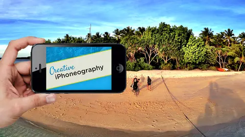
06:32 2Why iPhone Photography?
30:03 3New Possibilities
29:25 4New iPhone 5S
26:14 5Gear and Accessories
39:27 6Shoot: Panarama, Bracketting and Other Tools
28:34 7Syncing Photos
29:41Camera+ App
37:27 9KingCamera App
16:41 10Snapseed App
35:10 11Snapseed App Continued
42:01 12Day 1 Wrap-Up
04:43Day 2
13Day 2 Pre-Show
06:23 14Additional Gear Review
14:46 15Sharing and Syncing
19:32 16Embellishing Apps
49:40 17Retouching Apps
26:27 18Retouching: Panarama and HDR
32:46 19Printing Your iPhoneography
33:46 20Compositing and Graphic Design
38:13 21Thanks + Credits
01:46 22Painting Apps
34:12 23Video Editing
55:34 24Day 2 Wrap-Up
04:24Lesson Info
Snapseed App Continued
I'm gonna go over here to there's tilt shift, which gives you linear an oval blurring, but actually wanted to share with you the center focus because center focus actually does some really nice stuff that some people don't know is there. So, um, one If you click on the scene, you've got your little dot and the dot actually, just like in grunge is movable, which is great, so it's not really center. Focus its center focus wherever you like. It lets you change it, and the three parameters that you're changing our blur, atter, brightness and inner brightness. So it's doing both outside and inside, and one adjustment, even light room, and a CR's new radio filter is either inside or outside. You can duplicate it and then do inside and outside. But this excuse me ability to do both inside and outside is really cool. It also has when we come here to the Blur and we'll take our blur strength up you're getting and let me take down its size. You can see the blur if we it's on the center of this C...
ameron. I take it down. It's a diffuse glow. It's not actually blurring it. It's I can still read everything on the cover of that camera. It's still razor sharp. It's just defused. If you click down here on this weak versus strong on strong, it actually becomes a blur. Okay, much more like an optical blur. So you have both of those. Oftentimes, it's nice to get rid of subtle distractions by leaving it in this week blur and just giving a little diffuse glow to it, which is gonna draw the into the center. There's really no blurring going on. It's just a slight softening of the outside of the image. Very nice little effect. That's a blur, straight that at 100. But you can see it's not actually blurring my distraction. So that's up to you. If I really want to do a short in depth of field, then I'll use the tilt shift option. If I want a little diffuse glow, I use this the outer brightness. You can go up to brighten it, which doesn't do a whole lot, or you can take it down as a default. It's pretty close into the file, so I like taking the outer brightness down to minus 100 as dark as you can make it. And then I'll come up here and I will find tune its size by pinching. Okay, I can't figure out where I want it. And then I will find, too, in the amount, because oftentimes I don't want 100. But unless it's at 100 I can't really see what it's doing. And inner brightness again. I have inner brightness here at my disposal, so I confined. Tune it. I'm just not limited to it. It starts off as some brightness plus 30. So again it's giving you some brightness. So it is softening the edge slightly, and it's drawing my I am. The one thing that I'll mention here, which is not, um, really obvious is that you don't need to use all three of these. And actually, because what we like doing in our work is a general dodge and burn a nice soft edge. Give me a nice, soft edge feathered selection to do some dodging and burning. So oftentimes, what? I'll use this four and let me I'm just going to jump out of here and then I'll come right back into it is I will come up here and take the blur down to zero. I'll take my outer brightness to zero, so it's having no effect. And then what I'm left with is this little teeny bug, which is a perfectly smooth, feathered edge area for dodging and burning so I can take that up. That's the outer brightness. That's the one I accept to zero. Go back up to inter brightness. And now I've got a little teeny bug that I can move around the scene, which is this perfectly smooth highlight for Portrait's or anything. The little log in the foreground of the lake. The selective adjust inside of snap seed is razor sharp. It's gotta find an edge of color and tone. It's not a soft edge selection. It phase out, but it's sharp edged. This is just a perfectly smooth selection that Aiken drag throughout, and I'm not. Even though it's called inner brightness. There's nothing stopping me from taking it down to a negative value, and now I've got a little darkening bug that can follow me through the scene as well. So this little bug, um, is nice because it's a soft edge dodging and burning, and just because it's called three things doesn't mean you have to use it for three things. In this case, I'm going to use it in a more traditional manner. So let's just jump back out, jump back in, do that same thing where I'll take my blur strength up in the week for Matt. I'll take my outside down, fine, tune its position and scale and do my inner brightness down. And there is my compare where I'm just darkening and softening the background ever so slightly to get rid of distractions. Okay, so there is center focus. Here is my comparison now. Okay. I don't think I'm going to use a tilt shift. We already saw grunge, retro, Lux, all of these. The fact that I'm going through from optimizing down to getting crazy is why I would do that. I would never go into the ground or other ones until I got the tone where I wanted, But the retro looks, this is actually one words really is useful to go through the shuffle to get your variations on it. And they've done some really elaborate formulas in here to come up with these what they call retro lex and taking effects you'll notice they are using to fuse close their blurring the image on some of these. They're doing tone mapping on some of these. They're doing a lot of color effects. They're doing light leaks. They're doing textures, they're doing vignettes. They're doing saturation and re saturation of the file. And they're even doing kind of some framing effects by adding in things like sprockets and film stock names. So they're really elaborate. The problem is, is that you don't know what you have. If I like that, What is that? Well, there is no that if I come up here, these are color styles. But this isn't the recipe that I'm looking at. There's no way to get back to a look that you've come up with. I can see why. I kind of like with grunge What we give you 1500. How are we gonna know? I know you can't, but that doesn't mean that it's not a little bit of a I. I like that. Why can't I do that now? I confined to knit because I can go. Well, I like everything, but I want you know it to be this versus that and this is the overall style. So as a starting point you could use any one of these styles. Okay, so you have 12 styles in each. One of these has a different kind of effect, but the random izing is not going just through those styles. It's actually randomize ing the elements within that style. So let me, as an example, will find one here, and I'll show you what that random izing is doing. So as an example and each one of these, you'll notice it also has the randomize ing on it. So even style 11 isn't necessarily style. 11. As I keep going through it, you notice that style 11 now is blown out on the right. I keep going. It's now blown out of the bottom. I keep going a different like leak. And if I keep going, there is even one of these has the name, and what it's doing is it's going through the parameters that are associated with this style. You know, Mitt will explain what that means. In a second, there's my name up in the left, so I had to cycle through 20 different options. Each one of those 20 options changed all these other parameters called properties down in the lower right, which includes your textures and light leaks. In this case, each one of those styles has a different set of properties. You literally have hundreds and hundreds of parameters inside. This one area called retro looks really, really cool, incredibly powerful. If you had a way of replicating the style, the dirt and the light leak and other parameters that other styles have, man would be really cool. Yes, I've actually been able to replicate it before because if you go into the main screen and look at the options available, you can see where they have it set for each of them. And then if there's like a particular look that I like on one particular image and I wanted to make a Siris of it, I'll just write down. What were you seeing that recipe? Let me go on to the main screen, where the images and then I go up and down, side up. Oh, you mean right within retro. Look within retro Looks here. Kind of like when you go to tune an image. Yeah, right there. Well, those are given my brightness, my contracts my like leaks and everything else like that. But there's no you could write down for as example. This is using a light leak so I can go into the style. I could go into properties. I can go into a light leaks, and this is lightly before it's one of lightly before, because each time I move it, it's going to randomize it. So it may be light like leak for B. Is that one parameter for it? I can't see that anywhere except for going into properties and seeing it, and I only know it's because I'm gonna name it be because there's no label of which one of those variables. It is so in the same thing. If I go into here to style Aiken, go properties, you're so you're right, you can replicate it, and I can go over here that I like soft noise Now, soft noises only gonna be available in this style here of style. Three. I can't get to that. If I liked style four. I won't even be able to get to those noise patterns or those light leaks that be different. So what would be nice is a way to say, Well, I like the noise from this one, and the light leaks from this one. I love this color effect here, and I love this kind of little framing effect. So I haven't seen where that kind of recipe is, and in a way that would be useful in the sense of changing the parameters of being able to excise excess style six, which is now going to have a different set of light leaks or something like that. I mean, some of the different. I guess the filters that you would use have specific ones that are that are available. But if you did want to replicate it, there is a way to be able to do that with just going. And I mean, it's time consuming, but most likely right. If you want to be able to do that, there is the option to do it. That is what you what makes up a recipe? You're absolutely right. Is one that numeric values for each of these because these each one of these air being changed with each one of the effects, Um, including the style strength. So this style strength is the overall recipe for this style, usually in terms of some sort of color and tone mapping. So you're gonna find that So this style of style six. If you write down all these parameters when you get into things like scratches and light leaks, you would then go into the property's and then find out which of the light leaks and textures that it used and then try and figure out which, if you're using this one, is that the upper left lower is that works of the rotated parameters it is. My point was that I really like for them to just give it to you know, at least even though Timber Plus gives you the formula in one, you know, piece of metadata in there, so you can and they're. But they're really nice. I mean, if you look at him there, some of the nicest ones out there, and because you still have things like saturation at your disposal and you can take this case of you're doing some and taking effects, it could be that you want to take them down. In terms of contrast, I think they're really nice, so I like him. It's just you have so many things, and it would be nice if you could say that is a priest. And I'm sure at some point you will. Um this is an example. Where? On the desktop version of Snap Seat, each one of these little modules can be saved as a preset. So this is exactly the sort of thing that you can do with snap talk. Snap seat. I'm desktop version. So we know where we're headed there. Um, we'll say that we like this one. Sure, Why not? Well, say apply and we'll just show the frame. Ings will come into frame ings for our parameter here and again, that same sort of thing here, where you have in going up and down, you're not gonna have any parameters which is a little miss concerning disconcerting. But you do actually have parameters there hidden. You go into your different styles here. The ones on the left are all on white. Ones on the left on the right are all on black. They're all actually the same ones, whether it's black on white. So we'll do something with a little bit of a You know, we'll do exaggerate it. One for teaching purposes will do a little bit of a Polaroid edge to it. The thing that's not there, since there is no up and down on here, it seems like the only options that you have are the color. Add the color to the tent, so it's whether it's translucent enoughto let the color from the background image show through. And, um, this format here, this is original and wonder one. You could just switch it for making it instagram friendly, but what you wouldn't know is that you can pinch and make that as tiny or as thick as that. So that's something they added in there because in the olden days, all their frames used to be procedural there, all rendered on the fly. They were all just a mathematical formula. Now they're actually bit mapped images, really intelligently created because they work on horizontal or vertical or square meaning and they're scaled. But they're not stretched. They're doing some really fancy jiggery pokery in here, but in this case will come up here and we'll do our frame. One thing that you may want to know. If you apply this, I'll give you another little Kiki trick. Since you guys have been so good on here will come up here. We're going to do that same little effect. We'll do that one or a variation on it. And obviously you can add one frame on top of another frame to get something that's totally unique. Since you can scale the frames, there's nothing stopping you from combining frame effects. I also do. At this point you have vintage, which is another great set of effects. The thing to remember about vintages vintage can be used to tie all these elements together. I've got a framing effect. I've got the background of the frame. I've got all these different things that I've done. Um, again, I've got styles I like style. Three. It's the most natural color, and I can pinch. I get center size so I can do kind of a vignette to the whole thing. I can do saturation and d saturates it a little bit. As a starting point, I can change the style, the strength of the style. I still have access to things like brightness and on and texture strength, and I have variable textures. Number two Hitting it twice is my favorite is my formula exactly cause you start going crazy ago. I like that texture, and I like it to randomize it just once because it seems to do it the same way. It's the least distracting of the noise, so I have texture, strength, center size. I can control that via my left and right, and the style strength is basically the color effect in here. So here is a, um there and taking effect. The reason why I like it is that ties everything together now the frame and the background and the image. Everything is sharing the same patina throughout that there's a texture that goes through the whole thing. There's just a universal and taking to the whole thing. Yes, I know it's not specific to snap seat, but using some of their effects like grunge and retro Lux. In In some of the tone ranges, you can see there's a banding effect that will show up. Can you explain a little bit about how that works and how toe you would You broke the image? Yeah, Like I said, every single time you do an adjustment. Since this is destructive, you're throwing away information. You are never creating information So if you start off these air, finally starting off with an eight bit J pic, So that's two to the eighth power you know to to to the power, as you all know, is just do that math in your head. Ah, wait is 256 colors, and you have each one of those for each one of the red, green and blue channels. So to 56 times to 56 times to 56 is the number of tones and colors you have at your disposal. As we all know, to 56 times to 56 times to 56 is what classes go ahead. I know our host know that 16.7 million possible colors in the J pick what he said. That's that's known as an eight bit per channel file. It's also known as a total 24 bit file isn't as a J peg, it's a compressed file. You have 16 million colors, but you only have 256 shades per channel. The color elements that make it up and what's happening is when you pull out and you go well, I want this much color range threw away a bunch and move what was down here in the bottom, and it moved it to the middle, too. Make it brighter. Well, there's very little information, shadow detail. So what? That may have been at a to 56 shades in your blue channel. It took that and threw away maybe 3/4 of the blue because it was already up here. And you said, I only want that 25% useful and I want to pull it to the Midtown. The problem is, is that's gonna have artifact into it, because now you can see the limited range that actually was hidden because it was in the dark. So as you keep adding these different effects to it, each one of them is shaping the tonal range and where you want it. But if you look at a history Graham in photo shop, you'll notice what's known as combing that there are gaps in the tonal range because they don't exist. As you move something over, it starts throwing away information. So the combing ends up being this banding where you're seeing the fact that there's just no tones in there. There's no smooth tones though smooth. Grady. It's between those tones, so you're going to get that it's not specific toe snap. See, it is actually snap seat is one of the better ones of doing that, but because you can you'll see it more and snap see than other ones because it does tone mapping better than any other application. You see it because you can get more greedy and snap seed, but I want it all. I mean, you know, this is a huge, the subtlety that I'm getting in tone, and this image is actually pretty darn cool. I like it. You know, we do it here, and I even like the antique in going on. But you're getting greedy. So you're going to see it and snaps, eat what you're going to dio, and this is actually a very good point. This texture, especially in something like antique. There's two things that antique does here. Vintage effect in snap seed is one. It puts color throughout the entire tone range highlight through shadow. So your highlights, which could have been blown out because you've got greedy. Now we're gonna have some tone in it. Even if it's a little see Peotone. It actually will take that sunset that blew out cause you got greedy. And now you're gonna have a little tone all throughout the clouds. Nice as we say in Japan, schoolboy. The other thing is going to do is it's gonna add a texture to it in this one. The most subtle as I mentioned is to to, um and that texture is gonna hide the banding. Basically, to answer your question, how do you get rid of noise? Really, only way you can do it is either trying to blur it or you add no ways to help dither the transition between one band and another. You use texture, toe compensate for that. So a little bit of texture in this case, a little bit of color Patina goes a long way in covering that banding those in my two solutions for when you get the poster post rising, it's also comes up when you go out of gamut, you got a little bit carried away with the saturation and you say the color I want is this one. And he says, I'm sorry that's not available in s RGB, which is the color space that these air. Working in the color space for the Web is that's RGB. So if you say something that's outside of it, say I want that yellow on the sun to be fluorescent. It's gonna say, Dude, sorry, it's going green. I can't. It's outside. You can't do it. Can't do it would be prudent. 1000 points elected anyway. So it comes in when you've gotten greedy with color and always be careful of that. If you're blowing out your you're doing a beautiful picture of a red rose and all of a sudden you get a little bit too much, and all the sudden all the detail in that red rose just immediately disappeared. You've gotten greedy. That was really one of the nice things about that pepper image in the five s that we showed this morning. That's bright red pepper with a huge amount of tonal range. Any time you have red, green and blue, your primary colors that make up the image. If you can maintain detail in all those areas and push it, that's a really nice sensor. That's the difference between a good sensor and a cheap sensor. Okay, so very, very good question the only thing that I would mention is be cautious with your manipulation, and the only way you cover it up is a little bit of color patina and a little noise patina his ways. And that's what, actually, one of my favorite reasons for using this one right here, which is the vintage. Okay, but obviously it's doing a vintage. But you can if you take the style all the way down to zero and just use the texture. You actually have texture. You don't have to use the effect. So here is the entire image so far, If you want to get carried away, you can now go back and really tie it in. So now I'm gonna add structure on top of structure. So now what I've done is I'm tone mapping it. So where everything was kind of subtle, because I've done all these kind of antique ing effects. Now I'm able to tone, map and get the contrast back. Sometimes I like non contrast e but you can see now I'm getting, you know, contrast back inside of it. I also in terms of this have sharpness. But I wouldn't do that. The last thing that I mentioned is that in three automatic automatic, because that sets a black and white point, you'll notice that at the tail end of my workflow that it set my black and white point back to a pure white in a pure black. And now you'll notice it starts off with what they call the contrast Selection is at 50 so it could be that you just come up here and do something like a 20%. It's going to just give you that full tonal range without going crazy. Also, if you come over here, your color correction is going to give you a slight ability to find tune your color cast. So in this case, I can, you know, if I wanted to get rid of some of that CPN here, so I can just just do a little fine tuning, which you may or may not be able to see at home, so that I used the auto, which is the first adjustment as the last to fine tune it and get it exactly where I want it. Okay, so there is our before after before half, and there's 50 other ways that you can use the thing just in general. Let's go back to this snap seed things that might be useful for you. We haven't been a selective adjust. Let's do it selectively. Just so come up here. Basically, what you do here is you click on the plus. You pointed in the Syria. If I want more contrast right around this area, you tap. It sets a point pinch. You can see the mask. That little red thing right there is the mask. You'll notice that it's in the dark's. It's not in the lights. Like I said, it's not a soft edge selection. It's finding color and tone and says, OK, that's whatever that little Little Bug is on. I'm going to adjust, so it's not soft edge. And that's why I like that center. Focus what I can do a soft. So I'm gonna come up here, I'm going to select that. And now I've got brightness contrast in saturation within that area. So if I want to add some contrast in there, you know, and maybe even with brightness down or up, well down, maybe even well saturated. Obviously, the eye goes to saturated in contrast to areas more so here is my compare, so you can see okay a little bit there. I don't think I need the saturation I'm gonna take. That contrast is all the way up there. If I darken it, maybe even wanted Darknet, and I can change it after the fact. And maybe I want to move it to this side of the camera and okay, I want it down here. I want lower. So now you can see what that's doing. That's kind of shaping the camera. So it's now a little bit more balanced with the image. It's getting less fade out on the right. The nice thing about this bug, if you click on the bug now, after you've made one cut, copy paste, delete, reset. Awful. Nice copy. I mean, I could just copy over here and then come over here and paste and get the exact same setting. Like from one eye to another. I You doing a little teeny thing? Oven Iris. You know you want to pull out. I detail, you know, well, reducing saturation and copy it and paste it or anything throughout the scene. You know, if I come over here in this operating corner, you click on the plus You click in the corner, you adjust the area I'm gonna take down the brightness And if this is my own little hand vignette ing effect, Okay, maybe we want to add a little contrast. Okay, little saturation down. Don't need that much brightness if I add contrast. Okay, Just a little bit there. I like that for my little vignette. I'm now gonna come up here and copy paste pay So now I've done my little vignette and I confined Tune that toe where I want it. So here is my a little fine tuning of it I really wanted to find Tune it. I could come into the highlights just here. Fine. Tune it on the d Maybe I want, you know, pull out that it's getting a little flat. Then again, I could just pull out a little bit of detail in that file. So the targeted adjustment selective adjustment is nice. Remember, you have cut, copy and paste, and we set on all of them. You're limited to like, I think, of them. And then you have to say okay. And then you can create more, but you could copy and paste. Oh, you can do it. It's very, very specific. As I move this around, you'll notice as I move it. It's a completely different adjustment, meaning if I click on that, highlight its darkening. The highlight. If I click on the mid tone so don't think of it as the area I'm clicking on the lens. You're not clicking on the lens. You're clicking on a middle tone value of a certain amount. So one pixel either way is gonna totally a just totally change how this image is gonna work. Okay, okay, so that's a selective adjusted. We did a selective. Just remember, you can cut, copy and paste your selections Image to and remember, you have ambience. Ambience up is a great mid tone resuscitation highlight and shadow in mid tone ambience. Down is gonna be your skin. Softening is cool and groovy. Crop is awesome. Details. We're gonna find structure. Be very cautious about doing sharpening on any file just because you really don't have access to see what it's at. So if you're going out to print going up to photo shop for like, you know beforehand, I would say it's up to you. But the structure is there in structure is cool and groovy. That's drug. That's your crack cocaine. Go for it. It's much easier addiction, black and white. I did not do black and white. I'll just do it up here. The nice thing about the black and white is you do have access to the color filters in here, which are essential for any any decent black and white conversion is going to need you to have access to the primary colors. Both admitted primary and reflective Red queen, blue, Cyan, yellow, magenta. You should have access to all of us, but these are a great starting point. This is where you can get your foe, infrared and everything else. It's a beautiful. Remember, Nick has got its own civil effects pro black and white software. This is the engine little truncated version of that. You also can fine tune in terms of these things here. So, um, you can start with one of their presets. You still have access to things like mid tone brightness, contrast down and you can add grain. Okay, so we can add film grain to it, and you could continue toe to work with what you think is a nice one. So here is a very, very nice black and white. I just threw away all that wonderful little CP atoning that I did as I mentioned before. I like going into image tune and going up all the way to white balance, and I can get either a beautiful sepia tone or a scion a type just by changing the white balance. Okay, so it's just really nice. So the black and white is excellent. Remember your color filters everything on the left and right hand side of that main dialogue box in the center of all the effects of black and white vintage I use for time together images when I'm all done. It also is great if you get that banding effect dramas. The exaggerated tone mapping cool, groovy grunge is a drug effect. Remember, you can move that bug around, which does your focus effect to it, and you have options center focus. I like for dodging and burning as well as fact tilt if we didn't do. But it's nice either oval or linear, True kind of an optical blurring. It actually is one of the nicest tilt shift effects, but you can't say I want you to blur the background and dark in it. That's what I like about Center focuses its If you use inter focus. It gets kills multiple birds with one stone. Retro Lux Is there a little instagram? But 10 million options we did talk about. You can write down that formula if you want to replicate it, that's it's one parameter and the frames remember that you can stretch and squish and do those things and make you can apply them twice, as we did here to get a multiple framed image. And don't forget to save a matter of fact, this is one of those one. Since it is destructive, you might want to save often the old There's two main in the olden days for those you have, you have been with me over the years. There are two main rules of computer graphics. Save often and never borrow money needlessly. It's a really funny joke if you're old enough to remember the old HFC bank ads never borrow money needlessly, but when you do see okay, so but the save often that first joke is actually really, really good save often. In this case, it's the only way that you could save off variations. Or if you're about to do retro Lux and you've got a really cool image, save it before do your retro Lux. If you go now, I want to see what it would look like in grunge. You can open back up that previous version of it. Each one of them is destructive. You're not losing anything by saving, you know, multiple steps and reloading them back in. Technically, every time you do one, as you add one is, you save it. It's doing a J pay compression for most of these things. That Jay pay compression these days is maintains integrity pretty well, actually, that brings up one other good point for a lot of these applications. A lot of these applications are now not only allowing you to save J peg, but save both tiff and PNG as well. J. Peg is always gonna be a lossy compressed file, and it's certainly not going to help with these issues of banding or out of gamete or anything else that the pixel ization of the image a PNG by definition is the lossless Lee compressed. It's still compressed and it's lost. Leslie compressed. So is Tiff. Most of the tiff compressions on these devices are using an L Z W tiff, which is a lossless lee compressed tiff. So the files are dramatically bigger for tiff, bigger on PNG, but not dramatically so. And Jay Peak, which is the default setting for all APS, is destructive. So if you've got enough room on your device and your device allows for it looking your preferences and see if you have the option for saving in a PNG or a tiff, it will be much better, and you could then save that over and over and over again. And it won't be, um, compromise from compression artifacts. So that is something to keep in mind also when it comes into video, which we're gonna talk about tomorrow making sure that any parameters you have available in a video app because that again is a re compression J P video, by definition is basically a type of a J peg file. It's a it's a compressed. It's a temporally compressed file. And so whatever file format you use is really important for video, especially with the multiple editing Snap. See, hopefully there's a few things that people didn't know about Snap. See, it's certainly worth any time that you spend in and snap See it. And again, you also have help and help show overlay online. Help online videos is another thing. Here's your image size, which is going to default. And, of course, Google puts its little connection there questions. And the thing is with it, with the quality that you're able to get through that process. And that's a huge manipulation of pretty crappy image and the fact that I can pull out that much information and shape the tone if you look at the light around the letter forms. Okay, Dio are the fact that I'm able to pull out that amount of information. I can enhance my story again. The whole purpose is not to make it grandeur. HDR E or anything else like that is to tell a story in this case, especially since I went into the black and white. It almost you could get to it. This etching this really a beautiful etching effect with the black and white, And of course I could have left it in color. But I think Snap Seat is great, even though, for all that, the reason why we come back to snap seed even though it's destructive and all these other things. The bottom line is we want to tell a beautiful story. And it has some of the most potent image processing technology behind it. Any questions from the Absolutely Jack? So just a quick overview Soumaya had asked, Noticed that you're working on the IPad and wanted to know if Snap Seed was the same on the IPhone. And I just wanted to you to explain that it's just easier for teaching. But it is the same. Yeah, it's exactly the same. Some abs aren't quite exactly the same. I'll just pull up the interface. You'll see it's slightly different. Um um, interface for snap seed on the mobile app. So again depend upon with your left and right, it's gonna do that same thing where you can work in the way, but in terms of APS, they've actually done one of the best job of maintaining the integrity through it. But once you get down here, the reason why I didn't do it. If we jump back, those icons are just so teeny tiny. I'm worst of looking at the ones, but the the now mike my mail messages are all coming up on all my services. You can eat at lunch it now, so there there's icons are so small in here and you can't even read any of them. And it once you get in here, the dialogue boxes air pretty small, so I just thought it would give us more screen real estate to use it here. Most APS, like I said, some of them are complete redesign. Some of them have different features. That's also why we brought up camera Plus that actually has different features in the IPad version, such as the soft edge masking that's not available in the IPhone version. Um, but, um, you can always count on every single thing on the IPhone will be exactly the same on the IPad if it's an IPhone app. If they've made a dedicated IPAD app, then it's up to them whether they make it the same, whether they make it HD so they can charge him or whether they had features whether they change the interface or whatever. So you can always all IPhone app can be used on an IPad and just blow it on Blohm up like we did with King camera. And, um but there's no global setting where they're always gonna be exactly the same. But any time that will do it during these two days, I'll mention when it's a different interface or different feature set. All right, I just want to clarify that. Thank you. Thank you. And Victor from Miami would like to know Is there a way or a workflow that you can edit photos taken from your DSLR cameras on the IPhones or the IPad? Sort of after the fact. And then people are asking about other ways to transfer from camera plus to instagram. You have a workflow for that? Um, well, one most of these air gun allow you to go right into. If you wanted to to go into instagram. I typically will go back out to my camera roll because as soon as I send something to Instagram, I'm gonna do another variation on go. So this is the one I wanted. So I usually make sure that I'm all done before I do any kind of social networking. And then right before I do social networking, I stopped myself. I'm going. I don't like people, so I stop and I don't do any social networking. But so in terms of workflow, you can do it. There are APS that we're going Teoh touch on in terms of files. There's something called Multi loader, which is a great application. Allows you toe send unlimited files versus via email, lets you sound bigger videos, lets you make GIF files, lets you take multiple photographs and put him into one. Lets you dio a ton of stuff, including upload those two social networking. So if you had 50 images that you want to send up to flicker or something like that, a number of these APS we're gonna let you do that. You also notice King Camera also had as my share, But I can select a number of images and say share. So there's a number of APS that lets you batch process to upload to a social networking. Multi loader is one, and that's dedicated and other absolute. You do that as well. The first question on that one waas images from your DS. Oh, well, as example, this one right here, which will go back to my camera roll. Um, I mentioned that these cameras this right here is a Nikon Nef file that you can't see because the camera is not on this thing right here. But I think I actually transferred it as well. If your camera supports WiFi, then, um you can, um let's go back to I think my, um for a manager pro, we did teaching, and because this is gonna be easier to see. Have it up here, and I didn't transfer it. But any camera that has built in WiFi access and if we show the external camera again on this thing, you'll see a a person in a crazy there. Right? So this right here is a full resolution Nikon 7100 shot that I'm taking the picture right there because I've got the Nikon wireless app that actually controls my wireless Nikon 7100. The GoPro that we're doing today is exactly the same thing. A lot of the pocket cameras now have WiFi enabled. So from that standpoint, you can shoot control and transfer immediately from the phone from the external camera, right to your device. The other way to do that. What some people are doing is the WiFi card. There's the SD I fi card E Y E card, and that is a built in wire WiFi transmitter built into an SD card, and that would allow you to have WiFi access to any camera that uses an SD. It will immediately send the file depending on how you set it up right to your device. So if you want to do that, that is a wireless tethering that every single camera can do. Based upon this SD card called If I and you can get those at fries and other places, so that's another way of doing it. The other thing that we had mentioned about directly from the camera. If it doesn't have WiFi to it, you can some of the cameras if they can work with power with limited power. That camera connector kit that I mentioned this morning that I showed you from Apple allows you to one put in a USB plug to it, and that would go right from a device, whether it's a card reader or camera right into another device, specifically the IPad, um, or you would just take out the card if it's an SD card. That digital camera kit connector kit is an SD card reader, and that would allow you to take anything from any image from any camera and automatically downloaded something like an IPad to work. So that's probably the fastest is the camera card connector kit, especially if it's a fast card. If it's like a 10 UH, 10 rated speed SD card, right, um, the other ways would be using taking from your camera to your device and then using something like Photo Sync that we talked about earlier wirelessly move it to any device, whether it's to your IPad IPhone back and forth or whatever. Or you can do what we also demonstrated, which is using ITunes, dragging all your images from your computer into a specific app via ITunes. And that's going to ITunes. And the APP option will start off the day tomorrow. Talking exactly about this other ways of doing it will also bring up the whole idea of archiving your work and clearing off your system and things like that. So we'll talk about that because that's that is a big issue. Whole file structure. We did a little bit of that today. I part where I brought in camera Plus and why. I think that's a nice little way of working as well as the photo manager pro and how it uses folders and maintain star ratings and things like that.
Class Materials
bonus material with purchase
Ratings and Reviews
Phillip Ziegler
Jack is terrific and there's a lot I learned watching the videos. Of course this is a fast-changing field so some things are dated--some of the apps no longer exist--but I highly recommend this course to anyone wanting a wide and pretty in-depth orientation to the world of Iphone photo apps.
Student Work
Related Classes
Mobile Photography