Lessons
Lesson Info
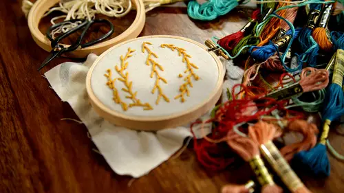
Backstitch Lettering Technique
I'm going to show you a way of making a big impact with a back stitch with letters especially this one of the reasons why I chose this alphabet is that it gives you the option to do an outline or to completely fill in the letters not all funds would give you that much of that much of an option especially if it's one that runs with a thinner line so I'm going to show you a way to use a basic back stitch that can make a really and I impact on a font that could be filled in her outlined so essentially what I'm doing is I'm going to be doing a back stitch all along the outline of the font I'm going to use a somewhat small stitch essentially what I'm going to do is I'm going to be outlining the whole letter with a back stitch down here and around and all the way back up syrian to really nice outline at that point if you like really wanted to go for the super intense you could fill it in with a satin stitch in a different color so you have an outline and then you'd have something else on the...
inside I'm gonna leave it blank just to show you a variation um how different it can look but also make an impact the nice thing that's about the nice thing about doing a stitch that's not filled in is that what you're doing rather than the satin stitches here you're emphasizing the color of the thread here you're emphasizing the color of the fabric both are really great ways to create enough contrast to be seen from a distance that makes sense for this project but it's more of a positive negative space type of thing e think you're gonna encounter this problems you like? What do you do when you come to the right angle? Do you just sit there like a is there a convention or is there something that you like to d'oh? I'll show together? So I'm going to show you this I don't like that that's just me, but I'm not happy with that. So for my eye, something like this even from, like super far away hanging on a wall, I would see that forever till the end of time, so you know, pull it out and these things kind of happen, especially when we're working from a computer generated print of something you know, it's manufactured it's not our eye in her hand. So if you're doing your own hand lettered, fallen thought might not happen, so I'm gonna pull it out and I'm going to re adjust those stitches just because I know that's going to bother me and I really suggest you do that when you're doing needlework because the time it takes to readjust is so small compared to the time that you're putting into the actual project that then you're creating something that you're going to be displaying in your home or give us a gift and for me it would like I said I would see it every single time I looked at it, I would notice that so when you pull stitches out, I'm just going to show you here up close you'll see there some needle holes here, one of the reasons why I like using a linen cotton blend is that it's super resilient so I'm just going to take my finger from underneath and on top rabbit a little use it, use the needle a little bit and you could see the holes disappeared I'm a lot happier with the way this looks now, so sharon asked about right angles so you can see here we get to the bottom of this l I have planned on this and, you know, I've planned my stitching so that my last ditch on this rose coming through at the point of the l so I'm gonna work it back through this way and then I'm going to start going the other direction but sharing that same hole, you can see that and you just developed a sense over the years how many stitches or do you ever get to the end of that? And you've got like it's like half the length that you wanted it to be I think I probably just know at this point for me but as you could see when I pulled those dishes out if if you don't like it just like stop, go backwards and start over but I try to not also not use such a large stitch that then I'm stuck having to recreate a very large stitch so I try to pick a size like ever take you can see like not if you really get in here the stitches air generally the same size but they differ a little bit so as I got down here, this stitch is a little bit shorter but generally the same size I try to give myself a little wiggle room by just picking a size of stitch that I'm not making so much of a statement if I'm outlining something now there's a part on the el where I'm going to show you you could make a couple of different decisions this is sort of what sharon's question was about like what to do the end so you tighten this stuff, okay? So right here I could make the decision to do a single stitch or to smaller stitches to cover this area so I'm looking at the size of my stitches and I'm thinking that a single stitch is probably going to look like it's about the right size instead of two, so I'm going to try it if it ends up being the worst decision ever, then I've had a completely charmed life and also I'll just redo it, so that looks pretty good to me, especially when I consider that there's going to be another stitch coming in here I feel like that looks pretty good, so you can start to see if I put both examples together that you're getting a similar impact just a different look to be able to see the letter justus clearly it's just a different look, so I'm going to come around and see how everyone's doing care about a couple of times like you did yeah, this is the type of stitch or a way of creating a monogram that would actually look really nice with a variegated thread, but you'd want to choose something that was dark enough throughout like I'm not sure if this would be something that would show up dark enough throughout on this fabric because there's some really light pieces here and you wouldn't want to lose the letter and there this one would definitely be too late, but you could do something that was sort of maybe indigo dyed variety of dark blues or something like that just along as it was dark enough you can also use the cyril paper on this project for more than the alphabet if you found a flower or something? Or you had an illustration of a flower or a leaf that you wanted to replicate on here. You could also use the surreal paper to trace that so it's not just limited to the alphabet. It's you need it for everything, it's amazing! I love it now, my suggestion would be when you're getting ready to switch letters that you tie off your thread instead of jumping to the next letter, this fabrics pretty thick, but because we're going to be stretching it over something and there might be some light passing through don't think you can see it on here, but I'll show you, you know, these air these air light pieces, so I wouldn't be too worried about it. But some of these darker areas I would say, don't do that because I get in the habit of not doing that because then you won't have to worry about something being held up and seeing a dark thread come through the fabric. Like I said, this is pretty thick, sturdy fabric, so you shouldn't have to worry about it. But if you are using a light colored fabric it's best to keep everything isolated.
Class Materials
Bonus Materials with Purchase
Ratings and Reviews
Student Work
Related Classes
Embroidery