Finalizing Materials and Design
Lesson 9 from: Poster Design and the Screen Printing ProcessMama's Sauce, Clark Orr
Finalizing Materials and Design
Lesson 9 from: Poster Design and the Screen Printing ProcessMama's Sauce, Clark Orr
Lesson Info
9. Finalizing Materials and Design
Lessons
Studio Tour
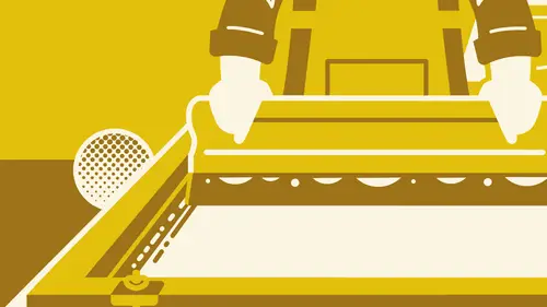
09:59 2Introduction to Screen Printing
07:26 3Choosing Paper: Deciding Which is Best
10:05 4Selecting Ink Color: Using the Pantone System
11:16 5Designing the Poster: The Process
09:40 6Preparing digital files: CreativeLive Poster
09:20 7Preparing Digital Files: Hill Valley Poster
06:20 8Halftone Hacks in Illustrator
07:34Lesson Info
Finalizing Materials and Design
paper You thinking? Using for the poster? I feel like I want to go with a speckle tone. Um, let's take a look here. I'm thinking I might want to do maybe, like either Madero Beach or give any natural. Maybe we kind of take a look. I'm pretty sure. Madera Beach. So, yeah, here's some Madeira beach school. Pretty sure this might be a start. Right. Okay. Yeah, that's pretty good. Maybe a newsprint. Does this not have newsprint aged in it? I think that's in the Dura town book. Yeah. Yeah. This is a rural town. I don't know what you think of. This isn't Madera Beach is might be starched white. Just not used much natural. Being able to see what I, um what do you think? Maybe do something a little. You have a lot of coverage on the poster for ink, so I feel like a lighter color might work better. Like contrast, wise against way. Go with the darker blue in a darker wines. Okay. I think that would look really good on the minute. Darabi. Even lighter if you wanted to go to, like Clark lighter to...
white, everything that's not deserve a Z much like like flex like Black are. Yeah. I mean, we could do something in the construction line. It's a similar kind of off white. Take a whitewash. Could work. Things has come in 80 or 100. I think whitewash comes in 100 on yet Just £100. £80? Yeah, that both work with their cover. Wait, so they will be picking up. Do that. Well, I want something that's not too high, not too dark. So maybe the Madeira Beach would be a lighter option. Or we could go with, like, a news print, white or non newsprint age, because I want the, um I don't want it to be. I don't want to be to start, but if I want as much like speckle or like black in it, so it doesn't your remaining of the whitewash. You want to be a little bit left, right? Sometimes it sometimes the flak lands on like a weird spot on someone's face. It just looks like a mark over. I might think it's like something under than Yeah. Well, here's a newsprint. White, actually. £80 cover. Yeah. Might be a good in between these two you can see with your own kind of that. Yeah, good. This tends to be might go to because it's, you know, it's in the speckled tone range, but it's not neutral. It's not crazy. It's on t light, not dark. All right, well, cool that one. Now, One day. All right, over here. The ink mixing station with Park. Tony's here in the back, working on some ink for another job. But Mark and I are gonna take a look at the artwork for the poster. And we've got the paper that he throws in here that we're gonna kind of use in conjunction with the Pantone matching system that we talked about. Teoh pick some colors for the poster. So what do you think? Um well, I feel like we should probably set up a few different color weigh options just for reference. Kind of choose from there. Obviously it's to color, so we need one to be a little lighter than the other. So in the case of the one I was just using for for trial was like orange and blue. So something that keeps her in that spectrum of like, a tonal difference. But a lot of times you'll see that the Yanks on screen. It's tough because your screen backlit, so you're gonna see a much brighter color there on the screen. Then you would once it's printed on the paper. A lot of times, you got to keep that in mind to make sure that if you are selecting some blues that maybe are a little bit of a darker blue, it's gonna look a lot lighter on screen. And if you want it to be more of like a nice, rich, saturated dark blue, we gotta make sure to choose that correctly in the Pantone book. So I don't want to veer too far from kind of where we started. So I might just kind of keep in the ballpark of like a yellow or orange and then maybe like you want a pretty saturated orange or kind of ah, muted like chalky orange on the well. I feel like since the important using the news print, why it's gonna have a little bit of that muted kind of result. So, uh, I feel like we can get a little Brighton. It'll soak it in a little bit too brilliant. Yeah, maybe somewhere around that range a little more towards the PCI section, like 1 50 Yeah, the 150 You How are you feeling about the direction of either of these? And it's gonna call it. It's a deviation from what we're doing. Maybe dark in this up a little, very little bit darker Blue. Yeah, yeah, that's pretty rad. So you're kind of reversing where the contrast points are. Yeah, so this is that step where it's really kind of cool. And this part is is mainly on Clark's end and that he's deciding what color ways he wants. But as a designer, Clark knows that whoever is designing a poster for or any design for might want to have some different options for color. So it really can't hurt toe, have other options that he likes, You know, instead of them saying, Why don't we use like this Blue or I want to use this kind of green If he's providing them multiple options to choose from that he likes all of those options, then he is not sacrificing anything with his artwork. What do you think? It's something like this where maybe it's like a red or like a deep red, like a or even a violet, almost a super dark purple. There aren't a lot of really, really dark purples mean We could even go go to a burgundy, maybe pull away from some of the blue kind of digging that is a little more muted of a color palette makes it a little more serious, not as whimsical sometimes that that works well in balancing. Sometimes if I have, like a serious looking graphic on, I want to turn it down a little bit. But I'll probably be a little more fun, right? Advice? Have a really silly you, like designed with a little more like Yeah, definitely using the using the colors not just a visual own it, but as a design element to in that he's picking colors that are going to either reiterate the style that he's going for or to kind of enhance something that might not have been there before. That's bringing the light based on the color of your choosing, even do something. Maybe a little more tonal, where we stick toe two different shades of green. We could do that as well. Very easy. Once he's gotten design worked out in a way that's it's simple, but it's working extremely well in all of these color ways. So that's a testament. Not only Teoh his ability to pick good colors, but also the design. It goes back to what we're saying about that design can't hold up as a one color or basic to color, then you're kind of in trouble. So to be able to to quickly do that many different color choices and have it still looked really great is definitely a result of his design in the way that he's built his elements. In my opinion, I mean, I know that not many things can you throw whatever color you want and they still look great, right? That's really the test of, in my opinion, when I feel like I mailed, design, feel like to be able to look at it, change the color way, kind of difficult, like even you got too many. Good, that's really good. Are you leaning one way or the other? I mean, I definitely like the tonal pretty good to me, too. I mean, I don't know, maybe we'll pick colors for all of the for those two options. And then from there sounds good way. I hope you guys maybe learned a little something about how Teoh set up your artwork and design for a screen printing. Uh, and hopefully it's inspiring you to make your own poster or print. Yeah. This is definitely something that we really think can help in your process as a whole, not just in the design process or in the printing, but to work together with each other so that everything goes smoothly and you get a product that you're super happy with. Thanks, Clark. It was great. Okay. All right.
Class Materials
Bonus Materials with Purchase
Ratings and Reviews
AJ Estrada
Man, I've been waiting for a class/tutorial like this for years. You've both cleared up a lot of confusion that I've had about the this process. Love the final design and colors you went with. More classes please!
Mjose Mab
Hi, I'm Spanish. I would like to know some company that works with silkscreen paper in Europe.Me You can say some european brand. Thank you.