Lessons
Lesson Info
Slide Setup & Backgrounds
How can you have a well-designed template that's going to fit your content if it's already premade and it's not aware of what that content is? I thought that these were called templates, but actually the proper terminology is theme. So let's look at some of those themes. This is from PowerPoint. It's actually called "couture" and I would never use this, it's too busy. It feels unprofessional. Here's another bad example. And again, like another one, maybe this is for the scientist who's presenting to the rest of his lab. And then here's an example from Google Slides, which I mentioned earlier has the best designed options. But even in this case, it's really busy, right? It's getting in the way of your content and that's what you do not want to do. So my suggestion is to create your own template. And then once you do that, if you're always using a similar template and you start to have to mix and match presentations, the great thing about that is you won't have to adjust very many styles...
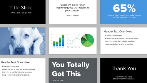
because you'll have similar fonts and colors into play. If you're using that same theme you created all the time. That's what I do. So the template that I provided is very simple, minimalist, it looks similar to the one that you're seeing now. And what you can do is take that and make it your own. Let's start with setting up your slides and choosing the background. So when you open the presentation software you have a few options in terms of physical dimensions. So the aspect ratios that you'll see are 4:3 and 16:9. In Keynote, these same options are referred to as standard and wide, but what's the difference? So standard actually isn't so standard anymore. But it's multipurpose when you compare it with 16:9. If you know that you're giving a presentation on screen in front of an audience, it's most likely that the size is going to be 16:9. So you're basically... imagine 16 units across and 9 tall, versus 4 units across and 3 tall. So if it's content that probably isn't going to be presented in front of people but will be circulated via e-mail and potentially printed out, 4:3 works better than 16:9. If it's content for YouTube, 16:9. If you design your presentation at 4:3 and you show up and it's a 16:9 aspect ratio, what will happen is you'll see black bars on each side of your presentation like this and you've probably seen that. I think we all have. What you don't want is for the 4:3 to stretch to fill the 16:9. That will distort your design. It will not look as you intended. So be sure to always check the aspect ratio of the projector ahead of time. So what should your presentation background look like? Well I showed you those poorly designed themes. Here's a simple solution. The highest combination of colors for contrast is black and white. So you can choose black background, white type. White background, black type. Base your decision on the room that you'll be presenting in. So if it's a lighter room, a light background will look better than a black. This could also be a light gray or a light beige. And then if it's a darker room, just think about like how movies look in the theater. Dark background will look better with light text. And it doesn't have to be black, it can be navy, it can be dark grey, but the thing about color and screens and projectors is you can't fully rely that it's going to look exactly as you intended. So what you see on your computer probably won't be the same in terms of color on someone else's screen or in the projector. There are gradient options. I always prefer flat colors over any sort of gradient because, again, this goes back to design being about communication. So ask yourself, "Do I really need a gradient? What is that communicating?" Avoid complicated backgrounds with unnecessary elements. So you've probably all seen presentations like this and it's every slide, it's got the title and the speaker name and a URL. And after a while it just gets repetitive and then it also interferes with the content, which is the meat of the presentation. So this drives me crazy. You don't want to do this. If you do want to convey something consistently across your presentation, use a footer. So in this example it's a very clean solution. It doesn't interfere with the content. It's a place where you can put your name, the title of your presentation. You could put social information there, so maybe you want people to tweet during your presentation and use a certain hashtag and then tag you. This is also helpful if someone enters the room in the middle of your presentation. So they might have not seen you at the beginning when you mentioned the title of your talk and your name. Another use for this footer could be as a wayfinding solution. Do not put the number of the slide that you're on, because this gives no information. You can see in this example 22 of 50. I have no idea how long it's going to take you to get through the rest of the slides. A better solution, if you want people to know where you are in a presentation, is to design a breadcrumb trail and that shows high level to more granule location. Margins, set these at the beginning. You never want your type to go past your margin and make sure that the margin is the same on all sides.
Class Materials
Bonus Materials with Purchase
Ratings and Reviews
Dave Pasciuto
This is a very basic class focused for a beginner, but explained well. I was hoping to see some great, successful and unique designs, but none were given. Much of the information here is beginner graphic design basics.
Josh Hersh
People often overlook the fundamentals of building a great presentation. We've all seen too many different typefaces, crazy typefaces, and distracting formatting and colors. Lara teaches you to build a presentation from the ground up, reminding us that the content is vitally important and that design is used to communicate, not decorate. I really appreciate the seemingly "small" tips that add up to make a big difference. I'll have much more awareness going into my next presentation. Thanks, lara!