Lessons
Lesson Info
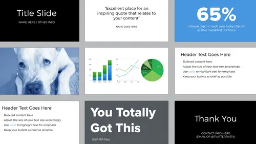
Using Color in Your Presentation
Color can be really fun. It can also be a disaster. This is the traditional color wheel, there's 12 colors. That's a lot to choose from. You have to remember that color conveys meaning. So it's very powerful. Color can make you feel things. People associate colors with different experiences, different brands. It's all about context. So if you're at a stop sign, red it's going to mean stop, green is going to mean go. When you're using color think about all of these things. If you have a brand color, you can incorporate that. And that actually could potentially make it easier because you don't have to choose a color, it's dictated by your company's brand. Don't overdo it. This of course is a worst case scenario. It almost vibrates, right? But what's happening here is that the color's distracting, it gets in the way of the content. And then it also reminds me sort of of like a kindergarten design because these are primary colors. Choose one color for your presentation as a highlight color...
and then use that same shade across your entire presentation. And if you need more colors, select a restricted palette. Two examples of really good restricted palettes are analogous and monochromatic. So when you think about that color wheel that we were looking at earlier, analagous are the colors next to each other. And then monochromatic all comes from a single color.
Class Materials
Bonus Materials with Purchase
Ratings and Reviews
Dave Pasciuto
This is a very basic class focused for a beginner, but explained well. I was hoping to see some great, successful and unique designs, but none were given. Much of the information here is beginner graphic design basics.
Josh Hersh
People often overlook the fundamentals of building a great presentation. We've all seen too many different typefaces, crazy typefaces, and distracting formatting and colors. Lara teaches you to build a presentation from the ground up, reminding us that the content is vitally important and that design is used to communicate, not decorate. I really appreciate the seemingly "small" tips that add up to make a big difference. I'll have much more awareness going into my next presentation. Thanks, lara!