Lessons
Day 1
1The World of Surface Pattern Design
35:40 2Living Your Creative Dream
22:15 3Introduction to Illustrator
27:16 4Basic Tools: Pen, Text, & Blob
22:28 5Color & Function Tools
32:27 6More Tools: Rotate, Duplicate, & Replicate
19:16 7Custom Color Palettes
18:49Essential Tools for Pattern Making
41:59 9Tools for Sketching Inspiration
27:50 10Inspire & Nourish Your Creativity
34:55Day 2
11Creating Objects from Scanned Sketches
17:04 12Tracing & Coloring Sketches
30:46 13Tracing & Coloring with the Pen Tool
37:44 14Working from a Photograph w/ Live Trace
36:24 15Hand Tracing Over Photographs
31:27 16Building Pattern Tiles in Illustrator
21:13 17Adding Textures to Illustrations
28:52 18An Unrefined Look in Illustrator
26:10 19Typography & Students Homework
21:39 20Legality of Design w/ Annie Tunheim
27:33 21Trademark & Licensing w/ Annie Tunheim
27:50Day 3
22How to Design Repeating Patterns
18:52 23Complex Cluster Patterns - Part 1
27:38 24Complex Cluster Patterns - Part 2
28:35 25Getting Noticed: Portfolios & Trade Shows
39:43 26How to Drape on Pattern Mock Ups
19:07 27Fun Stuff: Desktop Backgrounds
19:42 28Fun Stuff: Gift Cards & Tags
29:05 29Fun Stuff: Clip Art & Shipping Labels
28:17 30Spoonflower: Stephen Fraser
29:04 31Uploading Patterns for Web Printing
20:29Lesson Info
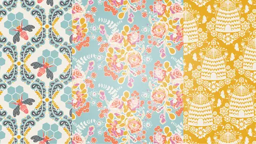
Custom Color Palettes
Okay so we're gonna go right into color, and what I wanna do first is open up this. I've pre-made some color palettes that are available to you. It's in your course materials if you have got an anytime access. So I'm just gonna grab them here so we can check them out. So it's color palettes.ai is the file. And these are the color palettes that I have put together for us to use during the course. I have gotten most all of these from photographs like I've showed you in the last segment. These are some that I have used in previous work that I just have fallen in love with, so. This is the document when you open this at home this is exactly how it will look and they're already loaded over here for you on the right. But I want to show you how to save this color palette to where I can then go back to my other document and open up the color palette. Same thing works for if you're making a color palette from a photograph like we went over. You can get them over into your swatches panel and you...
save the color palette just like I'm about to show you. So, over here on your swatches, you have a fly out menu. And you can go down to save, swatch library I believe as ASE. And then I'm gonna name this creative live color palette. And hit save. You can name it whatever you want. Hit okay. Now when I go over to the document that we were just in, come over to my fly out menu from the swatches panel, go to open swatch library. You should know that you have some color palettes that are already saved in illustrator. So you have tons of stuff to get you started with if you're not comfortable building your own color palettes or if you're not gonna be using this one, you can play with the ones that they already have and you can find those all here. But if you've saved one they're under user defined and now my creativelive color palette pops up. So if I select that, they will come up in this kind of alternative window here. They don't automatically get loaded in your swatches panel. So that is to allow you to basically pick and choose what you want from a larger color palette. So I want all of them. So I'm gonna click and as I click on these they get added to my swatches panel. See that? Done. Once they're over in my swatches panel I can just hit the X on this and take it away. So you can save as many color palettes as your heart desires. So, how do we use these color palettes? There are couple of different ways we can work. One of the most fun ways is to use, I'm gonna select this butterfly that we made last segment. And should be at the top of your tool bar. It's called the Recolor Artwork tool. So if you have a piece of artwork selected, this will be available to you and you can just select Recolor Artwork. And, that is the use at see. I'm gonna just zoom out here so that we can fit that in our window. Okay so when the Recolor Artwork tool comes up, all of the color palettes that are in your swatches panel are available to you in this as well. So, you can do a couple of things. First of all, these are all the colors that are showing up inside the artwork that you have selected. So, you can switch these around. See what it looks like when you alternate colors. Like for me, these two pink colors they're really almost identical so, I just would rather them be the same. So rather than exiting this and making them the same I can just drag this color on top of this one. And they're the same now. Now when I, that's permanently saved and now if I hit okay and reopen it then those colors will be the same. So sometimes it's nice to just reduce the colors that you have in a piece of work. So I'm gonna hit okay. And then if I open that back up, you can see I only have one pink there now. So, down here you'll find randomly change color order. And, if I just start clicking through this, it's gonna give me some new options for colors on this butterfly. (laughs) This is using the existing colors that are already in the butterfly, okay? If I wanna play with a new color palette that's when I come over here to my color groups. Click on this one, and it will load all these, and I can start going through this. So you can imagine, how fun this is and how addicting it is. So I'll just run through these and see maybe, holler if you like one. Holler, I'm from North Carolina. (audience laughing) So the possibilities are endless. You also have, you know, this is kind of out of control, it's doing it all for you. And you can gain back some control. If you hit new row down here, it's gonna add all of the colors and the color palette that you're using that aren't showing up currently in the display. So, you know, say I like this but I don't really like the orange I would rather it be the dark. All I have to do is click on this, and drag it up and drop it on top of the orange, and they switch places. Same with any of these up here. You just drag and drop on top of each other and they switch places. So I would like to get something that we're happy with. Through this guy. How about that? Or maybe, I don't know. How about that? So a couple of other options here are, randomly change saturation and brightness. I don't do this usually because I tend to be working with hues and saturations that I'm currently happy with. But this will like deepen or enrichen the color palette that you're using. It'll change it all around. It's not my favorite tool but you should know it's available to you. And, if you, let's see, go to edit. We're on the assign tab which is what automatically gets opened for the recolor artwork tool. But if you go to edit then you have the ability to actually change these colors. So if I want this orange to be like over here, changes all of them together. So you can really mess with the hue that you're working with here. They're all linked together now and you can also unlink them by clicking on the chain. And that way you can just move one independently from the other. Hey, Bonnie? Yes? Do you mind just showing one more time how you can get access to that recolor artwork panel? Yes. Someone just missed it. Yes, I'm gonna hit cancel. So once you have your artwork selected, your recolor artwork tool will be the little kind of color wheel up in the top of your browser window. And you just hit that, and this world of color options becomes available to you. Perfect, thank you. Yeah. So, again I actually don't use this edit pretty much ever because I have color palettes that I'm happy with, to work with. And if I get into editing this color in this way I've got to go back and, it's just kind of a cleaner way to work from the other direction. For my purpose, but, you should know that this is available to you to use that too. You can adjust the brightness and the darkness of this wheel as well. Okay, so I'm gonna do this one more time so that we can get a new color that we're happy with. I think we're going with that one and I'll hit okay. So these are our new colors and you can do that with all your artwork. You were talking a little bit about warm, cooler tints of a color and, so say if I have this like kind of fuchsia pink selected right now. If you come out to the fly out menu for the color panel, you can select invert. It'll give you the invert color. If you select complement, it'll give you the complement color. Another thing that is available is under window, just check your color guide. Which will bring up your color guide panel. And this will give you all kinds of shades and tints to complement the primary color that you're using. So, this is tints and shades. If you want warms and cools you hit warms and cools and that kind of does this. And vivid and muted gives you the more vivid and the more vivid of the color. So, if you really have a color that you are love working with and you need something that complements it that's cool or warm or more vivid, then the color guide is a great way to accomplish that. There's so much to learn about color. The other great thing that's available is that if you just double click on the color that you're working on, the color picker comes up. You guys are probably familiar with this through other applications that you just get to drag around and drop. But, this is great for when you're adding texture, which were gonna get into a little bit. You can just ever so slightly change the color so that it's more in the same family but it's a little more subtle. So you can ever so slightly change the color there or you can drastically change the color by going through the color picker. Also just a total side note is that, if you're working on the web, these web numbers should look familiar to you and you can plug in exactly like the color that you use on your website to get it in illustrator right here. Not gonna go into detail about that but, if you already work with that way then you should know it's there. If you're given a breve and you're given specific Pantone color, are you able to type those colors in somewhere? You are, and so I don't have the, so, I'll talk about Pantone colors a little bit. For those of you who don't know, the design industry has Pantone colors. I brought mine with me but, that are a industry wide standard for color. So years ago, it's relatively new I mean, it's been out for quite awhile but, you know. Years ago people would have to try to communicate a specific color to a mill or a printer. And you can imagine how hard it is to, you know, describe a sea foam green, you know, in so many different ways. So people were finding little bits of things and shipping them to mills to try to describe the color that they wanted and it was such a problem that it had resulted in the Pantone color system. So, they have color books. It looks like paint chips almost, that are available for your industry. So I primarily use the home and decor book but they also have print for just about anything. So the way that works is when you purchase a pantone color book you can find it on their website, Pantone book. You are able to download that color system. You get something that allows you to download that color system into your Adobe Illustrator. So I don't have it on this computer, but the way you would get to it is by the fly out menu. Open swatch library and over here would be whatever it's called, mine is called pantone cotton. That brings up a new finder window and you're able to search for the particular color and build out your color palettes that way. So, I'm not sure if we'll be able to get it on here for me to show you anymore than that. But, if you're using that in the industry it is very straightforward and you'll be able to save your Pantone colors for the print or the mill. If you already had the color in the breve, can you just drag and drop? You can. And then just make some from there. You can. If they have sent you the Pantone color and the way that you can tell, is, that, I don't have any on here. They have a little triangle in the bottom right hand corner of the square and you know that's Pantone color. Okay. And so instead of a CMYK that gets brought up right here, it brings up the Pantone number three, you know, 16-3501 or whatever. Thank you. Yes, so if you're ever working with Pantones and you don't see the triangle in the bottom right hand corner, you know you've lost it along the way and you need to get back to the, need to make sure it's the Pantone. How do you get back to it? Going to the original file, and making sure that they, as long as you make sure that when you drag and drop them they have that triangle then you're good. Okay. Yeah. The next thing I wanna show you is a lot of times, I'll be working with two colors and neither of them are just right. So, I want something in between. Or, I just wanna play with this tool. So, show you about that. I'm gonna draw a square, and I think I'll like, want two colors that are kind of similar. So, what if I do like this pink. And then I'm just gonna select this box, drag and drop it over here holding the option key and the shift key to keep it in line and do a drop, a copy of it. I'm gonna change this color to the light pink. I'm gonna use the blend tool to create steps in between the two. So if I select both of these boxes and it can be any shape circle, star, whatever. Then, I need to find the blend tool here. Yeah, here it is. The blend tool is on the bottom and the keyboard shortcut is W. So if I click on that, you need to double click on it, which brings up the blend options. You can either have smooth color, I like specified steps. I'll show you kind of what both do and then, you can tell it how many steps you want in between. So this is gonna give me how many hues does it take to get from the dark pink to the light pink. And I think eight will be fine. So, if I hit okay. I'm gonna hit the first color I want to do the blend with and then the second one. And it creates eight steps in between. So right now this is kind of like a blend tool illustration but if you expand this illustration then you have all these squares that you can play with so to do that you just hit, come up to object, expand. So you want to, you'll always pretty much always click okay. You'll want to expand the object and the fill. And that makes these individual objects. We'll be using the expand tool a lot so, if I ran over that too fast we're gonna come back to it. So then, you can ungroup this, and pull these squares out, if there's a color in here that is really what you wanted. You can, I'll just show you if you wanted a color palette full of these pink hues, you just select everything. Come over to new color group. Name it if you want, hit okay, and now they're in your document. And so that means you can use them to recolor any of your artwork. Hit command H so you can see. And then you can scroll through these pink hues. Okay? So I use that all the time when I am really wanting a shade that's just not quite perfect I'll find it between two other shades. I think that for now that's what I'm gonna say on color. If I'm gonna make sure you guys don't have any questions or anybody at home doesn't have any questions. Yeah we had a quick question come up on the color palettes. Now, earlier you mentioned Spoonflower and we had a user wanna know is there a color palette that could be downloaded to work with the colors that are available on Spoonflower. Yes there is. You can also order, Spoonflower has a color chart, and you can order that through their website that gives you the primary colors that they use which is a ton. It's a huge printout. So that you, they do not use the Pantone color system. So we will talk to Steven more about that in segment four on, in session three. And, we'll talk about their color system more but it's pretty easy and it also, I've done several things with Spoonflower and my colors always come out really good. So, yeah. If you're concerned about it, order their color guide and match it at home before you upload your colors. But you can't use your own colors you have to use their colors? No, it is a, it's sort of, it's not their colors it's just that you can see them printed on paper, printed on fabric so that you know. Because so many times you have difficulty with everybody's monitor having color issues. So you can seem them on fabric and just make sure that the color that you want is gonna be correct. Yeah, so I wouldn't say it's theirs but, just a nice way to make sure we're all on the same page. But if you made it a very different looking color would it be able to be printed on Spoonflower? Yes. Oh, okay. Yes, definitely. And Spoonflower is screen printing so you can use hundreds if not a thousand colors in a document, which is really unique to them because it's all printed. Whereas fabric like your, I showed you a little earlier with your bags or something, usually have a limit of 12-15 colors.
Class Materials
bonus material with purchase
Ratings and Reviews
Emily Leggett
I am so glad I took the time to sit through all 3 days of this course. I have been to hour long classes that I can't wait to get out of and this one I sat in for 3 days and I am wishing it wasn't over. I take a lot of continuing education classes and am always trying to learn new things and I have to say this is by far the absolute most informative, educational, inspiring, and motivating classes I have ever taken. Bonnie Christine was an amazing teacher. She took the time to take us through all aspects of the process and even beyond showing us so many things that can be done with everything she taught us in this class. I think she did a great job with the class, was easy to follow and is someone I would love to learn from again. Great job on everything. I would recommend this class to anyone who wants to learn about surface pattern design and Illustrator. Great job to everyone involved in putting this course together!
a Creativelive Student
Awesome awesome awesome course! Thank you Bonnie! Thank you Creative Live! I have learned so much... so much great information packed together in one class. I am so glad I bought the course so I can rewatch it any time I need to.
a Creativelive Student
I'm about halfway through my first viewing of the course and I have to say, its been electrifying! There is so much quality information here, its an excellent starting point, and I do think I can start working towards a career in design now. It also makes me want to find more information and courses in the art and design area. Bonnie is such a joyful, honest and enthusiastic instructor and really, it feels like she';s hosting an amazing party for her friends. Thank you Bonnie for doing this course and thank you CreativeLive for pricing it so affordably