Lessons
Class Introduction: HDR and Panoramics
22:44 2Light
07:47 3Profiles
07:23 4Tone Curves
02:57 5Color
08:35 6Effects
17:01 7Details
12:43 8Optics
04:05Lesson Info
Effects
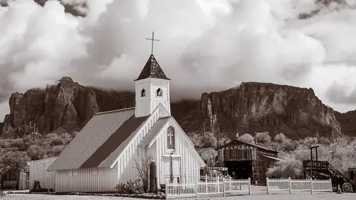
the next place that we want to talk about. The next panel inside of light room desktop is the effects panel. Now. The effects panel is inclusive of things that have something to do with, uh, there's grain. There's vignette ing, and then there's basically texture and and D hazing and clarity that's no one split tone is in there as well, but it's It's the effects area now. If you used to light room classic The Effects area has a different set of tools in it. There there, I think it's just grain and vignette ing, but they've moved texture, clarity and D. Hayes into the effects panel inside of light room desktop. So light on desktop has those is your effects. Let's talk about what they do. So texture, clarity and D Hazare all doing the same thing at different levels and with different intense. So, for instance, texture is specifically trying to create texture in the fine details. So, for instance, here I've got a lot of foliage back here. I've got would I've got all sorts of cactus. I've g...
ot dirt, so there's a lot of texture inside of this photograph, and so what? I want to do is create mawr of that texture, So I really call it out and I congrats the texture tool and slide it up. And you can see that as I do that the mountains get a lot more texture. So here's before, so no texture here. See how those mountains are a little softer and then I increase and boom the rocks get a little bit craggy. Er, the cactus start toe. Poke out a little bit more, Um, and ah, the wood itself gets, especially the shingles up in the top. Eso that's it's all fine detail now. If you take the texture off and you use clarity, clarity is Maurin the mid tone. So it's creating contrast inside the mid tones, so it doesn't create texture as much as it creates deeper shadows and brighter highlights in kind of the mid tone areas. In order to pop things a little bit more, so watch the difference. Here is clarity coming up, and you can see how it darkened down the background so that instead of just creating texture in those rocks, it's actually taking the cliff face and making it darker. It's also doing a great job with the clouds. Clarity is awesome and clouds. In fact, later on, when we talk about brushing, you might consider using a brush to brush in clarity on your clouds. Because if you want your clouds to really come out and be three dimensional clarity, does a great job with that. So clarity is a great place toe work on clouds. It's also a great place to really kind of create a little extra contrast just in the mid tones. I really like that, but it doesn't do the same thing as textures. The texture is all about the individual little cracks and wrinkles and things like that. Um, you never want to use texture. Uh, you don't want to add texture to skin, so you textures great in the negative. So here it's not so great, cause you're just you're blurring everything up. Um, but if you're doing a photograph of a person like this, then texture actually is quite nice because it softens the skin. So here let me show you see that it softens that skin really nicely, but it also softens the hair around it in any of these other things, so texture is best done to skin as a, uh, localized, um, effect rather than as a global effect. But just so you can see what it's doing, it's really great for skin. We used to use clarity in the negative, but it kind of creates too much of, Ah, see that soft glow. But if I take the texture down, it's it's more natural. It's not like this weird, glowing nous like that is so nowadays, if you're trying to smooth skin, it's better to use more texture in the negative than it is to use clarity in the negative. Okay, now, another item that's in here is the D. Hayes I option. And the D. Hayes option is to cut through fog and glare on glasses and in this case, even dust. And what it's doing is De Hayes is actually cutting through by creating extra contrast quite intelligently. So, actually, so if I want to see through fog or I want to see something a little bit more drastically because you can see here, I barely can see the Jets. I can barely see the person, but I can increase the contrast, and I start to see through them. Um, it's really great for fog if you want to see through fog or something of that nature. Um, so clarity and texture are fantastic tools, um, for increasing kind of the the pop of a photograph, whether it's if you're doing if it's a landscape or if it's like a textured wall like this one is, uh, here, let me turn off these highlands shadow warnings. Um, this textured wall is absolutely great. If we add a little bit of that texture to it, a little bit of clarity that's really great to use. Now let's talk about some of the other tools that are inside of the, um, the effects panel. So inside of the effects panel, we also have what's called a vignette. The vignette is kind of an old school, ah, tool that was used in order for people to create. So there was the lens correction vignette that was fixing the lens correction specifically, and everybody wanted to use that to create kind of an artistic vignette ing that brings people into the center of the photograph. And so they added a long time ago, this vignette ing option and this vetting vignette ING option allows us to vignette the photograph like this, and then see if I could choose how far in the mid point is I can choose. The radius is toe. How, how far out that are the roundness Sorry, whether it's kind of square vignette ing or round vignette ing. And then I can change the feather. So that is hard feather, No feather are lots of feather. And then I can also. And this is an important point is that if there's something highlight that's going through that vignette, Aiken, tell it toe let the highlight go back through the vignette so that the dark areas air vignette ing. But the highlights are not getting darker. Eso That's the controls I have. The problem with the vignette ing tool is that it's always centered. I can't click on a place that I want it to be the center of that. It's always starting at the edges based on the crop of the photo, and it's going in. And so it's always based on a center weighted ah, composition, which is which is generally the worst kind of composition that we can think of on DSO. I'm not sure why they still have this tool, but they do because some people like it. Um, I don't use the vignette ing tool at all, because any time I want to vignette, I'm actually going to go up and use this tool up here, which is the radial Grady int on the radio. Grady in allows me to create a vignette just like that, but anywhere I want so I can start them in yet so that it'll circle on Lee on her face and we'll we'll get into that in a little while. The other thing that's involved in the effects panel is grain and grain is one of my favorite tools. Light room grain is really beautiful grain. They do a great job at it. We want to open up the panel so the grain tool has a little triangle next to it. Seemed as the vignette. If you ever see one of these triangles, if you click it, it opens that up. So now I'm looking at the grain and I have the grain itself. How much grain? And then I've got the size of the green. And then I've got the roughness of the grain. So I'm gonna first do this on a portrait, and I want you to look at her, um, face. So we're just gonna zoom in here? There we go. So we're looking at her face, and I'm going to add some grain to it. I want you to pay attention to, like, the few of the little blemishes. There's a couple little places where maybe that's a scar, Um, some inconsistency in your skin. But if I grab the grain and increase that slider so that I get a little bit more grain, you see how it unifies her face a little bit more, especially if I take the roughness of the grain up. I start to kind of cut through some of those lines, and so she becomes a little bit more unified. And as I go up in size, it does the same thing. So now if I have Great, this is grain on, and this is grain off so you can see her skin while when you when you bring the grain up, you actually put texture on the skin. But the texture is everywhere on the photograph, but you're I can't see a lot of the blemishes quite as well, because it has these intersecting lines of grain that are breaking up your eyes, ability to follow the lines and see the circular patterns. So grain to me, is a really great way to just kind of soften up a photograph. Now I don't usually put grain on the final product as much. Well, I I still do. I add a little bit agree, but not this much grain. Generally speaking, I had a little bit agreeing to every photograph. But what I do when I'm showing images to clients is I'll add grain toe all of the images so that it obscures any of those kind of blemishes, so I don't have to retouch the image until they order it. When they order it, I simply come in and turn off the grain and then send to photo shop and work on it, come back and then turn a little bit of grain back on. Now, if you're going to do all the retouching here inside of light room, then you don't even have to turn the grain off because you can look and see OK, which blemishes are showing through the grain and you can go ahead and retouch those and it will retouch underneath the green. The reason I turned green off before I go to photo shop is because you don't want a copy and paste grain. Copying and pasting grain looks really bad. But if you're working in a non destructive environment like you are here in light room desktop, especially working on a raw image, the grain is sitting over the top of it. And it's not actually copying and pasting the grain. It's copying and pasting the underlying information. The grain is just laying over the top of the photo itself. So that's grain and the final thing that is in the effects panel. Oh, and by the way, before we before we move on from the green, um, grayness. So fantastic when you're when you're working on images like, for instance, on image like this one, I think grain. I mean, there's something to a perfectly clear, glassy, clean image, but I am a big fan of turning on just a little bit of grain to see the difference between this. Just a flats. Clean sky. Yeah, it's crisp, it's pretty that way. But, man, when you turn on that grain, it just gives it a little bit more texture. It gives the fog a little bit more of a character to it. It gives the sky something a little extra. I just I am such a big fan of grain. So don't ever be afraid of turning on the grain because the grain is actually very, very useful tool. Um, not only on Portrait's, but also on landscapes and pretty much everything you can think of. Grain is your friend, so that's the grain tool. Now, the last tool that exists inside of the the effects panel is the split, toning and split. Toning is typically thought of us something that we add to a black and white photograph. And the way we add a split tone is we come in and we choose shadow and highlight colors, and then we choose how much of that color we want. So what kind of, uh, saturation we want on the color. So I'm gonna first choose the shadow, so I simply increase the saturation, and it's best to just increase it all the way and then just kind of scan around for the color that you're looking for. And then once you've got the basic like C p a tone color, then you can start dragging it back down. So that's probably pretty good. And let's just zoom back out of that. Okay? So that's a pretty intense see Peotone. But I can limit that. See Peotone? Because I've got this little slider in between my highlights and shadows. Right now, I have no colors in the highlights. I just have him in the shadows and this out. Most people use split toning, so I'm can increase the amount that I have in the shadows and see how it goes into the highlights a little bit more. Or Aiken decrease that so that it's on Lee showing up in the deeper shadows. And I kind of like that a little bit better. So let's zoom back out. I like that a lot better, but I still think it's a little bit too saturated, so I could just simply grab this and bring it down just a little bit more. That's much more subtle. I love it now. You can also add a highlight color as well. So if you had a highlight color, just grab this and and I can move it around and say okay. I want my highlights to be a little bit blue. So I'm gonna bring those way, way, way, way, way down. There we go. I want to be super subtle about it. So now I can further increase the blueness of it or decrease the blueness of it simply by moving back and forth between the two. But come to think of it, I don't like this one. It also I'm double clicking and getting rid of it so that I'm just got the c p a tone. And there we go. Now that's that's all well and good. But you also have the ability to use that same effect inside of, say, a portrait. And so that split toning idea can also be utilized here by just warming up the shadows just a little bit. It just creates a nicer warmth to an image, and it can create in effect, so I could create almost like a little cross process look by just going in and saying I want the shadows to have a little bit of kind of a bluish green to him, and I want the highlights toe have a little bit mawr of that kind of that orange look to them. And so now look at the difference between before and after. It's a subtle effect, but it's got, like the greens get a different color to them. The face gets a little bit of a nice color to it, so that becomes a really cool kind of cross processing type of feel, all within the split tone in a color image. So you split toning not only in the color are in the black and white images, but use it in your color images to and you'll find that you you get a lot of cool effects out of it. So that is the effects panel and everything that you can do there inside of it.
Class Materials
Bonus Materials with Purchase