11:30 am - Second Quick Page Example
Lesson 4 from: Digital Scrapbooking for BeginnersMichelle Stelling
11:30 am - Second Quick Page Example
Lesson 4 from: Digital Scrapbooking for BeginnersMichelle Stelling
Lessons
Day 1
19:00 am - Intro & Michelle's History
38:59 29:45 am - Intro to PS Elements & Organization
44:46 310:50 am - Using Quick Pages
36:10 411:30 am - Second Quick Page Example
15:42 511:45 am - Useful Tools
12:08 6FreePreview: Red Eye, Feathering & Collages
34:33 71:30 pm - Creating a Simple Cluster Page
16:301:45 pm - Different Modes & Making a Bookmark
31:54 92:30 pm - Creating Cards With Digi-Kit Elements
41:29 103:15 pm - Constructing Cards Without Digi-Kits
33:30Day 2
119:15 am - Collaging: Alignment, Guides & Grids
23:50 129:45 am - Paint Bucket, Brushes, Gradients & Text Effects
45:13 1310:45 am - Cookie Cutters, and Personalized Background
22:38 1411:15 am - Frames, Filters, & Blurred Backgrounds
42:12 1512:45 pm - Photo Restoration: B&W and Color
37:22 161:30 pm - Photo Retouching
44:41 172:30 pm - How to Use a Pre-made Template
37:02 183:15 pm - Creating your Own Templates
38:31Day 3
199:00 am - Creating Your Own Paper
36:09 209:45 am - Photomerge: Panoramic & Style Match
21:18 2110:15 am - Text Clipping & Guided Modes
17:05 2210:45 am - Postcards from Digi-Kit
50:20 2311:30 am - Postcards from Scratch
17:40 2412:45 pm - Creating a 12x12 With a DigiKit
34:01 251:30 pm - Creating a 2 Page Spread
44:18 262:30 pm - Creating A Collage
48:47 273:30 pm - Second Collage Example
21:25Lesson Info
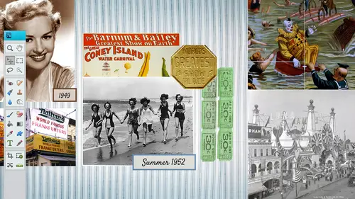
11:30 am - Second Quick Page Example
This one here is by nibble scribbles and she's an awesome designer as well amanda and this is a really quick one two it's almost all done for you you can pop in your photo in the background and put your ears were for instance, where there's a kind of a tag there where you could put the date could put whatever you want to in inside this heart. But again, this is the png file it has a little window there for your photo and you can go ahead and place right behind there and then you can put whatever you want to on the top so let's, just go ahead and go file open and I'm just going to bring in I'm just gonna open both of these photos just so that I can see which one maybe I would like best I could place them if I want to so let's take my move the move tool just drag and drop it in a place that one in there drag and drop this one and close up those and I'm just going to drag him right below that quick paige gonna fall right nicely in that area so let's, look at this one die like this photo a...
nd they're better I don't know let's go ahead and hide that one move this one into place to see if I like this one better kind of like the other one because this one here it cuts off the things that all I have to do is turn that one off or aiken, right? Click on it and delete that layer and then show this one again and in position it where I need teo double click on the hand tool to kind of bring me back out or you can use these right here you got the fifth screen, the fill screen in the print size so you can use those I'm just kind of used to double clicking my hand till so I can see it really quickly and then zoom back in with my mouth. Okay, let's, just pretend we want to go ahead and put the names of the kids may be inside this tag we can go ahead and get our text tool I am gonna have to switch back to my horizontal because it always defaults to the one that she used before. So this one was vertical. And by the way, these we're going to cover a little bit about these other tools as well. But there is a text on a custom path that you can kind of play around with, um that you know, if you want something to go on a line like that, we might get into that later, but we're gonna go and talk about the horizontal mostly when I pull myself back I'm gonna click on the top layer because I always the text always falls above the last layer um I think I'm gonna use a different font this time maybe something a little thicker and I'm actually gonna put cousin the word cousins in here instead of talking about the names of the kids so let's just put cousin so I'm gonna go cassio us in s and I'm going teo enlarge that so I'm gonna get my move tool and enlarge it commands thee our control or command z is your friend there and let's just pull this across and it would be in a perfect world that it would fit in each of these different blocks but it's not so and the one difference between photoshopped elements and, uh photo shop is you don't have as much control over this does anybody know what kern ing is and tracking okay, so this will be nice if we could do some current in here we could push the great idea to explain it. Yeah, okay, great. Okay, so kern ing is the distance between text on a line in between each like c and o okay, so if I could in photo shop I can push this if I clicked right in between there and push it over to the right it would automatically push with elements to my knowledge you can't do that unfortunately so I wish I really had that tool, so I'm going to have to kind of finagle it a little bit, which is fine it's not a big deal, but kerney is the distance between each character letting is the difference between each line of tax? So I think in the olden days they used to have the put lead in between each line attacks when they were doing the the newspapers and I think that might be where letting ellie a d I n g so whenever you are doing a text block and the text automatically scrolls back down and there's more lines of text, you can increase the leading or decrease the leading and that's the space in between each line of text that makes sense for the history lesson I'm that old, so in this case we can't really work with kern ing, but I'm just going to kind of, you know, wing it with that you can what u k there's a couple different ways, you can do it, you can copy and paste that over a couple times and then go back in and delete it you could do them individually, I'm just gonna copy this, I'm gonna duplicate the layer and then I'll bring this up here and I'm just going to quickly just delete the sea and in the u s I s and then this one right here, I'm gonna go ahead and copy it again. I know it's kind of monotonous, and this is where I would kind of like. Oops. Like I copy the wrong white let's. Delete that layer. This is where I would like photo shops. Um, extra tools there must select that one. Duplicate it. You kind of get the idea of what I'm trying to dio here. So I'm just going tio the you and then we'll be fine with the the rest of it. Pull that in here. Maybe I can even do something like apply that push that over a little bit. Delete these guys. And this is where guides and grids khun come into place so you can bounce these on to the perfect space. So then you can kind of zoom in really close to bring in a guide. You just click and drag it from the actual, um, ruler area. So see hama pierre net by the two. I can click and drag that into my area and drop it, and that will give me a nice little guide. That way my baseline will be pretty spot on some kind of just trying to center it within that block there, maybe push this over a little bit. In the eu is on its own lot layer as well so we're going to push that back in there and we could put those drop shadows and this is a good one where we can probably do some or bevel ing I'm gonna go ahead and select this layer I'm gonna go down to effects down at the bottom here move it on over here so we can see it okay so I'm gonna go ahead and double click on the soft edge and since I'm only on this layer that see and the s that's the only pieces that did that drop shadow but here's the really cool thing that maybe some of you know maybe some of you don't you can go back in there you can right click on the layer that you just did that too you right click on it you choose copy layer style then you go to the other layer right click and shoes pay slip hoops paste layer style and do the same for the others so you can do that exact same uh effect that you did on that layer and do it to the other layers you could do it all at one time if you want to see you don't have to remember what was the drop shadow distance and all that kind of like we're excited denise roses saying I just put text on a photo you p thank you michelle yeah, good seven tough hard is getting that in the text tool is kind of tricky it looks kind of easy but sometimes it's frustrating yes could you merge the text? You can yeah, you can if I right click on the see what we got here oh, and you got o and you let's go ahead emerge the owing you together these top two so I'm going to right click I'm gonna choose um let's see, we may have tio simplify it before we do it so let's just let's just look here yeah, well we'll have to simplify the layer which is going to be tricky because if you spell something wrong you can't really go back once you simplify it so simplifying a layer mia text layer that isthe means that it's no longer really a text piece of text and so what we're going to do is where neto had simplified in order to merge it down. I'm going to this one right click so we have to be really positive that we spelled it right well, we'll have to just redo it or you can go back to the history and go back up to all right so I'm going teo simplify that layer and now I can merge down yes converge one down and you know what it did the always that because now it's got a really dark shadow you see that? They don't know why do you know why? No, but if you if you link the layers rather than murder, can link the layers as well, then you could go back and banking stuff, too. Yeah, good point. Great point. So linking the layers, you would just go ahead and here's the little since we haven't covered layers yet, but that would get you to a good spot as well. So I don't know what I did there to make that really dark, and I'm not gonna investigate while I'm teaching. That was interesting. I don't know what you can do. You that is controls is your friend, that is for sure, but, yeah, simplifying the layer. And then you could do it or linking. It would probably be a good ideas. Well, alright, you're getting some great. Really? Yeah. Block around. Blogger gallus saying I'd no idea you could pull down the guys like that. So thank you. Good. See little things like that. Really? It's only fifty nine. Thanks, she's. Just loving the stack. Betters people are clearly people following along. Yeah, see, now we're getting the good stuff. The morning was a little basic kind of tools, but you gotta cover him, you've got to, if you don't you're going to be frustrated so yeah, we're getting us a good stuff. We'll go back to some of the basics yet still, um, don't get me wrong, but we are going toe to dig deeper and they're going to a lot of all home one is like, oh, I did not know you could do that so all right, so let's, just pretend that the each of those texts are in their boxes and they all look pretty. This is where you can go ahead and put in your little small text as well, like the names of the kids. So right in there, we would probably go lets go with a text let's go with, uh, let's, click and drag a little text box. Now there is a difference between just clicky one time and typing and clicking and dragging. So if you click and drag that's going to give you this automatic text box where you can put in put in names and of course, this is way too big. So I just type a little bit highlight that go in there, I'm gonna default back to the aerial, which is usually helvetica or aerial, and then I'm going to go with maybe a eighteen point. And I'm just gonna go ahead and see the leading is a little bit high but that's okay, I'm just gonna kind of pretend it with some texts in here and it's going toe rap automatically, the leading is way to lose, so I'm going to push it to the left that's going to tighten up the leading and a little bit more and again, we can go in there and we can write just to fight or you can put a hard return in there if you don't like it ending up on the top of the heart there you can go ahead and put a hard return and kind of space it out the way you want teo and that's a little bit light, so let's, go back in, go to the color of the text pool, maybe this maroon color out or the light salmon color, I guess you'd say still a little light, but it might that might work out ok, and then we can nudge it into place this maybe where you could put the date inside that heart and then you would be all set. So another example of a quick page so those air out there all over this is nipple scribbles and the other one wass snickerdoodle designs by karen and they teach for me every once in a while, their guest instructors at national association of digital scott booker's if you want to become a digital kit designer karen would be the one to talk to she comes in and talks about how to become a digital kid designer which is creating all the papers and embellishments and all the cool stuff I don't have the patience for it so I didn't go that route but luckily people like care and amanda they do some awesome work so again we well we didn't even say this yet shame on me so file save ass psd could just call this cousins save it now we got our psd if you want to print it directly from here let's just say for instance you don't like the twelve by twelve layout maybe you want to do a ten by ten all you gotta do is go to an image resize image size right here and it's weird because it always default back to two nine nine point nine nine nine which is pretty much three one hundred but I'm just going to go ahead with ten and I'm just gonna go ahead and put punch in three hundred I'm gonna keep the scale constrain and re sample image all checked and click on ok and now you've got a ten by ten so you confronted twelve by twelve and a ten by ten you could go down to eight by eight I don't recommend going from small to large but I always start with the large and small some people might say, well, what if I like eight and a half by eleven size you could get around it had to be pretty good to kind of alter this you don't want to take this and go um you know, shrink it this way it's better than shaking it this way but you don't want to do that because then everybody's going to be a real real skinny and tall so you'd have to kind of play around with that and re alter it a little bit if you wanted to do it and have my lemon I don't know if there's a whole lot of I would be interesting to know what the internet says about maybe what sizes they use what they prefer you do twelve by twelve and you're going to be doing all right is it all making perfect sense? You go with what you're doing it just for me actually and I'm saying are you really annie connected anything like this and way to start any of the other crafting classes that I posted you'll know that that's the truth I find it very easy to follow along sweater sweater thing that wait I like oh well that's good fun actually you're talking about holidays holidays yeah, okay, not your sweater yeah, well, now we did well we're holiday sweaters and that's. What he's talking about, okay, we're just encroaching on that one on my finger is still bleeding. Yeah, me and sewing just don't get along, so, I mean, what did you say that as a j peg, we can go ahead and pick j pick from the mr drop towns and save it. And, of course, that's going to be compressed. And here is where again, you can compress it to your little heart's content, where you can pull it down to a smaller file science. See if you pull it all the way to the last it's only three hundred ninety seven. If you push it all the way to the right, it's going to be six point, two megabytes, so whatever you think it needs to be, I always put it to the maximum just because it's high quality.
Class Materials
bonus material with purchase
bonus material with enrollment
Ratings and Reviews
PJ
I really enjoyed Michelle's teaching style. I'm new to digital scrapbooking and am on my way to becoming an die-hard convert. Thank you so much for explaining everything so clearly. I'm so glad I bought the course and all the extras you gave me were wonderful - a quick way to get started. Hope to see you again on CreativeLive soon!