Social Cover Templates
Lesson 21 from: Digital Scrapbooking with Photoshop ElementsMichelle Stelling
Social Cover Templates
Lesson 21 from: Digital Scrapbooking with Photoshop ElementsMichelle Stelling
Lessons
Day 1
1Day 1 Pre-Show
05:43 2PSE for Photographers and Scrapbookers
37:32 3Editing Photos in Photoshop Elements
45:20 4Favorite Features
39:30 5Typography
23:24 6Creating Textures
33:57 7Making Patterns
45:25More Typography and Simple Backgrounds
19:54 9Tools and Techniques
31:41 10Creating Layouts with Digikits
27:43 11Day 1 Wrap Up
01:28Day 2
12Day 2 Pre-Show
11:08 13Using Thumbnails, Templates & Masks
18:38 14Designing a 2 Page Spread
38:57 15Photo Composition 101
22:04 16Poster Creation
27:19 17Card Creation
37:18 18Custom Brush Creation
26:23 19Layout Creation
15:28 20Working Creatively with Brushes
38:01 21Social Cover Templates
45:56 22Create a 10 by 10 Layout
30:54 23Day 2 Wrap-Up
02:33 24Thanks + Credits
03:55Lesson Info
Social Cover Templates
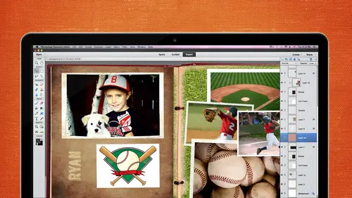
Now what we did in the last segment we have we touched upon two segments ago is we touched upon masking but we're going to still kind of beat that as well so we're going to some masking I'm going to show you how to take a template from what we think you get it for purchasing and for if you enrolled in the course for a facebook um way out so let's go ahead and get started with that one there are dimensions for the facebook covered page so if you wanted to write the's shot these down you can jot these down it's eight fifty one pixels by three fifteen pixels and if you forget not a big deal just go to google and say facebook cover picked paige pixel dimension and you'll find it all over the place but eight fifty one by three fifteen now here's where it gets you because I wasn't thinking about this when I did my first won a few months ago you're gonna have to leave a little space for that profile picture that comes up over there so you don't want to have any text or anything cause it's goi...
ng right behind that profile picture and it's approximately one hundred ninety from the corner so you're gonna want to kind of stay away from that area and then I can have to find out I think it's one twenty one twenty two from the bottom so you're gonna want to keep that kind of open and you could have a photo behind there, but as faras text or anything goes, you don't want to have it behind that profile picture. So let's, go ahead and I'm going to show you how to use it from a template, and I'm also going to show you how to create your own template if you wanted to. This one right here is created from a very, very simple template and there's basically the same size for each one there over here, it's not going to matter because it's going to come up a little bit, but it's not going to hide anything that we don't want hidden. Another thing you want to be careful of is what's going on at the very bottom, because sometimes the name of that facebook page is going to appear right about there. Um, so you want to make sure that there's nothing there that's important that you want to show these right here are just images pulled off of the graphics area, so they're very easy to pull off. You can put different papers from different did you skipped as designers in the background if you want to get more fancy, but this one was created from a template so let's bring out that template. We've got four difference layers right here remember, we go to the layer that we want to work on first, so I'm going to go ahead and pull a background into this I'm gonna go into file and open. I don't remember if I have that paper available just right off the bat. So let's go in, and actually this gives me a good ah leeway into showing you some of the digits. So let's go in to karen's kits. Let's, go check out ramble on rose, this is one of her latest ones. You see, if I can't make those a little bit bigger, here we go. So these airport picked a little, he says of one of her kids that she just sent out and created. I think I'm going to bring in a pay paper from that kit. So let's, the ramble on rose we've got all kinds of papers from there. Let's, get something let's, go with blue. I'm just gonna go ahead and drag and drop that in here. Now, this is going to be going from a three hundred d p I down to a seventy two because your screen is going to be seventy two, so you don't have to go with a three hundred d p I for your facebook page, so it is going to be a lot bigger it's goingto you know how to shrink it down if you need tio but just know that when you bring in a photo or an image in our background our paper whatever you going to bring in it might look a little bit difference because it is going from a three hundred resolution to a seventy two resolution and we can tell that by going to image resize image size and here it says seventy two if we went into ramble on rose paper we go into image resize image size three hundred some people get really confused with that resolution thing I think you guys all got it down pretty well but just in case you're going to look at it here and go well wait a minute wired why is it so big there? So if we would want that bounce back see how big that paper is right there it's huge so I can go and I can shrink it down if I want to I want a little bit more of that uh, texture and maybe that would be good let's just come and coming back in and now we see a little bit more of that pattern behind there before it was just way too big so any time you bring in something that goes from a large d p I to a small d p I you're going to want to back up and you might need tio make it smaller hey let's go to the next layer and we're gonna bring in our next photo let's go file and place and I'm gonna go teo the file that I need to go teo all right I like to choose photos that are going to be facing in and not facing out of a layout that's one thing that I learned in graphic design so I think what would be really perfect for this is maybe this one to come in on the left hand side and it's kind of facing in so I'm gonna go ahead and pull it over to the left and place it somewhat where I think it's going to be good and I'm a right click and she is create clipping mask and if I need to enlarge it or shrink it down I can pull it from one of these handles I think I like it larger silences keep it large there and I made it so that this does run off the side so there's not going to be any edge on the left hand side let's go to the next layer and go to file in place and I think this will work out pretty good actually no I'm gonna put this one in there because I wanted to be dark background and then bright background dark background and then like background okay move that on over and go up to that layer and right click and she is create clipping mask so this lay out is very, very simple, straightforward and we're going to create a template after we're done with this you can see how you can start from the rear beginning created template sell the templates or whatever because they do so facebook cover templates out there go ahead and click on that layer goto file place spring in this one q t pa it's gonna be a little too big I know, but it's okay, right click create clipping mask I kind of wanted to be the same dimension as this one so let's see how far we can go as far as taking it down now you're gonna have to pay attention to the top and the bottom so we're going only going to have to probably go right about there we could bring this one up if we were really picky to get the same dimension of the heads but it's you know it's preference there next one we're gonna go to the very last one go to that layer, make sure you're on that layer goto file and place and this one's facing in so we're gonna go ahead and face that one in the one thing about this is when people have shirts on that say something and you want to flip him just be really careful I was working for an ad agency when I first got out of college and I think it was me or my co worker were like, what was flipped the photo and this is like a big client this still this stands out in my head, so we flipped the photo not thinking about that. There were some text on the shirt and it came out to where it was backwards and it didn't get caught until it was printed, so it is being pay attention to that. No, we don't have to worry about that here because we're not flipping anything, but when you do flips something horizontally, just remember that, ok, let's, go ahead and let's, forget down escaped that one. I'm gonna bring it back yanks, I think I pull it on over commits right click create clipping mask, and that looks pretty good. Once you're done, you're going to go ahead and just save it as that as the psd, because you want to keep it and then you're going to want to save it as a j peg because that's, how you are going to upload it to your facebook page? Um, I like to put a little bit more girly things in here, so let's go to our graphics and see if we can pull in some flowers and I know we have some flowers in here I'm going to bring in I'm going to bring in a totally different color and then we're going to go ahead and try to match it so let's go with this pink one he drag it and drop it into your page there it isthe go back to my layers it's a little bit big someone is going to go ahead, shrink it down a bit and I think I just randomly put these kind of going off the page if I wanted to change the color of that I can go into I'm just going to zoom in so we could see the color change khun go into my drop down my create adjustment layer and I'm gonna choose who saturation now it's probably going to change it might change everything yet it's changing everything which is kind of ok because maybe this is what you want if you wanted to do like a monotone type of ah layout so it changed everything but we don't really want it to change everything, so I'm gonna come in here, right click and shoes create clipping mask and now it only effects that layer below it but I am going to go back in there again and see if I can get it to match a little bit better yes, a little box on the bottom I thought that that is what that was for on the bottom of your dialog box the huge saturation this right here are right here little guy there I thought it did the same thing oh, nice. I never saw that before. I like that one better. Cool. Okay, do you all see that a little bit about it do you all know that? You know you didn't back it. Ok? So let's go in and make sure that it does get that color it's pretty close so I wanted to kind of match that I wanted to kind of flow really well so once we have that and we know for sure we're not going to change that color we can emerge down believe won't let us let me see if I cant dio we hold my shift key down see and then right click and merged those two layers and so I need to unlock it from there oh I clipped it in there, didn't I? All right that's ok what we'll do then I think I can go ahead and right click on here and duplicate that layer but then I have to go on this here. I thought I could just go ahead and um huh I have to think about that one for a few minutes but what you could do is hopefully we can somehow figure out where we can merge that's we can copy and paste it not have to worry about it but maybe we can have a little bit of color going on splices. Try doing a few of them and I'll take this one over here, and I'm gonna bring this one down here. Copy and paste it. Mama. Lodi, where did it go? Why is it not copping a basic that's right? There we go. Okay, so I wanted to kind of off balance. I'm gonna go this one and put another try. I'm just going to copy this layer, duplicate the layer, and then I'm gonna move it right above the other one. And then I'm gonna go ahead and all to click. And then I have two of those and then two of these film is going to move this one here, and we're just gonna wrote ticket through right about there. So what I did was I copied and pasted that particular hugh and saturation because I wanted it to be exactly the same as the other one. So I right clicked on the actual adjustment layer, and then I can move it to wherever I needed to go. So let's, just go and duplicate this one and pretend that we want to go ahead and do the same hue saturation to that other daisy, so I'm going tio clip it to that one. So you have to kind of pay attention to your layers it's kind of gets complicated when you start getting a bunch of different layers and layers masking an adjustment layers so when you want o do the exact same hue and saturation that you did to the other flowers you can right click on that particular layer, duplicate it and then move it right above the other flower that you want to create that same human saturation then you have to clip it, so hopefully I didn't go to too fast, but that's basically what I did, I thought maybe I could get around that and there may be a way to get around that I'm just not it's not coming to me right now, so now we're pretty much finished we could go in there and do drop shadows and all that kind of step, but we're gonna to say that this is finished, we'll save it and save it is a topic and you want to say that probably is the highest j peg quality just because it will look a little bit better when you upload it to facebook when you go into side facebook, you all know there's like a little a little icon there where it says change facebook cover you click on that you're going to have to go find it from your desktop or wherever you stored it and it will upload from there sometimes you have to kind of tweak it a little bit if if your names like all the way across it everything's a little bit different, so if it looks good on your screen, then you're fine if you have to move things around a little bit, just go back to your original psd moving on up and then we save it and then reload it has anybody created a template before because they've recruited templates yet? Okay, so what we're going to do now is going to create our own temple it it's going to be a little bit different than what we just saw because that's really easy one it's not going to be really complicated one that we're going to be maybe doing different sizes throughout anybody have any questions on what I did the first speech but it's okay how's the internet doing yeah along so I can bring up a template or I can start from scratch I'm going to go ahead and open up I think I've made one in here. This is what we're going to create right now I think it's going a little bit different than this but something similar to this I'm gonna go file and open I'm gonna go eight fifty one by three fifteen I've already got like a a blank file here for that just make sure you do seventy five are seventy two someone's going to make double sure that I did seventy two okay, great. And, um right here, it's eight fifty one by three fifteen I just want to double check so I don't want to spend a whole lot of time doing this and then go back in there and see that it's not the right size I want to head and put a little placement right here for your profile picture and again, you might want to check to see but it's a right around one ninety from the edge to the edge of this one so I could be riel detailed and go in there and make sure it's like one ninety one but one ninety approximately it's not goingto matter too much of its one pixel off because the pixel is really, really small, I believe it's around one twenty one from the base up to the top approximately now this is where maybe that grid is going to come into play because we want to make sure that everything is lined up so I'm gonna go back into view and grid and if I don't like that particular grid, if I wanted to be a little bit, um smaller, maybe I want a little less space between I think that's what I'm going to do, I think I'm gonna go into edit and preferences and guides and grids I think I'm gonna go five let's just see what five gives us. That looks pretty good when I was six and see what that looks like. Maybe I'll go with six now. It's too close to the other colors and I'm gonna be working with because it's all gray and I know that I'm gonna be working with gray boxes, so I'm gonna change that color to something a little bit brighter so I can see it better when you click in inside of this area and it looks something like this. This is web safe colors, but if you click on this is going to give you all the colors. If you are back in the day when I was a web designer, we would only have be able to work with two hundred sixty five colors or something like that and that's where this comes in a place. So if you ever look at this, you're going, why is it banding like that? Just look down a bottom left hand corner and uncheck on ly web colors, and then you're going to get all those colors back again again. If you know the rgb values, you can punch him in four of you know the hex decimal number, you can punch it in that way too, so let's go with something a little bit bright, so I'm going who stood up to read and that works out a little bit better go ahead and click on ok and now we can start building our template now most designers I'm not really in the business to do templates but most designers that do templates they work with shades of gray all the time I can't remember there's a reason for that or not but I'm going to stick with that what they do because they know what they're doing so I'm going to stick with shades of gray and I'm gonna go in here and I'm just going to start randomly kind of making a template so this one right here is just replacement so we're not going to worry about that layer and maybe I'll even call this placement um profile placement okay so that we don't get mixed up with that and then I'm gonna add a new layer so this first icon right here with the little dog here says create a new layer I'm gonna go ahead and click on that and then I'm gonna go get my rectangle marquis tool and I think I'm going to go to in this one actually works out pretty good with the we were talking about this earlier so it does line up pretty good sometimes these girls don't line up perfectly but this one looks like it's going to line up pretty good so I'm gonna go over here in the upper left hand corner it should snap to that your id if it doesn't go up to view and check out, snap to and make sure these air all checked if they're not checked then it's possible you're not going to get a really accurate um lineup so just their usual I think they're checked by default that sometimes they you mistakenly unchecked them and it doesn't snap so let's just go up here in the upper left hand corner and it's going to snap to that area there and I'm gonna pull it down and I think I'm gonna may stay away from the profile picture so monaco and maybe go right about here and you can see the little marching ants are dancing ants whatever you want to call him and then I'm gonna go ahead, make sure I'm on the right layer go get my fill bucket tool and I have a great selected here but I can come in here and I can start with maybe the lighter gray it's going to be a little bit a little bit darker there there we go and is phil that area and then I'm a calm down in the bottom and I'm just going to go ahead and do it right about here it's hard to see those little marching aunts and then release go to another layer get a different color shade of gray I'm gonna go down a little bit deeper in the gray area tone and get my paint bucket and fill that one then I might come back in here and let's just say I want a couple little pictures up here maybe I want to do here maybe this baby this size all right and then I'm going to go to my new layer when you get really when you're going really fast you have to make sure that you're not putting all these boxes on the same layer because it's not going to work then go get your paint bucket to algo with a little bit deeper color and then phil when I come over here maybe make another another one you kind of do it you don't have a whole lot well yeah we did we still have some over here and my goal get my new layer and get my fill and maybe I go with a light one and if I wanted to keep this one I can go and hold on my shift in all key and maybe I wanted to come over here and then it it should know but didn't let's control z weaken go control x are now control see and then go with a new layer and control v and that'll put it on its own layer and then you can move that and just rotated or whatever so if you wanted to get a little bit faster with it you can control see which is copy and paste his control v is in victor and maybe I want to rotate that so I'm going to use my shift key to rotate it maybe we'll pull it down in here and I can also pull it from those notes and make it a little bit longer if I need tio okay this area can be saved for text if you want to or if you wanted to put photos all over the place you can do it as that way as well so let's just pretend we're just doing all photos I'm gonna wrap it up with doing a couple more I've been here and then fill it and then maybe one more here and I wanted to all line up so I am making sure that it's gonna line up over here with that it's topping two that layer and fill it and let's get a darker darker color all right so basically that's how you create your own templates and then you just bring in your photos clip it in there I'm gonna go ahead and take off the grid and you can't you know I put text in there or you can create a couple more blocks you can name all these layers if you want to um but most of all you know that you're gonna start from the bottom and start working your way up to create those clipping masts any questions on that if you wanted to you could put your drop shadows on this template so you can go into your effects and go ahead and put your drop shadows on there if you want tio I kind of like it plain and just real clean but some templates will have those drop shadows already there if you don't like him, you can always turn them off or the strokes as well. All right, I want to close that out unless anybody has any questions from the internet. Okay, let's keep rolling. I mean, if you got the right dimensions, you could figure this out for your google plus cover for your youtube page. You know, there's so many reasons what? Yeah, this's for this out so you know, I'm sure there's more and more people started to sell those templates, but hey, jump on the bandwagon. Yeah, I haven't tried good with google plus yet, but I'm looking at that one next for different reasons of seminars and stuff. All right, so we're going to go ahead and create one more facebook cover and then we're going to get teo the collages and mohr on um I'm asking so let's just create this one real quick we're in a do a little bit more to this this is the final outcome right here somewhat similar to that when I put it up on my personal page I noticed that my name was right over the top of this growing up way too fast, so what I needed to do was go back in there and move it over to the right hand side so depending on how long you're name is or what your business name is, you might need to kind of leave room for that little area as well, so we're going to go ahead and open up a little temple here and I'm going to go to my graphics because I know that I want a background that is available inside of my graphics area where it says backgrounds and I'm gonna pull in this is gonna be a beach scene so let's go get that background if anybody sees it floating through to say it just just screaming me raise your right hand should be down towards the bottom I think beach scene there's all kinds of cool backgrounds here I'm just going to pull a couple of them over here to see you can kind of see them if you have um right I thought it was towards the bottom there it is okay to pull this one in here like the footprints in the sand type of a background and then we're just gonna go ahead and pull in the images on top of that let's go file and open and it's kind of like a little chronological um or type of thing every year we go to holland michigan so I take a picture of them walking every year so it's going to be more like a step by step type of thing just kind of fun he's going to be taller than him probably in two or three years so what I'm gonna do is I'm going to bring in a premade frame from my area I'm trying to use as many things that people have access to so that you can use it right now so I want to bring in let's see what vintage photo that might be kind of fun ah white scalloped frame just pull that one and see what it looks like see how it works not bad I think I'll use it it's not perfectly square but that's okay, so now I'm going to go ahead and drag it drop it into my page it's a huge photo because seventy two from three hundred I should have thought of that about that before I drug it in when it's ok because people will do that now they're going to know how to do how to get this down shrink shrink it down I'm gonna rotate it just a little bit in fact I am gonna wait until the very end because I might put dates and there are text on the top so let's just not rotate it just yet because I like to rotate both the text and the dates at the same time. All right, now I'm gonna be consistent. I'm going to use that same frame for each one. Go back and I'm gonna open up my next photo two thousand eleven we skipped a year, so we don't have two thousand twelve. I'm going to go in there and check out. Dude, I'm curious to see how this works. I'm going to check and resize it at this point I'm going to take it down to seventy two. I don't know how it's gonna work with the frame that's going to be interesting to find out so probably will look maybe a little different I'm going to test it out. Okay, two thousand eleven I'm gonna close this one out and bring in that frame for this one. Okay? So far, so good and then I'm going to move it on over and now we don't have to worry about, you know, shrinking it down so much let's, pull it from the corner don't want to rotate it just wantto here we go. Okay, now I must say this at this point because if I ever click am clip, clip happy, I'm going to lose it so let's say this let's go with years, okay? Now we just have one more photo to bring in and a little bit of text. It's, goto file and open get that other photo, and I think I am going to go ahead and just shrink it down let's look at this, though close up these two frames, see if there's any now it looks okay, so we're good. I thought maybe it would do something a little bit different with frame, but we're good move this frame on over, and since this is kind of off to the left hand side, I'm gonna move my pictures, I can click and drag the picture over. I can also enlarge it if I need tio enlarge the photo and I can take it from this slider and do that. Click on the check mark and drag and drop it, stick your head in, zoom out and bring it down. I am going to pull all the photos up a little bit more than I did on my last one because of the fact they did notice when I pulled it into facebook that it was, um, running into some of the buttons and all that so getem all lined up, we'll bring in our text on the top and then we'll start rotating them how we need to go back to my layers panel, go to the top layer this right here we're gonna take off of the very end, so make sure that you delete that layer we're going go ahead until it now now we won't we're going to put some text that they're so we want to make sure that we see how far that goes up, but make sure that you do delete that once you're done does it may not line up perfectly with your profile page ok let's get our text tool and top layer I think the color is just going to be a light it's not going to be riel noticeable I don't really need it to be too noticeable. This is two thousand eleven or ten that looks like an ok font I'll keep that and I'm gonna right click on the ah layer and just duplicate that layer so that we know it's the exact same font and it's the exact same size. So I'm just going to move it over if you hold a shift key down of the movement increments of five and I just had to change the date on this one and one more so right click and duplicate that and move it on over I had to put a little slight drop shadow just so it's you can see that last one, but then we're good for the dates and then we'll go ahead and group them together we can merging together or whatever to make sure that when we rotate them that they will be perfectly aligned it's a little I liked I liked her segment on drop shadows that was cool. I never really thought about the skewing it that was that was I caught the last ten minutes of that, um, of karen's. So you should just go ahead and use the premade ones, but I'm going to be using her method now, ok, so I selected both of them. You can see that they are kind of a far apart, but that's okay, we can right click and I have to simplify the text first before I can rotate it so let's, go ahead and do that. Actually, let's, get this one right click and simplify that layer. Just pull this up here, okay? Select both of them and then we're going to merge them together because we know we got the right date and now we can rotate same with this. Hold down the shift key actually simplify and then merge son is gonna go right simply by and murch, easy stuff. All right, text on the left hand side and then we will save it off as a pig, I like to line my text up so I'm going to go in there and get my text tool and two a actually, I'm gonna go ahead and click once I'm gonna go in till top player and I was going to click once and his ottawa beach beach press the return key I want to beach and all upper case, but you can't really tell anyway because it is, um font that and I think it's bill that wrong? Okay, let's, shrink this down and pull up some different fonts because that's just not going to cut it with ottawa. Change the font on each one of these probably it's tio that it's tried different thoughts for beach and then michigan a we'll keep that. So this myth this ottawa is gonna have to be a little bit smaller. This is one of the one reason somebody said asked me during break, are there things that you miss that were in photoshopped, that are not in elements and then this is kind of the text part is the stuff that I miss because you can go in there and you can automatically duke earning and tracking on each individual, and in this program you would have to get that plus the photoshopped elements plus so I might just, you know, it's only twelve dollars, but that is one thing that I kind of do miss as opposed to having, um, a lot of they have a lot of web stuff too but since I don't do web design anymore I don't miss it as much but the typography is what I kind of miss a little bit for for elements go ahead and enlarge this word beach I'm trying to kind of make it so that they line up with each other and then michigan a little bit larger and then I might work with the leading and I am I'm like in the fact that when we dio overlap and change the color that it works pretty good so that kind of helps it out a little bit pull this up don't know why that's not going that way there we go let's start with that one first so I'm pushing it to the right too put more leading and there and give it a little bit more space and I'm pushing it to the left to tighten up the leading but it seems like it's kind of stuck here so let's just do it the here we go and then I would of course change the color of maybe ottawa beach maybe to a brown color like a dark brown but I want to pull from the background that make it a little bit brown or their slowed stands out all right we're finished with that lay out we're going to save it as a j peg and we're going to start the collage are safe all right? Any questions on that for my good when you get the hang of it, it goes a lot faster and with the creativity that that abounds and all the covers and all the things that you could make once you get the hang of it. Yeah, definitely, I know, and a lot of people think that this program's too hard to learn, but once you learn it and you do it over and over again, especially with the templates and everything we have at our reach, it's it's not so bad, so in photo shop is a little overwhelming when people hear photo shop. Um, but photoshopped elements is a lighter version, of course, and it just seems like there's less steps for it. So I think scrap bookers, definitely I have a really good base for, for learning how are doing their own twelve by twelves and whatever they're wanting to do so unless there's another program out there, I'm sold on l elements, all right? Let's, go ahead and kind of dissect this, masking the masking business because I think you guys are pretty close to being experts in masking the layout that we're going to create now is actually, you know what I'm going to show? I'm going to do the eye color change, because that is probably one of the one top thing that people say, how do I kind of make if they're in the glamour business? How do you make an eye color changing as all interested in that? So this is also goes into masking as well? I like to use masking whenever I'm kind of up and the color of people the eye color, and you don't have to really make it so stark such a stark change, but just a slight little change of the eye color can really make those ice pops so let's make a couple copies of this. I'm just going to right click and I'm a duplicate is another way to do that is just a drag and drop it to this first icon, which is create a new layer icon, so if you wanted to do that, the third way of doing it is control control jay on the keyboard so you could make a bunch of duplicate copies three different ways, probably four five different ways, but those of the three ways that I usually use depending on how you like to work now here is what we're going to try to select is the eye, but we don't have to get really, really picky with it because we're going to be using a mask so let's go to our quick selection tool the a you can either use that tool or you can use just these circular tool, but I'm going to use the quick selection tool I'm going to purposefully um not select very good. I'm just gonna make sure that I don't get a perfect selection cause I want to show you something when I hold down the shift key to select more than one area, so holding the shift key will allow you to add to that selection, and if you forget that you're going to notice down here, it says ad, so you're adding to this election again. If you want to save that selection, you can go to select and save selection. We didn't spend too much time on this, but I just wanted to reiterate that you can save a selection if you do spend a lot of time on it, and if you have to leave your desk, you could come back and you can load that selection back. So now we've got the I selected, we're gonna go up tio adjustment layer and hugh saturation and it's going to give you the little masking all done for you there, and we're going to zoom in a little bit so we can see this and let's go ahead and cull arise it, and then we're going to go ahead and to say that this a person wants to have some bright blue eyes and all these air, really stark, but we're going toe tame it down a little bit. Now, I'm purposefully made a little bit more than what I needed to, because I want to show you how you can change that so you can go back into that layer, make sure that the blue is around the mask. If you have something else selected, it may not work for you, and I go get my brush now when I keep brushing, it's going to go ahead and, um, with the white it's going tio reveal, and I'm gonna make the black at the foreground and it's going, tio conceal, and I'm just going to go in there and brush it all up and make sure that it is perfect when you zoom in, you can kind of tell where you're working, ok? It depends on how big these eyes are going to be, but you don't. You have to get too crazy with the perfection if it's, not if they're not real large it's on a billboard. Yes, you will want tio now, if you go down here and you take down all the opacity, you're going to see that green shine through, so I usually do increments of like ten, or whatever and then when it gets to be where you really think it's a good slight change then you can stop it I never hardly ever go with one hundred percent cause it just looks too fake unless that's the look you're looking for some of the glamour magazines they do do it one hundred percent but I like tio bring it down to at least fifty or below so it's not so much of a change ok if you had a client that wanted to see five or six different eye shades or whatever then you would go ahead and do all those layers try different colors for each one and then you could show him click on the I right here to show to hide and teo you know go through the client list and then they can pick out whichever color then you through all the other ones away I'm not going to go into that because because guys know how to do the mask for that now so pretty easy, huh? All right another thing I wanted to show you as faras masking goes a lot of times the sky see if this is it yep this is it the sky isn't how you want it when you're taking the picture there's there's not fluffy clouds or whatever so maybe in this case we want to add some clouds to it there's a thing called a grady it mass that works really well with this I can take I take pictures of clouds all the time, and I have like, a little library of clouds, so if when I was a digital when I was a graphic designer than I had my little stash of clouds where I can go ahead and switch out the clouds backgrounds so in this case, we want to add some clouds to it a couple different ways you can do it, but there's a really easy masking way you can do it so let's, go ahead in and go, teo file in place and these clouds right here they're not going to match the sky completely, but there is a thing called the grady it mask that helps it gradually change into the color. So let me make sure that I clicked on the right one let's add a layer mask and that's where when we placed it, we add the layer mask after that, then we go to our grady in't tool, and then we click and drag I'm saying this slowly because I can't remember yeah, okay, they brought the opposite way. I'm clicking and dragging up, so what I'm going to do is make a longer click and drag, and then it gradually goes in, whereas if you did it another way, if you will be able to tell that that's not the right um background cause it's his looks fake so the only way I found that works well is that grading it mask and I forget about that grady at mask a lot because I'm not haven't been doing a lot of layouts that require the different background but I used to use this all the time when I was a graphic designer so make sure you bring in the clouds on the top then you go in you add your layer mask so it's the third icon adam ask then you go over and you pick your grady int and it needs to be the black and white okay black and white one if it was this foreground too transparent it's not gonna work so make sure it's the black and white and then you come up into your layout and you click and drag and I hold down the shift key because I just that's it makes it a better transition now here's another thing let me just test this out, okay? Yeah I'm going to keep that in there but if I wanted to I could bring those clouds a little bit down further but I think I'm just gonna go ahead and keep it as is any questions on that did you guys all know about that grady a mask cool I'm gonna go ahead and save it off now you guys are expert and masking
Class Materials
bonus material with purchase
bonus material with enrollment
Ratings and Reviews
Prairie Chicken
I found this an excellent course on the use of PSE--not just for scrape booking but for any use. And of course the scrape booking ideas and methodology was great. I enjoyed Michelle's approach very much, and also liked Karens.