Lesson Info
7. Masking Two Develop Settings in PS
Lessons
Lesson Info
Masking Two Develop Settings in PS
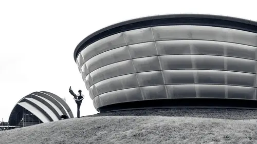
so far, everything we've done has happened in adobe camera Raw. And I love being able to finish an image from start to finish using just that because then my file size stays tiny. I get the original raw file that I captured and the actual processing information that I added to that in adobe. Camera raw is tiny. It's like the size of a text email. But sometimes I'm not able to get what I want using camera Raw and that's what I'm gonna head over to Photoshop. And that's when things get a bit more complex. So let's dive in and see how we can make dramatic black and white beyond what we could do with camera Raw. We're going to do it in Photoshop. Here's an example of the end result and you can see your eye being drawn to all sorts of areas within this but it's all controlled by me. If you want to see the original version of the image here, it is that looks pretty plain, it's kind of an overcast day. The light was not that interesting. And here's our end result. Let's take a look at how it'...
s done. Let's start off by opening the image in camera raw. What I want to do is create two versions of the picture. Right now. I believe we're at default settings. You can see all the sliders are zeroed out and the only thing that's been done is the black and white button has been pressed. But we want two versions of the image. We want one that is really dark in one that's really bright. Whereas right now we have what I would call a full range image. If you look up here at the hist a gram. The hist, a gram tells you what's in your picture and you can see the history Graham generally goes all the way across and I want it. So they're dark version of the image has a huge gap on the right side of the history Graham and the bright version might have a big gap on the opposite side. But let's take a look. What would we do to end up getting a really dark version of the image? Well, you can bring exposure down, you can bring things like the highlight slider down, you can bring the whites slider down and we're just trying to make a dark and dull looking image. You can also bring contrast down sometimes that gives you less of a difference between bright and dark. I'll bring my exposure even further And when I do this, notice up here with my history Graham is it pretty much only extends halfway across and that's about what I want a dark in boring version of the picture. I'm gonna make sure my clarity has not been turned up. In that case, Then I'm also going to create a bright version of the image and if I want to save more than one version while I'm in here in camera, what I'm gonna do is on the right side of my screen, you see various icons, One of them looks like a few squares overlapping. I'm going to click there. This is where you create snapshots as snapshots simply remembers the adjustment settings you currently have. And if you click this icon you'll create a new one and I'll call this dark version. I'll put my name on the end because I already have some over there. Uh click Ok I'll show you a different version of the dark. That's right up here. This is what I used when I for the end result that I actually showed you. It looks like I went just a little bit darker. If you look at the history gram difference just shoved the teeniest bit further to the left. Then let's make a bright version of the image. So let's go back to our adjustment sliders and we could come in here and double click on any of these slaughters. We want to reset and in this case in order to make a bright version of the image, we're going to do things like bring exposure up and make it so it's almost too bright by almost too bright. I mean you have almost forced areas to white. You can do that. Then we can take the shadows slider and bring it way up so we're gonna have a good amount of shadow detail. Get that really bright in the shadows. We can bring up if we want to throw out some of this texture because your eye is going to be drawn to texture usually up in the teens as far as how high I might uh bring that and then we could even take blacks and bring it up. That's going to make the absolute darkest parts of the image quite light as well. Uh Then this bright version I also wanted to easily be able to access but before I do let's make sure we didn't force to many areas to white. I'm going to go to the white slider. I'm going to hold down the option key and click on it. I see nothing so I could continue bringing this up until I see something and then back off just to ensure that's about the brightest I'd want to go and I just want to go somewhere close to that. Then I'm going to go over to that snapshot icon. Once again I'll create another version and I'm going to call this bright version and I'll put my name at the end. So I remember it's when I just created if you want to see the bright version for the end result image that I had shown you here. I have it. I'll just hover over it. It looks like I did not bring my black slider up as high because if you look at the dark areas like here, that version has more darkness to it but either version is going to work fine. Uh Now we want to start with the dark version. So I'll click on that and that just loaded the settings back in. And when I open this image, I want to open it in a special way. If you look in the lower right of my screen, you see the open button. Watch what happens when I hold down, shift it changes from just open to open object that's going to open this as a smart object, which is exactly what I want. So a shift held down, I click open object that should launch Photoshop and open this in a special way known as a smart object. And now let's take this dark version and let's put the bright version on top of it to accomplish that. I'll go to the layer menu, choose smart objects and that's where I'll find the choice of new smart object via copy, I need to use that particular command because if I duplicate this layer in any other way, any change that I make to the top layer would also affect the bottom layer because they'd be thought of as being just two instances of the same image. But in this case the top layer is completely independent of the one below. So now I'm gonna double click on the little thumbnail image for that top layer and that should bring up camera raw and we saved some snapshots and I can access them under this icon. And so since we currently have the dark version this time I'm going to go for the bright version and I'll just click Ok so we'll have that right on top of our dark version. And now all I'm gonna do is mask the top version to control where it shows up. And I'm going to do that by adding a layer mask. You can usually do that by clicking on the layer mask icon at the bottom of your layers panel but that would get you a white mask. If you hold down the option key at the time you click on the layer mask icon instead of getting a white mask, you'll get one full of black and black will hide that layer. And now since your eye is drawn to the brightest part of the photo Alright, it's not really drawn too much in this image. Maybe the top of these little benches on the right, but otherwise it's up to us now to decide exactly where the I should go. And so what I'm gonna do is choose one of these panels of concrete over here and I'm going to select it and I can do that using a tool known as the polygonal lasso tool with that you can just click and click and make a bunch of straight lines and if you click where you started it finishes your selection Well I'm going to do that but I'm going to start right up here, then I'll go down to the bottom and over to where the edge of that bench meets the wall and so on until I get this just right and the left most edge does not have to be perfect. You'll see why in a moment something like that. Then I'll choose the gradient tool in the gradient tool, I can click on this down pointing arrow to choose a preset. I'm going to choose the first one that goes from my foreground color to my background color and right now my foreground color happens to be white, which is what I want. So if I click outside of this selection like out here and drag into the selection and maybe end about three quarters of the way across, then what I'm going to get is I'm never going to get full strength of that layer because it's only where I actually click where I would usually get white And by the time it extends over to here we're probably going to be instead of it white, we might be a 20% gray or something like that. But let's try it out. I'll click hold shift to make sure I don't get an angle and I'm going to end about three quarters of the way across that panel and let go. Now there's our highlight coming in. All it's doing is making the topmost layer visible and now all I need to do is repeat that process for all the other walls in this image. So I can go back to my polygonal lasso tool and as long as it's set to its default setting, which is this one over here it's going to replace whatever selection I have when I next click then I'm just going to try to get those edges just right and usually I'd zoom up a little bit more than I am here, but I'm going just a little bit faster so it doesn't quite take as long as usual. And then I'm gonna grab my gradient tool and again start a little bit outside and drag to about three quarters of the way across. Let go now we have another highlight and then I switched back to my polygonal lasso tool and go for another panel. The left most edge doesn't matter as far as how precise it is and that's because you're going to end up with your gradient and you click, you should say you let go shy of that edge. And so when I go to my gradient tool, white would be applied wherever I initially click which is out here and black is going to apply right there and anything to the left of it would also be black. And uh so it doesn't matter here because we're putting black into a mask that's already black so nothing's really happening at that edge. But all you need to do is repeat this process for as many of these walls as you want your eye to be drawn to. And if you're off a little bit, you can fine tune your mask a little bit afterwards. But it would be best if you get this precise, which means I would usually zoom up really close to these areas like where I am right now because I'm assuming I'm going to have a slight little gap there where I wasn't precise, same with at the top. I think the edge of that wall extends up a little further. Then let's zoom out. I'll just type command zero. And now if you look on the left side, you can see that your eye is drawn right to those highlights and that's the bright version coming in and all I need to do is come in here and do a little bit more to other panels that are in here. Uh Then I could do the same thing to the other side. I'm not gonna do that right now because it's just repetitive doing the exact same thing over and over again. Instead, let's look at some other areas within this image. Well, let's say that I applied this to an area and it was just a little bit too strong. Well, if I choose undo. So I have my selection back, let's say it was this area. If it's the very last thing you did which was applying that gradient, then you can go to the edit menu and there'd be a choice called fade, but that's not the last thing I did. I get rid of my selection I selected again and all that. So this is not available. But if you were to choose that immediately after using in gradient tool, you would have an opacity slider. You can adjust. If you forgot to do it, then you need to do it later. You can always re select that panel and then instead come over here and use levels not in a levels adjustment layer, just a straight up levels by going to the image menu and then down here we have sliders and this one will take whatever is currently white in the layer mask and it will change it to whatever shade of gray this points at. So if the area that's bright here is too intense, you can just grab the slider and pull it in as you pull it in. You'll be mellowing out that adjustment so you can lessen it. The other side usually takes black and will lighten it to whatever shade this points at. And in order to use that, you'd have to be really precise with that selection down the left side. I wasn't but if you brought this in, you'd end up lightning the left side a little bit as well. Then this middle slider here can control the transition of how abruptly does it fade from one shade to the next. So you could fine tune that in a few of those panels if necessary, but it was only affecting this one panel here because none of the others were selected. I could have always typed command did de select and just say I want to work on this side of the image and as long as the mask is black out here and where this edge of my selection is, I don't have to have a precise selection there, I'm just adjusting the mask and now I can come in here and say again levels and maybe all of those highlights are a little bit too bright. I could pull that in to lessen them or if they're not bright enough, what that means is up here you have a history graham, there'll be a gap on the right side and that's because none of those edges have actually white in there. That's because when I made my gradient, I started with my mouse outside of the selection. But if I bring this in we can get white on the edge. So that would intensify the effect. So those are some things you can do to fine tune, I'll type command d to get rid of my selection and then let's say I've done the other side already and I wanted to then enhance the sky. Well I could come in here and possibly get Photoshop to try to select my sky and usually I'd refine the selection to make sure it's accurate because here I can see that there's some of the buildings selected and other things I'm not gonna do that here because I'm primarily talking about how I'm gonna do the lightning. I don't want to talk as much about making precise selection because that just takes time. Uh and here I want to just get you the general technique for the black and white. So what I might do here is to get some attention drawn to this part of the sky. I could grab my paintbrush tool and if I paint with white, will I have the sky selected? I'm going to brighten it just like we brighten the sides of the building. I can adjust my opacity control how strong it is because I probably don't want this guy to be quite as far as the building because I don't want my eye to be drawn to it twice as much. So what I might do is type the number keys on my keyboard, which is going to lower my opacity. In my case, I'm gonna type the number three for 30 and then I'm gonna get a large soft edge brush and I'm going to paint like this to just say make a bit of my sky bright and therefore your attention goes down there. Um I want that to fade out a little bit more gradually so I might bring my opacity down to about 10% by taking the number one in my keyboard, get an even larger brush and go a little bit further into that sky and I can go over it more than once if I need to or I can either type two numbers like 05 to get 5% and painted up a little further. But when I do that you might notice that if you zoom up that sky has got banding it, it's very easy to see. And so if you ever paint like that in a soft edge brush and you have a transition that's supposed to be that gradual afterwards, I would usually go to the filter menu and I would choose the camera, raw filter in the camera, raw filter. We're not gonna be messing with most of the sliders that are over here. And right now, all we see is the mask that's here. What we're gonna do is just zoom up on the sky and I can do that by clicking here and I'm gonna come down to an area that is called effects. And that's where I'm gonna find the choice of grain as I bring up the grain slider here, it's going to add noise to that mask and that will cause it to no longer have that appearance of banding, it can adjust all these settings depending on your preference and what the rest of the image looks like if it was grainy or not. And when I click OK, you should find, if I choose undo here's before where I can see distinct bands in the image and then I'll reapply it and now it's smooth, you might not be able to see that completely in the video because compression with video might end up putting the banding back in. But if I get rid of my selection now you can see that my eye is drawn to these vertical surfaces and a little bit right here to this sky wherever else I want. Your eye to be drawn is where I would make a selection and I would use the gradient tool to fill it in. You should know that there are different kinds of gradients though. So far we've only used this style right here which is a linear gradient in here. I'll have it replaced the entire contents of this mask by just doing this and you can see that this is in general how it works. But there are other choices that might be useful. There's a second version that acts just like the first except for it, applies it twice, it makes it reflected and it looks like this. That's great If you have a round column in that round column is lacking a highlight because it was an overcast day by doing that. You're going to end up putting emphasis on one part of the column and that would make it be similar to what we've done with these walls but it would be to a column. Then if you instead had a dome that you wanted to apply something to, I would go to this gradient, The second one that's their ID click and drag like this and we can add a bright highlight. Well if you put that bright highlight where you want it to look as if the light is coming from, it's going to do something to draw your eye to that particular part of a dome and by doing so we'll really get your I pulled to exactly where you want it to be. But for this image we're just using that single type of gradient. Let me show you what the end result looked like when I was done with this particular image here, you can see the highlights that I added on each one of these panels and I simply repeated the process for the panels on the opposite side. I also took this little area which was a water feature that was here and I selected it and I applied the gradient where I clicked out here to begin with and I dragged into maybe about there and therefore it was applying at full strength by the time I got there and I could have it fade out. I actually had black apply out here in white applying there, therefore it wasn't full strength here, but it got to it by the time it got to about here and then there's the sky painted just more carefully than what I demonstrated. We go back to the layered version though. I just want to show you that if you zoom up on some of these masks, you might find that the edges off a little bit here. I was in a little bit too far. You can always touch that up but you do have to be careful. Let's look at the contents of the mask. I'll hold down the option key, which is all time windows and click on the mask and you can see that what's in that? The mask is a gradient. If I need this to extend further up, I need to put that gradient in. I can't just put in a standard shade of gray. So what I would do in a case like that, if I do notice some issues is a couple things first. If it's really close to being right and it's just a little too crisp, then go over here to your tools and one of your tools should look like a drop of water and that is the blur tool when you use it on your image, it's not going to blur the picture itself, it's going to blur the edge of the mask and therefore I can paint across there to soften that edge. I would usually do that before adding noise to any transitions because that's going to blur the noise as well. But you might find that that ends up giving you a slightly better edge. More realistic one where it blends in a little better then if I needed to fill this in where it went up just a little bit higher, I'd actually do retouching. I'd grab my clone stamp tool here, I'd copy from area directly below by option clicking, clicking if I was in windows and then I can go up above and if I do that, as long as I'm working on the layer itself I should be able to and if I hold the shift key I can get straight lines out of this and I could paint this back and forth to fill that in. In this case I'm going just a little bit too high. That's probably because my brushes too soft. Let me choose undo and try that one more time. I'm gonna get a harder edge brush. The hardness should match the hardness of the object that I was applying it to. Then I can come up here, hold shift to get a straight line, click on the other side and touch that up, get a smaller brush for the corner so there's all sorts of things you can do to refine your mask once you're done and there you have a dramatic black and white in Photoshop. It all starts out with shooting mainly getting the angles right and just the general mindset of how to go from a dull and boring kind of static looking image of a straight on piece of architecture to incorporating angles in drama into that image. Then you bring it into Photoshop and in adobe camera we can take that image and with few extra sliders in adobe camera make it for much more dramatic contrast than you can get away with with a color image. But that's not all. We also want to think about where do you want somebody's eye to be looking at a scene and we can help control that through selective adjustments and most of them can be done right there in adobe camera Raw. The same adjustments are available in light room as well and therefore we can decide which area is going to have the highest contrast in which area will be the brightest because that's usually going to be the first place somebody looks and we'll also look at where don't we want the guy to go and we'll darken those areas up. But then there are some things that can't be done in adobe camera Raw and for those we pop over to Photoshop and that's where you have total control but things take a lot more time. But with that we ended up making two versions of the image a dark in dull one and that's what we're going to present from the majority of the image. Then we had a bright version that we're going to selectively put in only where you want the eye to really be drawn in the scene and by doing so you can really produce dramatic black and white architecture. I'm Ben Wilmore, I hope to see you again on creative life
Ratings and Reviews
ehab ghobara
Good content Ben. Thanks a lot
Chris Lonardo
Ben's course is concise, practical, and packed with useful info. I've already recommended it to several NYC photographer friends. Well done!
Tom Hackett
Thanks for stressing the position of the photographer (perspective) rather than the focal length of the lens.
Student Work
Related Classes
Architectural & Real Estate Photography