Lesson Info
2. Processing in ACR
Lessons
Lesson Info
Processing in ACR
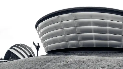
Now let's shift from talking about capturing images to talk about processing them and how your mindset changes when things turn black and white and it gives us a lot more flexibility and end results. Things. We couldn't do a color and get away with it. We can do in black and white movil of color makes it so reality is not being pictured, You cannot see with your eyes what you're presenting someone. And therefore you can get away with things that you couldn't otherwise. And when it comes to an image like this one having a white sky, which would be fine if it was an overcast sky with a color image. But still you would feel a little odd if there was absolutely no detail most of the time. But with black and white we can get away with that. We can also get away with rendering an area with no detail whatsoever by making it solid black and by giving us areas of solid white and solid black, we end up with a much more dramatic image. And so let's take a look at how I might think about that. Her...
e's one example and notice how much solid black there is in this picture. It's all over the place. And also how I'm not necessarily being careful with what is white in the picture. It's okay to have a large area of white. It might be the entire edge of this building, but that's not what it looked like when this image was captured. Here's the original capture with no changes whatsoever made. And so let's go in a just this image and make it a much more dramatic image. We've already made it dramatic by tilting up on the building. Didn't just tell it up though, notice I walked really close to the building by walking really close. It made it so those diagonals in the building are exaggerated, giving us a lot of diagonals in those diagonals are sending us up into the sky just pulling us right across the building. So let's process this image. It is a raw file and here I am in adobe bridge with comes with Photoshop and I'm just going to double click on the file. And since it's a raw file, it'll open it in adobe camera. Raw. If you're not working with raw files, you could also go to the file menu with jpeg or tiff and choose open in camera raw since it wouldn't open it automatically when you double click. And the first thing we're gonna do here is just get rid of some sensor dust specks and near the upper right is the spot removal brush in with that brush active. I can come in here and if there's an odd shape I can click and drag but otherwise just a few clicks here, I'm not going to get rid of every single sensor dust back because that's not necessarily difficult to do. And it doesn't make the difference between dramatic and not I just can't stand looking at those for you and now let's talk about processing. So first when you come up here to the upper right, there's a choice called black and white and when you click on it sure you get a black and white version of your image. If you click it again, you'll get the color version. Well what I suggest you do is analyze the colour version a little bit first and just remember where colors were. Remember at the bottom of the frame, there was some green and then the sky is blue and the building, if anything might have a little less hint of maybe a yellowish brown to it or some other slight warm color here. So we have blue, we have green and then we have the building slightly different. Then I'm gonna hit black and white. And before I start messing with these sliders here, I'm gonna slide down here to an area called BMW mixer and that's where you're gonna find the basic colours of your image listed and you can move these to the right to brighten a particular color or to the left darken it. And remember we had greens at the bottom of the frame. So here, if I choose greens, I could brighten those greens, remove it the opposite direction to darken them. You don't have to remember what colors things were. There's also an icon over here. If I click on that and then I hover over my picture, you're going to find a little circle there that showing me the color that's underneath my mouse and if I were to click and drag now it's going to be moving, whichever sliders would most affect that particular area, whatever color used to be there. So in this case I want my sky to be near black. So I'm gonna click there and drag the left to get it to be nice and dark. I might click on the building itself to see what color is in there and see about bringing it up and see if that helps at all. But when I bring that up, I noticed that the formerly green things at the bottom also change. But this is an area that I often work with to just get a general starting point for how bright I want areas in my image to become. Then afterwards I'll come up here to the area called basic and let's just take a basic look at what these sliders do in which ones make for much more dramatic looks in your image first. If you want to get the overall brightness of your image, go for exposure and decide exactly how bright you would like the image as a whole to be. But then if it's not the image as a whole, you want to work with, it's only the brighter dark parts. Then go to highlights or shadows. In this case I want my shadows to be dark. So I can bring that down, but there's only so far I can bring it and it might not give me enough black areas is what I want. So I'll show you how to change that in a moment. Then we have highlights for the bright areas of the picture and we can decide exactly how bright we want those to be. Contrast is how big of a difference is there between the brighter in the darker areas. If you increase it, you're going to make a greater difference, that's going to cause bright things to get brighter and dark things get darker at the same time. So that's one thing you could do to make things a little more dramatic after bringing that up, you might decide well I like it but my highlights are just too bright. Well then go to your highlights slaughter and bring it down So you could fine tune it. Then I mainly think of whites and blacks as being finishing adjustments where I use the mainly when I'm done adjusting the other sliders above this controls how bright is the absolute brightest part of your image meaning do you actually have white or would you rather have a shade of gray in that bright area? If you bring up really high, you're gonna blow areas out, we lose detail in your highlights and you can bring it down to make sure you don't have any white in your picture. I mainly avoid white. If I want an image to look hazy though this slider below does the same thing for blacks. If I bring it up it's gonna make the absolute darkest part of the image brighter. And if I bring it down it's going to make it darker and determine how large an area is. Solid black with both whites and blacks. There is a way to visually tell exactly where something is becoming solid black or solid white and that is by holding down the option key Alton Windows and then click on the slider and if you don't see anything appear when you're working with the white slider meaning your screens only black, there is no part of your image that is solid white. But if I bring this up eventually I'm going to see where it is and I could have little highlights right on the edge of the building or I could have entire areas. It's a personal choice of your style but at least you can know if it's turned solid white or not, you can do the same thing with the black slider. Just hold down the option. Key Alton Windows click and now I can see how much of the image is solid black and either make more of its solid black or less. So I might decide that I don't want quite as much of the building. Solid black maybe about there to work with it. If you find that these sliders, you've maxed them out. Like here, Shadows is at negative 100 and you wish you could take it further. Then you want to slide down here to a section called curve And when you're in curve there are some choices up here at the top. Unless you're versed with using curves, you'll want to be on the choice on the far left, which is what I'm in right now. You'll know that you're on that choice if you find sliders below and now here we have alternative sliders for our shadows, our highlights and then we have stuff in between lights and darks. And sometimes that's nice to be able to get a slightly more granular feeling to those kind of in between tones because lights and darks can be very useful. But this I primarily use when I've already been up here in the basic area and I maxed something out and I wish you could go further. Then I'll pop down there to curve. Then below that here's where we can emphasize details. We have a choice called texture and texture. You're gonna notice the most when you click on your image to zoom up. If you zoom up to 100% then you can adjust texture and it's going to bring out the really fine details. That means if you have for instance if there's something would the grain of the wood, the very slight vein ng that might be in marble or granite like white marble or something. You see slight little hints or you have a leaf would be the veins on the leaf. That's when that thing called texture is going to make it come out clarity is something where you don't have to be zoomed up on your image. You can look at it as a whole and it's going to make the larger areas in your image more prominent. If I bring that up, you can see those areas starting to pop a little bit more. Just be careful with clarity. If you end up with it really high watch the edge of buildings. If you're a black sky you'll be fine. But if you have still some gray in your sky, you might find that there's a halo of darkness around the edge of the building. And if that looks artificial, you probably need to bring down clarity. The other sliders that can cause that kind of a glowy or halo feeling Is your highlights in your shadows. If you get those to an extreme like here -100 with Shadows, watch the edges of trees and other things to make sure that they're not too much of a glow kind of a feeling around them. And if it is, you might want to back off on those particular sliders The sliders that are found under the area called curves do not produce those halos. So you could use those as an alternative to the highlights and shadows. Sliders then we have down here a choice called D. Hayes in D Hayes will be hard to see on this image because we have so much black in the image. So let me change some of these sliders to get rid of some of that black. You can double click on a slider to reset it to its default settings and I'm gonna do that to a few of these and I might bring contrast to its original as well and just make it so you can more easily see what the heck's in this image and I'll bring down clarity just to work closer to the original picture. All right now let's take a look at D. Hayes. Uh well and also we have curves going on. Let's get rid of those curves, double click on their sliders to get them back to normal. There bigger D. Hayes is designed to get rid of foggy um Hazy looks in an image anytime you have something that is hazy, what you'll find is the darkest part of the photograph will almost never be close to black instead it's going to get lighter and lighter as it looks hazier and hazier in a scene. And so what D Hayes is going to do is it's going to concentrate on the dark part of your picture, it's going to take whatever that darkest area is and make it even darker, darker, closer to black. But once it starts getting really close to black it's gonna start affecting that darkest area less and it's going to start affecting the area is just a little bit brighter than it, it's going to concentrate on that. And as that area gets closer to black it's going to concentrate on areas that are a little bit brighter, so it's going to really concentrate on the dark part of your image, It's going to push it towards black and it will be very easy to make large areas of solid black, but let's see what happens to the building itself. When I take D. Hayes and I start cranking it up, you see the dark areas getting darker and darker, keep going and you're going to be able to get a lot of solid black and if that's what you like in your images, feel free to use that. In this case, I just might want to bring my highlights down a little bit so that I have some detail in that building, but that's not due to D. Hayes, that is due to my overall adjustment. But now I got a lot of black, but what I find is often times I don't want a large area of solid black. So in this image, what I'm gonna do is go to default settings, you can do that by going to these three little dots and you can choose reset to default if you'd like and that's going to end up bringing you back is if you've never adjusted your image, but then also took away our black and white and my little retouch, but I'm going to hit BMW to make it black and white once again. And now let's take a look at how D. A's often works better when you combine it with one of these other sliders and you move them in office directions and the other cider is contrast. So first I'm going to bring up D. Hayes and we'll see what it does to this image and notice how quickly we get some solid black in the image. Well let's say I don't want that solid black. What I'll do is take contrast now and lower it and I'll do that until I get that shadow detail back that I want. But that's going to give me a much different look in the dark part of my image than if I didn't use D. Hayes at all. And I so often bring contrast down and bring D. Hayes up that it's anytime I want something dramatic. Almost always I'm heading towards that. So what I end up doing is I make presets. What I'll do is move this down a particular amount, let's say 275 and maybe I moved to haze the same amount 75 and then I can create a preset. If you go to the right side of your screen, to these icons, these two circles that are overlapping, That's where you have presets and if you click this icon right here, you could create a brand new preset when you do it asks you which settings you'd like to have in your preset. And over here I'm going to choose, Check none. Then I'm going to have it only changed D. A's in contrast because those are the only two slaughters I wanted to mess with. And then here I could type in the numbers I was using Now. I actually don't remember the numbers but let's just say it was negative 50 contrast In plus 50 days. That's what I might name it. Although I think it might have been at 75 then I click Ok and you can combine these into different groupings up here, you can create a new group and I actually have a group. It's right here, it's called contrast plus D. Hayes. And that's where you can save them. Just click here at the bottom of the choice of new group and you can call it contrast slash D. Hayes. And that's where you'd save all presets that relate to this and then just make multiple presets. Make it so you're doing negative 10 for both of these, the negative 20 negative 30 and so on. I've already done that. So I'm going to click cancel. And let's just look at my D. Hayes presets. Uh If I hover over these it's going to preview what they would do to the picture. So here's a minus 10 D. Hayes, so this is going the opposite direction most of the time I. D. Hayes is higher. If you ever have an image that includes neon or other really bright um signage negative D. Hayes is going to make it look like it's glowing more. But up here is my positive ones. So uh here it goes, I'll just hover over these and therefore I can get a sense for exactly how much would I like of that D. Hayes Maybe it's 80 or 90 or even 100%. But I wouldn't know that without having to move both sliders and you can't move both sliders at once unless you're using a preset. So I would end up creating presets. I would choose the one that is closest to what I want and then I click up here near the upper right to get back to my sliders and fine tune things. Maybe you just crank the D. A. Is a little bit higher but I do find that that is very useful to be able to um adjust both sliders at once. Then I'm not afraid of having solid black or solid white. If it's an overcast sky making that go to solid white, makes it so now you see just the more basic shapes within the image. Same with a black sky with a contrasting piece of architecture
Ratings and Reviews
ehab ghobara
Good content Ben. Thanks a lot
Chris Lonardo
Ben's course is concise, practical, and packed with useful info. I've already recommended it to several NYC photographer friends. Well done!
Tom Hackett
Thanks for stressing the position of the photographer (perspective) rather than the focal length of the lens.
Student Work
Related Classes
Architectural & Real Estate Photography