Lessons
Introduction
01:14 2Materials and Tools to Use when Drawing
14:27 3Preliminary Furniture Plans on a Floor Plan
07:45 4Using a Scale Ruler and Templates
05:36 5Rendering Furniture on Floor Plan to give Volume and Depth
06:06 6Line Weights and Adding Texture
04:24 7Architectural Lettering
08:11 8Complete House Floor Plan
03:23Isometric Perspective
03:42 10Why 3-Point Perspective Doesn't Work
04:05 11Benefits of Two-Point Perspective
03:06 12Preliminary Sketches for a Living Room
11:29 13Using Different Textures of Materials in your Drawing
03:51 14Adding Color to the Couch to Create Shiny Leather
11:26 15Rendering Soft and Shiny Textures
09:09 16Starting Elevation for the Kitchen
07:54 17Full Rendering Elevation of the Kitchen
07:28 18Putting the Elevation at a Different Scale
10:33 19Two-Point Perspective for Kitchen
10:04 20Canson Paper with Pastels
05:35 21Transfer Line and Heights
08:27 22Finishing the Rendering Using Canson Paper
08:48 23Creating Chrome and Color Reflections
10:43Lesson Info
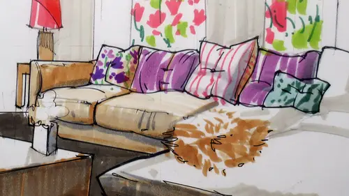
Rendering Soft and Shiny Textures
we're going to be covering now. Textures, um of different kinds, from the very soft to the shiny to the very shiny. So I have here a partially completed work. What I will be doing first is finishing a little bit this. Hello? Um, what I will dio is first you notice how I have bigger, broader strokes over here because there would be an area that would be more in a dark spot, so I would do more. Pencil lines were here. You can do them almost randomly and then pick your thicker marker and then out an outline. Since it is soft, you don't want to do straight lines you wanted to more like straight, like little dashes here and there to give you the idea off a soft plush material. Granted, you will not be using this a lot, but still is good to know that that exists the option off using that exists. All right, so now let's imagine that we would want to have, like, a shiny or floor over here. What you want to dio on this weekend to take it into the next? The next paper to Would you want to dio fi...
rst? his grab a white pencil. I have remember we were talking about the China marker, how you can unravel it so that you can get a good tip. You can use, um, vertical strokes to give your perspective the idea off that it's reflect Your floor is reflective, so we can do that on the floor, and that alone makes a big difference. On top of that, you can also use some gray markers to emphasize again, it's the squinting thing. Do we have enough contrast? I can do some dark lines like that, especially where we meet the corners, meet the reflection. That's when you would want to go a bit darker. All right, that alone makes a big difference. And from here, we can jump into the next paper. We can do some extra lines here. Okay, We can add a few lines here. If you think that this is a straight material cut cut with industrial machinery, then we would you reduce your your ruler? All right, so now let's uncover this. Remember, we were talking about this, right? How we were going to work a bit more on this. I'll just work more in a couple of minutes knowing what we have learned on the previous step, right, I can add some lines over here to make the floor more reflective. Imagine that you would have just recently varnished it. Your kids are already You're an empty nester, for example. And your kids are out in college. And, uh, time to polish your floors one more time. Right? So you would have to show that shiny surface. Now, the China market over here, we will not be able to use a lot of it because the floor is very light. You see the difference between these two? Right. Um, I could use the china market over here because the floor was kind of dark for the China market. Over here, you cannot barely You can really see it because it is white on a very light, um, color. So we can't really get a lot. That's when you reduce your pencils instead. Then I can use my marker and dark in some areas slightly. You see, the surface over here would be reflected on the floor somewhere here, in here, too. All right. So I'm just basically imagine that you would have this cube and then another cube over here. This is the reflection. This is the real thing. The reflection would be rendered a bit lighter, but still showing volume. All right, So instead of using black, I am using a pencil like a brown pencil over here. That would be you would get better results than I can use. A little bit of great pencil, which is different than your number two pencils. Right. So just great pencil over here. Too dark in native you want? Remember what I did over here. Superfund shape very loose. Well, that's kind of crazy. I don't know if we would use that so much in interior spot. What we have learned over there, we can use it over here. Whatever. You have an area rug that you want to, um you want to show the pile of that area rug? Right? So you would just add, you say I was kind of moving my outlines. I didn't really use the ruler straight. A kind of made it very clear that he was kind of fun relating. Then I would add my dots for texture, texture. Very important. Remember the beginning on my presentation here? I showed one drawing off the stone. We can indicate Stone. I will. Just indicated briefly over here. By doing stone, you can do some outlines. Just moving your lines in and out slightly, paying special attention to the crowd lines. All right, so you can do some lights like this to suggest that this is stone. In this case, you work first with your outlines slightly thicker for the outside perimeter. Remember the squinting every now and then just squint to see where you are. And then some pencil natural materials for texture. Some pieces would be slightly darker than others. So you would have to kind of show that imperfection of the material. All right, so a little bit of that the stones have some highlights. I'm not sure. Groups, Um, we can use guesses. The same thing, right. We can use it like this for highlights. All right, so that can get us further. We have explored reflections. Here are soft material for the area. Rug on Ben, some stone. All right, on this section on. Starting on, the project in the kitchen will cover what we have in the bonus materials. So we have What is an elevation? Um and we're going to be rendering a little bit on top just to get our hands on to this. Um, we have as well what is called on elevation of just the island itself in the kitchen. Um, and I have two examples here using different people at different scales in your package. You should have a swell some perspective use. And this is something that I want you to pay special attention when we reach this part because it will get a little bit technical. But if you listen to me and kind of watch the screen closely, you'll get what we need. I tried to simplify it as much as possible. So important that you don't get turned off when you see all this technicality will get will cover that. So I'm showing two point perspective in one point perspective. So that's included in your packet. And then we'll start rendering um, this view at the end of the packet you'll have here, um, the list of the May basic rules for working with are materialists in the class started with light pencil work that I showed the non photo blue and then starting with markers first with grace than working with color than pencil on your black outlines to define the shapes. The pencils actually would be added toward the end. Um, should be used on top of marker tones just to make sure that, um, we add the extra textural notes all right, and then some eraser notes, he would want to gain some highlights.
Class Materials
Bonus Materials with Purchase
Ratings and Reviews
user-d2a6ef
Creative LIve Why don't you re-do this class! Its a great subject.....get a new camera operator, who knows the concept of learning from watching.