Lessons
Lesson Info
Tonal Gradation
I wanna take you through some really fun ways to make marks, and also to create a sense of drama by really asking ourselves, like, how can we make marks that function not only to create a drama of light and dark, but also function to create form. So the shape of the marks and the way you make marks, depending on your subject, becomes really important. So let's first take a look at some slides that show a variety of mark making. It's really fun to sort of see how different artists make marks, because there isn't just one way to do it. There are ways that you can learn to do it initially that can help you with some fundamentals about creating form but when we look at these images you'll have a sense that you can be playful in the end and try different media in terms of building tonality. So we want to be able to experiment, we want to be able to choose materials that feel the most exciting to us and most organic, so let's just take a look at how some different artists create marks, and t...
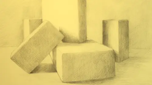
hen I'm gonna show you some tonal gradients and how you could practice that. We have practice pages that you can download, that you can try this out on, and we'll go from there. So let's first just take a look at some, what I consider really beautiful drawings. I'm gonna show you some master drawings, but also some drawings that students and artist friends of mine have done and they've donated these to this project, which I'm really appreciative of. So this is a Raphael drawing, Italian, you know, 15th century, and in this sketch you can see how he's used really sort of stark hatch marks, like direct straight lines, to create, this was a self portrait, to create just a sense of form by not so much wrapping lines around but you could almost hear the sound of the pencil as it might have gone down on the paper with sort of a (mimics scratching) sound and you can see on the side of the hat and the side of the face there's this real sense of rhythm and beautiful, almost like a smooth quality to the form. So that's one option that you can experiment with. Let's try to look at another one. So this is a skull drawing that a student of mine did some time ago, and this one has a different feeling. So mark making also can evoke a certain psychology to the drawing, the way that you put the mark down, the materials you choose, the intensity that you make with it, it can evoke a feeling like simple line making, like drawing a particular simple line, a felt line, a simple contour, can have feeling, but when you start building the materials and you start making choices about, do I wanna work with cross hatching. So this is an example of lines that cross hatch over each other, and they make this lattice, sort of a lattice of marks that help to develop the form, and they also go along the form. So in this case you can find little cameos where there's little x's and hatch marks that really evoke a sense of bone. So when we think about even the texture that we're drawing, is it bone, is it fur, is it something botanical? There's things that we can work with that, methods we can work with to evoke that very substance. So it's important to really look at a lot of drawings and ask yourself what your preferences are around that. I love this drawing, it's by an artist friend of mine, Nicholas Mancini. This to me just has so much emotion to it, it's charcoal, he's making a lot of very felt marks, he's taking it and dragging it, making crosses, and he's using some smudging and some erasure, it's very active. There's a sense of activity, there's a sense of sound when you look at this drawing, and I love this idea of a sense of sound. When I have a roomful of students and everyone's drawing in charcoal there's this like, almost frenetic sense of sound that's happening, and it's really exciting, and you can feel that in this sketch. So, when we start to develop our mark making we could build towards something that has feeling and let our materials pair with our subject matter and pair with what we wanna say about it. Mark making here in this da Vinci drawing you can see, you know, it doesn't have the sort of emotive quality of the one before but you can see how he's taken the walnut ink and very systematically wrapped it up around the forms. So he's not just putting it anywhere, he's actually thinking about the cross contour, and we're gonna work with this some more like we did in the third course, the cross contour and ellipses, he's taking line and he's using tonality but he's taking that line and wrapping it up around cylinders and egg shapes to create volume. So this is sort of a almost systematic, but expressive way of using mark making to not only create tonal changes but also to create form. This is my friend Elizabeth's drawing, it's a gannet that she found on the beach, she's always walking the beaches and finding things to draw, and I love this drawing. It's an ink wash and then it's like a roller ball sorta pen and it's some water soluble ink, but look at the way she's built up the darks under the head of the gannet. It's actually kind of like a scribbly, kind of really active mark that is very expressive and very organic, and also has a certain kinda feel to it. And that feel might pair with walking the beaches of Provincetown out in Massachusetts and finding things that have been left behind on the beach and sort of the remnants of that, there's that feeling there which is I think really beautiful. This is another artist friend of mine, her name is Amy Yeager, and she does these incredible drawings using ballpoint pen, so we've talked a bit about materials in earlier courses but ballpoint pen and then having a little bit of watercolor brought into that, so look at the marks that she's made here, like these are the sorta downy feathers of taxidermy birds that she's found in an old drawer, and I think it's so beautiful because it's very, and at first you might think wow, that must have taken a lot of work, and I know it did, but there's like a system that she's using and there's a direction to the marks, and she's chosen pen versus something else because she knows she's dealing with little soft feather marks, and that's something that, you know, when you think about what you're drawing and what would be best to draw it with that's something that you can start to work with. This is just a quick study that I did using another kind of mark making, using tonal paper like a mid-tone paper, heightened with white, and again using almost the texture of the paper to help the marks go down with a certain directness and also wrapping the lines around the forms. So, what we do in terms of tonal rendering can be varied, and I really encourage you to look at different artists. A fun thing that I've done in the past, and we may have this as a downloadable practice page as well is look at a bunch of artist drawings and take little postage stamp sections of them and take those little postage stamp sections, you could tape them off, and then replicate those in the material that the artist used, just a little section. So let's say you take a little section of a Van Gogh drawing that was done in ink. You can take a little detail and in your sketchbook replicate it, just to get a little window on the feeling of how those marks were put down. And the more you do that, like, mimicry and replication is a fabulous way to sort of internalize the possibilities of mark making. So I've done a lot of that, and it's really helped me expand my spectrum of being able to put marks down and the possibilities of that. So even any of these drawings that you love a little section of, you could go in and just copy it. And even though it sounds like, oh, I don't wanna copy someone else's work, it's a time honored tradition and a lot of art schools use that method to help students learn about how artists have sort of processed their work and put marks down. So taking it back a step and thinking about, well, those are all really beautiful marks and we've looked at master drawings and contemporary artists drawings, but how do I build towards that, and what are some of the things I should be thinking about depending on the materials I'm using? So one really key thing, before we go into demonstrating sort of object drawing that I'm gonna be building up some drawings for you and working with them in a way that hopefully will help you see possibilities around drawing basic objects, like eggs and cylinders and blocks. But before we get there I'd like to show you something about creating tonal gradations. So if we come and focus at the table here, I've started to work up three gradations and talk about what is a gradation and how do certain materials compare to each other when we're starting to think about this sort of work. And this might seem a little, a lot of people just wanna jump in, they just wanna jump in and start drawing, like why do I have to do all these? It's like practicing your scales on the piano or warming up your voice if you're gonna be singing opera or something. You know, or like stretching before you run a marathon. So depending on the material you're working with when you start to put tonality into a linear drawing, either some things you might wanna check out about it before you choose it, or after you do choose it you could think about how that functions in terms of polarities of light and dark. So in any drawing you're gonna have your lightest light and you're gonna have a darkest dark, and sometimes those are very extreme, and sometimes they're closer together on the tonal scale, it depends on how dramatic the lighting is in any particular subject. So what I wanna show you here is I wanna show you how you could practice working with a tonal gradient. So a gradient is like a gradation, like there's a progression from light to dark, and later on we're gonna apply this idea to sort of a draw by numbers technique that I find really useful for students to sort of really ask yourself, okay, what is my lightest light, what is my darkest dark, and what are the mid-tones in between? Pushing those dramatic polarities can help the mid-tones have actually a voice, because if you don't push your darkest dark dark enough or honor your lightest light, then they can sometimes all mush into a mid-tone and things become rather flat. So what I wanna show you briefly here, and this is also available as a downloadable practice page. You know, on the downloadable practice page if you choose to do it, you can also work this up for yourself. I have some five part gradations that you can practice with different materials. I also have some seven part and nine part gradations as a challenge for you, which you could try. But for our purposes we're just gonna kind of move from one to five with a couple of different materials, and then see where we can go from there.
Class Materials
Bonus Materials with Purchase
Ratings and Reviews
user-7963ec
The package of four drawing basics courses by Amy Wynne are very well organized. Each section builds on the other. By the end, she has given us a technical understanding of how to use marks and tonality and shadows and highlights to develop a beautiful drawing of anything. The illustrations of important points were very helpful. HIGHLY recommend.
Ariana Graf
Amy teaches a straight-forward approach to tonal rendering and mark-making that builds on her previous courses on building basic line drawings. She makes beautiful and believable tonal shading attainable. Loved it!
Student Work
Related Classes
Illustration