How To Create Atmospheric Perspective
Lesson 3 from: Essential Compositing Tips & Techniques In PhotoshopJesús Ramirez
How To Create Atmospheric Perspective
Lesson 3 from: Essential Compositing Tips & Techniques In PhotoshopJesús Ramirez
Lesson Info
3. How To Create Atmospheric Perspective
Lessons
Class Introduction
01:04 2How To Match Perspective
13:01 3How To Create Atmospheric Perspective
11:27 4How To Match Luminance And Saturation
04:42 5How To Apply Ambient Color
03:57 6How To Replace Skied With Blend If
08:58 7How To Composite With Group Blending Modes
06:00 8How To Create Custom Brushes
06:01Lesson Info
How To Create Atmospheric Perspective
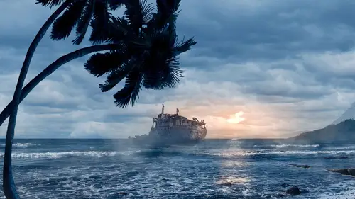
And now we're gonna talk about atmospheric perspective, which helps us determine the depth of an object in a scene, and this is just a quick graphic that shows you how that works. We have the object that is closest to us, it's got the most contrast. And then as the an object recedes further into the background, the contrast decreases and the color becomes the color of the atmosphere, which is usually the color of the sky, in this case, blue. So you can see how these little balls back here have that little blue tint. So I want to talk about more of why that is important, so I'm gonna open up this blank layer here, and I'm gonna paint with my brush, just to explain a couple things. When we're working with Photoshop, we really are working in a 2D environment, and when we're compositing, we're trying to fake a 3D environment. So with Photoshop, we have the Y axis, oops, that brush is a little too fat. Let me undo that, just so you guys can read that better. So we have the Y axis, which goe...
s up and down, and we have the X axis, which goes left and right. If you press V on the keyboard, you have the move tool. Let me find one of these spheres here. So, Y axis, up and down, X axis, left and right. But if you want to push something into the Z axis, y'know, back further into the image? That's where atmospheric perspective comes in. So the Z axis, again, goes from closer to us to further away from us, that's the Z axis. So atmospheric perspective helps you to make that depth in an image. Also, as a side note, when you're working with atmospheric perspective, you also have to think about color just a little bit. During the daytime, the colors in the background are cooler and the colors in the foreground are warmer. During sunrise and sunset, the opposite happens, where the warmer colors are in the back and the cooler colors are in the front. We have this skyline here. Notice how the trees here in the front are warmer than the trees that are here in the middle, and way back here in the background. I'm gonna double-click on the foreground color picker here, and if I just click on any of the greens, it really doesn't matter which one, notice that they're in the warmer colors. If I click on the ones back here, here in the middle, notice how much cooler they get. And if I click way back here, they're even cooler. So you gotta think about that when you're compositing, just so that you're mimicking reality, and your brain doesn't tell you that something is off. A lot of times, you don't know why, but you just feel it. Everything I'm showing you guys is just for you to avoid that feeling of, why is this wrong? And I'm sure we've all been there, I know I have. And also, the other example, sunset and sunrise, notice how warm the mountains are and how much cooler the foreground is. That was just an example with actual photographs of how the color in atmospheric perspective works. So we have this scene here, and there is no detail whatsoever, there is no color, it's just different shades of gray. But we know that there is depth, we know which trees are closer to us, which ones are furthest away, just because of the atmosphere that is created on this simple graphic. If you wanted to composite a tree in, even though this one has detail, we could easily do that. I'm gonna click on the V key on the keyboard, select the tree layer, click and drag that around, and if I want to composite this tree right up front, I can double-click on the side of the layer to bring up the layer cell window, then I can click on color overlay, and with my blend mode set to normal, I can select the color of the tree that is nearest to it, in terms of the depth, and select that. In this case, it's black. Press OK, and I'll press OK, and you'll notice that the tree fits within the scene. I can click and drag this and put it up here, maybe you want to have a giant tree way back here. So command T to transform, that's control T on the PC, shift option, that's shift alt on the PC, click and drag on the corner handle to scale uniformly, click and drag this down, and now we have a giant tree there, but now the depth is off, it looks like a cut and paste sort of job. So you want to do is match the color of that area in terms of depth. So I'm gonna select that color there, press OK, and notice how the tree fits within this image. Now, obviously, this is very simple, this is just a vector graphic originally. What happens when we're working with the real world? So I'm gonna select the color, color overlay. And there it is, bring down the opacity just a little bit. And then add a little bit of blur. We'll use the same blur. I could have pressed command F to reapply the last filter, or I can just go back and select the first option in the filter menu to reapply the last filter. And there it is. So that's what you would do, and if you wanted to bring this tree even further back into the background, like way out here, maybe we have this huge giant tree. I'm gonna scale that in again. Every time you see these corner handles, I'm pressing command T to transform this, control T on the PC, in case I forget to mention it, and I'm gonna scale that in. And again, I'm just gonna add a color overlay, which is the same color as the trees that are near it. In this case, I need to bring the opacity back up, because there's not a lot of detail on those trees. I'll zoom in, just so you can see. I'm gonna press OK, and then I'm gonna zoom in. I pressed the Z key on the keyboard and I'm clicking to zoom in. Notice how, back here, there's not a lot of details in the trees, so I can get away with just using a solid color, and if I zoom out, way out, it looks like it belongs there. I mean, in terms of depth, maybe not so much in terms of scale, but that's a whole different problem. So what I'm gonna do now is just show you one other example of different ways that you can match the atmospheric perspective. So we have this scene here, where we're gonna composite this castle onto these cliffs, and we're gonna duplicate it two or three times and just place 'em alongside the cliffs. Now, I just want to mention that, in this example, I'm not gonna worry so much about lighting and the linear perspective we were just talking about, I'm just gonna worry about the depth of the castles, just so you understand how that specific technique works. So I'm gonna transform this castle, so that's command T, control T on the PC, shift, option, click and drag on the corner handle, and place that right about here. So now we have a castle on the edge of that cliff. And if I zoom in, you'll notice that maybe something feels a little bit off, and a trick that I like using when compositing, and specifically when talking about atmospheric perspective, is creating a black and white adjustment layer, which turns everything black and white. And this is the properties panel here, showing you that adjustment layer. And if I zoom in, you'll notice that maybe one of the reasons that it doesn't feel right is that the luminance values of the castle do not match the luminance values of the object that it's sitting on. Notice that the castle has a little bit more contrast. So if I were to click on the castle, create a new levels adjustment layer, and create a clipping mask by holding option command G, that's control alt G on the PC. Notice this little down-pointing arrow. This is telling us that this adjustment layer will only affect the layer directly below it, which is the castle. Another way of creating a clipping mask is by holding option and hovering between two layers, but I prefer the keyboard shortcut, command option G, much easier. And now what we can do is use the levels adjustment layer to try to match luminance values of the castle and the cliffs, so watch what happens when I just click and drag these sliders around, just to... Try to match the luminance values, right about there. Notice how the darkest values of the cliff now match the darkest values of the castle. If I disable the black and white adjustment layer, you'll see now that that castle fits within that cliff much better. I'm gonna zoom out, just so you can get a better view of it. So there it is. Watch the before, and the after. So right away, just by making that quick adjustment, that castle fits better within that scene, 'cause that matches the atmospheric perspective between the viewer, us, and the cliffs. I don't think I mentioned this earlier, but atmospheric perspective, all that is is just the particles that are between the eyes and the object you're trying to see. That could be water, smog, smoke, could be anything, it's just particles obstructing your view and the object you're trying to see within the distance. I'm gonna click on this castle here, and I'm just gonna duplicate it. Command J, that's control J on the PC. Click on the bottom layer and drag it and place it way off here to the side. Again, I'm not too worried about the scale of it or lighting, just the atmospheric perspective. So now we have that castle sitting on that cliff, and we can either do the same levels technique, or we can use the technique we used earlier with the color overlays. So I'm gonna select color overlay, and this time, I'm just gonna select the color of the sky. In this case, it's an off-white. Press OK, and then adjust the opacity. If you really can't tell where the luminance values match, simply turn that black and white adjustment layer back on. Zoom in and adjust the color overlay. So removing the color from an image really helps you see how it works without the colors getting into your head, and all you're really worried about, in this case, are the luminance values, 'cause you've already got the color, we selected it from the sky. So somewhere about, I would say, right about there, more or less. And I can fit it to screen, I can disable the black and white adjustment layer, and the castle looks like it fits within that scene, just by adjusting the luminance values to match the area that it's sitting on. And if you wanted to place something really really far away, we would do the same thing. This time, I'm gonna duplicate the layer by holding option, clicking and dragging, oops, I gotta zoom in a little bit. I'm not, I'm clicking on that pivot point. Okay, so I got my duplicate here, and I'm just gonna zoom. We're just gonna pretend there's a little floating island back here. And again, color overlay. Click here to select that color. And then bring up the opacity. And actually, it might need to be even brighter than that. So right about that much. So I'm gonna fit this screen again, so now we can see how these castles are now, the depth of the castles matches the scene.
Class Materials
Bonus Materials with Purchase
Ratings and Reviews
Arlette Hatcher
A great course full of useful information and helpful tips. I would really recommend this course to anyone interested in compositing in photoshop. Will look for more like it in Creative Live. Thank you.
gingermegs
Jesus is amazing a true guru of PS and an fabulous instructor very clear in his instruction method and details ... been watching him for years and he's improved 10 fold.
Jo Moolenschot
This short course is packed full of incredibly useful tips! I've been working with Photoshop for years and I did not know some of these excellent techniques. I highly recommend this course to anyone interested in refining their compositing techniques, understanding why things work the way they do with compositing or simply refreshing their technical compositing knowledge. Thank you Jesus, much appreciated!