Blend Modes & Adjustment Layer Presets
Lesson 8 from: Everyday Adobe Photoshop: From Workflow to SmartflowDave Cross
Blend Modes & Adjustment Layer Presets
Lesson 8 from: Everyday Adobe Photoshop: From Workflow to SmartflowDave Cross
Lessons
Day 1
1Why Work Smart?
33:20 2End Results and Reverse Engineering
49:07 3Make Adobe Photoshop Your Own
52:11 4Customizing Presets
20:36 5Layer Masks
38:56 6Compositing Using "Place" Command
50:36 7Adjustment Layers
35:12Blend Modes & Adjustment Layer Presets
42:39Day 2
9Not-So-Obvious Smart Techniques
24:11 10Layer Comps & Shape Options
29:31 11Creating A Series Of Objects
23:04 12Group Layers
41:40 13Scaling Masks & Masking Text
20:29 14Clipping Masks
47:11 15Student Questions & Preset Buttons
38:15 16Smart Objects
45:37 17Smart Object Tips
32:19Day 3
18Smart Filters
42:35 19Clipping Masks & Smart Retouching
36:05 20Smart Object Templates
50:02 21Template Variables
16:30 22Adobe Camera Raw and Adobe Lightroom Smart Objects
38:18 23Adding Texture & Adobe Camera Raw Presets
36:55 24Adobe Lightroom Smart Objects
17:52 25Automation & Example Projects
43:46 26Batching & Audience Q&A
35:08Lesson Info
Blend Modes & Adjustment Layer Presets
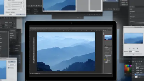
Now the other idea again is to always be thinking that none of these air standalone techniques so when you add that just malaria by nature initially unless you do something first it's going to assume you want this whole photograph to be affected if you know for example in this case might I want to do a couple things of this photo I can't get over how different it looks I keep looking back derek is on my photo it's like you can barely see any detail in the mountains at all so looking back there to make sure looks better so my first thought is I want the sky to be a little more noticeable. So as soon as in my mind soon as I say first I want to work on just the sky the phrase just the sky means selected first because if I had to just malaria it won't affect just this guy it'll affect everything and that's okay, I suppose I could add the justin layer and then mask it, but since the ability exists to mask first and adjust based on that especially when I see nice edges like this one the sky ...
it's not like it's all there's a bit of force going on for the most part it's a fairly clean edge, so in my mind the quick selection tool should probably do a pretty good job of that and just by quick drag I mean it's not perfect, but it's pretty darn good to begin with and then I could tweak it after so now I could for example, use one of the interesting adjust lairs is called grady and map and the great map adjust blair basically not a lot to it at first glance, but as you see, I should actually reset this for second this is what it normally looks like out of the boxes to siri's of great and someone was you'd be like, why on earth would I ever used the yellow to orange to purple to blue radiant? And the answer is hath no idea, but yeah, some of the so say some of the presets created for us by adobe just make you kind of go any who so I would use the black too transparent grady in't map and at first you see here it just looks like really bad and you like, why would I even do that? And that's? Because at first it's just doing this overall thing which is making everything like first just looks black and we haven't really talked too much about blend modes, but one of the powerful things about layers is using a blend mode to affect the way that a layer interacts with a different layer many people think of that as you know they put a photograph of a tree on top of the photograph something else and change the blend mode that theory also applies to adjustment layers so I take this adjustment layer I changed the blend mode to overlay look at the difference see how it just pulling out details just like that done anything I just said out of grand map changed over land is already better and because this command doesn't have a whole bunch of sliders that's basically it but one of the other things about blood modes is they're kind of they pile on each other so if I just take this adjustment layer and do the shortcut for duplicate commander control j now it's even more intense so I kind of said put two of them over laying on top of each other to get to the result that I want once I do that I start to see areas where the mask probably needs some help but that's okay, because aiken aiken tweet that the the one of the challenges with this type of adjusting layer is it's kind of all or nothing there's not like a lot of sliders you basically pick a grady int and then change the blend mode so in this case to me that's not enough I'd like a little more when I duplicated that's too much so then I just take this layer and lower the opacity of it say now it's sort of a one full overlay and kind of a partial overlay because of a capacity so in almost every circumstance and photoshopped there's a way to get to the end result might not be obvious at first, so if you have an adjustment with a whole bunch of sliders, the chances are you can move settings to get the effect you want. If in a case like this there really weren't a lot of they were just different options for ingredient and that's it that's what you get, then it's a combination of try a different blend mode and or lower the opacity. Okay, now in this particular case, if I were to notice, for example, over here I noticed that the mask didn't work so well because some of the overlay is sort of falling onto the rock there, I would just have to look at and say ok, so using the same theories of masking in this case, I don't want a soft edge brush because the edge of the rock is fairly hard, so we make better sense for me to pick a nice hard edge brush otherwise what would tend to happen you'd see just a tiny little kind of glow around that edge, so thie layer mask is white for the sky black for everything else, so that means I need to paint with black right so you take advantage of my pressure sensitivity now at first you're looking at it going well it's kind of working, but why isn't working completely that's because I have two versions of the same adjustment layer so what I have to do is fix the first mask and then once I'm finished, use our little trick option called copy and that's his replace their mask yes so I had when you adjust one layer mask it does not automatically update the other you must do that yourself good news is you can but at first that throws you off because you're painting on a mass going it's kind of working but why isn't it working completely that's? Because there's two of them I could have made life easier, I suppose by hiding like doing one of the time but I want you to see that that's a very common thing that half people's air like quite sure why he's not the kind of looked at the circumstance ago of us because there are two masks, so if I update one after then take the finished one and replace it on top of the other one. But again, that's that's not an uncommon situation for me is to say one adjusting layer of this nature is not quite enough, but duplicating it full out is too much so then lower the capacity to kind of get a happy medium so if you wanted to do something on the bottom so to speak could you duplicate that mask and inverted okay yes because ultimately a massive is black and white so if you decided exactly that that you wanted to affect the other part of the photo you would just say take that mastery their inverted then it will have the opposite of fact now adjustment layers by nature want affect every layer below in this case only have one but when you add a mask it kind of changes the effect because now it's only affecting certain area so for example, like I said, I'm on my monitor the mountains off to the right there are really dark like I don't see as much detail so here I would use the method I did a moment ago as they go into curves brighten up everything which is a little too much and then take this fill it with black go back to my white paint brush and now start kind of painting in so have a hard edge brush sorry about that start to pull out a bit more detail where I feel like it needs and I could paint on rocks and do anything I want and then saying theory go back and second now that I've seen that that's a little too much let's pull it back and probably do just a little feather on here is well so you can imagine that for it wouldn't be that unusual to have four or five adjusting layers built up affecting certain areas and the reason for doing that way is if you had one adjustment layer and tried to affect different areas differently than you'd be painting on the mask and different shades of white or gray and be a lot harder to say now is one headed this part again so I'd rather have separation to say and I might even I mean I can tell just by looking at it but I don't even label them mountains sky just so at a glance I'll know oh yeah that's the one I wanted to just for this purpose so that ability to be that specific and say on this photo and it could just be frankly just these four rocks out the bottom just think a little bit of a tweak it seems odd to say it but I'd rather have a full adjustment layer filled with black on the mask in a little bit of white because I know ultimately that's gonna get me way more options what I used to do anyone's ago before adjustment heirs were so cool is I'd actually select the rock duplicated and then use a blend motor try and lighten it which worked but a my selection wasn't perfect it looked a little funky and b if someone came back and said can you make it not quite so bright a sort of but not really and that was all I hated ever to have to answer to someone. No, I can't do that, and now I just say, yes, I can, for my minimum a charge of five hundred dollars. Now, I don't ever say that it's it's actually six hundred, but I'd much rather see that, you know, five adjusting layers each with their own mass, because it means I know I can get all that level of detail if, after all this I now decided, maybe I want a black and white after all, then I just make sure at the top of my stack is where I had the next adjustment layer, because I want to thank everything else, so I make sure I'm not down here, but up at the top and add my black and white. So now it's, they're all cumulative together. If I start going backwards, you can see if I hadn't done those other things. The black and white looks ok, but the skies kind of got nothing. So by doing this first already now the sky looks better and I pull this in. So this is an option which allows you to say, keep building up, but again, as I said multiple times, ultimately I still haven't really done anything to the photograph itself. This is all building on top of it, so at a certain point if I do all of this and go oh yeah, this is just not working it's okay? I just have to say, well, then don't show these and go back to the original one personally, I would be saving this as my ps defile so that I know for example, I could do a test print and say not sure let me tweet this adjust mayor okay, that's better and maybe at that point, I might save out a copy that's j peg to give to someone at least I know that way if there's anything I need to tweak or someone says, I love that, but because people tend to say that, but could you just tweet this or maybe it's your own work? And you look at on the wall every day and some point thing, I think I want to redo that because I want to tweet that a little more. Well, now you can, because you have all that about ability available I'm going to save this for future use because it occurred to me that this would be interesting to use later on when we talk about ah find the right folders, I know smart objects so that's foreshadowing that we'll talk, we'll use this again later on in an interesting way. Um okay, so questions so far we're good, we're good now that's kind of one level of adjustment of the other thing is sometimes it's just an easier way to do things when you're experimenting and trying to go, I'm not sure like maybe you're creating something and just trying to side about color. So, um, here's a very simple example I wantto start building something, so I'm thinking ok, on the left hand side of this, I'm just going toe create a selection and let's just fill it with blackness because it's there I don't really want a black I don't know what color actually want now I could use my color picker, choose a color and say phil, but every time I want to change it, every time I have to remake my selection, go back to the color picker pick a different colored shoes phil, which works but here's another example of thinking adjustment layer instead of thinking harder ways there's a very simple adjustment layer that's called solid color so long to do is keep my selection and then go back and choose solid color and choose a color and it's ready okay actually didn't really need this, I think about it, so basically I have ana justin layer that is in effect telling the entire document be read but because of that mass could say except for that half right so if I were to turn off the mass which I don't think I mentioned before shift clicking on the mask will hide it you can see technically it really is ah full layer filled with red but the mask is making it have the bread only visible on one side so why would I go to all that effort? Because now if I may be I have a co worker sitting next to me and we're tryingto decide on a color is of every time me having to go wait, what about this color? Pick it and then go phil an adjustment layer allows you to open the color picker but its life so as soon as I pick any color, see how it's constantly changing I don't have to go click ok phil click ok phil is just alive effect so as soon as I drag any color in here it's right away showing the the effect and that way it's much more interactive and someone could say, oh that's kind of what we had in mind there and then you click ok and like any adjustment layer just means for now that's the color until you change it to something else so even a simple matter of saying I just want to solid colored background it even makes sense to consider using the justin layer compared the alternative every time going color picker pick number click ok phil oops that was wrong and have to that over and over again this is like any kind of adjustment where you saw each one we've done so far curves hugh saturation et cetera when I moved a slider it was live and in in in instant this is the same thing you just have to again I use that phrase put on your photo stop thinking caps ago if I only want half of it to be color but I have to make a mask that hides the other half and as you're doing this if someone says yes but could you possibly instead of having just a rectangle what if it had a curve shape to it and first you go but then he's saying, well, I can't really want scrambled to yourself a little bit and then make a nice big oval now I have to think about this how would I show mohr of that color? I want to show more of it and right now the mask has a white stripe and a black stripe so I've made a selection but I want to this to be filled with the color so it means on the layer mask I fill it with white so that's kind of that the brain teaser you have to go through is kind of sometimes it's not completely intuitive but you sort of think through it go in our to show this adjustment which in this case happens to be just a solid color how would I do that? It comes back to what color is the mask so it's each case you can see it's the same thing and just sometimes you have to kind of step back and kind of think especially those ones where it's like black but to not show it you have to fill with black that that well that's why the biggest brain teaser people kind of go could see that look of but here I just look at the mask and say yep, that white area so if I do all that and then I decide it still needs some tweaking technically a layer mass like this is just a shape it's just some paint that I put on there so once again I could do free transform and say maybe it needs to be over here over the year appear whatever it is stretch it up like this get where that little weird knobby thing rotated a bit maybe not now there you go for all those times you desperately wanted to have a big rectangle with the curve thing on it but you get the idea so this kind of concept is that's probably the simplest form of adjusting layer on the surface but it's a very powerful one because it's all those little things adding up if you had toe add up the number of times if I said no let's now make it read I have to go low this election pick red click ok, phil, multiply that by experimenting for a few minutes. This to me is so much easier to say oh, look, there's a color right there I just double click and I could pick anything I want in one click and see it life especially in this case where I want to try a slightly different shade of blue maybe and I'm just dragging around till I go that's nice right about there that means for now that's its color in this case I did click ok, but it's okay to the color pick or not anyway, that's any permanent, the only way this would become permanent if wants to choose merge you know what we think about purging or flattening? We would not do it. So as long as I keep it like that. And this is the way that if I'm trying to build up some, we've been talking about photography all day, but I mean, if you're doing something more from a design percent maybe ultimate gonna put three photographs in front of this, as a little portfolio thing, that's still it an element that I want to be ableto edit. So rather than just saying, let me slap some paint on there and hope I like it, this is an easier way. I mean, you could still in the old way, there's the works, but I prefer this just because it's giving me way more options, questions about that? Well, good question, um, on adjustment layers, can you reorder the adjustment layers and do you have, ah, best practices of how you like to have things higher and lower? Well, the first question is, can you reorder? Yes, and depending on what they are, you may or may not see a difference, except for things like black and white, I would generally if I'm trying to say, convert the photo, black and white, I'd want that at the top and everything else in between, but in the other one's underneath, changing the order especially says if they have mass on them, you won't really see a big difference. Where you see the difference is if those air just players also have blend modes because then they're kind of multiplying on top of each other. I would say if I had to come up with a theory would be if I'm doing just layers that affect individual areas I have those at the bottom and I'm doing a global wanna have it at the top to make sure it covers all everything down we'll talk about an interesting little side note about adjusting layers by nature adjust layers automatically affect all layers below but there's a trick where you can say I want this adjustment on ly affect this one layer but we can't talk about that yet because that's clipping ok happy children yea so let's just look at some other adjustment layers and how we could start to play with some of these things so um there are some even though they're just blair's I would still not use so brightness and contrast it's not great as a regular adjustment it's not that much betters announcement here either, so even though it's there doesn't mean it's it's still better than the permanent brightness contrast but I'd use other ones instead but here's some interesting ones photo filter is interesting because it's a very subtle effect a lot of other justin layers you have to make it subtle by moving sliders. This one is kind of like when we put a filter on the front of our lens to say I wanted to be a warming filter, a cooling filter or polarized whatever it might be it doesn't dramatically change the photo it just makes a little adjustment that's what these do so for example, I just chose photo filter and it happened to default to the eighty five warming filter and if you look under the list these air all presets that come with it not ones that you create they're just all there some are related to actual real life camera filters others or just colors like orange yellow but when you choose this orange look what it did it's not like the whole photo is tented with orange but look at the sky see how it's changing a bit subtle but that's the point it's not like let me show you the difference is for the purpose of demonstration if I went to aa, hugh saturation went this and chose colorized now you see what's happening when you're adding a color is actually just saying tent the whole photograph that's huge saturation and that's in effect that might be usable for some purpose but it's saying I'm going take the entire photograph and attended with a color in effect sometimes honestly I still do this and then just lower the opacity to get the effect that I want because I find sometimes the photo filter is little too subtle and that's the beauty of having multiple choices so with photo filter you can see it's a lot more subtle you can push up this amount called density but it's still never going to get to the same over the top color tent there's a whole bunch of built in ones that air kind of interesting and all the people that love instagram alike. You look it's like instagram, which it kind of is or if you really want to, you could just say, I think I want just a color, and now you can go in and pick some color to say, I want to really cool is off or warm it up, or whatever it might be. So this is one of these where there's not a lot to it, but it's a very powerful one because by nature it's, much more subtle. So if you're tryingto say this want, that photo appears to be a little warmer instead of trying to do it some other way, we have to pull all kinds of sliders here. Do you just pick a warming filter and usually right away? Or, like that's? Pretty good. And if it's not if you look at and go that's a little much than your control well, there's two of them in the photo filter itself using the densities somewhere around the forty to fifty range. So it's pretty subtle, but if you really want to, even then you could still lower the opacity, and or if you decided that I want only the sky to be affected that's where you would create a layer mask on here so that that never changes you always have that other ability to say overall I like it but I don't like it as much there let me add a mask be between applying a filter here is opposed to adjusting thie color temperature well, the main difference is photoshopped certainly doesn't have like that color attempt like a white balance it's something that people been asking for, you know, light room camera, how just a white balance and where there actually is a color temperature setting this is the closest thing there is at the moment, so that's really the difference is personally if if I really was trying to just fix white balance, I would do it in light room or camera raw there this is more and I'm trying to create a look or in effect that's not really maybe necessarily eh? Technical temperatures I would like it to look warmer, so I'm just trying to visually say, you know, add some warmer tones to it the photo filter just had a dozen in a much more subtle level. Now the newer adjust blair that's kind of interesting and it's quite different because most other things have some options where you can say apply this setting and then tweak it this one I'm kind of intrigued by because it's just sort of well just does its thing and it's kind of interesting because it's called color look up and really it's just it's all presets there's nothing you khun enter in you just pick a preset and part of the fun is they have names like you're just like uh candlelight so let me just quickly make sure yeah turned off all the others so that's it you like it or you don't or you lower the opacity and or you changed the blend mode and or you paint on the mass we even know what the surface all and that's the reason I'm showing this it looks like you're kind of like eh? So what you're telling me is that just creates a look based on like some film look or something and you're like well at first but then once it's done, you still have blend modes you still have opacity shall have mass if you really decide you kind of like it but it's a little much you've been still tweak it, so this is fairly new I would say I can't member now but it's fairly recent that color look up just mayor came at the moment I mean where this is carefully as possible at the moment it is not possible for you to create your own look up adjustment layer at the moment who knows what might happen down the road who's to say, because that would be pretty cool if you could take a photograph. So I love that look, let me apply that look to another photograph by creating this thing called a color lookup table at the moment you can't do that, but maybe someday so it's an interesting one, because it just some of the effects are actually really interesting, and there some of them are very trendy and others are like, oh, that's emulating kodachrome something rather than a photographer look and see what love that? Because I remember used to do that with my film that I had or the way I developed it remember, at any given time, this is an important function is that you can have in this case I have three adjustment layers, one of which at first I thought, probably is going to do anything, but as I turn them all on or off, I'm seeing some different things happening now I would love it if there was a way where in effect, that could become a preset, like those three adjustment layers built that way, there isn't, but what you could do is save this document and just know that that set of three adjustment layers dragged onto another photograph would give you that effect. So unfortunate there's no pull down menu could just say save this but the nature of adjusting layers that it kind of does because that's what adjustments do so that if I know gosh, I love that I want to do that for ten other photographs at worst I'd have to take all three adjusting layers and dragged them onto a different photo so it's not quite as easy but it's still better than the alternative would be writing down all kinds of notes and trying to replicate it somehow so that's one of the advantages of this kind of concept ok, one of the interesting concepts of photoshopped that we're going toe maybe touch on here and there is one of my favorite parts of photo shop is the fact that brushes and photo shop are very powerful we barely touched on that when I was showing you painting on the mass with kind of weirdo brushes, but what's kind of really cool to me is you can make a brush out of anything that you can then use another perk for other purposes and it could be anything from anything could be a texture could be your copyright notice anything you want can be made into a brush and just to show you the basic principle of it, I'll just make a quick little brush here for the purpose of demonstration the way the brush concept works is whatever is black will be the brush whatever's white will be transparent anything gray will be somewhere in the middle kind of similar to to the hole that idea of a mass but as an example let's say all I wanted was I wanted to create a copyright brush or a signature brush or something like that so I just type here's a side tipped by the way when you're putting type on a white background, make sure type isn't white because it's just kind of hard to see if you're typing correctly or not on the wife photos up just doesn't know that I don't want white type on a white background I mean, come on so you got something that was bad that's a type here I need to make it small enough to see okay lovely, so I want that sorry can't do it I hate when I do type I can't stand when something is all that font is really weird because that copyright symbol should be centered and was up a bit, so I'm sorry I had to change that couldn't help myself um and there needs to be a bit more space here, okay, sorry so anything you want as a brush is based on this concept now a brush is not very re sizable, so ideally want our brush to be defined fairly large he's going always make a brush smaller but if you try and make it too much bigger it loses quality so I've picked a relatively good size brush for the purpose of demonstration first that's all I need to do and we'll get back to why it where adjustment layers coming in a minute so I wanted for those people haven't seen brush it before this is the basic concept of it so then just go under edit and shoes defined brush preset it'll look at whatever you have I don't have to select anything I didn't have to hide any like transparent layers just black on white it look at that and say ok whatever is black will be the brush whatever's white will be transparent if I wanted to I could call it something that's it now that I've done that that document is served its purpose I don't need any more now I'm over here and I saw they want to add my little copyright notice so I would add a layer just because we don't ever want it as we know paint directly on the background go to my brush tool pick the color that I want let's use black but then I go to this brush picker and this has not only all the standard brushes that are built in but weighed on the bottom here is the one that I just created and now I just position it and go click there's my copy right now so if you're every time wanted to add some text you're taking the type to ongoing this is the fourteenth time my tight this today that's the long way this will be much quicker so that's sort of a very quick overview of the concept of one of the reasons we define a brush is to save time like this. The other reason though, is just artistically if you're trying to create interesting border or you're trying to overlay a texture and make it look old fashion or just do something interesting it's definitely for anyone that does any kind of scrapbooking thing this is built for that because a lot of scrap booking is layering of things like culture montes and all these I don't what they call him but do dads and weak nuts so as an example I have some other brushes I've done previously which I can show you here for example uh this one this one so my dad used to collect old maps and I inherited a few of them and as a looking at them there was some really cool all the english lee latin type on it and because of the age of the map by nature was kind of faded out so I took a close up photo of it and then used in adjusting layer to make it black and white because by nature was kind of had different shades and then it's got all this cool writing so I just have a new layer and I put this on here and I click once and also I just got kind of a cool it doesn't matter that it's a little blurry because it's supposed to be old tax that I would probably go in and lower the opacity a little bit so it's not quite so obvious you know something like this or a blend mode or something but that's kind of the wedding brushes believe it could be a whole another and I have done a whole section on brushes before but that for those people haven't seen the principle of creating brushes that's kind of the idea so what else could we do a we could make anything into a brush this could be a brush I don't know why but it could so let's try it don't do anything it's open so I just go edit defined brush preset but before I do that let me remind you that the way this works is whatever is black is the brush whatever's white is transparent gray is somewhere in between this is a color photograph but we have to think of it as if it's shades of gray and when I look at it I don't see anything that's going to be jet black don't see anything is going to be pure white so that means by nature this brush is going to be a little unusual but that's ok that's that's the whole point, so I choose defined brush precept and have now got this weird, weird brush going on so let's see what that looks like? Whatever brought you to find, as always, the bottom of this list and now I've got this thing it's a little too small, so I'm used making my brush well bigger, I've still going on a separate layer now, here's, the way that brushwork is important to remember when you define a brush and paint with it, it paints with whatever you're foreground color is so I might have taken a color photograph and made a brush that becomes a grayscale brush that then paints with whatever color you have, so it won't be it's not like copping an entire photograph saying, let me take a grey scale version of this photo and then apply it based on the color of the brush, and sometimes, frankly, you have to try it and see, I have not done this before, so let's, just see if I paint with white it's so subtle I can barely see it, so that might not be the best choice. What if I switched to black that's kind of interesting to see by nature? It's already kind of semi see through because the brush itself was shades of gray. So in this case, I'm not sure that I'm sold on this as a brush, but it may just take changing a blend moto like, multiply and adding some mass or something, I don't know it has potential, I'm not sure yet, so because of that, it occurred to me that sometimes when I'm trying to create a particular look, I really would like the brush to be black or white is to define a brush of I want one hundred percent, you know, solid brush, it can't be shades of gray like this one. There's, actually, no way by nature, this is going to be solid anywhere, because there's nothing black in here, so one of the potential solutions is to use an adjustment layer of one type another. I could start off with black and white because right away, that's going to help me realize how this brush goingto be defying, because I can look at it now more in the context of a brush like black and white, and start moving sliders around to say, well, now I'm getting some darker spots here, and I'm getting some lighter ones there, so that be one option. The other one, which is a little more unusual, is there's an adjustment layer that until I sorry thing about this idea I honestly couldn't think of a reason why it ever use this adjustment layer because let me show you what it does first over here on this voter wrath and I think you'll agree you'll find absolutely no reason to ever actually hughes thiss except we're about to show you otherwise would be pointless but has called threshold with the threshold of justin layer says is that you remove everything except either a black pixel or white pixel yeah beautiful I mean I could imagine doing that all my photographs because it's so so lovely and the only thing you control is how much it goes so you can imagine I mean some people have figured out ways to do this and apply it a certain way but it's kind of odd because that's its function is to take out all shades and either give you a black picks or white pixel from a design graphic design standpoint something will use this to kind of create more stylized does not look photographic and they overlay it on top of a color or something. So you know, I can kind of see that but that's what it does it's a little odd then occurred to me when I'm making brushes especially for things like making a border on something or whatever I really wanted to be either black or white so here's how I would use it in this case is I would add a threshold adjustment layer and start playing around to see where am I getting some kind of text everything like a really like this part in here looks kind of interesting to me so I might take my one of my selection tools like the rectangular marquis tools I don't want the whole thing but I want like this area right here sorry tang gator markedly better I want that could be a nursing brush so when you this case to find a brushes and to find it based on how it looks right now including this weirdo adjustment layer so now when I define the brush so have to click on the image now my sample brush is gonna look like this and I'll just make a new document so you can see it I brush find that thing so it first it just looks like that you're kind of like gosh dave that's awesome I would love to have a brush like that because it's so cool well no but what you might use it for is something like this so here's something and didn't really talk about before things every so often important things change and photo shop like in the past if you wanted to do things to the background layer like adam ask you had used to have to unlock it now you can just add a mast to it and automatically is going toe do that so just election but I want to create interesting border effect on this so let me actually look at the mask so remember I used the adjustment layer to help create this kind of funky brush I take my brush tool black is my foreground color and I clique I'm not sure why I'm here you know just kind of as some of this along here now with brushes here's an interesting little fact because I defined the brush by making a selection that way that's the way I brush looks if I now want to go down the side of my border will it's not gonna work so this command over here allows me to change the angle of it here I'm doing this really fast just for the purpose of demonstration on lee now if I really wanted to get fancy I could occasionally come back and re adjust this adjustment layer and then make another brush out of something down here maybe it's even crazier this come back here my mask rush I'm the new one I just graded after all that then I get something that looks like this kind of an interesting start of a border mean it's it's they'll need some work but it's kind of interesting because it didn't exist a few minutes ago it's not like I went to some template and said let me use the existing border I've used a thousand times this is just me going you know what? That texture in that photograph is kind of interesting? Baidu threshold, it makes it more specific. You can adjust that slider to go where is a good point where I like the way it looks? Define that as a brush and by painting on the mask it means while it looks like I've altered the photograph it's still just a mask effects if I don't like it, I can always turn it off. And as we saw before, I could go into this by kind of like it. But I'm thinking it's, it's a little too structured. Maybe for this photo, I could still go into that feather command and just start making more subtle. I mean, just from this one thing, I could probably sit here for another twenty minutes and say, or I could try, I mean, it just that's what I love about this is it's, just the seat him and ideas. How could I make something that's unique? So I find a photograph that's got a little bit of texture to it use that threshold of justin layer knowing that I'm not firmly changing the photo, but is allowing me to go in and say, what can I pull out of this? As a result, I'm sure some of you have done the whole photo walk idea we're just a bunch of people go out and photo every so often people look at me very oddly because they're looking at all these artistic buildings I'm going to look at that gravel it's really cool because in my mind I think that could make a cool brush so I'm not saying I'm not taking that vote because I want to frame that I'm thinking for a photo shop perspective there's so much texture in there that could make a really cool brush that liked it then paint on a mass to create a need effect so when people in the restaurant I looked the proposal like just ignore these ones here that's just me doing brushed off they're like ok interesting but rush from like a pattern say like from stripes or ok or bubbles anything can be made into a brush if not that I would but I could make a brush out of one of these kidsfaces right? But the concept you have to always remember is I'm looking at a photograph of a face that I know was a face because there's flesh tone eventually it would be a great scale brush that would eventually take on my one four round color so for certain things while you can you might look at the end result kind of go ok but it's all possible to do that and I didn't cover every adjustment there, because a lot of them are just variations on the same theme. But as long as you remember the relationship between adjustment layer and later mask, and the fact that we sometimes if we double up the adjustment or make another copy and then lower the opacity and or changes the blend mode, you never have to feel like that's. Pretty good. But I wish it was more or less. The chances are. You can make it more or less by combining all of these property things, like feather and justin layers and opacity to get results that air never permanent and always reusable.
Class Materials
bonus material with purchase
Ratings and Reviews
a Creativelive Student
I enjoyed this class by Dave Cross. I like his method of teaching and found him very easy to follow and I learned lots of good tips on smart objects and working non destructively. I have just made the move from PS Elements to Photoshop CC 2014 so have lots to learn so I look forward to more from Dave in the future. Thanks Dave, I thoroughly enjoyed this class.
Roni Chas
DAVE CROSS IS AN EXCELLENT INSTRUCTOR. HE EXPLAINS TECHNIQUES SO THAT I CLEARLY UNDERSTAND WHAT HE IS DOING. I LOVE HIS TIPS, AND I LEARN SOMETHING EV!!ERY TIME I HEAR DAVE. I DID BUY THIS PROGRAM, I WANTED TO BE ABLE TO REVIEW IT AND GET IT ALL. I HAVE HEARD DAVE TEACH BEFORE AT NECCC CONFERENCE AND WAS SO HAPPY TO WATCH AND PURCHASE THIS COURSE. I CONSIDER MYSELF PROFICIENT IN PHOTOSHOP YET I CONTINUE TO LEARN NEW THINGS WATCHING DAVES PROGRAM! HUGE THANKS DAVE!!!
a Creativelive Student
Dave Cross is a wonderful instructor! He has a fantastic teaching style and has great mastery of his subjects!