Lesson Info
15. Adjust Color and Contrast in Photoshop
Lessons
Class Introduction
12:53 2What Is Low-Key Lighting?
11:11 3Bringing in the Subject
05:01 4Lighting Patterns
19:21 5Lighting Patterns: Broad vs. Short
09:25 6Giving Your Light a Job
12:07 7How to Create Separation
06:58 8Shoot: Putting it All Together
08:34Developing the Raw for Low-Key
12:40 10Enhance with Local Adjustments in Lightroom
12:31 11Creating Different Interpretations in Lightroom
16:19 12Clean Up Image in Photoshop
09:11 13Dodge and Burn in Photoshop
11:00 14Liquify in Photoshop
09:40 15Adjust Color and Contrast in Photoshop
11:17Lesson Info
Adjust Color and Contrast in Photoshop
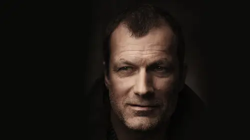
So we got to the liquefy. We're gonna do a little bit of a contrast and color adjustment here. One of my favorite ways to do this is using the selective color. Um, but I usually use selective color is way to balance the image. Some people will use it as a way to change the color in the image. I find that it's very effective as just a way to create balance and selective color is this last little adjustment layer down here and what it enables you to dio is to go into each of the individual color channels. And you can manipulate the rgb c m y que in all of them, and you can actually start to see colors within colors. So, for example, I'm in the Reds and there's probably be a little bit of reds in this and a little bit of yellows and not much else, so I don't really have to go through everything. I kind of show you how we can see that, which is just by changing this black cider, you can kind of see what information is in your image. So this is my red right? And so what I could basically go...
, and I could say, Do I want more science and the rents or more red in the reds? Or do I want more magenta or more green or more yellow are or not or whatever the case may be, and you can actually go through and you can. You can start toe work colors and color casts in or out of different subtle tones in the image. So I'm gonna kind of grabbed me yellows just to kind of show. There's there's my yellows and I use this really subtly. I actually will just look right at the image. I'm not even looking at the sliders, and I just go back and forth, back and forth until I'm happy with how it looks. But like I said, you're probably not going to see a whole lot of other colors in here. Others there's no greens and just like in light room, if you double click on the number, it will reset it of Scion's and there's no blues. It's it's all yellows and reds, but you also have whites, neutrals and blacks. I tend to not mess with the neutrals too much because it it could be a very aggressive change, but you can actually come through and you can kind of see that pop in the in the whites a little bit. So if you want to add that little bit of a glossy sheen, you can kind of just push that a little bit. You want to add a little bit of yellow to the highlights. You can do that. That's looking pretty good like that. I don't I don't like to mess with ease because it just turns it to too much. I love the selective color, but it's really a less is more kind of a situation now. I also made this whole thing about yellow. This is a good opportunity for May to come in. Encounter the yellow out of a place that I wouldn't want it like the shadows So opposite of yellow is blue rgb c m y que right r c g m b. Why, right, so the they're all opposites. Once additive once attractive, you want less yellow, you add blue, right? And so obviously this is this is too much again, this is a less is more situation where I'm probably not gonna add too much of any of these colors. I mean, I'm usually when I'm doing this. I'm right at the the one, the one value or even less. Sometimes you could see it. It's kind of a subtle, a subtle change. But what it ends up doing is removing that reddish color cast that I had in the image. And sometimes you'll refine this even further by lowering the capacity or creating masks upon this so you can great, very complex masks upon these selections to target very specific tonal ranges. Um, but that's looking pretty good to me. It's it's subtle. Now what I am going to do if I want to color grade the image, I'm gonna show you a very quick, very easy way to change the color in the contrast in your image that's gonna give you ah, whole lot of control and we're gonna do it with curves, two curves. We're gonna do one for tone, and we're gonna do one for color now. In truth, it doesn't matter what you use. All that matters is what your end results is what you want it to be. So if you want to use a curve, you want to use color balance if you want to use photo filters. Doesn't. Doesn't matter. It's all about what you do with the colors. Curbs could do pretty much anything, so I always think it's a really good tool to master, Um, but there are two tricks, but I think are really helpful when it comes to working on curves, and that is using blending modes to do so. Now. I'm gonna use tone here and let's say you want to come in and you want to add contrast to your image. Now, unfortunately, when you add contrast to your image, it messes with the color common problem, right. You make the s curve. It makes the skin look really orange. I like the contrast, but it looks orange. If you change the blend mode, toe luminosity, it will not apply color information. It will only apply tone information. And so it's gonna go from orange to the original color that it was meant to be. And I'm gonna exaggerate this a little bit more, so it's even easier to see. We see how orange it is, right? Super orange. I know. I'm gonna move it back to where it was that was a little bit of a better a better contrast. Um, go back to luminosity. That's looking good. Thank. And then over for color. I'm gonna do the same thing. But instead of putting it on luminosity, I'm gonna put it on color and that we defects the color information, but not the tone. Because sometimes you come into color and you start manipulating all of these individual colors, like for whatever, Whatever you want to make it. Um, So you want to come in here and you really want to put something really aggressive on it like this blue and yellow because that's, you know, common common color palette that's used. It's a little bit too heavy for me. I'm just exaggerating a little bit. But what ends up happening is your I've been exaggerated even more when you when you affect these endpoints of color, you're making it brighter or you're making it darker. But if you change this to color, it retains contrast. And so you're only affecting the color. I'm gonna dial this way way back. Um, now you can obviously come in here and you can make this a little bit more subtle, but this is kind of why the adjustments aren't really affecting my tonal range when I'm really massively moving it up and down. Whereas it would in, uh, if I just had this on normal. No, not so much in this particular case, Um, but what I'll do is I'll do, like I said, one on color, one on luminosity. And the more you play with this, you'll realise how effective that is at separating your adjustments out and and making it so you're only really affecting what you want to effect. And so this kind of brings us to this image, and I think it looks looks real good. Um, let's look at the before and after, which is Here's where we started. Here's where we ended so to kind of take you through that we started here, which again was are already developed image. We like that already. We came through. We cleaned it up skin global dodge and burn lightning up the eyes liquefy evening out the color that was very, very subtle. A little bit of contrast set to a luminosity blend mode. And then finally a little final color. And what I might do after this is prepare it for the Web. I know we talked about that a little bit earlier, so we're gonna go ahead and do that just toe, you know, get us all in the same place. And I'm basically I like to shave about five points off the output values of each. That's my personal way, a way to go about and usually what I'll do is all darken it down about five points as well, from the mid point. And that's that's a generic adjustment that I have found. That's very effective for me as someone that develops on a darker monitor, because I know it's gonna look good better on on a on a Web monitor, which is how most people are going to view it. And so it just becomes this very subtle little adjustment that kind of flattens the image out a little bit so that it's a little bit more friendly for through the for everyone else that views it not on a brink calibrated monitor. So that basically takes you, uh, all the way through it. And so if you want to kind of come through here and you really create that, you know that that map that Matt, look, this whole thing, this is where you want to do it in this step so that, um when you're ready, you just turn it off when you want to go to print, and it's good to go. So I noticed when you export that to photo shop, it was at 200 for the dress solution. Are you pretty much stuff into 40 now? I use traditionally from may I use 300 but I think if you're to 42 300 year, it's okay for printing. Okay? It depends how big you want to print it, obviously. But that also depends on the file. So yeah, I'm usually to 40 to 40 is what it defaults to. I mean, I set mind to 300 but And second question is, we're gonna add knowing stood up to this image. Yeah, you definitely can have noise to it. Um, you know, I talked about doing it on a 50% gray layer earlier where you just come in here. It's overlay noise. Add noise. Gazi in and monochromatic is what I use. I used causing a little bit bigger use monochromatic, because it's not weird colors and ah, this is kind of what it looks like up close. It's, you know, it's pretty subtle. You don't really see it from here, but I like it.
Ratings and Reviews
Brenda Pollock Smith
Thank you Chris Knight and Creative Live for another excellent class. I appreciate both the actual shooting and post instruction. Right before your eyes you will see how simple applications of light, shadow combined with post production can create gorgeous, dark images. Chris has a great relaxed manner, easy to follow while offering a ton of tips and tricks. I can hardly wait to try my hand at producing some hauntingly beautiful images like Chris.
a Creativelive Student
I don't have a ton of time to spare and largely catch segments of courses on short breaks. One of the things i like best about this course Chris's ability to communicate so effectively and efficiently. He covers a lot of ground in not a lot of time, but the course doesn't feel at all rushed. He's just a good speaker/instructor. One of the other reviewers mentioned that this instructor brings no ego to the stage, and I have to agree. He's a confident and competent instructor without being obnoxious. Rock solid course with terrific instruction. I will definitely check out more of Knight's classes.
a Creativelive Student
Truly amazing class. Chris taught me a few things, as well as providing a structure to organize (previously) disparate facts I already knew. Background is important: I have 40+ years of experience in photography, and I love (and shoot) Low Key Portraiture. I took Chris' class to keep current. Most of the information wasn't new to me, but I enjoyed Chris' tight, concise presentation and his organized approach to this subject. There is value to this. But I also learned a couple of really useful tricks from this class; things that I'll use. What's the value of that? Hard to know, but easily many, many times the cost of this exciting class. Well done, Chris! CL, please: more Chris Knight!!!
Student Work
Related Classes
Portrait Photography