Enhance with Local Adjustments in Lightroom
Lesson 10 from: Exploring Low-Key PortraitureChris Knight
Enhance with Local Adjustments in Lightroom
Lesson 10 from: Exploring Low-Key PortraitureChris Knight
Lesson Info
10. Enhance with Local Adjustments in Lightroom
Lessons
Class Introduction
12:53 2What Is Low-Key Lighting?
11:11 3Bringing in the Subject
05:01 4Lighting Patterns
19:21 5Lighting Patterns: Broad vs. Short
09:25 6Giving Your Light a Job
12:07 7How to Create Separation
06:58 8Shoot: Putting it All Together
08:34Developing the Raw for Low-Key
12:40 10Enhance with Local Adjustments in Lightroom
12:31 11Creating Different Interpretations in Lightroom
16:19 12Clean Up Image in Photoshop
09:11 13Dodge and Burn in Photoshop
11:00 14Liquify in Photoshop
09:40 15Adjust Color and Contrast in Photoshop
11:17Lesson Info
Enhance with Local Adjustments in Lightroom
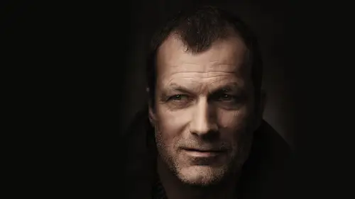
we're gonna take a look at this particular image, and this is the one we are going to develop. So all right, first thing I'm gonna do is I'm gonna address the overall exposure. Okay? So I want to make sure I kind of get it relatively close to where I want now. We used a light meter, so I know the exposure is actually gonna be pretty close to what I wanted to be. I may not be affecting this very much at all. You may not be affecting this very much at all. It totally depends on you. Now what I am looking for because this is a portrait is that one of the biggest things that I'm looking for in a developing image isn't paying attention to the skin, the luminosity of the skin and the color of the skin. You want to make sure you're not rendering someone a really unusual color. Skin tone is something called a memory color. And even though there are a wide range of skin tones all over the planet, when we're looking at something incorrect, we inherently know we're looking at something incorrect.
Whether it's got too much red or yellow or green. We know when it's wrong, and so I find that it's very important to try to hone this in the development process as much as I can, and I'm always paying attention to it in the post production process. If you are looking to drastically color, grade your image. If you want to create this visual fantasy, where everything has heavily toned colors to the highlights of the shadows. If you make your memory colors correct, it sells the illusion much more successfully. So if you notice in color grading and movies, you may have very unusual grades to the image. But like skin tones, for example, will always be rendered or almost always be rendered correct. Or maybe you've got a red stop sign or a school bus. Or, you know, if if you got on opening scene in the movie where they're going to the streets of New York and the yellow New York taxis are not that right color yellow. You're like, I don't something's not right. And so these are things that we grass is green skies are blue, and as soon as you start playing on those colors, what ends up happening is you start toe if you were No, they're looking at a visual fantasy, and so you have to decide which way you're going. Are you making something that looks true to human human perception or you trying to create a visual fantasy? What are you trying to dio now? We're going to try to create something that's relatively true to life here. So we are going to try to make his skin colors look Astrue. Life is possible now. One of my a few tricks that I have when it comes to developing the image is I actually like to bring the highlights up quite a bit. The reason I do this is because of how it manipulates the lit part of the face. No, the way the highlight slider works, and the way the shadow slider works is they control, contrast and your shadow and highlight regions of the image right? So if I and you'll see it right here and you'll see it right here, if I bring the highlights up, what it's doing is it's pushing my highlights closer to the white, which is lowering the contrast of that particular tonal range. If I bring it down. It's increasing the detail in that image. If I bring the shadows up, it's increasing the detail. If I bring it down, it's compressing the detail. It's gonna make the darks darker If I compress it, it's gonna make the lights lighter if I compress it right, so I know it is going to affect the overall exposure to my image. So it's something I definitely have to keep in the back of my head, so I may have to fix some other things. But when you compress the highlights, or when you compress the shadows, you're making less detail visible, right? So if I want to make skin look smoother, I compress it. If I want to make the skin look more textured, I stretch it out. Depends on what you're trying to achieve, right? So by bringing it down, I'm bringing out all of the grid and texture. By bringing it up, I'm compressing it together and making it look smoother. One is going to save you on the retouching time. The other is going to draw out more character to the face again. It depends on what you're trying to achieve. Okay, now, the caveat to bring up the highlights is usually it may make your image a little bit right. So all you gotta do is bring exposure down to compensate. That's one of the few tricks that I have when it comes to developing is that bring the highlights up, bring the overall exposure down and it's gonna make your skin look a little bit better so you can kind of see the before and after. Okay, there is without it. There's with it just kind of brings a little bit mawr creaminess to the light in the texture, the skin, but doesn't actually change the texture. It's all still there. Okay, so now we also are going Teoh. We could weaken play with the temperature if we want get different feels we can manipulate all of the tones here. Now what I want to make sure that I do is I want to make sure that I have a little bit of information happening here. It's pretty dark. It's a little bit more compressed here, but I mean, it's it's there a little bit, you know, So if we kind of pump it up, it's all there, right without too much too much noise. It's still in a pretty, pretty reasonable amount of it in the shadows up. I can start to bring it up a little bit, and I'm going to use these quipping guides just to stretch that information out. So I'm gonna bring the blacks down just to work it clips and then just about there, Okay? And that's looking pretty good. I think. Now the white balance you could decide. Do you want to go with something that feels cool? Something that feels warm? Member Earlier, I shot with a warm white balance. I regularly do this. I shoot with a very, very warm white balance. And then what I'll dio is because this looks terrible. Obviously, Um, when you you don't want to make your subjects look like they have John Dis, Um, we just bring the saturation down a little bit. And what that does is it starts to balance everything out so you can apply an overall color to your image and then dial the saturation back a little bit until it's a little bit more palatable. Now I'll basically take my vibrance and my saturation, and I'll kind of go back and forth until I'm happy with the result. Um, kind of something, something in this ballpark. I know that I've got a fair amount of flexibility with my white point, but I don't want to go crazy with it. It really depends on what I'm after. Visually kind of give you an idea where we started, where we were start to bring a little bit more information out of it. Now, this is gonna be a little bit friendlier to print. I know that it's still going to darken down a little bit, but it also depends on the screen that I'm looking on. Okay, So when you start to stretch your information out when you start to go pure black to pure white, lots of detail you're generally going to give yourself a pretty reasonable amount of contrast in the image. If you want that, great. If you don't want that, feel free to dial your saturation slider down a little bit as well. Also, when you're affecting your white balance, don't necessarily ignore your tent as well. The idea is I'm trying to balance out skin tone, so it feels to be the certain color that I want it to be. So I'll go back and forth messing with these two sliders between both of these and the vibrance and saturation until I'm happy with the result. So I do definitely go back and forth on it. Okay, We can kind of see the before and after side by side, and it's definitely starting to look and feel a little bit better now, the clarity we can choose to add now or later. I'm gonna add it later, and I'm going to show you why when we get to it. The reason is because it just I'm not loving its effect on the face. But I do like it down here. It just a little bit too much on the face. So I'm gonna leave it alone as is. I know some people like to use the tone curve. I'm not huge on the tone curve. I I definitely would prefer to use the sliders. They're more accurate and quicker for May, but some people do like the tone curve. I also tend to not do a lot of heavy color grading beyond white balance within light room. You can Some people like to do that, but I do find that it's one of those things that tends toe get manipulated a lot in the end. And I like to give myself the flexibility at the very end. So my general structure is developed. I bring it in. I will clean up and retouch things. We'll do a little skin work, Duma Dodge and Burn Duma liquefy. And then I save my tone in my color. For the end of those final adjustments, I basically worked clean the image up and get it to be what I want it to be before doing those final tonal adjustments. I'm getting it close like huge difference here in here. And I'm totally happy sending out a bunch of these to my perspective client saying, you know, be cleaned up a little bit and they're gonna be much happier with that result versus the other. And so that's that's kind of value of developing and then just being able to sink this across Ah, lot of different images. Now, down here under the H S, L I find that this is always a good place to tweak the skin tone if you need it to be. So we have the orange lighter in which we can change saturation. If you find that your hue is pushing one way or the other, you can change it. And then you could even come in here and make the skin tone brighter or darker. Based on luminous. Most people are going to be some combination of red, orange and yellow with orange being the primary mover on that slider. I'm actually pretty happy with it overall, but you can kind of see how even just changing the red can manipulate detail on the image. And depending upon the face, sometimes yellow does more. Yellow is really only affecting the background here in this particular image, oddly enough, doesn't really affect the face. But again, it depends on the person. Okay, and then I also like to do a little bit of pre sharpening Justo to make it extra sharp. Not a crazy amount, just just a little bit. I just turn it up a tiny, tiny bit, and I'm not gonna do any of these other things. Here is well now fun, little fat down here in the bottom right hand corner, The absolute last module. You'll notice there's a way to change profiles, and if you click on profile you'll see embedded in Adobe Standard and Defaults to Adobe Standard. And that's fine. But when I shoot, I shoot on natural and I actually like the way it renders colors, which is quite a bit different on my camera. That isn't Udobi standard. I don't know if you're shooting like Canada, an icon and urine portrait or landscape or whatever. The colors look different, and sometimes you just want to make it look that way without me having to fiddle with it too much. If you change it here, that's how you get it, and it will actually change the way it renders the colors. And it will give you a lot better interpretation of more accurate interpretation of the file that you saw in the back. Your camera. If you so choose, I use natural, and that's why that is, there
Ratings and Reviews
Brenda Pollock Smith
Thank you Chris Knight and Creative Live for another excellent class. I appreciate both the actual shooting and post instruction. Right before your eyes you will see how simple applications of light, shadow combined with post production can create gorgeous, dark images. Chris has a great relaxed manner, easy to follow while offering a ton of tips and tricks. I can hardly wait to try my hand at producing some hauntingly beautiful images like Chris.
a Creativelive Student
I don't have a ton of time to spare and largely catch segments of courses on short breaks. One of the things i like best about this course Chris's ability to communicate so effectively and efficiently. He covers a lot of ground in not a lot of time, but the course doesn't feel at all rushed. He's just a good speaker/instructor. One of the other reviewers mentioned that this instructor brings no ego to the stage, and I have to agree. He's a confident and competent instructor without being obnoxious. Rock solid course with terrific instruction. I will definitely check out more of Knight's classes.
jos riv
The detail and order in which the information for this class was presented was just perfect. It was like a perfectly prepared meal with each bite more delicious than the last. It had exactly what I needed to move forward with some of my techniques. So glad to have the class so I can enjoy/learn over and over.
Student Work
Related Classes
Portrait Photography