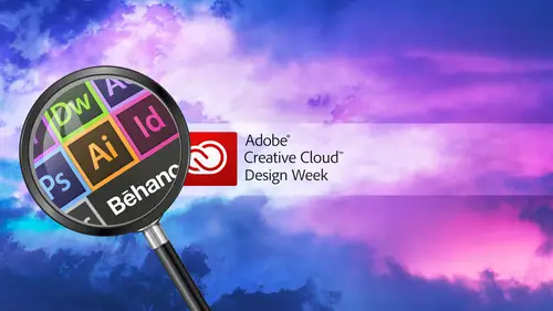
Extending Photoshop using Plug-Ins
Lesson 1 from: Extending Adobe® Photoshop® using Plug-InsBen Willmore
Extending Photoshop using Plug-Ins
Lesson 1 from: Extending Adobe® Photoshop® using Plug-InsBen Willmore
Lesson Info
1. Extending Photoshop using Plug-Ins
Lessons
Extending Photoshop using Plug-Ins
1:17:25Lesson Info
Extending Photoshop using Plug-Ins
we're going to be spending our time playing with plug ins and Photoshopped. So just in case you're not used to plug ins there things, we're gonna add the photo shop. They don't come with it. They don't ship with Photoshopped, so usually there's the things that either give for free or you purchase online, and then you have to run installer to get them to show up. You should be aware of a couple things when it comes to installing them with the newest version of federal shop. The newest version of Butter shop is called Photoshopped CC, which stands for Creative Cloud, and I'll be using that version. But nothing I do in general will need that version. Meaning anything I do could work with older versions of federal shop. But if you happen to run into a plug in that was released before Photoshopped Sisi was available, then usually they're installer won't know where to put the plug in in the proper spot, because usually it'll look for the queen to photo shop. CS six is Plug ins folder, and th...
at's where it's gonna try to install it and how I have no idea that there's such a thing. It's Photoshopped CC. So if you happen to be getting a plug in, that has been updated. For instance, I believe the ones from Nik Software, which has been been purchased by Google. I don't believe those have been updated yet, So the last time they came up with their installer was when Photoshopped CC didn't exist in, so it doesn't know how to install him properly. So if you ever get I plug in that somewhat older, you want to install it with photo shop. See, see if within the installer it ever asks you where to put it. Sometimes there is a little plus button at the bottom of your screen you can click on, and you can tell it an alternative location. And if that's available and you want to point it in your Applications folder, you're gonna find a folder called Photoshopped CC. Inside that folder will be a folder called Plug Ins, and if you pointed to that folder and install it, then if it's one that's compatible with photo shop CC, it should work fine. It's just sometimes you have to take that extra step because some of the plug in vendors haven't updated their installers. So what I'm gonna do is you could literally spend a week talking about plug ins. There are so many of them available and just so much you can do with them. And in fact, coming up on September 4th through the sixth, Jared plants gonna be here and he's gonna teach three full days on plug ins. So if he can teach three full days on this topic, there's only so much we can cover in an hour and 1/2. So what I'm gonna do is there are certain vendors that make plug ins that will make a large variety of them. And I'm gonna pick one from each of the main vendors that are out there and show you where I think they shine like their best plug in where if they have competitors for that particular plug in, I think they do it best. And these are the plug ins that I actually use. And I want to just show you how I think about them, how to use them and a few tips about the features and Photoshopped that could make them more useful. So you're not stuck with just what you get out of that plug in your able to be more versatile than that? Yeah, So let's just jump in and get started. So first I'm gonna talk about converting the black and white and I should mention, in general with the images that I'm gonna use I haven't worked with any of these images except for two of them that I looked at last night. But otherwise I want to work on images that I've never played with because I don't want to sit there and nowhere to move the sliders. I want to just have it flow. Let is, if I was suggesting these images right after they came off the camera, So let's take a look. So when converting the black and white first thing I'm going to do is just open an image that I'd like to convert I and in photo shop, you do have image adjustments. Black and white. You can try to convert to black and white in that way. Built in comes with Photoshopped. It's kind of nice. You have sliders for each color. Uh, and if you move the sliders towards the right, you'll brighten those particular colors moving full laughed will darken, and at the bottom there's a check box called tint You could turn on, and if you do, it will add color back into your picture. And you could pick the exact color you want from this little slider at the bottom until it how colorful it should be with the slider below that. That's what photo shop offers in general. But I find this to be so basic that I don't really enjoy using it, knowing that there's something that is so dramatically better that I almost never I'm in this atoll. So instead, what I do is I go to my filter menu in. I have installed software from Nick. Now there was a company called Nick Software. They were in San Diego that developed this software. They have since been purchased by Google, And so now, in order to get this, we need to get it through Google. But if you do a search on the Internet for Nick Software or Nick Photoshopped plug ins, you'll find the proper Web page to get them in for $149. You can get a whole package of plug ins in the plug ins you'll get is, there's one called HDR Effects Pro. There's another one called Silver Effects Pro, which is what I'm gonna be using. There's Nix sharpener, pro color effects, pro Visa define and all those things come for $ which is a pretty darn good deal. We're just gonna look at one of those right now, and that is the one that is called Silver Effects Pro, which is my favorite way of converting anything to black and white. So let's go to Silver Effects pro and see what we get when we first come into it. On the left side will be presets, and you have two different choices up there. You have a choice called custom, which is where you can store your own presets that you develop yourself and then the tab. Next. That says presets. And that's where the ones are that come with the program and in here you're just going to see your picture that had all these presets applied, and you can scroll through this list and click on each one, and it'll apply those settings and show it to you on the main image that's in the middle, and so I can go through here and just kind of click through these and see if I can find one. That I think looks pretty good for this image is a starting point in. Sometimes I'll find a preset where that's all I need. But most of the time I find that like to fine tune it quite a bit. But in the left other presets you can narrow down so you don't have such a long list. At the very top left, you can go to things that are what they call modern, classic vintage, that kind of effect. It's just going to narrow down How many of these you see? So once you started out with a preset, then over on the right side, we're gonna have a lot of stuff we can adjust. Let's take a look at each little section to see what's available with each of these sections. There's a little disclosure triangle to the left of each title that allow you to collapse down or expand each section. So I'm gonna go through one a time like this to show you what's available and show you how it's so much better than what's built into Photoshopped. So first off, we have a brightness slider here, and there's even a disclosure triangle next to the word brightness. So if you don't want a generic brightness slider that's gonna affect your entire picture like this one does, you could click on that little triangle. And now you would have separate control over your highlights in the image, your mid tones and your shadows so that you could end up coming in and fine tuning those particular areas. So if I needed more shadow detail, I could adjust my shadow slider, that kind of thing. If you collapse it down, you've got just one slider for overall brightness. Below that, we have contrast so I could get here, boost the contrast or bring it down to get a kind of a mellower look to the image. And it has a disclosure triangle as well, and I come in here and tell it to amplify the whites, meaning really make those white pop, or I can sell it to amplify the blacks, which means really make those areas pop. And I can also soften the image, which might be good if I have a portrait, possibly and I don't want it to look, to contrast and kind of harsh for skin, that type of stuff. Or I could just generically a just a single contrast slider so you don't have to dial down to the detail necessarily of each slider, but it's available. Below contrast, there's a slider for structure in structure is going to think about the fine details within your image. So if you have, let's say, would be the grain of the wood that would show up. Or if you have skin tones and probably the pores on the skin, it's the fine, small details within the image. And so if I bring this up, it could emphasize that Bring it down and it can soften it again. There's a triangle next to that where I can work on separately the highlights of the mid tones or the shadows, because maybe it's whatever's in the highlights that really needs the detail to come out. But what's in the shadows? It would be distracting to see the detail, and so you could find tune it individually for each area, which I think is an amazing amount of control. Um, I'm gonna go down here to the next section, though, to see what else we confined. Here. We can work on selective adjustments if I want to click on my image and work on a very specific area. Like if the bottom part of my photograph needs a different amount of contrast in the top, I can click on this icon and then click within my picture to define an area I'd like to work on. When I click there, there's a little slider next to where I click. If I pull on it, you'll see a circle that circle defines high large of an area that I might be working with, and I can click on the dot that I originally added to move it around to maybe limit this more to the bottom of the image. Then I have some sliders available. They have overall brightness slider, So if I wanted the bottom portion of the image to be a little darker or a little brighter, I could do that. I could also bump up the contrast or tone it down and other things. Structure is gonna bring out the fine details in the image, but being able to click on various areas to adjust them separately really gives you a lot of control. You can have more than one of these. They're just to button up here to add another one s. So you control all sorts of different areas in your image. You could work on, you know, five or six of them if you find you really need to. The one thing that I find to be more useful for with this is a couple things first off. Sometimes I can't get one of these applications to fill large enough area in this particular image. I could do pretty good and get to the bottom of the image, but sometimes they needed over a wider expanse. Let's say it's a sky and I have a panorama. Well, I might be able to define the left side of the panorama sky and darken it, but then it's hard to get the right side with a single adjustment. Well, if you have one of these, you can hold on the option key, which is Alton Windows, and then drag the dot that you've added somewhere else and you'll be moving a copy of it. So now you have to then have the exact same adjustment, and therefore you get it to apply to a larger area. The other thing you can do is if you want to see really where you're adjusting your picture, because seeing just a little circle when you move one little slider is not really enough to know what's being affected. On the left side of my screen, you're gonna find a list of each one of those control points you've added, and over here there's a little empty area. And if I click in that area, it should show me visually what part of the image would be changed. Any part that is whites is going to be changed. It's gonna get the main change, and as you see shades of gray, it's gonna get less and less of a change in wherever you see black, it will get no change, and so you can turn that on for each one of these control points to see what part of the image you're working on. And you can also keep that on when you come over here and try to adjust the size and see it change. How much of the images being worked on and so I find this little check boxes to be overly useful. There's actually a whole bunch of stuff you can do with these things. The control points. But I don't want to spend too much time on. If you want to see what a particular section of adjustments is doing, there's a check box next to each section. I can turn it off and then you'll see what it would look like had I not use those settings. Turn it back on and you see the result of those settings so you can see it quick before and after for each particular area. The next section that we have in here is color filter, and if you are taking a black and white photograph using film and a camera, you could put different colored filters in front of lens of the camera, and it would absorb certain color spectrums from within. The image like you could use one that would absorb the blue colors in the image to darken your sky and that type of thing. And you can simulate the same kind of effect here by clicking on these little icons. If I click on H one, you'll see the image change in different colors within the image will be suddenly become darker, as it would usually absorb the color of light that was in those particular areas. So if you're used to putting colored filters in front of lens of your camera when shooting black and white, you can simulate us the similar feeling here. Or if these little presets here are not good enough for you, you could come down here below and choose an exact color instead of the preset that is here. You can also simulate various film types. If you're used to shooting black and white film, then we have this area called film types, and there's a little menu that we can come in and say I want to simulate the look of one particular brand of film that I was used to shooting back when I shot film, which is really nice if you're used to do it. Traditionally, with film otherwise trying to reproduce look that you've done for decades. Using all these sliders would take you quite a bit of time, but here it's gonna give you similar contrast of of the different film types that used to be able to work with. It's been quite a long time since I've shot film, though I've been digital since. I can't remember when long enough where I don't remember what these different film types of the characteristics of them. But if that's where you're coming from, it can be really nice. Below that, we have more. We have grain because often times when you have a black and white image especially printed traditionally, you'd have some grain to the paper, the printing process, and you can end up coming in here and adjusting it Now. When you do this, though, in order to really see the grain, you're not going to see it. When you're viewing your image it full size, you really need to be able to zoom up on your picture so the bottom of your screen there's a choice. It says Loop and hissed a gram, and if I click on that little triangle here, you can see a zoomed up version of your picture in the upper right of it. There will be a little pin, and that's gonna lock the position. You can click on that pin and then move over your picture and decide which area of your image is the best to be evaluating. When you're adjusting it, then I'll click. And I have, in essence, pinned this view so it sticks to that spot. So what I done there is, if you look closely at this in the upper right, there's something that looks kind of like a thumbtack. I clicked on that in that made it. So when I move my mouse over my picture, it's changing the view based on where my mouse is. Once I found the area I thought was best to look at, I just click the mouse, and that's what pinned it there. So it stays in that particular location if I click. And now this is what I would end up looking at while I adjust the grain settings because it's really hard to see the grain when you're zoomed out. You can have more contrast grain if you turn this up. Less contrast grain, if you turn it down with that and this grain per pixel is what's going to control how prominent the grain is. As you bring it down lower and lower, you're going to see more and more of the grain showing up you'll see it mainly in a little preview in the lower right of my screen. Once I get the amount that I might like in the image, then I'm gonna come over here and see if I like the contrast your version of it. We're all a bit softer version, so grain could be nice. Uh, weren't Some people want to really clean looking image, and so they'll stay away from that completely. Just turn the grain per pixel setting all the way up. And then you won't notice the grain anymore Or turn off the check box next to this section so you can see what it looks like without that sensitivity. This is similar to what photo shop offered. Remember, with photo shop. We just had a slider for each of the main colors. And then we had one thing to tent it. Well, we do have that here, So if there's any particular color within your image that you need to find Tune, you could do it here. And it might be difficult, though, to figure out exactly what colors were within the image. So in the upper left of my screen, there are three choices for how Teoh view your image in one of those choices is a split preview, and we can see them side by side as well. So if you want to be able to see what you're doing with this, like before and after, you can accomplish that. But if I come in here and move these sliders, I confined. Seen what used to be read. Make it darker by Movinto left lighter by moving it to the right, insane with all the other colors that are in here to really fine tune what we're getting then finally, if you want to apply levels or curves, the three sliders of the bottom are equivalent to what you would find in the level style Ugg box and photo shop. And then we'll diagonal line up here is equivalent to curves and photo shop. If you happen to know how to use them, you could use that to further tweak your image. The main thing that I would do with this is down here at the bottom. You have the choice of either viewing a loop or a hist a gram, So if you're not working with the grain settings where you really needed to be able to see the real fine pixels within the image, you can instead click on the word hissed a gram. So if I zoom up here, Mr Graham, it is gonna give you a bar chart of the end result of what you have. And in here, if you look at it, if you happen to notice a gap on the right or the left side's where doesn't extend all the way across, then you could come in here and pull in the slider on the lower left, and this is gonna force more and more areas to solid black within your picture. If there was a gap on the far left of your history, Graham, you could bring this up because the gap would indicate you have no black in your picture. If this history and goes all the way to the left, then you have black in your image. If there's a gap there, you don't. Instead, the darkest part of your image might be 95% gray, 90% or something similar, and I usually like to have a small area of black of my picture so I could bring that in to get an area of black. With this image, we already have black. If there's a gap on the right side instead, then that means you have no white in your picture, and I could bring in the slider that's on the bottom right of that curve, and that's gonna force more and more areas within my picture toe white and I would bring it in until there's no longer a gap on the end of that bar chart and see if it helps the picture. Just be careful if you bring it beyond that so that the history ram touches the edge and then you keep going, you're gonna find that you develop a spike on the end, were suddenly you'll see a little tall portion, and that means you have a large area of solid white within your picture, and that means you have no highlight detail. That's fine. If you have, like the noonday sun up in the sky, you wouldn't expect to have detail there. But in most other images, unless it's what's known as a speculative highlight, which is Ah, highlights so bright you wouldn't want to look at it directly with your eyes like the noonday sun or the noonday sun reflecting off of water, glass, chrome, that kind of stuff. Usually I want to maintain detail in it, and so I would usually try to avoid a big spike. So there's levels and curves then below that we have finishing adjustments. And you remember when we converted something a black and white using Futter shop, we had just one little check box called tint and that forced some color back into our image. Well, in here, what we have are some presets, and if I just click on this little hair on the right side next to the word toning, we'll get a little drop down, and if I don't click on them instead, I just hover over them. My image will change to preview all these different toning effects, which is going to give you a slight, warm or cool tone to your picture, which can look rather nice. So just mouse over them all and see which one you think is most appropriate for that particular image and just click when you find the one you like. If you want to find, tune it so you're not just using the preset. There is a little disclosure triangle right next to the word toning right here. If you click on it, it's gonna expand. And you're gonna have choices in here for the overall strength of the effects. If you want to tone it down as a whole to make it less colorful, you could do it here, where you're gonna have choices for the silver Hugh in the paper. You. It's thinking about mawr of traditional printing, the terminology it's using. But the paper Hugh will control the bright parts of your picture. So just so you can see it, I'll turn up this setting here so you can see the color really being pushed into the image and the paper he was controlling. The bright part of the image, the silver Hugh is controlling the dark part of the image. So if I put this to a different color and I start boosting it up, you'll find that this one is controlling the dark area. I'm just doing this to exaggerate what's going on so doesn't necessarily look good, but I would usually come in here, choose from one of the presets. If I happen to find I need to find Tune it a little bit. Here's where I could say, Hey, make the highlights a little bit more colorful by bringing up the paper toning or make the shadows a little more colorful by bringing it up. Balance controls. Where dues the highlights end in the shadows. Begin eso if you find that the color that's being applied to the dark portion of the image is applying too much to the images a hole. You could move the balance slider, and it's going to change what it considers to be a shadow in what it considers to be a highlight. So the shadows, how far into the image do they extend eyes Kind of what balance is controlling. But if you don't want to deal with all the settings, that's why you got the preset sitting here. So it's one of those things where you can stay nice and simple with this program, where just don't expand all those little disclosure triangles and instead use the basic setting. Once you get used to the basic basic settings, then consider hitting the disclosure triangle and really fine tuning how it's being applied. You also the choice of vignette, and that is gonna allow you to dark in the edge of your photograph were to lighten it, depending on what you want to do. But if I come over here and mouse over these, you'll find it darkening or lightening the edges. Lightning the edges is usually to compensate for a lens that you might end up using where your lens doesn't deliver as much like the edges of the photo as it does the middle, and you want to even it out, and so you can try to compensate for it here. Or you can end up darkening the edges of your image. In the idea, there is your eyes usually drawn to the bright portions of an image. So by darkening the edges, you're gonna try to keep your eye away from the edges of the picture and more towards the middle. And as with most things in here, there's a little disclosure triangle. If I click on it, we'll have additional settings. Amount is going to control how dark or how bright that edge is gonna become. Size is going to determine how much it encroaches in towards the middle of the picture in circle vs Rectangle is gonna control the shape. So if you go towards rectangle, you get more of a rounded corner rectangle effect, and as you go towards circle, it just becomes more curved overall. But in general, with this, I would start off with one of the presets, and only if you find the preset to be a little too brighter dark, where its shape to be a little bit different than what you'd like. Would I expand it and start going in there and find tuning it? There's also a choice called burn edges, and this is going to darken the edges, your picture. But unlike the choice called Vignette, it doesn't have to be in a circular shape, and you can do it to just one edge if you'd like. If I expand this, let's say it's the bottom edge, my photograph where I just find this a little too bright, and I'd like it to be pretty darn dark at the bottom. Well, there are some icons here which indicate which edge you might want to darken. This would be the left edge, top right edge and bottom. So if I click on the icon for the bottom edge now, it's gonna think about darkening the bottom edge. My picture, the strength slider controls how much it's going to darken it. So if you watch the very bottom line image when I bring this up, you see the bottom edge getting a bit darker. Then the size is going to control how far up the image that darkening effect extends. Then transition is going to control this shape. How irregular is that transition? If I bring that up in this image, it will be a little bit more difficult to see. But it's gonna instead of being a straight line, it will be a little bit more irregular, which can be nice. And you can do this to more than one edge of your photograph because all you need to do is after you have darkened the bottom portion of your picture. Just click on another one of these icons and move it sliders as well. You can adjust all four these settings if you'd like. In this case, I just want the bottom edge of my picture, and I don't want it quite be that dark. Finally, when you're done with that, you have image, borders, and with their we have presets again, and here they just have a generic names. But all you have to his mouse over them to get a preview. So now, instead of getting a completely square edge, we're going to get a little more customized and a little more of an effect on the edge to paint on which ones of these we choose. I'm gonna go for one of those. Let's see, sometimes hard to decide. And then after you've chosen one, of course, you can expand the settings and you can control the size, which is how far in towards your image does that edge extend? You have the spread, which is usually how much black is in the edge before it fades out. If you can see it on the if you look at the very top of the picture and then how clean oven edge you want. If you bring it down to clean, it'll be a relatively straight edge. If you bring it up to rough, it's gonna vary a lot more on the the edge with that that once you've spent all the time to come in here and, you know, do all this you saw the stuff we went through, I would not want to go through all those settings again. In fact, most of the time I don't most the time I start with a preset. I simply apply the preset, and I look at what particular qualities don't I like about the preset? And those are the only areas I go to when that really long list of settings, so it doesn't usually end up taking as long as it's taken me right now. Instead, I click through the presets. Couple times might take me about five tries before I find one I think is a good starting point. And then I just look at it and say, Is there something wrong with the global look of my image, like too bright, too much contrast? If so, I go right into that area. Where do I need to work on a very selective area like just somebody's face? Because it's a little wrong. Then I add those little control points. Where do I want to change the way the border effect looks? Or maybe add one if it didn't have one to begin with, so that's how I can end up doing this now. Once you've applied this to an image in the lower left of your screen is a button. The button is labeled add preset. And so if I click that button now, I can give this a name. Just call it creative lives. So I remember when I made it click OK, and now I'm gonna find that if I go over to the custom choice in the upper left of my screen of the choice of presets, who's gonna list them all or custom? And there's my one creativelive one. And so these are all presets that I've created. And so if I click between them, I can see the various looks I get. And so what I end up usually doing is maybe creating a dozen of these presets for the kinds of looks that I like. And then, after clicking on one to apply it, I'll probably come in and do maybe the selective color filter, one of the others to find tune it for this specific image. In that way, you can go much faster through this, and you don't have to deal with every single setting. This there makes sense. So I know in this particular filter, there is a Brazilian settings that air there. I want to make sure you got a sense for what they dio. But remember, in the end, it's the presets where you start. And then it's only those things that you don't like about the preset that you end up diving in and making changes with. No. When you're done with this in the bottom right, I can cancel. If I think I really didn't improve the image or click OK, it's going to apply it. And then in this particular case, it's going to duplicate the layer so that it does not harm the original and then apply it. There is a way where I can have this applied directly to the layer itself and make it so I can easily make changes later on. I'll cover that in a moment. But first, is there any general questions about what we've been doing? Guys here or over on the Interwebs? There's a few from the Internet already this morning there were some great questions coming and kind of just going from the beginning of this segment, you can let us know from Annette de in Palm Beach. She's been watching all week. Thanks, Annette. In terms of the order of processing, is it better to use a photo shop? Curves a judge adjustment prior to using Nick or after? What I would say is, if you're gonna convert image to black and white, I think about curves mawr after or in nick. But the adjustments that would end up doing beforehand before converting a black of white would be color correction, even though you're going to remove all the color in the image. If you haven't color, corrected your photograph and you have a color cast. Your image as a whole might look to yellow or two blue or to some other color. But any time that happens, all the colors start to look the same. And if you color, correct the image, you really get the individual colors in the image to separate better. And so when you're in the Knicks software any other software and you try to target individual colors, it's gonna be much more effective. If you color corrected your picture. You might also want to amp up the colors. So, for instance, if I had an image that looked like this one, which the colors just aren't all that colorful. I might want to come in here, go to hue and saturation or to a vibrant adjustment and crank up the saturation. So there's better separation between those colors because then you're gonna find that the choices you have within the Knicks software will be more effective. They'll be able to tell the difference between the colors more so color correction and maybe boosting the saturation first. But curves is something that either do you while I'm in the nick plug in or after I'm done. One more question from creative love. Can Knicks over effects be applied as a smart object? Yes, it can. So before I end up applying that, what I would usually do is before going into the filter, just go to the filter menu. There's a choice called Convert for Smart Filters, and if I end up choosing that clicking on OK, you're gonna find if you look in the layers panel that you have an extra icon on top of that layer. That means that the layers of smart object and that means the original contents of the layer will be protected so you could always get back to it. you could always make changes to the original contents and any changes you make to the original contents the filter would reapply to. So if I did, retouching to the original contents that removes something in the filter will reapply to that that kind of thing. But you convert to a smart object by going to the filter menu. There's a choice called Convert for Smart Filters. I've already done it. So it's great out here. Then, if I come down here to Nick Silver Effects Pro when I click the OK button. And in this case I'm just gonna choose a preset find when I like, Let's do that one. No, that one click. OK, and now it should be applied directly to the smart object where it will just kind of be an accessory to the layer where I could turn off the little eyeball next to the name of the filter and you'd see the original picture. So if I come over here, here's my smart object. Below that, it says solar effects pro. And if I click on the eyeball next to it, it should show me what the image looked like without the filter turning back on it, and it will show me what it looks like afterwards, although it can take a little while for it to apply. But, yeah, it could be done to a smart object. Alright, Creative cloud is new to a lot of us there and plug ins. Of course, we're familiar with those, but are plug ins are installed differently on Creative Cloud and no on traditional Photoshopped know pretty much where photo shop is stored on your hard drive. There's just a folder for that version of photo Shop. Within that folder is a folder called Plug Ins, and that's where the plug ins go now. As I mentioned earlier, if you have a plug in that was introduced before Photoshopped Sisi was released, then it might not be aware that the folder is called Photo Shop Sisi, where you find plug ins. So you might have to either manually install them into that folder because the installer wasn't smart enough to know war in your installer, there might be a little plus sign when it asked you where to install it. You hit the plus sign and you feed it that folder to say Go put it here now. There are a few other changes they've made in photo shop over the last few years, one of which is they change the program from what was known as to bet to something known a 64 bits. Just a technical thing they did behind the scenes. And what it did is it allowed Photoshopped address more memory before it was limited? I don't know. I think it might have been four gigabytes of memory. And once they've converted over to 64 bit, it's Utkan address. A ridiculous amount of memory. But in the process of doing that, any plug ins had to be reprogrammed a little bit to make them work in 64 bit mode. So if you happen to have any old plug ins meaning plug ins that you bought five years ago, they might not work with modern versions of photo shop Because of that technical change they made and you would have to get an updated version of the plug ins. That's what's known a 64 bit compatible. It's a technical thing you don't want to deal with, but they made a change. It's a change we like because it could work with more memory, but it broke some of the old plug ins. So hopefully the companies are still in business and will update software maintenance. Yeah. Yeah, If I am in light room and I say edit, input a shop Does this plug in work when I'm doing the head in light room, editing it in photo shop? Yeah. If you have something on image and light room and you go to the photo menu, choose edit in. So you want to edit in photo shop? You can use any of these filters you'd like, and then when you're done, just type command s or control us and windows to save it will save it on your hard driving in reimported in the light room so you would see the end result of this. Also, many of these plug ins will be available as a standalone program where you actually don't even need Photoshopped. Instead, if you install the plug in a part of the plug in in light room, you could instead tell it to go edit this image in the plug in, and it would run as a standalone program where you don't need to own photo shop, and when it's done, it would save it back into the light room folder. Now that's only some of these plug ins. Not all of them will be able to do that. But it's a nice thing if if you want to look into it, see if it can do that right. I think we're good to move onto good the next thing. So a couple other things now, when I'm done and I've done, especially if I've done it to a smart object, I don't always just accept the end result. There's a couple changes I sometimes make. For instance, in this image, which is image of some temples. I want to bring some of the original color back, but on Lee, where the temples are on Lee, a hint of it. So what I can do is if I applied it to a smart object in here, it's gonna have this little guy right here say smart filters into the left of it is a little rectangular thing that is a mask. If I click on that so it's corners are highlighted, then I can grab my paintbrush tool. And if I were to paint with black anywhere. When I paint with black, it would remove the effect for my image. So if I just paint like this, this is the original picture coming through. You see the original, and if I choose on do I don't want to bring it all the way back. I want to bring maybe 40% 50% of the original color back in. So at the top of my screen is a setting called opacity. And I'm just gonna bring that at setting down. If you use the number keys on your keyboard, just press five to get 50% 3 you get 30%. You can dial in the percentage you want. I'm gonna bring back 40% and all I'm gonna do is come in here with a brush and I just need to make sure I'm painting with black, and I'm just gonna paint where the temples are. And can you see a hint of the original color showing through this black and white look and that therefore, I'm not gonna get such a generic black and white. Instead, little hinting the original colors coming in, do the same thing to the other temple. You gotta be careful, though, if you're working at 40% opacity. If you release your mouse button and you click again in your second post, your second paint stroke overlaps your first. It's going to double up the effect, so I'll do that somewhere. Here. Let's say I was painting up here and I extended down to where I overlapped with Same up here. Just gonna overlap where I've already painted and you might not be able to tell in the picture. But I'll show you how you can really tell. Look in my layers panel. Do you see the gray that's in there? That's 40% Greg. That was painting with 40% opacity. And can you see where the very tip and the bottom kind of overlap? There's a slightly darker area. You can kind of see it a little bit in that preview. Well, if you want to view that full screen, just hold on the option key all time windows and click on it. You're going to see it on your main screen, and you can see where I overlapped my pay strokes. It doubled up, so sometimes we all need to do is once I'm done only to find tune things. And the way I find tune things is I take the opacity and I bring it up to and then whenever you paint, usually a paint with your foreground color. But if you'd rather paint with a color that's in your picture in the mask that's here, you can hold down the option key, which is all time windows and click, and you're just gonna grab the color that's underneath your mouse to paint with. So I just grabbed this color, and if my capacity is at 100 that means I'm going to apply 100% of that. And I could come up here just kind of clean up that area where the two things overlapped. This could also be nice if I want to fill in any gaps that I find in my paint strokes like the one that's right here. Eso the way I viewed that mask is the same method I'm gonna use to stop feeling the mask. And then I still hold on the option key Alton windows and click on the Mask thumb now in my layers panel. But now I can see with a little bit of that color showing through if you want to see before and after you can disable. The mask is well so you can see what it looked like with the effect applied at full strength. To disable the mass called on your shift key and click anywhere within the mask. Here it ISS with just the filter itself, and here it is, with just a little hint in the original color showing through. I didn't mean to double click that open this little dialogue, but shift clicking will disable it, so that's how I often find. Tune it after using silver effects. Pro. Bring just a hint of the original colors back through, and I often prefer that depends on the image, though. All right, let's move on from converting to black and white to doing other stuff. Another filter that I use is from a company that is called on one software in on one software has something called perfect effects, for That's the filter I'm going to use now on one software, just like Nick, Software has taken a bunch of filters that they have available and bundled them together for one price, and they charge $199 for their suite of plug ins. And for that you get one called perfect Focus. You get one called. I won't remember all the names. Perfect effects. But there's probably about five filters that you get in that package. Just like what the Knicks software is done and packaged all there's together, I'm just going to show you one. It's called perfect effects for, and I have not adjusted any of these images before, so I have no idea what I'm gonna get. Usually, I would optimize the image as much as I can. Using Adobe Camera raw first to get the most out of the image and then do this is an after step in. In fact, if you start off with a raw file, here's a trick. When you double click on a raw file, it'll open it in camera raw, and you know how we convert things, too. Smart objects before you apply a filter, there's a way to convert it to a smart object right here and came a wrong in camera. Look at the bottom of my screen bottom right there's a button that's blue, it says. Open image. That's how you usually open your file? Well, if you hold down the shift key, it will change from open image to open object, which means it's gonna open this as a smart object. So it's already going to be a smart object, ready to have a filter applied. And so I'm just holding shift down open object by looking my layers palette. I see that extra icon and top of the layer telling me it's a smart object, and that means any filter that I happen to apply to it is just gonna be a setting. I could turn off by turning off a little eyeball, and I also have a mask that I could paint on just like I did when we converted to black and White. So now I'm gonna go to There's a couple different ways of getting the filters I should mention in on one. Software has chosen kind of a different route for this. If I go to the filter menu, I don't see the choice of on one down here. That's usually where you'd find your filters. The ones that you've added manually would be down here at the bottom on. One has chosen to do it in a different way. There's two ways to access their filters once you have them installed. Want us to go to the window menu in under a choice called extensions? You're going to find the choice of on one that is gonna cause a little icon on the side of my screen to show up this little icon. If you look at it looks like a Lego brick inside of a folder, and that's supposed to mean a plug in. If I click it, I can show or hide this little panel, and this gives you a list of the programs that come in the on one sweet to programs For $199. You get all these. I can click on one of the EU's I'm gonna use perfect effects for to access it or instead, take me a second just launched the other method. When we go back to photo shop click Cancel here is sometimes you'll find that this doesn't install correctly, especially in front of Shops CC. You might need the newest version of the plug in to get her toe work. If you have the old version installed, this might show up with nothing listed, it'll just say reset at the bottom with nothing here. If that's the case, get the newest version of the plug in and reinstall it or go to the file menu. And there's a choice called automate in. This is where you'll also find the same filters. So if you have the older version, you have Photoshopped CC and you find it's just not showing up in that little side menu. Then go to the file menu, choose automate and you can get to adhere to. Then I have to ask their Did you take that picture? Thanks. This picture was taken in Iceland. I've been to Iceland many, many times. It's one of my favorite places to go and visit, and that's why it was taking. You want to see a lot more images that I've shot in Iceland? I have a full gallery of them To get to them, easily, visit a website called the best of ben dot com and then look for Iceland. Okay, great. Thanks. If you ever going to Europe, consider connecting through Iceland. Sometimes it's cheaper, and then you can just lay over and spend some extra time there. So sometimes I'm just not sure what an image needs. I look at the image and I'm like I like the raw material I have. I mean, I like this curve in the river like the The mountains are like horses at the bottom. That's what those little dark things are in all that. But I just don't know what it needs to make it look great. So over here, when I'm in perfect effects, I had a list of different effects I can have. For instance, I can have Borders. Let's say I think this just needs a particular kind of border. We'll click on this choice called Borders Simple, and I'm going to see a preview of what various borders would look like on my image, and I can click on them to preview mum on the center screen, and I might come in here and say, I like one of these particular borders. If we can find one that I like, maybe I like that. It's pretty simple or this one little slightly rounded corners. Now, if I like that effect, but it's not the only thing I'd like to do to my image on the right side of my screen. There's an effect SPAC in here it list what I've done to my image at the bottom of my original picture, so I could always turn off the eyeball on the things that are above it to view my original picture. But up here is what I've applied to my image. And if I want to be able to apply something else, I hit the add button in that adds what they call an empty layer, which is just another effect I can apply so that all that means is that border effect is going to stay there. And now when I click on something, it's gonna add it on top of it. So now it's close up these borders and let's see if we can find out what other things we'd like to dio. Here we have a landscape. So let's look at the category called Landscape, and it's gonna give us some ideas of what we might be able to dio here. Maybe I want a golden hour enhancer that's gonna make the image a bit warmer. Or go through here and see if there's anything else Magic Sunset, even though we don't have a sunset, but I can come through and just see if there's any particular setting that I like. I kind of like that Magic Sunset. If I really think I like it, then I have some options for each effect. First off, there's an overall amount slider right here that's like an opacity slider in photo shop. So if the effect is something you like, is just too strong, consider bringing that down to lessen the effect. Or if you want to get to the options for that particular effect, there is a little choice down here called effect options. And if I open the little disclosure triangle, some of the effects, but not all of them will have some sliders down here to adjust. This particular one's not offering me in. Now, if I like that, the next thing I want to do is hit the add button again to say I want to add another effect on top of that, and then again, I can come through this list and look for other things to apply. The problem with this is having to expand each one of them and be able to see the effects. If I click Go back here for a second on this little icon to the right of any of these topics. You see the one here, it's gonna show me this in a different view. If I click on it, it's gonna show me is just a bunch of thumbnails and I can click on the thumbnail to apply it. And I could just going to each one of these individually click on in si again previous here I'm gonna make it look like it's printed on a folded map. You know, like folded paper in one of the choices is all the very top. So if I really don't like thinking about words and effects, I could click on the icon next to that. And now I'm seeing all the effects, and I can just scroll through here and see what do I think this particular image might be able to use knowing that I don't have to just go with one? I can always do a bunch of them, and so often times what I end up doing is applying about five or six of these effects to the image, and each one will bring it a little bit closer to just a good looking and result, and one by itself won't quite do it. It's just a matter of discovering which ones. What happens is, after a while of working with this, you start getting to know which sections of choices you like. And so you really know how to dial into exactly what you'd like. And if you find that you really, like a particular choice, use it quite frequently than in any of these particular areas. What you have is, let's say we go to movie looks, and if there's one that I use all the time, let's say I use this one here all the time. Enter the dragon. There's a little of flag icon. If I click on the flag icon, you're gonna add it to your favorites. And if you do that to enough of these effects, then instead of going through the full list of effects where it takes you forever to find what you want at the top left of your screen and steady gain the full effects list, you can just get your favorites. Those are only the ones that you click on the little flag icon for, and so then you can get to them very quickly, and it's not gonna take you all day to go in and fine tune your picture. Yes, question from the Internet. And actually, a lot of people probably feel this way that used photo shop. There are so many options with these plug ins and there all beautiful and you have, like, a 1,000,000, choices. Do you ever just throw your hands up in horror and walk away from what you are doing when working with an image? And that comes from Annette de again from I usually don't unless it's a client image somebody gave me and I'm being forced to work on it, and I'm just like, I don't know what the heck this is. Otherwise, most of time for me. I'm working on my images in their more fine art kind of images where I'm just trying to create a great looking image in self. For me, the process is fun. It's a matter of where could this image head? It's when I get a client's image where they're like, fix this and they don't know what's wrong with it, and you're just like, uh, that's when I get more of that frustration, and I don't do that very often. Usually it's my own images, and I'm doing this. But when you first get into any of these pieces of software, they can feel overwhelming. Just there's so many choices. But if you really utilize the favorites and also the presets, then I find them to be much more useful, and it becomes a much faster process of working. So I mentioned at the top left, we have a facts, which is your full list of effects, where you can find all sorts of things to apply in the middle. You have favorites, which are the ones where you've clicked on the little flag icon to stand will think I'm going to use this one a lot so you can get it in there. And then you also have another choice on the right called my presets, and this is where you can save a whole stack of effects that you might apply to an image, and when you come in, there's a preset menu at the top of your screen. So if you've adjusted an image and added multiple effects of the stack, you can come over here and say Save that preset, and you can have it in various categories. If you want particular ones for portrait's other ones for landscapes in that type of stuff, you could create new categories and put them in them so you can further do this hit, create, and then over here under Ben Settings, I'm gonna have a bunch of kind of collections of presets. So instead of having to start from scratch now, I can come in here, just click on them, and it's going to apply the whole stack of a fax that I have created on a previous image. And so the more you spend, let's say it weekend playing with this on and producing presets. Then the more you're gonna be able to just come in here and with one click, be able to get a particular look, and then what you'll end up doing is over on the right side of your screen. You'll just find tune it. You can click on any one of the effects that are in this list of effects and then bring down the amount. If it's too strong, um, and you confined to in the setting, some of them will have a lot of settings, and they're gonna be listed down here below. You'll have things like strengths. Or if you're ended up doing borders, you want to scale the border to make it larger or smaller. Take a more or less space, that type of thing. And so I find it could be really nice. You could also paint in an effect in a particular area. So if you find that the effect is too strong as a whole, maybe doesn't look good on somebody's face. That type of thing. In the upper left of the preview image, there's a brush icon, and if you click on the masking brush, then just above that you can choose the choice of either paint out, which means get rid of the effect or paint in, which means add the effect where you paint. And you could paint on your picture to say, Get this off of their face because adding the texture to the image that looks like some you know, no dirty looking thing. Doing somebody's face just doesn't make the face look great. So you grab the little brush icon, just paint right over their face to remove that particular effect. So I find that to be rather nice in the list on the left side, you can turn on and off the eyeballs to preview. What does it look like with only particular effects applied? And if you turn on, I'll all the eyeballs. That's when you're going to see the whole thing. If there's ever one of these effects you don't like, he just thought you applied too much. You can click on the one you don't like, and they just hit the delete button. It'll get rid of it when you're done, click apply, and it can take a little bit of time, depending on how many effects you've stacked up, especially if you've really fine tune your image and you've stacked up like a dozen effects, which is not unusual for me. I'll have one effect that's warming the image. Another effect that's bringing in shadow detail another effect with some texture, other effects of borders on when I'm done with all that I'll save. It is a preset. So in the future, if I want a similar effect, I don't have to go through the whole thing. Instead, I can start with the preset and just fine tune it. And if you applied as a smart filter, then you're gonna have the same set up we had before where there's that little mask if you wanted to bring back some of the original color. Maybe in this particular case, I want the bottom portion of the image to have more of the original color. I'll come down here and paint. I still have my 40% grand painting with so in this case and bringing back 40% of what the image usedto have. But I find that perfect effects for is something that if I really don't know what an image needs, I really like them. Leg it all these preview thumb now of various effects I could get. So I'm not certain what direction I want ahead with an image just scrolling through the all. I'm just looking at anyone of these look better than what I had a minute ago. I'm gonna click on it, and after applying that, I'll go through the whole list again and say, Now, what would make it look better? Because oftentimes it's a matter of making the image look warmer, maybe dark ing in a certain way that you might not have thought off to begin with. But let's move on. I'm gonna open this image as a smart object, so I just double clicked on a raw file it, open it in camera. Ah, hold shift, which changes open image to open object. In this time, we're gonna look out a filter that is from a company called Alien Skin. Alien skin software makes a whole bunch of filters. We're gonna look at just one. This is a filter that I use if I want my image to look like a painting. Photoshopped has some features for doing that. One is to go up to the filter menu, and there's a choice called oil paint, which is in the newer versions of federal shop. But it limits you do oil paints, and it doesn't have anywhere near as much. Control is what you'll have with filter. I'm about to show you also photo shops. Brushes can be used to virgin image into a painting, but you later and have to paint on the image. Teoh do it if you want to know how to do that. Look at a class that Jack Davis recorded just a few days ago on painting and photo shop. He's amazingly good at doing that. And so check out his class. If you want to know how to do it in photo shop, I'm gonna do it the lazy way where you depend on software to do most all the work and you only have to influence that software. So the plug in I'm gonna use this from alien skin software. It's called Snap Art three. Snap art three. The plug in costs $99 and I had to reinstall the plug in on this machine and it wouldn't accept my license code when I did that. So it's gonna be in demo mode when I use it. I'll fix it when I get back home. The code I have it just wouldn't accept it. So I'm gonna go to the filter menu. I'll go to alien skin and I'm gonna go to snap Part three is going to say, Hey, demo mode, continue trial. So here's what it looks like in I haven't touched a thing and already in the middle of screen, it's starting to look like a painting, isn't it? So let's take a look at what snap are three condo's on the left side, we have a bunch of presets. That seems to be a theme, isn't it? My left side always seems to be a list of presets. Regardless of what company makes this in here, You can just go to favorites for a general selection. Or if you know you want a particular look like you want crayons or you want pastels or oil paint, you condone I'll into a very specific type of preset and you'll have variations on here. But just start off with. I'm going to just go to favorites and you can click on one of these and it's gonna change the image on the middle to show you what it would look like with that particular preset. Then you could just use the arrow keys if you care to to cycle through the various presets, just taking a few minutes for it to our a few seconds for to change the preview in the middle, and you can try to get a sense for what kind of effect you'd like. And so I think I'm gonna go in here and either use this one or one of the oils for our image, and then I'll show you how you can find Tune. In fact, I think I like this one with thick brush in that or this one you can't decide. I'm gonna go with this one. So you start off with a preset. That way you don't have to really work with every single setting that's available. Then on the right side, you confined to how that presets being applied. So at the top is the general mode that you're using and that was defined by the preset. You were getting into one of those basic modes and then these are the general settings that we have. And so let's take a look at some of these choices. So overall brush size. If I bring this up, it's gonna be a Ziff. We use really huge brush, and it's gonna be hard to see detail within the image because we're using such a huge brush that how can you get really fine detail out of it? We want a little bit more detail. We could bring it down. I'm going to adjust this until I like the images. A whole. But I might not like little little areas of the image. Like, for instance, for me. I don't like the trees. They don't have enough detail right now, But I'm gonna ignore the trees and try to get the rest of the image toe look the way I would like. Then we have a slider called photo realism. As I bring that up, you're going to see more details from the original photograph showing through. And as I bring that down, you're gonna obscure the original detail on the image to make it look more like a painting painting where you're not seeing the really fine details. So there we got to side, and I'm gonna try to make the images the whole look pretty good except for the trees, because the trees I'm gonna treat separately. So I'm ignoring the trees as I just this and trying to decide how much detail what I like in the rest of the picture. I kind of like it there. Then we have stroke curvature and with stroke curvature, as far as I know, it means how much is it going to really follow? The edges of these objects is if you painted right around the edge as opposed to doing more of a generic stroke when you're not trying to follow the edges, eso if you look at the edge of the mountain, for instance, if this stroke would to follow that edge, following it around in various areas. So if I bring my stroke curvature down, if I bring it way down, you'll find near the edges of objects. It's not gonna line up quite a swell, as if you were being really careful painted around there. And as you bring this up higher, it will be more careful. And so for the images a whole minus the trees that might bring that down a bit. We also have the choice of how long are paint strokes are. So I confuse really long ones or use really, really short ones really, really short ones. They're going to give me more of a dabbing kind of of look where long ones. They're going to give me more of us look of strokes, then we have paint thickness that's gonna control a couple things of one thing that it's controlling is the gloss that's on here. If you look when I bring it up really high, you notice more highlights on the paint itself. If I bring it down, you'll notice less of the highlights. So it's as if it doesn't stick up a much from the surface. But it also controls a little bit about how much the color varies. But down here, stroke color variation is really words going to control. How much does it deviate from the colors that are in the original picture? As I bring this up, we're gonna get more colorful things, and we're gonna have it deviate more from the colors from the original. So if I original sky was pretty consistently blue, getting this up high is gonna make it very more in the color of blue it iss As I bring this down, it's gonna be much more likely original picture not going very quite as much. So I'm just moving this until I like everything except for the trees, because I think the trees need more detail than what we're getting right now. Then let's move on to the other choices that we have at the top There, four different tabs in background is gonna control the images. A whole. If I click over here on layers, this is going to allow me to paint on my picture and use a different set of settings for the area I paint across. And if you look down here, you see these sliders. If you look at it, there's 123456 sliders. Well, though, should be the same sliders that I found under background. 123456 Sliders there that they should be over all the same. Six sliders. You'll find a little tick mark in the middle. That would mean if I move this slider to where the tick mark is. I want to keep the same settings that are being applied to the rest of the image. If I move it to the right of the tick mark, then I'm saying I want to use a higher setting than what's used on the rest of the image. If I move it to the left of the tick mark, it means I want to use a lower setting than what's applied to the rest of the image. If I double click on, ain't Tick Mark, it's gonna pull it to the middle to say Use the same is what's on the rest of the image. I don't want to vary this particular setting. So what I can do here is I'm simply gonna move my miles on top of the image and I'm in a click and drag, and I'm gonna paint over the area where I want to use different settings. And that would be for me, the trees. So I'll click here. I'm just gonna start painting and you can click and let go as many times as you want. Wherever I think I've got trees, I'm gonna paint. You don't have to be overly precise because with all the little painterly strokes, it's gonna disguise exactly where this edges. Okay, Then I can hear. Tell it, what settings do I want to use different in that area? If I double click that every one of the sliders, it would look the same as the rest of the image. But I can come in here and say, Well, for those various, I want more details. So I'm gonna bring my brush size down, and I want to be able to Seymour of what was in the original image. So I got my photo realist of realism up a bit. My stroke curvature. I might wanna have it follow the shapes a little more. I might want shorter stroke lengths. You don't have to play with all these, um, but can kind of fine tuning now, just so you know, the pop up menu that above here is a preset. So once you've done this to an image and you figure it out, what settings you like, you can click on a little icon that's sitting right here and in there you can save as preset, and I'll just call this more detail. Click OK, and now that's just going to appear in this menu up here. So if you don't feel like dealing with all the settings that are here, and you've done this on 10 or 12 other images and you've saved your presets instead of having to fine tune all the settings, all you end up doing is choosing a preset from here. And then if you don't even want to see the settings that air here, there's a little disclosure trying on the right. If you click it, you're gonna hide most of those settings and just look at brush size and photo realism because you're gonna let the preset dialing most of the other settings for you. Then click on the X closure triangle and you can see the rest. Uh, now, when you've done this, if you paint on your image, you can either paint to add the effect or if you get too much over spray, let's say, accidentally painted up here into the sky and suddenly it had more detail in one part of the sky than the rest. Well, there's an icon. You see this little plus and that's a minus. That means you want to paint in the effect. Where do you want to take away of this? And so if I got too much over spray, just click over on the minus sign when you have the minus sign turned on it shows you an overlay of where you've painted, and then you come in here and say, Get it off of that part where I got over, spray on to the sky and then if I got too much off I hit the plus sign again. It only shows the overlay when you got the minus Sign on and I could say, OK, bring that back in there. If you want Teoh? See this all the time. There's a couple things you can dio if you press the letter M that shows the mask. All it's doing is the same as clicking a button called Show in the Upper Right. And so if you just wanted to see it, regardless of your adding or taking away his letter in. So by fine tuning this, I can really deviate in those areas to get quite a different look in other parts of my image, you can have up to three mast areas all you do if you want to. Let's say, have a different setting for where the water would be at. The bottom of this image is over here, say new layer, and each layer will have a different color. So where you paint instead of showing up his magenta. In this case, it's gonna be Scion, and I can come over here then and say in this part I want to use and just got a little preset menu. I want to use more detail, or I want to use or structure whatever it happens to be. So once you end up control, creating some of those presets it becomes much faster of a process to come in here and apply this with different settings. But you can have up to three of these layers so you can paint in various areas. That I find three is usually pretty good because I can have basic area where I don't want to see a lot of detail. I can have a very detailed area and then something in between a couple of their settings you have available. You have color and canvas. Color is just. If you want toe, adjust your images A whole. If you find your image is too bright or dark, you gotta brightness control. If it's got too much contrast or not enough here, I'll bring down the contrast in a adjust your image and then reapply the effect. Where do I want to make the colors within the image more colorful or less? I want the image to be a little warmer cooler, but this is just an overall adjustment. Finally, we have a tab called canvas and canvas controls. What kind of textured surface are we painting on? Are we painting on in this case we're painting on cardboard, but I could make it. So we're painting on some sort of fiber paper, pastel papers, even would. And then you would see the texture of the wood showing through with this. And you can also control the color of that Usually, minister, off with a preset with one of these below that you have lighting. And so is there light source pointed at this pain. And if so, uh, you know what? How is it affecting the image? Highlight brightness is gonna be those little bright little highlights I can see in all my little pain strokes. How bright should they be? And be careful with highlights size. We bring it up. It's gonna make the whole image bright. You can get more settings with all this stuff. Little disclosure triangles like the angle of the light hitting the canvas, what direction it's coming from upper left is what I usually uses a generic. And then, finally, at the bottom is a choice called vignette vignettes a little different than what most people think of if you're used to photography. But vignette ing usually means Brighton and are darkening the edges. In this case, it means, should you be able to see the paper on the edges because you know how, when somebody's paints he might not paint all the way out to the edge of the campus. You might stop near the edge. Well, here we can use the preset if we want, and when you choose it, it's going to make it so we can see through to the raw paper that's out here. So if you want to control what it looks like up here, go up to that choice called canvas and change the color of it or what kind of textures in it. And that's what you're going to see here. And then we can go through here and use a few of these different presets. And if you want to find tune the end result, you can always click on the disclosure triangle, and the amount means how much of the paper can you see on the edge? If you don't want to see 100% of it, you could bring this down and then you're going to see some of the image out there on the edge. The size is that size of that oval. How big should it be? Softness is, should it fade out on the edge, Or should it be crisp and finally, distortion is, Should it be a perfect oval or should it be distorted? I find I don't like This is much, uh, in here, so it's not very often that I end up using this. There's a choice called None. If you played with it, just don't like it. I find I much prefer using a layer mask and Photoshopped in pacing something into the layer mask. Like if I used to brush on a sheet of paper and just scanned it, I can put it in a layer mask, and it looks much better than these kind of generic ones. When you're done, you can hit the save button in the lower left to say, This is a preset and it's gonna save everything you've done, including the masking that you've applied so that if you wanted this look at a different picture than down here, where it says user settings, you could just quickly click and have it applied with. One thing you would have to do is go over to the tab called layers, and you would want to click on each layer, and you can clear the layer, so there's nothing in it and then paint for that particular image where it needs it. So this is one of the images that I played with once before, and I'll apply preset to it where I spent a little bit more time getting where I like it. When you're done, you finally click. OK, so I think it's a nice way to be able to get a painterly look to the image that doesn't feel like a generic filter. Quite as much is what's built into photo shop, and you don't need to do as much work as you need to do with photo shops actual brushes. And so I rather like it. It's called Snap part three. It's from a company called Alien Skin Software. An alien skin also has a whole bunch of other filters available as well. Eso you can look into theirs, too, but there is our painting with not much work done on my part. Once you get enough presets developed, this guy don't only need to take a couple minutes. I'm questions. Yeah, we have a look at a few questions in the chat rooms right now for you, but might have time for just one. If that's okay, this one is, says Ben, When you have applied all the different filtering and texture into the image, what is your recipe for sharpening for sending out for prints? Ah, sharpening for sending out for print. Um, depending on what it is, have applied to an image. If it comes Teoh this type of an image where there are no skin tones that have fine detail, I use a plug in or a plug in a filter that's just called smart. Sharpen in smart sharpen is what I'm gonna end up applying the settings that I used or going to depend on what kind of output device I'm using. If I'm going to newspaper, I over sharpen the image where it doesn't look that great on screen because the printing process is gonna degrade it quite a bit. And as I get to higher and higher quality printing, if it's actually on a printing press, then I'm more subtle with my sharpening. So it really depends on the printing process. If I'm gonna use it on the Internet or I'm gonna printed on my own printer, I'm much more subtle with my sharpening because I'm gonna notice it compared to going to a printing press. And if my image has skin tones in it, then I don't use smart sharpen. Instead, I use a filter called on sharp Mask. In the unsure mask filter, there is a slider or a setting called threshold, and if thresholds said it, zero, it sharpens everything. But if you bring threshold up to three or four somewhere in that range, it will not sharpen the things that barely changed within your image. And it keeps skin tones looking smooth, whereas smart, sharpened always applies to the skin tones and will make people look older, so depends on how I'm doing.