Class Introduction
Lesson 1 from: FAST CLASS: Color for Designers: Exploration, Theory, and ApplicationRichard Mehl
Class Introduction
Lesson 1 from: FAST CLASS: Color for Designers: Exploration, Theory, and ApplicationRichard Mehl
Lessons
Class Introduction
06:29 2Natural Awareness of Color & Playing
10:09 3Colors and Their Relationships
15:49 4Color Contrast of the Color Wheel
13:04 5Color Illusion in Practice
03:14 6Illusion of Transparency
04:34 7Color in Design: Tangrams
07:34 8Expression of Color & Opposites - Part 1
02:56Lesson Info
Class Introduction
we start with this, why study color? And when we talk about color, color for a lot of people is very serious thing and it's often times very difficult to comprehend, We all have what I think to be a natural sense of color, we learned color based on observation when were kids, we're taught colors. Uh and so we all have a very clear sense of it. And um here we're going to be talking about how to study color for designers and artists and artisans and do it yourselfers. Um when I think about studying color as a designer, I like to think that I'm here to enhance my understanding of color and to gain confidence and that's kind of what this is all about. Two is gaining confidence, becoming familiar with colors that perhaps you're not comfortable using, ah becoming aware of colors that you maybe never have played with before. And um talking about things from that point of view, When I think about why studying color, I immediately go to um some of the experiences I had as a student when I was s...
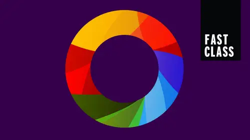
tudying color and one of the principal color teachers on the planet, a guy who was a student first and then a teacher at the bauhaus joseph Albers gave us this wonderful exercise where we learn about the relativity of color, that is the sort of lack of objectivity of color. So here we have two exes, they're both the same color and as soon as we apply a color behind one of the X's, we start to see changes. And so what does that teach us that there's relativity, that color is never what it seems that it always is dependent on its context. So as soon as we put that pink color behind the gray, it starts to change, and as we add this blue or this green color to the other side, it starts to change more dramatically. And now we see a really dramatic change in these colors and if we hook them together at the bottom down here, You can see in fact that it is one color, but it looks dramatically different. And you can also say, if you start to stare at this, if you stare right in this area here, and this is the key for all of these Albers exercises as we'll call him, You stare there for maybe five seconds, you'll start to see that this color starts to look like that and this color starts to look like that. It's a reciprocal relationship often happens with complementary colors, so we have a red and a green, those are compliments and the shifting of the X is fascinating for me. That's really intriguing, is one reason to study color is to study that idea of relativity and how color is never absolute. And this is a great quote from Albert from his book interaction of color. We're gonna be talking about this, I believe sometime today, later in the workshop in visual perception of color is almost never seen as it really is, as it physically is. This fact makes color the most relative medium and art, it's very important to remember this. So if you're into branding and you have a hero color, one color that is really the symbol of your brand, the identity of your brand, that color is going to change depending on its context. This is a very important idea. This is another great quote and another one of my main influences, johanna satan, we are going to be talking about him as well throughout the workshop. If you are knowingly are able to create masterpieces in color, then a knowledge is your way. But if you are unable to create masterpieces out of your own knowledge, then you ought to look for knowledge and I love that idea of looking for knowledge. That's what we're gonna be doing in this workshop is we're going to be looking for color knowledge observation, looking at these colors, these colors that are on the table, these little pieces of colored paper. One of the best ways of looking at color. One of the best ways of looking for knowledge. So Johannes eaten is best known for giving us this wonderful color wheel and he breaks it down in this really interesting way. So we start with yellow, we had blue and we had read and those are the primary colors mrs sen triangle and we can immediately see that yellow is very light red is sort of a medium color in lightness and blue is a little bit darker, so right there, we have an expression of contrasts of light and dark. One of the main contrasts of color theory as we develop a wheel around this now, this is something we're all familiar with. We've all seen this before. Maybe even when we're kids, we start to see the color wheel. That's how we learn color. Often we see yellow here and now opposite the yellow. Down here we see purple and purple or violet is the mixture of red and blue. Orange is the mixture of yellow and red. Green is the mixture of yellow and blue and green is the complement of red. Blue is the complement of orange and yellow is the complement of purple. We see those compliments there and then as we begin to fill in the spaces, so yellow, orange, blue, violet or indigo, these are mixture colors, yellow, green, very close to this, you're actually more yellow, red, violet, blue, green and red, orange. So compliments are opposite each other on the color wheel. The aim of such studies to develop through trial through experience by trial and error and eye for color, joseph albers again, and this whole idea of trial and error is very important. It's all a matter of experimenting. We're gonna be doing a lot of that in this class
Class Materials
Bonus Materials with Purchase