Landscape Edit #1: Enhancing a Waterfall Image
Lesson 2 from: Fine Art Landscape EditingBlake Rudis
Landscape Edit #1: Enhancing a Waterfall Image
Lesson 2 from: Fine Art Landscape EditingBlake Rudis
Lesson Info
2. Landscape Edit #1: Enhancing a Waterfall Image
Lessons
Lesson Info
Landscape Edit #1: Enhancing a Waterfall Image
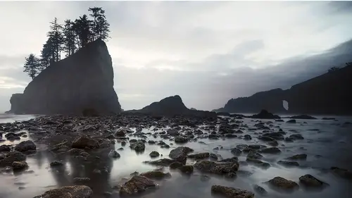
So with this process I wanna go through basically how I start from Adobe Camera Raw and transition into Photoshop and just build this image. I'm gonna build a series of these images in this process. And I just wanted to show you kinda how my workflow goes. I typically do something called tone, color, and artistic effects. So if we're looking at that technician and that artist or that creative we can actually break the workflow down into two very distinct parts. Tone and color, that's your technician, creative effects. Okay, and a lot of people stop after they make a technically beautiful photograph. They stop before they've gotten to the point. But that's also a good saving point. 'Cause here's the thing, we're emotive people. As artists we're emotional, we are going to bring emotion into the work. What you do today to this image is not what you're gonna do tomorrow to this image. It's crazy, it's crazy to know that this image will never be the same reproduction if I were to start from...
scratch and try to replicate everything I did. I mean obviously I could probably cheat. Go into my layer stack and see what I did the day before. But try it, take an image, one photograph, edit it one day. Leave it, save it, whatever. Come back to it the next day, process the same image. Do that for a week and see how those images change. Do it when you're mad. Do it when you're happy. Do it when you're sad. Do it when you're excited. Do it when, you know, the worst possible thing could have happened to you, edit an image. And see what you bring into that because those emotions will find their way into that image. It can suck that life outta you in a way too. You just think it's just a picture, how can it do that? Well when you're investing yourself into it. When you're pushing yourself to that point. But tone and color, that's the technician. Creative effects that's where you start putting yourself into it. Alright, so with a photograph like this I would probably start out by, especially if I know it, I'm gonna be doing my very heavy handed creative workflow. I'm not gonna try to hard to make this image look magnificent right now. Actually what I'm doing in Adobe Camera Raw at this point specifically with this because of the way I wanna push this in Photoshop is I'm gonna do something that I call like a low dynamic range image. I want my lights to be darker. I want my darks to be lighter. Because the way I like to work is I, if you've taken anything that I've done, I'm very, very meticulous and very nitpicky. So I don't wanna start with too deep of shadows or too bright of highlights. I wanna be able to control that in Photoshop. So the way I set myself up for that is I'll come down here to my highlights, just start dropping 'em down and do it like your typical, like niche, like HDR style work, you know. I would never leave it this way but what I'm doing here is I'm just expanding the dynamic range in the image. I'm allowing everything to kinda even out. If you look at the histogram up at the top here and you see how the histogram is working. We bring the highlights down. We're just pulling that stuff away from the whites. We're pulling the shadows away from the darks and making them more of a mid tone. I'll look at my white point just by pressing alt or option and clicking on that white point to make sure nothing's clipped. So that nothing is beyond 255. How we know if it's beyond 255 is if you bring it up. It's gonna show you per channel your beyond 255. So right now in the RGB value because it's showing up as white that's basically all channels blown out and then if you look at the blue that's the blue channel blowing out or clipping and then you start to get into the red channel that's happening up at the top. So I'll just basically press alt or option to see what is clipping. I can even expand that dynamic range more. If I move this up and I can get to about here without clipping it, see what that looks like. I'm just expanding that dynamic range. Press alt or option on the blacks, bring that down. I can't go too far with that. So I'm just gonna leave that at zero. Contrast, this is actually a very artistic type slider. You wouldn't think so but what the contrast does is when you increase it, it increases the contrast between the areas of light and dark in the photograph. Which I'll probably end up with something looking like this anyway but if I have one slider that's doing all this like tone crunching and I don't know what it's doing, that's where I'm like, ah I'll do that myself. Thank you but no thank you. This is where I'd also address the exposure if I need to do anything with the exposure. I'd start to get my colors in a decent way here. Where maybe I might add a little bit of yellow to this to take some of the blue outta the waterfall. I might even add a little bit more green to make this feel a little more green. This is another one of those times where I was in Olympic National Park and we were walking to Sol Duc Falls. And Sol Duc is probably the one that you've seen of Olympic where there's basically three exit points for the water falling in so it looks like three waterfalls in one. It's a really beautiful place but what's more beautiful is the trip to it in October when, you know you got a nice amount of water that's coming down through this little. And this is just on your left hand side. You're walking to Sol Duc, you're about a quarter of a mile away from Sol Duc and on your left hand side you'll see this. And it's just like this, it looks like a mound of waterfalls all collected there just dropping. Where if you were to get a telephoto lens you could almost find a hundred different waterfalls and personalities here. That's another thing, when you're on location, start with the 16 to 35. Then move into a 50, then move into a 70 to and when you're in 70 to 200 start at 70 work to 150, work to 200 because using your lens choice is a lot like getting to know someone. So when you're on location and you're shooting and you're at 16 millimeters. At 16 millimeters that's my view of all of you people in here. I don't know you at all. I have a very wide angle view of just what I know of you right here. And that's everything, right? But as I start to get to know you. Say we started to hang out or maybe I was your actual photo mentor. As time progressed I would start to know you at maybe the 35 millimeter range. Where I'm starting to get a little bit deeper into who you are. Then I might know you a little bit better at that 50 millimeter and then like my wife and I. I'm probably at a 200 with her and she's probably at an 800 with me. That's just the nature of who we are but I know her really well. I got that 200 millimeter shot where when I show up on that location I know exactly where to put a 200 millimeter lens 'cause that's the shot. I know exactly what her mood is gonna be at any given time 'cause I've got a 200 millimeter view on her. That's that analogy between the lens choice that you use. So when I go to a, like a tunnel view is a perfect example in Yosemite. You come outta the tunnel on the south end and there's a place called Tunnel View and that's where you see like all of Yosemite happening in front of you. With like birds chirping and rainbows everywhere and unicorns flying all over the place, it's amazing. But that's a great place to do that. 'Cause your instinct is to go wide to get all that stuff in there but there's a magic that happens when you go 70 to and start pulling that person out. And that's that emotion that you start to feel when you know that landscape so well. I went on a really long aside there. So the concept here is to really just kinda pull out as much dynamic range as I could here. In Adobe Camera Raw I'm also gonna do what I call the preliminary boring stuff. Straighten horizons, get rid of chromatic aberrations. Do the stuff that nobody really finds, you know, crazily fun. If you find that stuff fun then you need another hobby. I like to do all the really like, you know dodging and burning and getting deep in there, that's fun. So I'd probably just open this image at this point. Now if you're one of those people that likes to do things with smart objects you can by all means open this up as a smart object so you can always come back in here and edit. I don't really tend to use a smart object workflow so I'm just gonna say open image. So as far as the realm of tone and color. I haven't even really touched on anything at this point. I've done my preliminary edits. I'm not even in that tone, color artistic effect range now. This is just expanding the dynamic range so that I can close it down. So a lot of what I like to do is I like to really meticulously select by highlights, by mid tones and by shadows. Whether that's through luminosity masking or through some of the panels and tools that I've created. I really like to use those 'cause I make it really stupid simple. I just click this you get this mask. But in showing that I'm gonna break this down into a highlight, mid tone and shadow type of effect. So I'm gonna go to select. Go to color range. And I'm blowing up this studio. And I'm gonna go to highlights and I'm gonna move this fuzziness up so I can see what those highlights are and what I want those highlights to be. The range here, this is gonna help me select how much of that area that I wanna select as a highlight. But for this that's a good even highlight. I'm trying to get a good amount of highlight data. What do I know is highlight data at this point? Anything that's white on this mask picture that's my highlight data. Everything that's black will not be affected. The transition into the mid tones will be the grayish stuff. So I'll press okay on that. I'll make a curves adjustment layer. And I'll call this Highlights. If you took the luminosity masking course this is gonna be very, very familiar for you. I'm gonna select, I'm gonna go to color range. I'm gonna to shadows and again I'm gonna find a good shadowy area, probably gonna be about right there. About right there will be good. And if anyone's familiar with Ansel Adams and his zone system, I like to do things based on zones. So I like to take chunks of zones into five different zones. So zero through two. Three through four or two through four and then you know, five. Where I take my middle chunk is usually between zones three and zones six. And then I do six through zone eight. And through eight through 10. So I get a good range. Five whole masks for me to work on with in that range. So not only am I getting highlights, mid tones, and shadows. I'm getting the shadowy-est shadows. The highlight-iest highlights and then what happens in between and in the mid tones. Okay, so we'll just do 30 on that. Fuzziness just make it a good rounded number. We'll press okay on that. And we'll make that mask. So this should be all of my shadows. This will be all of my highlights. I'll call this Shadows. Okay, and now we're gonna make a selection. Go to select, go to color range. And then go to mid tones. And again I get to say how much my mid tones are by this slider right here. Now you see two different range sliders here because I get to see how much highlight I want included in there and how much shadow I want included in there and then chose my fuzziness in between. So for this I'll just go with something about right here. About right here and a little bit of lower, a little higher fuzziness and then get a smaller selection. Okay, and then we'll call this one Mid Tones. Now because I want to work on tone and not color I'm gonna take all of these curves adjustment layers and I'm gonna say luminosity. So when I change the blend mode to luminosity no color is gonna come through. I'm telling these curves, hey you can do whatever you want to this image within the tones. You can no longer affect the colors of this because the luminosity and blend mode is locking you to only tonal data. It does not allow color or data to come through. And the way we know that is I were to change. Not lock all these. If I were to come to this one and make this mask like something crazy like this and change it back to normal. You'll see that it brings color along with it, right. If I change this back to luminosity no color comes along with it. Only the tonal data. So now I can edit within the highlights, the mid tones, and the shadows. So I'll go into the shadows and I'm gonna make those shadows a little bit deeper. You're like, didn't you just do that with the contrast lighter? Well yeah, but I wasn't able to see exactly what that shadow was and I told Photoshop what I wanted a shadow to be. So I'm gonna make those shadows a little deeper. I'm gonna make them a little bit more rich. And I might even increase the, see here. What I'm doing with this, curves adjustable layer. Just to give a refresher, my favorite tool. We've got the shadows down here, mid tones right here. Highlights right here. So I'm working in the shadows. I made the shadows darker I'm not touching the mid tones of those shadows or the highlights of those shadows. But I can make the highest highlight area in those shadows a little bit brighter too. So I can make them a little bit darker and a little bit brighter. So I'm getting more control over that than just slamming the contrast slider, okay. So I'm now going beyond the range of that technician. I'm artfully looking at how I want those tones to be conveyed in the image. So now I'll go to the mid tones. I'm gonna do a slight S curve in the mid tones. It's a popular thing for me to do in the mid tones. 'Cause it brings out a lot of nice feel and mood there. I'll go to the highlights. See what those highlights have for me. And here I can probably make those a little bit deeper, a little bit darker. Or a little bit brighter. It just depends on what you wanna do with that waterfall at this point. So that looks about good right there. Pretty comfy with that. Okay, I'll put these into a group. I'll click on the bottom one, press and hold shift. Click on the top one press command or control G. And I'll call this, tone. I'm specifically working in this workflow. I do this all the time, this is how I operate. Now I have many options that I can do with color. To get the colors technically perfect. I can go in and I can make very selective range masks for those colors by going into select and going into color range and making range masks. Or I can do something called the selective color adjustments which is one of my favorite adjustments. What this selective color adjustment does is right now we're operating in the reds. This is saying okay, you are in the reds. This is the the cyan that is available in the color red. And within cyan we have cyan. By increasing we get more cyan in the reds or we get more red in the reds by taking cyan out. Keep tracking. We're still in reds. Do you want more magenta in the reds or do you want more green in the reds? Keep tracking. We're in the reds, do you want more yellow in the reds or more blue in the reds? And do you want them to be darker or lighter? So that's just for the color red. No imagine all of these for every color that I have here. So I do have red present in this image. One of the best ways to figure that out is to go to the blacks first, you see that? As I move that back and forth like a crazy man. I'll go a little bit slower. There we go, makes those reds specifically. I'll just zoom in for ya so you can see a little bit better. Up here makes those reds more rich and thick and it makes 'em brighter. That's because I'm working with the black slider. If we start working with say the cyan slider if I include, let's just zoom into there because that was a really great way to see that. If I include more cyan it's gonna taper off the amount of red that's there. Why is that happening? It's not turning cyan, why is not turning cyan? Because what's happening is I'm allowing the cyan that's available in that color red to get more cyan in it. So it's never gonna get to it's max potency of cyan because technically what's making that red is the absence of cyan. Woo, okay. It's like is darkness dark or is it just the absence of light? That's what's happening here. Is that when we add that much cyan to it we're just tapering off the amount of red that can be available in there. It's like mixing that color a little bit. Taking some of it's compliment out to allow it to become more red. If we take it's compliment out it now becomes more red. We're now saying, hey red that cyan that was holding you back, we're pulling it out. So now you can be a more potent red. And I'll do this with all the colors. It might sound crazy but I'm gonna compare this to Lightroom in Adobe Camera Raw 'cause that's typically where people do this type of workflow. Go into that HSL doc, that little pane in Lightroom and Adobe Camera Raw and what'd you get? You get the hue, which is the color of the color. The saturation, which is the potency of that color. And the lightness which is how much value is present or how much black and white is present. Anywhere does it say how much more cyan do you want in that color red, no. That might be considered hue but when you move that hue it's physically taking that color red and moving it around the color wheel. And it only does it in 30 degree increments. Because there's that governor in Adobe Camera Raw Lightroom that doesn't want you to do something really bad. So it only goes in 30 degree increments. So here we're not saying that we're adjusting the hue by moving you around the color wheel. We're adjusting the hue by removing the amount of color or adding the color into that we want. So in those reds if I want them to be a little more yellow. Just boost up that yellow. I don't wanna add blue to it 'cause now I'm getting like this hyper nasty bad HDR red thing going on there. Okay, I know bad HDR, I did it for years, trust me. So we'll just go ahead and zoom out and see what we've got here. Now with that much red present there it's probably too much. So I'll bring that down a little bit to about right there. But the two colors I wanna target the most here are gonna be the yellows and the greens. Because there is a separation between yellow and green here. And quite frankly, when you're looking at green grass in your photographs you're actually looking at more of the presence of yellow than you are green. So if you ever go to the green adjustment and you're like why isn't my grass changing? Well it's because there's not a whole lot of green in there. There's not a whole lot of green data typically in our photographs unless we do something wrong. Then we really start to see it. It looks like circus vomit green. It's really bad. Bad visual, sorry. But late afternoon wake up. So if we go into the yellows we can make the yellows more yellow or we can add some blue to them to taper off the potency of that yellow. We can come into the cyan. Maybe make that yellow a little bit more of that Olympic Park yellow, or greenish color that you see. Now I've experienced this, I've been there. I know for a fact that my camera cannot show me the green that I saw in Olympic National Park. I know it can't. 'Cause when I took this picture and I looked at it in Adobe Camera Raw, I was like what? Dude, really? Like, that's not what I saw. I saw this really nice, like, it was crazy. Like the amount of, it's so green you can feel it. So I want you to feel that too so how do I do that? Well I need to go into my yellows and add a little bit of cyan to it. I might even need to add a little bit. If add too much green to it, it's gonna look like that like. (high pitched yelp) Don't do that, okay. Don't do that. There's literal and there's, you know, hinting. This is literally saying this is green. And it doesn't make for a good photograph. So you just a little bit of green in there. Maybe a little bit more of that blue in there to taper that off. And add a little more of that cyan to get that color. If at anytime you're working with saturation and you notice that your color is as robust as you want it to be but you wanna taper it down. Just add a little bit of black to it. 'Cause what that will do is it will make it a little bit more rich in tone inside that color. So even if you take a saturation adjustment layer and you hike that bad boy up and it looks disgusting. I'll show you, if you take the luminance adjustment and you add a little bit of black to it, it can actually look pretty good. Because you're making that tone. You're getting that color at the right color that you want it to be. You just need to make it a little bit more rich. So going into the greens here. Just go ahead and add a little bit of yellow to those greens. Looking good right there, okay. That looks pretty good. So I'm just gonna show you that real quick. If we go to the hue saturation adjustment there. We slam that saturation up. It does not look good, okay. But watch what happens when I go into the lightness and start giving it a little bit of darkness in there. You know adding some value to that rich color. I would typically do this selectively if I'm gonna do that I wouldn't just globally saturate everything. I would go in and say, okay, yellows get a little bit more potent but taper down a little bit. Okay, I'm just gonna delete that layer 'cause I don't want that there. So technically speaking this what we came out of Adobe Camera Raw with. This is after our tone and color. Now this is the fun part. That's all like the boring preliminary stuff. Now I'm gonna start doing things that I do that create a very creative looking image. That start to go into the realm of creative light rather than just, okay, yeah it's a good photo. So one of those things that I like to do is actually what we call like a glow or a radiance adjustment. Where if I take a stamp and what a stamp is, is if you like what's happening here. I'll tell ya that none of this data right here. None of this data except for these masks is pixel data. Okay, so this is, there's three different types of layers. There's pixel layers, there's adjustment layers, and there's vector layers. Vector is gonna be shapes and text. Adjustment layer is gonna be these guys right here and pixel layers are gonna be things like this background. In order to do what I wanna do I need a pixel layer. I need a layer that I can just obliterate all of the pixels in. So what I'm gonna do on the top of this is I'm gonna make a stamp. And a stamp will give me a pixel layer of everything that's happening underneath here. So I'll press control shift alt and E command shift option. And on a Mac you can do this grr thing on your computer. It's like a claw. And it's not gonna look like it did anything different but what this is, is this is a pixel layer of all the stuff that happened underneath. It's basically a physical stamp of everything that I've done underneath. Control shift alt and E or command shift option E on a Mac. It's one of the hidden ones. That's one of those ones that you're not going to find in your, in the background there. And if you right click it doesn't really make a good stamp. Anywhere in here, it doesn't say hey let's make a stamp. If you ever create actions. I create a lot of actions and there is no good action method to record a stamp. Other than one that I could just show you but that's a whole nother class in and of itself. So we'll go to filter. We'll go to blur, and we'll go to Gaussian blur. But before I do that I'm gonna change this to soft light. And the reason why I changed this to soft light. Soft light makes lighter things lighter. So, and it makes middle gray things not have anything happen to them. It makes darker things darker but never pure black. Lighter things lighter but never pure white. So what that means for us is if we change that stamp into soft light it's going to increase the contrast like crazy in our photograph. So when I go to filter and I go to blur and I go to Gaussian blur. Look at this. If it's set to nothing we're gonna get that contrasty image. As I increase this Gaussian blur, look at that. Look at the glow that we're getting there. Now this is a global like radiating type glow. This is where I start to get into that feeling. This is where I start to get you to feel what I felt. Because I'm making it feel like it's lifting off of the page and it's almost three dimensional. By pushing and pulling those colors into a contrasty world that doesn't exist with our human eye. But that's what makes this in that transition of technically good into creatively good. Now by itself, if I were to just leave it like that it's probably a little too much. So that's where I'm gonna go into some of those tools like blend if. I'm just gonna call this Radiance. So if I double click on this layer. I've got blend if. And in the blend if course I talk all about this. So I'm gonna do this a little bit quicker. I want to protect the dark areas in this image from this effect. So what I'm going to do is this underlying layer thing here it's gonna start protecting all of those dark areas in the image. If I come down here to color overlay and I move this over, again that color overlay, it's amazing. We can see exactly where this glow effect is gonna take affect on the image. I'll pull this all the way over. It's only at this point going to be affecting the highlight areas. So I'll pull this down a little bit. And then press alt or option and then feather this over. Go over here, it looks good. Looks pretty good, okay. Press okay. Turn that color overlay off. So there's the difference. If we turn the effects off. There it was before, here it is after. You kind have to look deep in here to see this on that pixel peeping level. But I do promise it made a difference. So that is a creative move. That's taking this image and putting those pixels in a place where they don't normally exist. But look at the difference that we're making now. Here's out of Adobe Camera Raw where we thought we had a decent image, nope not so much. But we can keep building, it does not stop there. So what else am I gonna do to this? Well at this point this is where I start to do what I call dodging and burning. Well, we all call it dodging and burning. But the thing about dodging and burning is anyone in here a traditional analog film? Okay, so you've done analog dodging and burning, alright. So the people that I'm speaking to that have done analog dodging and burning know that there's no excuse to not do it now. So how it went in the past is you would get this print, they would be like oh I love this print. And then you'd bring it to your teacher and she'd go well you know, this could be brighter and this needs to be dark. And I'm like well, I can't go re-shoot it. She's like no, you gotta dodge and burn. So that means you gotta cut things out. And then you gotta go into the dark room. You gotta make it a good time stamp and then right at that certain time you go, uh, and you just start agitating that thing. And you gotta move but it's like a dance. It's like you gotta make this like whatever move you gotta make to get that. Okay, okay, seconds are done go, poof. God forbid someone's, hey Blake what'd you doing this weekend? Oh I don't know, ah! Now you gotta reprint the whole thing all over again. Okay, so now I've told that grueling story about dodging and burning. We're talking hours could go by to get that one print to look good. Dodging and burning these days, it's stupid simple. We're gonna make a new layer. Press shift F5. We're gonna fill it with 50% gray, press okay. Why 50% gray? 'Cause when we change this soft light anything I do on here that's gonna make this image remotely darker or brighter will get darker or brighter but never get pure black and never get pure white. So that means I could brush on this layer with a white brush or the dodging and burning tools. Never will I ever use the dodging and burning tools on a pixel based layer. I'm always gonna do it on it's own layer right here. And that's because I want to maintain that transparent layer that's doing all that work for me. So I'm just gonna go into the dodging and burn tools here. So we've got the dodge tool. I'm gonna make this brush a little bit bigger. And I'm just gonna start very selectively putting this. Sculpting this image with light. Light that I want, where I want that light to be. That light wasn't present there but I get to have it wherever I want it. So I'm gonna turn on all my tools up here that make pressure sensitivity happen. 'Cause I'm using a walking tablet. And I'm gonna brush on this rock. And as I'm doing this you're gonna be like, Blake I don't see a difference at all. But guess what when I turn this on and off you're gonna be like what? My voice can't get high anymore 'cause I've talked too much today. Okay, so we'll paint here. And what I'm doing here is I'm making things brighter that I want your attention to go to. I want your eye to literally jump from this rock to this rock to this rock and navigate you through this image with light. And I'm doing that by dodging and burning these rocks. And it's so subtle you're not even gonna know the difference. Might even come over here a little bit on this one. If I press alt or option it will automatically flip me over from the dodge tool to the burn tool. Press and hold alt, I'm burning, I'm burning, I'm burning. I'm dodging, I'm dodging, I'm dodging. See that little alt thing that pops up there? I can dodge up here 'cause I like that tree. And burn around it. If you ever want something to pop off the page. Make it brighter and burn around it. One of my print making teachers taught me this awesome trick about where two lines converge is where you can make them deeper and darker and that's where the eye will get drawn to. So it was really cool, so as you're drawing and you're perspective. Like if I'm drawing into that corner down where the lines meet I'd make that really dark and it would really emphasize that rush of the walls coming together. And we can do the same thing on our canvas. She was a genius. She also taught me how to see in terms of tone. I did a print once and I was like, ah I'm not feeling it. And she's like well, what I want you to do is I want you to scan it and I want you to bring into Photoshop and make it black and white. And I was like, what, why would I do that? And she was really cool then you'll see tonally where your contrast is off so that when you go to put other colors on there you know to use brighter colors or darker colors. I was like, ah that's genius. So now I teach people to see in terms of tone. It's just a genius method. A lot of times I'll even dodge and burn with a black and white, temporary black and white layer on there because it makes it easier for me to see those tones. So here's the before, here's the after. Look at that, I'm making you bounce all over those rocks. And you don't even know it. It's so subliminal, it's so subtle. But I'm forcing you to feel what I felt. What did I feel while I was there? Well I felt the rush of all this waterfall coming down but my eye was bouncing back and forth between all these rocks. Well how do I get you to see that? It's like seeing the forest through the trees. How do you let people see that? I don't know, I probably butchered that one up but you get the concept. So the next thing I'm gonna do is I'm gonna make a vignette. I'll make a new layer. I'll press shift F5 and I'll fill this with black. And I'll drop the opacity down pretty low. Put a mask on here. And then I'll brush with black on that mask. A really big brush, just start brushing around where I really want your eye to go. So I'm making a custom vignette. You can't make one of these vignettes in something like Adobe Camera Raw Lightroom. They don't make it possible. Okay, there's before there's the after. Tunneling your vision into that mood and that feeling that I want you to get. And it doesn't stop there, we can keep going. So what I'm gonna do now is I'm gonna color grade this. So I've done tone, I've done color, and I've separated them. Now I need to do something that unifies the entire canvas, okay? So a lot of times if you leave it just like this you don't get the mood that I want you to feel because I haven't told you what colors I'm using. Colors convey mood. I have a color theory course here on creative live that talks about what colors to use to make people feel a certain way. Whether you uses blues, or you use pinks or you use purples. Now that you know if you're angry and you're editing you're probably gonna be color grading in red. Ah, blood red! So I'm gonna go and make a gradient map because the gradient map makes a really good tonal basis of the, it turns my colors into whatever colors I want them to be. So all those colors transitioning into a really good black and white. By the time you're done with this you should have a really high contrasty black and white image. So seeing in terms of tone. That's a good way to know that you have a lot of good contrast in there that's gonna make the viewer bounce around the image. But I'm gonna change this gradient map to, let's try like the sepia tone type of effect. I'm gonna change the blend mode to color. Or soft light depending on what I want. Soft light looks good. And drop the opacity down. And see how that just ties all the colors in the canvas together. Now if my darks get too dark but I want them to stay in that richness I can always come down here. Pop on that selective color. Go to the blacks and add a little bit of white to 'em to kinda crush 'em a little bit. Then I can also maybe add some yellow, some green to that little vignette that I just did. Utilizing the black area there. Maybe even a little bit of that red there. And that would be the color grading process. So let's just go ahead and look at this. Does it make a difference, Blake? I really hope so, otherwise I just wasted a lot of your time. Here's the before, here's after we do tone. Here's after we do color. Technically it was a pretty good photo, right? Then we jumped into that creative realm. Then we sculpted the light how we wanted it to be. We shaped it. Then we added that vignette. Then we started doing some color grading. And that would be our finished resulting image. Overall before, overall after. Does that feel more like I want it to feel like when you see it? Does that help that conversation between me and you now? Yes because I've deliberately touched all those colors. I've deliberately touched all those tones in there and then I tied all of it together with a nice pretty little bow and added that color graded mood to it and that feeling. If I were to click on this gradient map and change this to something like this, it's a totally different discussion. Totally different discussion that's happening. Just on the color grading that I'm choosing with this gradient map. Very different conversation happening there.
Ratings and Reviews
JennMercille
Blake Rudis demonstrates how to take an amazing landscape image (that SOOC would make your friend with a fancy phone and filter, envious) and then turn it into an image that evokes from viewers the emotion you felt when you first captured it. His teaching style is witty, thorough, and from the heart. As a portrait photographer, I was expecting to learn a couple of helpful post-processing tips that work across the board. What I actually learned was how to conceptualize, execute and process an amazing landscape photo that I can then blend with a landscape portrait to create a fine art image with storytelling impact. I am so glad that I have this class to re-watch while I'm planning, and then editing. Thank you Blake for a great class!
ValeriaArdiyants
I thought this course was great. These editing techniques may be nothing new to landscape photographers but I'm actually interested to see how they transfer to lifestyle portraits. Might be nice to try on my portfolio quality images to give them more refinement.
Kaltham Ali
amazing- this man explains the process so clearly and rich knowledge, love his style and courses. defiantly recommend this course and all his courses, you learn techniques you cant find anywhere else.