Concepts to Practice: Fine Art Image from Start to Finish
Lesson 5 from: Fine Art Photoshop EditingTJ Drysdale
Concepts to Practice: Fine Art Image from Start to Finish
Lesson 5 from: Fine Art Photoshop EditingTJ Drysdale
Lesson Info
5. Concepts to Practice: Fine Art Image from Start to Finish
Lessons
Lesson Info
Concepts to Practice: Fine Art Image from Start to Finish
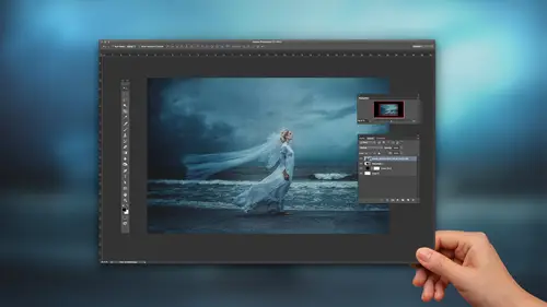
I've been in Seattle since last Thursday, and me and my girlfriend, we went out to Olympic National Park, and got some pretty cool pictures. This is one that we got while we were out there. That's in the, a cove, like a rainforest. This is gonna be the first time I ever work on this picture, from beginning to finish. So I thought that would be kind of a fun exercise. So let's open this up in RAW. Then we'll actually go through the entire process. Alright. I'm instantly looking at this picture and I know that I want it to be a little bit brighter. So let me use the exposure tool here. I want it to be a little bit warmer, so let me change that there. Add some warmth. And like I did with all the previous photos, I'm still going to increase the shadows. It's really subtle, but you can see it a bit. Then decrease the contrast. Now, to me when I look at this picture, of course she's kind of like in the center of the frame, but my eyes kind of like wandering around and I'm kind of going to th...
is a lot. This area, which I can already tell you, I'm probably gonna add some sunlight coming from that area. But I still want her to be a good focal point to the picture. So let me brighten her hair just a little bit. On the top of her head, at least. Looks pretty cool. And I'm going to change the luminance of the moss that we see around here. Just make it a little bit darker just to make her stand out, her and the dress stand out a little bit more. Let's bring up the saturation just a bit. And to make life easier, I'm gonna make another brush and add it to this area here. So that it's a little bit easier to mimic the sunlight later. So now let me go to my curves. Let's add little bit more contrast, just a tad. Very cool. Alright, so, I'm pretty satisfied with how that looks in RAW, so let's open this. Alright. So. First things first, let's add some sun rays into this picture. I'm gonna make this one kinda big. This time I kinda wanna add an actual flare. Not necessarily just within this region here. I kinda wanna make it reach her like a little, like it's almost coming to her or she's walking like towards it, sort of. Alright, so let's see. So I have this selection here, and I'm going to, this time let's use the exposure. I'm gonna drag up the offset here. Exposure just a little bit more. And let me just start erasing in areas where I don't want it. I want it to just appear like a single line almost. (mouse clicking) So it's really subtle, but if you look at the before and after, you can see that there's a slight line. It might be hard to see on the screen, but I can see it here. Okay, so let me change, I'm gonna actually duplicate this. I'm gonna add the same mask in the selection like we did a little bit earlier. So that's that, interesting shape. And then let's, change the color just a little bit. So now we start to see it looks more like a sun flare coming in there. Alright. Okay, so that looks pretty good. So now, next up, let's... Add some contrast, using the black and white adjustment layer. So if you have the drop down menu here, you've got different types of filters. You've got the blue filter. You can make the black and white a little bit darker. The red filter, which is kinda like the infrared we were talking about before. But for this, we're just gonna stick with the blue filter. What that does is literally just killing the yellows and reds within the picture. So, let's make a soft light layer of that. We can kind of see the drastic effect it has there. I'm loving how that's lookin'. Alright, so, I still want some more of the original quality back up in this area, so, I'm gonna use my mask again. Then you just erase, I can bring up the opacity just a bit. Alright cool. I also wanna bring back a little bit more attention to the bottom of the image, like the foreground. Let me make another marquee tool. This time, I'm just gonna brighten it, just a little bit. Cool. So just adds a little bit more detail to the bottom of the picture there. Next step, it's gonna add that glow again. You guys know I like that. But this time, again, we choose the strain mode. We'll just effect that layer itself, independently. So we'll go to curves, we'll drag down just a bit. Adjust the shadows just a tad. Very cool. So I like this for certain parts of the photo, but I don't like it for necessarily all. So let me use that mask again, to erase some parts, 'cause I kinda like the original quality of like her skin. I don't necessarily need that to be glowing. I love for the forest itself to look a little bit more enchanted, she's cool enough as it is. Alright. So I like the color of her dress, but I think I want it to be, stand a little bit more, so let's add some color back. Let's make it a little bit more of a blue color. So, let's go to the top here. I haven't flattened the image yet because I'm not too certain I'm done yet. Alright. Let's go to the top. I'm gonna adjust the mid tones. Again, I'm just paying attention to her dress. Not really anything else. Alright. So I inverted the mask and now I'm just gonna start painting back in specific areas. So let me make sure that my mask is on white add. And again, to do that, you just press x on your keyboard to switch back and forth between this area. Let's start bringing back some blue. So it's getting her hair a little bit there but I'll kind of go through that again to get rid of it. So I'll zoom in really close, change the mask to erase. Add some to the bottom of her dress there, and erase like on her foot. Kinda cool. So let's look at a before and after. She just stands out a little bit more now. Alright. So let's make another vignette. Most of the vignettes I made so far are to the center of the image, but that's because I usually have my main light source coming from the top. Right here, I want this area to be somewhat light, while it's kind of being faded like around here. With this marquee tool, I'm gonna start from way outside of the box. Outside of the photo, sorry. Kind of make my vignette start about here. Cool. Then we'll use the exposure tool. Oops. Should have inverted. My bad. So let's invert that. So now it's getting a little bit darker like at the outskirts of the image. But our main light source, we're drawing the viewer's eye, from here, to here. She's waking towards the light. Kinda cool. So, I mean this looks pretty good to me, but, I'm never satisfied. There's a few more things I could do. I still wanna add a little bit more, 'cause the colors are pretty similar throughout but I think I wanna add a little bit more of like a red hue to the trees like in the distance. Because, when you're thinking about sunlight, you know, it's, especially towards sunset, the colors a little bit more orange. So I kinda wanna add that feel to the back of the image. I don't want the colors to be like all the same. Let me go to the selective color adjustment tool here. This color replicates yellow more than anything, so that's why we have yellow chosen. Let's change the, pull down on the cyan. There. Let's start, we'll put this on 100% this time. Just so we can see the different colors here. Not up there. Maybe even her hair a little bit, just to... Add a little bit more of that sun effect. Alright. So now, my finishing touch is always making like an artistic-like matte for the photos. I'll go to my exposure. Bring up the offset just a little bit. Now that's a little bit severe, but again, I'll just bring down the opacity. Last step, I'm just gonna make myself feel a little bit better and brighten her up, just a bit. If you see that disclaimer there, that's only because, because it's feathered, it's not gonna show the actual selection. In reality, it's still there. When I make this mask, you can see that it's still there but it just wasn't showing because it wasn't big enough to display. Alright. I think this pictures, I'd be happy with it. I think. Yeah, I think that's good. I hope everybody learned a little something. (Mumbling) I am pretty impressed with your Photoshop skills. Thank you. But the really really thing that amaze me, is seeing your camera roll. When I see the camera roll, I really thought it was like (mumbling). So can you share, I know it's in the class, but can you teacher how your settings, and what time do you shoot? Do you shoot in the mornings? I usually shoot before, this picture, we had no say really as to what time we shot because it was just a day full of activities. We shot here first, and then we went to Ruby Beach which is a really nice, and we got some pictures there. I'd say this, at this time, or for this picture, was around probably like three, I'd say. The thing is, about the forest, up here in Pacific Northwest, are so thick, so there was nice light, like filtering throughout the trees, like the entire day. But if I'm at home, back in Tampa, like where we don't have thick trees like that, I'm generally shooting always at sunset. Always at sunset. Sometimes I'll have clients and they'll be like, "Oh let's shoot at noon," and I'm like, "Naw." No. But, for like my own personal projects, always, like sunset. Except for it's like an overcast day, then I'd say probably like noon, because you've got that gray filtered sky, all over the place and you want the most light possible so noon would be better. Honestly, when I'm shooting, whether it's sunset or not, or like how it was like in this picture, I'm just looking for the best light, like possible. Usually, I'll shoot at a low f-stop. So, I think this pictures taken at like, I wanna say, 1.7 I think. Just because, it's tricky, because sometimes I get home and I'll kick myself and be like oh I should have shot a little higher because when you have to shoot at lower f-stops pictures are a little bit more blurry. They have the potential to be a little bit more blurry but I do that because I want the background to just have that soft, real soft, like feel. I just recommend everybody, just try to find the best available light. If you're eyes like it, then the camera will like it. As long as you have the appropriate settings. Great. Thank you. TJ, we have a couple more questions coming in. So this one was from 24Bricks, who said, "Why and when would you choose to use "a contrast adjustment layer, versus adjusting contrast "on a black and white conversion?" Because with a black and white adjustment, like when you change the blend mode, and everything like that, I like it because it really just mutes the colors a little bit more. To me it just looks a little bit better. With the black and white, you can change the tone like what I was doing for a few of the photos. Every now and then I'll definitely use the contrast adjustment, but I prefer the black and white just because I think it just looks a little bit better. Alright, thank you. No problem. Another question. Do you always photograph your model in the elements, or do you ever do composite photos? This person says your photos are moving and inspirational. Awesome, well, thank you very much. They're always environmental. I've been asked that several times. A lot of people think that the backgrounds that I have in my photos are composites, whether they're just like this, or like when we shot in Ireland and all those places. I'm like no, you know, it's actually there. The only composite work I do, sometimes, like when I told you guys we shot at Ruby Beach. For that picture, I'd probably do some sky replacement, which wasn't gonna be covered in this today, which is why I decided to use one of the pictures from the rainforest. I'd say sky replacement is about the only composite work that I do. Fantastic. It's been our pleasure to have you here on CreativeLive. Thank you. Where can people find you, and follow you, to see more of your work? My website is tjdrysdale.com. I'm also on 500px. That's 500px slash tjdrysdale. I have some actions available on there for people to purchase. I'm working on getting some overlays up there, adding some more actions, and what not. So, yeah, check out my stuff, I'm really excited to share a little bit of my knowledge with everybody and I'm hoping everybody learned a little something today.
Ratings and Reviews
Michael Halloran
Well, this dude is awesome, he knows too much! What I saw when I first watched this instruction is his manipulation of light, and he knows light and color. If you don't know Photoshop, and Adobe Camera Raw --- you will need to learn many of those functions first to follow along. TJ isn't showing you why he does certain things step by step, he is creating, and you're watching him do it. He does tell you the reason for Camera Raw is to get as much detail out of the Raw file before taking it into Photoshop, but then he does it all by eye, no histogram help, no clipping help, no sharpening reasoning ---it's all on the fly. He's a brilliant young man -- he isn't an instructor yet, because he doesn't know that he knows more than all of us already ---because it comes so easy for him. If you want to see how to create light in your landscapes and colors TJ style --- watch and learn ---more than once---if you don't know the basics of all the layers and functions ---you'll be watching this class many times. For TJ doing this live -- with no experience teaching -- that's tough --but he showed you -- and he wasn't showing off, he kept it basic mostly ---till the end. I would recommend this class, yes, with a caveat, don't think you're going to edit like TJ right away ---he's moving fast, that's why the class is fairly short. My .02 cents --