Compositing and Color Matching Dress Image
Lesson 10 from: From Shoot Through Photo Editing: Fashion RetouchLindsay Adler
Compositing and Color Matching Dress Image
Lesson 10 from: From Shoot Through Photo Editing: Fashion RetouchLindsay Adler
Lesson Info
10. Compositing and Color Matching Dress Image
Lessons
Class Introduction
03:14 2Three Reasons to Shoot for Photoshop
16:00 3Shoot: Working with Dress Length and Color
12:53 4Shoot: High Key Image with Flowers
28:01 5Shoot: Dance Pose with Water Splash
27:51 6Creating and Installing Brush Presets
12:36 7Compositing Dance Image with Water Brushes
27:46 8Toning and Retouching High Key Image
12:02Lesson Info
Compositing and Color Matching Dress Image
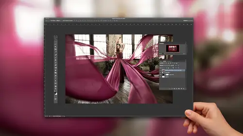
So the last thing that we are looking at here is looking at the floofy fake dress fabric shot. And trying to make it look a little bit more interesting. Alright, so I would have to go through here and I would, if I were editing I would go through twice. I'd go through the first time where I find the shot that's closet to everything looking like I want it to and then I'd go through a second time to find the right dress movements 'cause they're probably the same thing. So let me see, you know. Maybe I like her face in that one but the dress movement looks better in that. So we'd go through and select the parts. One thing that I did want to show you is we were talking about this already but if you go into Develop module and you go to hue, saturation, luminance and I grab on to that targeted brush and I click on the green. Now I can start to move it in the direction of that purple. There's only so far you can go in Lightroom but I could also take this purple and try to move it in that othe...
r direction as well. So I can get them, pretty close. There's a lot that you can do here in Photoshop. And notice, let's say this whole purple, I think it's too dark. I don't think it picked up the light that I want. I can go over to luminance, still got that and I can kind of click and drag and lighten this all up a little bit. I'm gonna go back to hue and that's something around there. I can go back to luminance and darken down this blue. So you know, just seeing what you can do in just dragging a couple sliders. There's a lot you can actually do in Lightroom for color. Alright, so let's see the ones that I want to mess with. That's a good floof for one of the ideas I have. That's a good floof. Okay, let's see, maybe I like her face there. So I kinda just gotta figure out which ones I like. So let's do, three star and take a look at which ones I ended up with so far. Okay I like this movement, this movement. Okay, I think think this is gonna be a good one for movement of fabric to make it look like it's flying. So I'm gonna give that a six star and let's do, maybe this one for the dress and then I'll try move 'em over. Okay, alright, so I'm just gonna select this one and we'll build from there. So we're gonna open up these two files and then here in Lightroom is where I need to at least, even if I don't have the color right, at least make sure I have the exposure right. So let's lighten this up a little bit. Make sure I have enough detail to work with without losing detail in the highlights. Same thing here, okay. I'm gonna open these up now in Photoshop. And the first thing that I want to do is I wanna check the color and try to make things match and I just wanted to give you a couple tools on how to do that. If it opens. There we go. Okay, one of the ways that you can match a color is you can of course, just go to hue saturation and try to figure out what that color is. So if I go to my adjustment layers, go to hue saturation, I can then try to figure out what color this is. One of the ways that it can help you out is this finger. In the top left-hand corner next to Master. It allows you to select that color and it tells you, that's in the cyans. So if I wanted to drag the hue, now I have that whole range and it told me it was the cyans. So if you notice, I can get it to that purple, like almost instantly so it's a good trick. If for some reason it's like in between two colors there's actually ways to refine that selection. So let me just do that one more time so you can see that. We're gonna do the half moon cookie hue saturation. Grab that little slider, we're gonna select that. Do you see this down here? This, these little kind of like, in and out points on a spectrum of color? So right now, it's basically selecting all of the cyans, it's kinda selecting the whole thing. You can actually use this to get more specific to an area of color. So in this one, it doesn't really work 'cause it's pretty perfectly where it needs to be but in another one, if you're dragging it and it's just not quite picking it up, try moving these points and it'll allow you to better select that color. So for this, I'm just gonna get it back to that purple again. Somewhere around there, I'm gonna darken it. Darken it down a bit. Okay cool, that one works and let me grab I liked this dress movement from the other photo. So I'm gonna select it and drag it over, I'm gonna copy and paste it. Okay, and that works fine. I also liked this dress floof that I can put in another place so I'm gonna select that and copy and paste it. Okay, so what I want to do in this image is I want, okay perfect. I want to be able to use color for impact. So first of all, I did that by making all the color match. The next thing that I could do as well is that I can also change the color of the background. There's a few different ways I could do it. One way really is by just painting it. If you create a new layer and you grab whatever color that is, purple. That you like there and you just paint. What ends up happening is it looks like it's kinda just sitting on top, like it's clear that it was painted. But depending on the background that you're working with you can change your blend mode and your blend mode will make it better, interact with the background and actually look it was that color. So the one I tried first is color and so now, that background looks purple instead of looking like you painted purple, it actually looks like it has that color. So you would go around and you could more carefully, you know, extract her, make a selection but now, again, it doesn't look lik I'm painting. It looks like that background actually was purple. So that would be my one recommendation for this. Even if it's not purple, even if you go with teal like make your colors on purpose but the other thing that I think I wanna do is I wanna play around one more time, with brushes. So I'm gonna show you another brush that you might experiment with and let me real quick, because I'm not gonna be able to work with this, I gotta clean up some of these floofs to let me work so I'm gonna grab an adjustment layer. On this one. This one, okay. Let me just clean this up so I can actually have fabric to work with. And probably on an image like this, with this type of work, I would probably spend at least, like an hour and 20 minutes, hour and 30 minutes making it happen. Okay, alright so, kinda clean that up and I do know that I would be cropping out her foot 'cause it's not of interest to me but I'm gonna leave it for now. Okay, so let's take a look at adding another brush. I'm going to go up to my brushes again. I'm going to use the gear and I'm going to load brushes and the brushes that I want in this case, I've downloaded online for free and you wanna just search Smokebrush. Like just Smokebrush's online smoke brush pack and I've got one here. So I downloaded 21 Smoke Brush and I'm gonna hit open. And it's gonna load in the very, very bottom. All of these different smoke shapes and patterns and so for example, this could give you an idea of what it looks like. It would be something like that. So what I can do, is I can use my color picker which I have up here in the left-hand corner to select the color of the dress and then I can paint with the smoke. So the problem that I see, and again, I don't have like the, the art background that my brain works like this is this smoke is pretty one dimensional. It's all that one tone of purple and throughout and so that's kind of the giveaway to me that it's not real. So what I would do for something like this is I would do two versions of that same brush. I'd create a new layer, I'd do one at that color and then I would grab the picker and grab a darker purple. And I would paint exactly on top of it again. Or maybe directly below it. So do you see now how there's a little bit of depth to that? It looks like there's actually shape and it looks like there's actually a highlight and shadow to it. So that's the problem that you get with most brushes is that they're one dimensional. They're a cut and paste. So if you're working with a lighting situation, if you can see. Okay there's dark on the right hand side of the frame and then it goes to light. If you can layer your brush so that it's darker on the right and then put a layer of highlight on top of it to the left it'll start to mimic what the scene actually looks like and then you can use a brush to look real. So that's what I try to do, is I try to look at it and I said, "Okay, so in this instance, there was a highlight on the top "a shadow underneath "'cause the light was from that direction. "I layered two of them together." And now I can come in and find a way to blend this so that it actually looks like smoke. Kind of leading off of it. So I'm gonna spend a minute just to try to get this to a point where I can actually demo my concept let's, I'm gonna paint this black this background. I probably should've done a little bit of extraction sooner but it's okay. So let me just paint this black so you can see the idea. Alright, so we're going to paint black around here. Okay, poor John, I got rid of him. Alright, and I'll clean up the bottom of this frame, okay. Alright, and around here so this obviously would be a thing you would spend time on but I am not going to. And for the sake of time, and then we just darken this down around here. It's all I'm doing is just darkening down around her. Okay. Alright, so now that I have things a little bit more stark against the black background is that I can start to paint with these brushes and then, work them and blend them in so I can, yeah rotate this around, figure out well maybe it looks good there. So I did it look like it's trailing off there. I can add a layer mask. Paint so that it blends into the fabric so it looks like the smoke is trailing off. I am going to do another one of those and I'm gonna pick a different shape. So let's take a look at another shape of smoke let's see, maybe, let's do see what this one looks like. Ooh, flux up. No, not enough I want this one, yeah this one okay. So let's grab this particular brush. Okay, I like that one but I need to give it depth 'cause that's what it looks like. It looks flat with the one color so let's give it a highlight. I'm grabbing a lighter purple and I'm gonna put the highlight right on top. I think that was a little bit too light. Darken it down. And layer that and so now I'm gonna take it and find a way to blend it in over here and I can shift the colors and so on and so forth. Okay, let's do that again. So basically as you can see, I don't have, there's not really any sort of formula to it. I'm just trying to find ways to blend this in and kind of, extend the smoke on the side I would do the same thing. Then I would start trying to darken it down. So that it matched, matches the other side perhaps just a little bit better and so in the end, it would end up being something a little bit more dramatic and I would also of course tone the shadows so that everything matched. So maybe I would do my blue to the shadows again and the yellows to the highlights again and so it'll kinda start being a very dramatic flow. So yeah, the end picture that I envision will have like three tendrils off either side and then it flows into smoke and I would blend it in a way that matches a little bit better and I could do that lot with burning and dodging. So in here, this perhaps is a little bit too dark so I could match it by lightening it up or changing the hue, just lots of little tweaks. So, that is the overview of this concept but the original picture, not that it's, it's not to where it would need to be but the original picture lacks impact because of color but also those creative effects kinda takes it another step instead of just being flowing fabric. Now you could have it trail off to smoke, you could do it with fire, you could turn a dress, again, you know into water. So, you know the brushes open up a lot of different capabilities but the point of this one really is to take control of your color. Would you leave, you've got on the left side, you got a lot of the background that shows through on the, would you leave that or would you eventually work that out? I would, first of all, shoot it better. That's like, that's where it comes down to. You know Photoshop's not for saving things. Yeah, don't shoot it crappy and you won't have to do that. But then what I would also do is let's see, where is that area. Okay, so this area right here. What I would do is I would come in with a clone stamp and I would change my blend mode to darken. So what I can do is I can select by cloning, select the color next to it. Let me pump up my flow. And it will darken that down. So it almost instantly fills in that background for me because when you change your blend mode of your clone stamp I'm telling it right now when you clone, what's basically a cut and paste, when you paste, only darken down areas that are lighter. So it's seeing, you can see here in where the background is. I'm saying okay, when you clone, just fill in those areas that are lighter. So it is actually not too challenging to get rid of it but why not just shoot it right? Make your life easier. Alright, we have Jennifer Coscalin who says, "Holy freaking moly, Lindsay is amazing. "Watching her work is ridiculously entertaining "and so inspiring."
Class Materials
Bonus Materials with Purchase
Ratings and Reviews
Avril McPherson
Yet another fantastic course from Lindsay. She is by far my favourite photographer as well as a brilliant teacher. We are so lucky she is willing to share her brilliance )
Phyo wai Moe
Lindsay is awesome as always . I should have bought this course long ago . Its well worth of money and i recommend to people who like to start fashion shoot with cheaper option . Thank you Lindsay . As for Creative Live group , please fix the " Purple Skirt Picture " as crush or corrupted . Thanks .
user-f37802
I love Lindsay's tutorials. She speaks "our" language. She has very simple, but highly effective approach to studio set ups as well as post-processing. She is very (very) creative photographer. Highly recommend.