Lessons
Class Introduction
17:26 2Welcome to Photography
13:08 3Camera Types Overview
02:00 4Viewing Systems
28:43 5Viewing Systems Q&A
08:45 6Lens Systems
32:06 7Shutter Systems
13:17 8Shutter Speeds
10:47Choosing a Shutter Speed
31:30 10Shutter Speeds for Handholding
08:36 11Shutter Speed Pop Quiz
09:06 12Camera Settings
25:35 13General Camera Q&A
14:38 14Sensor Sizes: The Basics
15:33 15Sensor Sizes: Compared
19:10 16Pixels
20:13 17ISO
21:13 18Sensor Q&A
13:34 19Focal Length: Overview
11:09 20Focal Length: Angle of View
15:09 21Wide Angle Lenses
08:48 22Telephoto Lenses
25:23 23Angle of View Q&A
09:29 24Fish Eye Lenses
10:39 25Tilt & Shift Lenses
23:42 26Subject Zone
17:19 27Lens Speed
09:56 28Aperture Basics
08:46 29Depth of Field
21:49 30Aperture Pop Quiz
13:23 31Lens Quality
18:30 32Photo Equipment Life Cycle
03:57 33Light Meter Basics
09:25 34Histogram
15:25 35Histogram Pop Quiz and Q&A
10:58 36Dynamic Range
06:03 37Exposure Modes
15:58 38Manual Exposure
09:38 39Sunny 16 Rule
05:54 40Exposure Bracketing
10:18 41Exposure Values
27:21 42Exposure Pop Quiz
26:43 43Focus Overview
16:15 44Focusing Systems
05:15 45Autofocus Controls
11:56 46Focus Points
07:35 47Autofocusing on Subjects
20:19 48Manual Focus
07:52 49Digital Focusing Assistance
03:40 50Focus Options: DSLR and Mirrorless
04:58 51Shutter Speeds for Sharpness and DoF
05:20 52Depth of Field Pop Quiz
12:14 53Depth of Field Camera Features
04:54 54Lens Sharpness
09:58 55Camera Movement
05:20 56Handheld and Tripod Focusing
04:32 57Advanced Techniques
07:12 58Hyperfocal Distance
06:50 59Hyperfocal Quiz and Focusing Formula
04:36 60Micro adjust and AF Fine Tune
05:34 61Focus Stacking and Post Sharpening
06:00 62Focus Problem Pop Quiz
18:07 63The Gadget Bag: Camera Accessories
25:30 64The Gadget Bag: Lens Accessories
12:46 65The Gadget Bag: Neutral Density Filter
20:43 66The Gadget Bag: Lens Hood and Teleconverters
08:55 67The Gadget Bag: Lens Adapters
05:43 68The Gadget Bag: Lens Cleaning Supplies
04:34 69The Gadget Bag: Macro Lenses and Accessories
15:57 70The Gadget Bag: Flash and Lighting
05:08 71The Gadget Bag: Tripods and Accessories
18:50 72The Gadget Bag: Custom Cases
11:20 7310 Thoughts on Being a Photographer
07:37 74Direct Sunlight
25:04 75Indirect Sunlight
18:49 76Sunrise and Sunset
18:39 77Cloud Light
14:48 78Golden Hour
09:50 79Light Pop Quiz
07:53 80Light Management
14:00 81Artificial Light
13:56 82Speedlights
16:02 83Off-Camera Flash
27:38 84Advanced Flash Techniques
09:49 85Editing Overview
08:24 86Editing Set-up
08:06 87Importing Images
16:45 88Best Use of Files and Folders
20:54 89Culling
20:56 90Develop: Fixing in Lightroom
18:13 91Develop: Treating Your Images
10:53 92Develop: Optimizing in Lightroom
14:51 93Art of Editing Q&A
06:01 94Composition Overview
06:53 95Photographic Intrusions
10:10 96Mystery and Working the Scene
16:18 97Point of View
09:11 98Better Backgrounds
16:02 99Unique Perspective
11:02 100Angle of View
15:06 101Subject Placement
41:14 102Subject Placement Q&A
05:18 103Panorama
07:39 104Multishot Techniques
13:57 105Timelapse
16:13 106Human Vision vs The Camera
20:07 107Visual Perception
08:35 108Visual Balance Test
22:56 109Visual Drama
12:25 110Elements of Design
28:57 111The Photographic Process
12:28 112Working the Shot
27:38 113The Moment
04:42 114One Hour Photo - Colby Brown
1:04:32 115One Hour Photo - John Keatley
1:03:05 116One Hour Photo - Art Wolfe
59:01 117One Hour Photo - Rocco Ancora
1:01:20 118One Hour Photo - Mike Hagen
1:01:20 119One Hour Photo - Lisa Carney
1:00:52 120One Hour Photo - Ian Shive
1:08:00 121One Hour Photo - Sandra Coan
1:10:29 122One Hour Photo - Daniel Gregory
1:06:07 123One Hour Photo - Scott Robert Lim
1:05:41Lesson Info
Develop: Optimizing in Lightroom
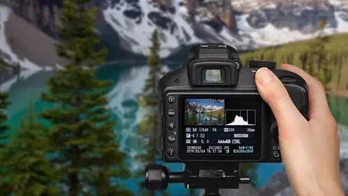
Now as far as your typical exposure, I don't know that you're expected to do this. But it's quite frequently that most people are gonna have to play with the exposure, the saturation, and the sharpening of their images to some degree. Even if they have got the perfect exposure out in the field, there's usually a little something that needs to be played with to really make it look right. So with the exposure we have a lot of different things that we can go in and adjust. In the develop section there's gonna have a whole section within basic that's gonna have some very simple sliders that you're gonna go in and work with. So let's go down to Yosemite National Park. And this is the natural straight shot out of the camera. And if we look at the histogram, we can see that we got a lot of areas of darkness and that's all the shadows here in the valley. And then we have some areas of brightness which are probably the sky. And then we have a lot of kind of in between very flat area here. So le...
t's take a look and you can see all the sliders are right in the middle at their kind of zero setting right now. And improving this image, I am gonna try to reduce the contrast a little bit. I'm bringing the highlights down. The highlights were a little bit blown out. Little bit too bright there. And so what I did was I brought the highlight slider to the left, to make the highlights less bright. I brought up the shadows so that we could see into these trees and the rocks and so forth, a little bit brighter. And I brought the whites down a little bit as well. The whites and the highlights kind of work together. The whites are a little bit brighter than the highlights. It's just breaking the scene up into different segments along the exposure scale. And so, working in this area, you're gonna want to be looking at the histogram very closely. And so as I say, these different sliders deal with different areas on the histograms. And these are words and names that they have changed and is likely different in different programs. And every once in a while I forget which one is which. And it's very easy 'cause blacks are in one end, whites are in the other and then we have the shadows, highlights, and exposures towards the middle. And so when you slide one of the sliders in Lightroom, it adjusts mostly in this area here but it will eventually push all the other pixels. It kind of works a bit like a rubber band. But this is the area that has the most adjustment in it. So sometimes you'll need to work with two sliders to adjust an area. So in this case, we have just a little too much in the... The shadows are a little bit dark. So I'm gonna go in and I'm gonna make the shadows a little bit brighter by lightening up the shadows quite a bit here. And so in this case, I have a lot of highlights up here that it's gonna be very challenging to crop out. But if I take the sliders and I just bring the highlights down a little bit, maybe bring up the shadows a little bit as well. Bringing up the shadows is probably one of the things that I most frequently have to do. Oftentimes it's just information lost in those shadows in relationship to everything else. So in this photo, here on the photo on the left, you'll notice the highlights on the face got a little too bright. We're getting a little bit too much exposure in that case. And so bringing those highlights down back to where they are kind of in a normal skin tone. Up at mount Rainier, you can see with the scale over on the right hand side, I've brought some of the highlights down. There is some points of light with the sun hitting the snow up on the top of the mountain that just got a little too bright in the left hand photograph. And then lightening up those shadows again so that we can see in those flowers and the rock area a little bit more easily. So every photo needs a slightly different little touch to it. But a lot of 'em have kind of a similar concept to 'em depending on the types of photos that you shoot. Local exposure adjustments versus global exposure adjustments. A global adjustment is something that affects everything. For instance, the color. The scale of either blue to yellow and so forth. You would fix that over everything. Going in and locally changing something, there's a number of tools. We have a graduated filter. This is very similar to the graduated filter that we were playing with in the gadget section. But this is in post. The one to use out in the field typically is a little bit better because that records the correct colors. This is potentially gonna try to be working with pixels that are a little over exposed and try to bring 'em back down. But it is possible in here. And so you can set this exposure as need be to darken a photo. And so you would slide it over the top and you can darken the sky down. But you have to be careful about not grabbing an overexposed photo 'cause there's only so far, only so much that you can do to correct for something like that. But if there's just a little bit of a tweak, what this does is it allows you to adjust everything from a flat line on one side or the other side. In this particular case, the highlights seemed pretty good. I just wanted to lighten up the foregrounds a little bit. And so I could use that neutral density filter down there just to lighten up the foreground so we can see what's going there a little bit more easily. The radial filter is gonna be a circle or an oval area. Talked about it before with the lead singer on the band, draw a little bit more attention. Using the same thing in this case. We have one subject that's really standing apart from the crowd. And we can draw even more attention to them by putting this oval over them and darkening everything outside of that oval just a little bit. And you can see there's just a touch. Let me see if I can go back. And so I'm not making a radical adjustment. I don't want it to be too harsh. But just toning it a little this way. As I say, it's kind of like that flavoring with the food. Just adding a little bit of flavor to make it the style that you like. And so that's the radial filter. The adjustment brush can be handy when your area is not just like a simple line above it and below it or a circular area. Example here is the road going in. I wanted it to be just a little bit darker and so I darkened and selected that area and made that a little bit darker so that it drew your attention less there and more towards the flowers. And so generally when you darken something, it's gonna attract less attention. Your eyes tend to go what is brightest in the photograph. So those are three different ways that you can go in and adjust the lightness and darkness. This is what we used to call dodging and burning in the dark room, where we would dodge an area that we wanted to hold light back from or we would burn an area that we wanted to add more light to. It's a very common thing. It's been done in photography since the very beginning. Controlling the saturation. Now the images that you get back straight out of your camera typically are a little desaturated if you shoot in raw. And so it's gonna need quite frequently a little bit of boost in the colors to make it look even natural, let alone trying to make it look good. The problem is is that it can be kind of addicting. And it can kind of be like this is the magic bullet that fixes the photograph. I will just add saturation to it. And so one of the problems for people who are new to photography or new to Photoshop is that they will decide well, if a little bit is good, more is better. And they just keep adding it until it gets ridiculous. And there's a lot of images that I know online get a lot of likes because they have this kind of eye candy appeal to it. It's not really based in reality but it has some really vivid colors and it looks nice in a photograph. But then after a while, it starts to wear on you a little bit too much. And so you have to be careful about overdoing things. You have to be very careful about adding too much saturation when people are involved. Because if we add too much saturation, as in this right photograph here, the skin tones really start changing and not looking so good. So Lightroom has two different ways of adding saturation. One is the traditional saturation slider. The other one is a vibrance slider. And the difference is is that vibrance is essentially smart saturation. In saturation, if you say give me 10% greater saturation, it takes all the pixels and raises everything up 10%. If you say make it a little bit brighter in vibrance, what it does is it looks at pixels that don't have much saturation to 'em and it adds a little bit more to those than everything else. So if something has a lot of saturation, the vibrance setting doesn't effect it quite as much. And so you'll notice that we've got better colors in the clothes here, but her face hasn't gone with the fake tan look. And one of the questions that people continually ask is how far should I go in adjusting an image in any particular setting? But especially in this vibrance type setting. And so there's a couple different answers. One, just until it looks good. And if you know what looks good then you just slide it up to that point and that's where it's at. But as you go back and forth, you're kind of torn between well this looks okay and that looks really nice but maybe a little fakey. How far should I go with it? And so my rule of thumb is that you should go one third of too far. Sorry about that, clicked a little fast on that one. And so as an example to this, one of the options that we have is something called clarity. Which is mid tone contrast, adds a little bit of texture to your image. Now this one might be a little bit harder for you to see at home 'cause it's a little bit more subtle and you have to really see it on a big screen. But if you take the clarity and you slide it too far, the image often gets a little too crunchy or a little to contrasty. So figure out the point at which it went too far and really started to look bad, 50 here. And go about one third of 50, which is about 17. And so if you just slide that slider across until you say whoops that is way too much. So for instance, let's try this on the saturation slider. So we'll have our original image on the left. Let's take the image on the right and let's just slide that saturation slider until you look up at the top. Those vibrant colors. We have clearly gone too far. And what does it say down here? Number is 60. So probably a good setting would be around one third that, 20. And so what we're doing is we're kind of setting a boundary where things clearly don't look good and we don't want to go there. And we don't want to go anywhere close to that. And one third back from that is just kind of a nice rule of thumb as far as how far to take something in this field. So let's take our original image. Let's see if we can add a little bit more blue to this sky. Okay, this is a little too intense up here at plus 90. Let's go about one third that far up to plus 30. And that seems good. But still pretty natural. And so in working with these sliders, until it looks good or one third of too far. Now as I said before back in the focusing section, you really have to nail sharpness in camera. 'Cause there's very little we can do here. There is a few things that we can kind of tweak a little bit to kind of give the appearance of a little bit more sharpness. But there is very little that we can do. And so I was in the right place at the right time for this shot. And so we had the hydro races in Seattle and I caught a series of photos of one of the hydros doing a flip as it came around the turn and I had the right lens and I had everything. Just seeming clicking, going through the right things at the right time. I brought the images home, loaded 'em up, started to look at 'em. And as I looked at 'em I was pretty excited at first and then I realized, you know, that boat seems a little soft. And the background seemed sharp. And every image, my camera did not focus on the boat. It was focusing on the background. And all of these images are destined for the garbage. 'Cause they're just no good at all. And so you really have to nail the focusing out in the field. You're just not gonna be able to fix a problem like that. Now there are some things that you can do if you are 99% of the way there. One option is the clarity slider. And this adds essentially mid tone contrast. A lot of people say that it looks like texture to their photograph. And an image that looks like it has really clear texture tends to be a little bit sharper in nature. You can add a little bit of contrast. That'll also give you the appearance of a little bit more sharpness. Also, a sharp image typically has a nice black point on it, so you may need to drag the blacks down a little bit so that they're a little bit darker. Then there is a section for detail and sharpening. And so you can control the amount of sharpness with the top slider, and then some fine-tuned controls with the radius, detail, and masking about exactly how big of pixels it's working with and what type of contrast edge it's working with. But as we mentioned before in the focusing section, over sharpening can be a problem. And so the normal raw image typically needs a little bit of sharpening as a standard. And so some sharpening is fine. But if you go too far, what it's doing is it's adding a very highlighted edge around everything. And it gets to look bad if you go too far with it. And so this is one of the problems that I remember in the early days of Photoshop. People realized there was a sharpening tool and it made their lenses seem a lot sharper. But when they enlarged their images, it just had a really bad look to 'em. And so you got to be careful with this, like many other things in photography, going too far with it. Go just as far as you need to.
Class Materials
Free Download
Bonus Materials with Purchase
Ratings and Reviews
a Creativelive Student
Love love all John Greengo classes! Wish to have had him decades ago with this info, but no internet then!! John is the greatest photography teacher I have seen out there, and I watch a lot of Creative Live classes and folks on YouTube too. John is so detailed and there are a ton of ah ha moments for me and I know lots of others. I think I own 4 John Greengo classes so far and want to add this one and Travel Photography!! I just drop everything to watch John on Creative Live. I wish sometime soon he would teach a Lightroom class and his knowledge on photography post editing.!!! That would probably take a LOT OF TIME but I know John would explain it soooooo good, like he does all his Photography classes!! Thank you Creative Live for having such a wonderful instructor with John Greengo!! Make more classes John, for just love them and soak it up! There is soooo much to learn and sometimes just so overwhelming. Is there anyway you might do a Motivation class!!?? Like do this button for this day, and try this technique for a week, or post this subject for this week, etc. Motivation and inspiration, and playing around with what you teach, needed so much and would be so fun.!! Just saying??? Awaiting gadgets class now, while waiting for lunch break to be over. All the filters and gadgets, oh my. Thank you thank you for all you teach John, You are truly a wonderful wonderful instructor and I would highly recommend folks listening and buying your classes.
Eve
I don't think that adjectives like beautiful, fantastic or excellent can describe the course and classes with John Greengo well enough. I've just bought my first camera and I am a total amateur but I fell in love with photography while watching the classes with John. It is fun, clear, understandable, entertaining, informative and and and. He is not only a fabulous photographer but a great teacher as well. Easy to follow, clear explanations and fantastic visuals. The only disadvantage I can list here that he is sooooo good that keeps me from going out to shoot as I am just glued to the screen. :-) Don't miss it and well worth the money invested! Thank you John!
Vlad Chiriacescu
Wow! John is THE best teacher I have ever had the pleasure of learning from, and this is the most comprehensive, eloquent and fun course I have ever taken (online or off). If you're even / / interested in photography, take this course as soon as possible! You might find out that taking great photos requires much more work than you're willing to invest, or you might get so excited learning from John that you'll start taking your camera with you EVERYWHERE. At the very least, you'll learn the fundamental inner workings and techniques that WILL help you get a better photo. Worried about the cost? Well, I've taken courses that are twice as expensive that offer less than maybe a tenth of the value. You'll be much better off investing in this course than a new camera or a new lens. I cannot reccomend John and this course enough!