Color Tools Overview
Lesson 9 from: Get The Most Out of Your Photos With Capture One Pro 12David Grover
Color Tools Overview
Lesson 9 from: Get The Most Out of Your Photos With Capture One Pro 12David Grover
Lesson Info
9. Color Tools Overview
Lessons
Interface Overview
04:08 2Customizing Your Workspace and Keyboard Shortcuts
15:55 3Making Your First Catalog
07:02 4Importing Your First Images
11:51 5Virtual Organization
20:21 6Basic Tool Behavior
13:32 7Starting Approach to Editing
24:02 8Next Level Editing
20:10Color Tools Overview
16:28 10Basic Copy Paste Workflow
10:40 11Basic Export
13:32 12Getting Started on an Edit
05:13 13Adding Layers to Your Toolkit
10:25 14Radial and Linear Gradients
08:21 15Luminosity Masking
10:12 16More Advanced Layers
22:44 17Removing Simple Objects and Local Adjustments
14:52 18Advanced Color Edits
05:31 19Using the Color Range to Select Just What You Need
05:45 20Editing Colors in General
03:48 21Editing Skin Tones
14:30 22Combining Color Selections with Layers
08:58 23Creating Masks From the Color Editor
10:28 24Color Grading with the Color Balance Tool
16:34 25Intro to Second Day
01:37 26Session Overview
05:47 27Tethered Basics
05:04 28Setting Up Simple Sessions and Setting Naming Conventions
10:11 29Controlling the Camera
05:08 30Handling Next Capture Adjustments
07:39 31Using Live View Focusing and Overlay
19:40 32Selecting Images and Using Smart Albums
14:55 33Saving a Session Template
03:51 34Overview of Process Recipes
05:28 35Tokens Overview
26:21 36A Simple Round Trip
14:04 37Sharpening Workflow
08:06 38Creating a Recipe for Web Output
15:50 39Selecting with a File Name List
11:46 40Using Plugins and Sharing to Clients with PRODIBI
06:06 41Image Review 1 - Sometimes Simple Works!
08:44 42Image 2 - Radial or Gradient Masks, Object Removal
07:28 43Image 3 - Keystone Tool and Aspect Ratio
09:11 44Image 4 - Using Styles in Capture One
10:04 45Image 5 - Black and White
09:13 46Image 6 - Landscape
07:22 47Image 7 - Portrait
05:06 48Image 8 - Action in Lowlight
07:46Lesson Info
Color Tools Overview
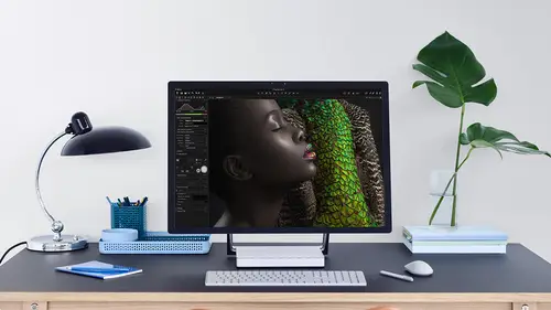
So far, we've looked at all things that a base sort of around exposure and contrast to some extent color with saturation. But we've yet to sort of manipulate color to any strong degree. So this is where we can look into the color told Tab whips Wrong click up here, which contains everything to do with color. Let me just switch to my color tools. So what you'll find in here is the color editor. I'm just gonna bring them out so we can see them side by side and the color balance till lets reset that. So we're back to zero, and we just make these a little bit bigger because often these two can get confused. So first of all, we're gonna look at the color editor and then later we look at the color balance, too. So the cholera deter is about picking a color and changing its appearance. So picking a red, maybe making it more orange or less saturated and so on. So that's its purpose. The color balance tour is generally Maura about creativity, so applying some kind of color grade to the image li...
ke do I want to warm it all up to some extent do I want colder shadows and warmer highlights and so on. So the color editor is exactly that. It's a tool for editing color. The color balance is more your creative friend, so it's important to have those two distinctions. Now the cholera editor is divided into basic advanced in skin tone. So for this segment, we're gonna look mostly basic and a little bit that advanced. And then when we get to later on in the course, when we look a deeper editing and color, then we can look at the advanced tab in much more detail on also the skin tone tap. But you can probably already guessed or assume that the advanced tab allows you to do much more critical color edits, which it does on the skin tone tab is designed purely for editing skin tone to brilliant all for anyone who shoots portrait or people anything like that. The skin tone tool can save you a huge amount of time in a post production work purely because it has thes two or three additional sliders, which creates skin tone uniformity. So none of us have perfect skin tone course. I have different skin tone all over my face like everyone. What the skin tone tool it in the color editor can do is basically give me a even skin tone. I could make it perfectly even, or I can, you know, balance it. So it still looks natural and not like some crazy instagram filter or whatever, but it's a brilliant tool for that. So as we're still in quick stop moat, we're just going to look at how the color red it. It'll works in the basic sense. As I said, when we move through later, we will get more advanced. So let's put color balance away. Ah, ironically, there's also the black and white, all in the color tool tab, but that guy's very easy to use. We look at that later, too. So if we go to the basic tab, zoom in on our image a little bit. You can see that is divided into these six or 7 6 different color tones. So, for example, if I wanted to you change, the reds would click in this segment. Here it also select. Sit down here and then I have the ability to modify those red colors So, for example, if we look at our great fruit and I changed the lightness, then it will make that much darker. And if I changed its saturation, then it will saturated more. So that's just in the red tones. Then equally. If I wanted Teoh, let's say that it let's go over here to maybe yellows, oranges, for example. Then we could do similar things, and they're now that's changing the color appearance on the edge of the ball, like so. So you only have these 123456 zones to play with. Now, if you're not sure what you're gonna be affecting in any particular zone, there's a really handy little addition or option down here, which we can click on a called view selected color range. So if we turn this on check box, everything goes to black and white, which is not in that range. So you can see now only the red items on the table and now showing in color, everything else has turned to monochrome. Now you do have a small amount of control over the zone, so you can see here on my red zone. It's just picking up a bit of a warmth on the crust of the bread, which is probably sneaking Maurin this direction so I can, if I hover my cursor over the segment, make this a bit bigger. So it's easier to see if I hover my cursor over the segment. I can actually make it narrower, and you see now I've limited the effect away from this portion. But the big disadvantage of the basic tab is that it's also going to affect the neighboring color. So even though I have narrowed down the red range here, I've wide in the range that sits alongside it. So there's a compromise going on here, which is why the basic tour is really only good if the color that your changing sits banging that that segment and you don't really have toe edit it, for example, so in this case we can almost get away with it. If we just drop the color tool back over here, we can almost get away with it, because if I sit into the regs segment and change the lightness, you can see that it's no big deal, really, that I can pretty much get away with it. But if I needed more critical color selections than that's where we get into the advanced side of things before we do that. Just Teoh. Clear up how the rest of the sliders work. Whips make you a bit bigger again, so we've got four sliders, which have pretty much self explanatory. You've already seen how lightness and saturation works, so that's making that chosen zone. Either brighter grapefruit gets brighter or darker, great, for it gets darker like so and saturation less saturated or more saturated. Hugh will essentially tweak the color off that zone in either direction around that circle. So if I pushed the hue in this direction or this direction, were essentially walking this little dot in each direction. So 30 degrees in one way and degrees another way. And then you can see how it affects the color, like so that excuse me now, smoothness. It doesn't relate to, like how smooth you know, the color looks or anything like that. It relates to this kind of fuzzy boundary on either side of our wedge on this controls. If you like the adjustments that roll off into the neighbouring pots of into the neighbouring color so like this that just gives me a GN to roll off into the next neighboring color. If we take smoothness down, you see it gives me very hard edge, so it will cut off the adjustment straightaway, which can lead to post a realization. And so when we look later on in the course about color editing and manipulation, you'll see how smoothness actually can be really important. But once again, you're kind of limited in the basic tap, which is why, if you can always figure out how to use the advanced up, and it's really not difficult, lets reset what we've done here and let's turn off you selected color range and we go to advanced on. People tend to get intimidated because right now I can't do anything. It'll great out. How does this work? What do I do? And it's all centered around you, defining a color range first and then making the edit. So the basic tab is pre defined ranges. The advanced tab. It's down to you. So again, if we use our great fruit as an example, if I grab the picker, click on the flesh like so it will give me a suggested range, like so with the dot in the center again, if I turn on view selected color range, we can see what's part of that. Now I can have a very broad range, so I could actually include the grapefruit and the edge of the boat. Or I could hover my cursor towards the edge and make it narrower. So it's only the grapefruit, so the range could be narrow or broad, and equally we can have an influence on the saturation range as well. So range goes in this direction, so coloring. So if we wanted to, we could have a super broad range like this, and saturation goes from the center of the circle toe out, and you can see that the color indication here is showing us more saturated colors and less saturated colors. So if we want to cut out the less saturated colors and you can see it just change in the shadow in the bowl behind, then we can do so and we can cut out the more saturated colors. So this gives us the ability toe have really narrow ranges, and you can see here in the middle where it's less saturated. We can choose to include that or cut that out. So it's way more powerful. And also you're not limited to those six or seven zones. We can have up to different pics. I'd be amazed if you ever got to but the ability to have those 30 different pics works also later, in the course, when we took about layers or local adjustments, you can also combine colored it with layers, making them even more powerful. And you can't do that with the basic tour. So, um, lets reset you and just like a couple of other examples. And then we get into much more detail when we come to the, uh, color manipulation part of the course. But once again, if you're in the advanced tab, grab the color picker. Click on the color you want to edit, turn on view, selected color range, and you're very quickly see which elements of the image it's going to effect. Like so, adjust the ranges suited so color range in this direction, as you can see when out sneaking into the petals and then saturation range in this direction. And if we zoom in, you'll see if we cut out the lower saturated range, we just lose the tips like so So it's really simple, but really powerful. And then, once you're happy with your selection, weaken, turn off you selected color range and then that it that particular color. If you want another color, grab the picker once more, click on the color and then go through exactly the same process as you did before. So don't be intimidated by the advanced tab. And, as I said, loads of examples coming up when we get to that part of the course in more detail. So that's color editor in basic now color grading. Also in basic. Let's drop away the color editor and then bring back color balance like so we make this a little bit bigger, just so it's easier for you to see. And let's just pick on one example on Let's reset this so the color balance tall is divided into a master wheel and three wheels, which is shadows mid tones and highlights. Now they're represented in this triple array like so, or you can individually play with shadows, mid tones and highlights. This tour really couldn't be simpler to use. It's really straightforward. So the idea of the master tab is that it affects the entire image. So if I grab the little center circle and pushed that in this direction, that will warm up or apply that color tint to the whole image, if I go in this direction, it will call it down somewhat. The further I go out to the edge of the circle, the stronger it is. That's all there is to it. The only difference with the three way tab is that we're now divided into shadows, mid tones and highlights, so weaken target those adjustments in different areas. So if we go back, Teoh continue on editing this image back toe the motorcycle. Then we can look at the shadows and think, Well, let's do a typical cinema sort of color grade. So I take my shadows and I would call them down somewhat or go to the TL aspect and then the highlights, which is kind of the clouds. And over here, let's make them warmer or even sort of red sky at night and then the same for the mid tones. Just warm everything up in general in the three way tab, you've got additional sliders to the right, and this relates to density. So if we pick up this one, this will make our shadows darker or brighter. It's if you like another way to affect. Contrast, a swell. So just a little tweak here we could darken our shadows a bit. Lift on mid tones and hey, presto, you've learned how to color. Great. It's really that simple. There's no mathematical numbers. There's no required knowledge of how to mix colors in curves or anything like that. It's what you see is what you get, so it's very elegant and simple to use. If you want to reset, start again, just double click, and it will take you back to the center so really simple to experiment again if we want to preview what we did in our color balance. Still, hold our option key down and click on Reset, and we can see before and after. So just a subtle change. It's a really fun tool to use. You'll probably find you end up doing a similar color grade to everything else. It gets even more awesome when we combine it with local adjustments or with layers as well, which is also coming up when we talk about that. So not only do we have the power of the color balance tool, but if we combine that on a layer, then we can decide where we want to put it. We can change a pass ity. We can do all kinds of things, combine it with other adjustments, like saturation and so on. But if you want to keep it really simple, go for it. It's such an easy in elegant tool to use, and you can use it on any image. It's not just for landscape to portray its carbon. It still works great on anything and even on a let's go back Teoh initial image, if I can find it so uh, slightly hazy one. So So this was the one we did with that different levels technique that individual channels. Now there's still, if you like somewhat, you know, a coldness in the highlights, so the color balance till you can also use for color correction. So in my highlights, I'm going to say, Well, let's just warm those up a bit and corrected so we could just take out the opposing color. So if I need to get a bit mawr, then I can pretty much do a nice job of taking that out. Because I know blue sits down here, so I just go in the opposite direction. So okey click. So before and after, maybe a bit too strong and so on. So the Taliban is still great for creative input, but also good for a color correction like that.
Class Materials
Bonus Materials with Purchase
Ratings and Reviews
Leon
This is a superb course. David is an excellent teacher. I'm coming to the end of it and have learnt so much. I've been using the software for a year, self-learning as I went along. I had watched the odd David Grover video on YouTube, but never got much further in my understanding of the software. Capture One is brilliant software and to do it justice you need to learn it properly from an expert. Highly recommend this course if you want to produce professional results.
lakiut
Excellent course and a very engaging speaker. If you are starting with Capture One 12, this is the best class to take. The lessons are presented and explained in an organized way that it shortens the learning curve. Thank you, David. Cheers!
Jino Lee
One of the best course I've purchased. Very helpful and I learned so much more with this course and in a short period of time, than all the official Capture One You Tube videos put together! Anyways David Grover is the same guy who does the Phase One C1 official YouTube videos, so there's no better person to conduct this course than him! Truly excellent and if you think you know all about C1 Pro 12 interface, wait till you watch this course.