Lessons
Class Introduction
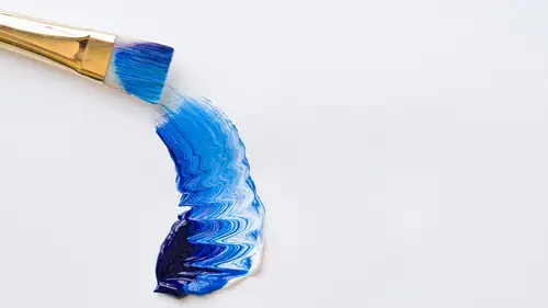
05:14 2Materials for Acrylic Paints
08:30 3Mixed & Layered Acrylic Paints
18:35 4Demo: Explore Glaze Mediums
19:56 5Demo: Palette Knife Technique
12:33 6Demo: Brushes for Acrylics
15:05 7Surfaces for Acrylic Paints
19:15 8Demo: Gesso a Surface
09:13Lesson Info
Materials for Acrylic Paints
What we'll start with is the color itself and the acrylic color, just like with watercolor oils, you have primary colors which are your reds, your blues, your yellows. And your secondary colors which is your orange, your purple and your green. And then what's called your tertiary colors, your browns and your grays. Those are the neutral colors there in your palette. I really recommend, just like with other media, that you have all these different types of colors in your palette, mostly because you want to have the options and the range to use a variety of different, make different purples or greens or oranges from the colors you use. But also, just to get to know the colors. If you only have one red, one blue, one yellow, you're not getting to know the potential of acrylics or the potential of watercolor oils. So I strongly recommend, for your base palette, to have a couple versions of each of the primaries and then at least one green, one purple, one orange, and then all of your terti...
ary colors, raw umber, burnt sienna, burnt umber, Payne's gray and, of course, Chinese white, or in this case, titanium white, which is basically just a clean, clear, cool white. So, what I did do to make it a little bit simpler to see and understand the colors is I made a chart here. I'm gonna show you, not really a chart, more of like a test. I'm going to talk a little bit more about the two barred color and then we'll shift to this. One thing that people often ask about is on the tubes of paint, there's what's called a series. There's series one, two, three and four. This is permanent violet. It's a series three color. So what I think is really important to know is that the series two, three and four are gonna be more expensive than the one. The most expensive is series four. And the reason why these kinds of colors are defined this way, and it's done for watercolor, acrylics, oils, any kind of paint, is because the manufacturers of the paint want to make sure you understand it costs them a lot more to make a series four color. It's a more rare material so it's more expensive. And that's the reason why it's more expensive. It's harder to make where as a series one is more plentiful, the source for making that color. So this is what's been done for quite some time, as long as paints have been around. If you look at a series one color, you're gonna know it's not gonna cost as much as a series four. Some of the more rare, beautiful colors, are of course, series three and four. You have to spend a little more to get, like this gorgeous, permanent violet. It's a really beautiful color. It's also a series three so it's a little more expensive. Acrylics, as you can see, can come in small tubes, sort of medium tubes and then very large tubes. It's much larger than you might expect for watercolor because people who paint acrylic paintings, some will paint small but they also can paint really, really large. Watercolor paintings generally aren't enormous. Typically. They can be but when people are painting with acrylics, there's a tendency to paint larger, like with oils. The quantity of the color is much more substantial than a little tube of watercolor. The other thing that I want to mention is that when you're building your palette, you're going to try to have a base set of colors but you can't go by the color that's literally on label of these tubes of paint because they don't match what's inside. You can't use that as your guideline. What you want to look at is what are the types of primaries that you can potentially use and for this, I want you to see the different types of reds, blues and yellows in your primary category that are great to have in your palette. We'll start with the cadmium red hue. That, across the board, cadmium red is a great red to have in a watercolor, acrylics, oils palette because it's very warm red. Now, naphthol crimson is a warm red but not as orange-y as cadmium so that's also a good color and it's akin to alizarin crimson. Those two colors are kind of close to each other but they're very different from what's called, and I always say this wrong, quinacridone crimson. It's so long. I just call it Q crimson or Q rose. It's a very pink color and it's a wildly different red than cadmium red. Even if you only have two reds in your palette, cad red and Q rose are beautiful colors and they're really different types of reds. The purples and greens and oranges that come from those two reds are really different too. If you don't have all four of those colors, at least have the cad red and the Q rose. Now cadmium yellow, you can also see again, it's really orange-y, very different from, say, the Hansa yellow or even the cad lemon yellow. Lemon yellow is typically sour, like with lemon. It's meant to seem kind of cool and greenish and is very different from cad yellow, just very orange. So those two colors, again, if you only have two yellows in your grouping, as opposed to three, you're trying to save money, you want to have a variety but you don't want to have too many variations, those two are really key to have in your palette. Now, the blues have some beautiful variation and I'm loathed to lose any of them because each blue is so different from the other. Their reaction in the colors that come from them are also very different. Cobalt blue and ultramarine, these two colors, would be what I would consider sort of a purple-blue and so they skew to the less warm side. They're more purple as opposed to cerulean and phthalo, which you can see it, the color's really kind of greenish-blue. So these two colors are more similar to each other and the cobalt blue and the ultramarine blue are more similar. You could substitute and just have one cobalt and a pthalo but all four of these blues are really quite lovely and you can literally see the variation between them is more different than each other than say, the yellows or the reds. I tend to want to have good blue options and those are all good. In your secondary category, I have two different types of greens. There was only one purple that seemed to make sense to me to have, although there are others. And then one orange. The reason why you might have a secondary color, and secondary just means, on a color wheel, it's the color that comes from two primaries. A yellow and a blue made this green. A yellow and a red made this orange. A red and a blue made this purple. But when it's pre-mixed in a tube, the color is more pure. It's less neutralized. It has a vibrancy level that is even more potent than when you blend or mix the colors from the primary chart. I like to have secondaries in my palette. The tertiary colors, that means, like, the third out on the color wheel, are colors that are basically browns and grays, or black and white. And the browns and the grays are made from the mixing of three primaries to get those colors, but when you buy them in a tube, like that burnt sienna, is a version of a brown, it's more rich and dense when you buy it in the actual tubes so it's a good alternative to have there and you want to be able to work with your neutral colors. We have burnt umber. We have raw umber. Burnt sienna and yellow ochre. This burnt umber, I wanted to show you, is different than this burnt umber and the burnt umber is two different brands. What you're gonna find, too, is that different brands have different sort of colorations. They shift a little bit. And even different batches of a color can be different. I actually like this burnt umber. It's a little more chocolate-y. I believe it is the Utracht brand, which I really... I really liked the Blick and the Utracht, but this is the Utracht brand of brown. It's warmer than the burnt umber from another brand. You're gonna test and sort of discover, as you buy these materials, what colors you like the best in terms of brand usage, but I could recommend, if you're first starting out, you've never used acrylics before, you can't got wrong with the Blick or the Utrect. They're really true to my expectations of what ultramarine should look like or cobalt blue, et cetera.
Class Materials
Bonus Materials with Purchase
Ratings and Reviews
anshu priya
Very thorough . perfect for someone who wants to start painting with Acrylics.
user-f0fd68
Great class with all the fundamentals!
Nancy
Nota review but a suggestion. Use a table knife to remove paper from bloc. No curling of edges.
Student Work
Related Classes
Design Inspiration