Lessons
Class Introduction
06:06 2Colors of Oil Paints
15:16 3Solvents and Varnishes For Oil Paints
06:19 4Demo: Oil Paint Glazing Techniques
16:05 5Oil Painting Brushes & Palette Knives
08:01 6Demo: Oil Painting Brushes
14:34 7Demo: Oil Painting Palette Knives
08:15 8Oil Paints Tools and Supplies Q&A
04:22Lesson Info
Colors of Oil Paints
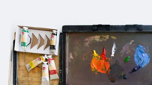
So I'm gonna take my spot here at the desk, and we're gonna talk about the materials for oil painting, and I'm just gonna lower my chair just a tweak. There we go. So what I'm gonna start with is the colors. Basically the tube oil paints, I'm gonna move onto the brushes, and then we'll talk about the surfaces. And as I move through this, I'm also gonna talk about some of the other tools that are used and necessary for oil painting. So we'll start with the color. Basically oil paints come in tubes, and the tube color is standardly a small size, but you can get a really large size as well if you paint in a very large fashion on large canvases. And oil paintings, as I said, are held together by oil that holds that pigment together. And so, because of that, oil paintings generally use solvents in order to clean up the brushes, or to thin the paint. Typically you don't use water, but because we're in this space where it's not ventilated, I'm gonna use a set from Blick that is all water solu...
ble, which means we'll just be able to use water to clean the paintbrushes, and also to move the color across the surface. But let's talk a little bit about some of the materials that we use here to move the paint around, as well as talking about the colors we have here. So the first thing you probably wanna think about is what is the palette that you're going to use? What are the colors that you should choose for getting started with oils? Now typically I recommend that you start with a couple of primaries, and that would be a couple of reds, yellows, and blues, and those are your primary colors, red, yellow, and blue. People mostly think there's only one red, one yellow, and one blue, but of course there isn't. You want a variety of reds, a variety of blues, and a variety of yellows because it gives you more opportunity to create different types of greens, purples, and oranges. So what I typically like to have is at least two or three reds, two or three yellows, two or three blues, and then what's called your secondary colors, and that's orange, green, or purple. You don't need a lot of the secondaries, but it's really nice to have them in your palette because they're a little bit more intense when they're in the tube versus when you mix them, or blend them, or glaze them. The third area of colors would be, they're called tertiaries, and those are your neutral colors, burnt sienna, yellow ochre, Van Dyke brown, Payne's gray, raw umber, ivory black, and then of course white. And white serves a very important purpose in the oil paintings. If you think about Steven's work, Steven Kenny's work, the white mixed with the color was what made that opacity in the areas of light. So you really need white as part of your language if you wanna create volume or volumetric form. So I think it'd be easier to show you the colors if we look at this chart, I'm just gonna scoot this over, that I made, and I made this ahead of time because with oil paints, typically they take a fair amount of time to dry, and I can tell you that the drying time on some of these colors took a week, which is amazing to me because with acrylics and watercolor, they dry pretty fast. Cadmium reds and most cadmiums take the longest to dry. So I made this ahead of time to make sure that it would be fully dry, and some of these colors are still slightly tacky even now. There's a little bit of tackiness to the touch, and some are completely dry. So the one thing you wanna pay attention to with oils is your dry time. It comes into play when you're wanting to layer or glaze color, we'll talk more about that later, but you have to pay attention to that because you certainly don't wanna go back into something, try to paint over it, and you're just moving color around. So let's just look at the colors that I've talked about here. If you look to the left hand column, I have actually four different potential choices for red, and what you wanna have is at least two variations, this is vermilion hue, which is kind of a very warm red, and a really different kind of red is rose matter. You notice that when I talk about reds having a warm red, or more orangy red, versus a kind of rosy or pinky red, at least those two reds should be in your palette, because the purples and oranges that come from those mixes will be really different, one from the other. So I have four choices, alizarin crimson is also a very common color in a palette, and the cadmium red deep hue is a nice variation, but again, that would be an extra color if you wanted an additional red. Now these two yellows are also really different from each other. The cadmium yellow light is kind of, you can see it's orangy colored, and the lemon yellow is sort of sour looking. So the kinds of greens that come from this, or oranges are really, really different. Now the cobalt blue and the cyan blue are also, I would say the most different from each other. Cobalt and ultramarine are similar, not the same, but they're kind of a purpley-blue, and the cyan blue, and the cerulean blue are kind of blue-green. So you'd want at least one purpley-blue, cobalt or ultramarine, and one kind of blue-green, cyan or cerulean. So if you're trying to make a palette and you don't wanna buy too many paints and you just wanna get started, you wanna have at least two variations, more if you can in terms of the blues, the yellows, and the reds. Now the secondary colors, you might say to yourself, well why would I need a secondary color if I can make them from the primaries? Well the reason why, and this is true for watercolors, acrylics, and oils, is that these secondary colors that come in the tube are really vibrant. They have so much energy to the color, so they're kind of nice to have in addition in your palette, so I recommend at least one green, one red, and one purple, and even with the greens, you can have a really cool green, or a really warm green. So if you can, and you can expand and have a cool and a warm of each of those secondaries, it's great, but I'd have at least just one option for each, a green, a purple, and an orange. And finally your tertiary colors, sort of third layer of color, are your browns and your grays, and of course your white that I mixed in with color so you could see them here. You have Van Dyke brown, raw umber, burnt sienna, yellow ocher, Payne's gray and ivory black. And again, you might say to yourself, well I could make a brown or a gray from mixing three primaries, which is true, but the purity and the vibrancy of a color premixed in the tube can never quite be achieved by combining colors like the primaries. So I like to have this as part of my repertoire, it's sort of a classic element of color that you should have, so I recommend it for the palette. Now the white is key because, as you can see, I've done a rose matter mixed with a little bit of white, and very little white here, and same thing with the blues, and Naples yellow, which is also a very opaque color I've mixed with the white. So the white creates opacity, and opacity is basically, it means that you can't see anything through the color. Opaque color blocks out what's underneath. So that's a real advantage when you have opaque to transparent colors, and oils have that beautiful range. You can get densely opaque with oils. So I've mixed white in to show you the difference between what would be a more transparent version of the color, versus a more opaque version of the color. White also neutralizes color, so it does have that reaction, but it also blocks out what's underneath. So it's just a useful thing to have. So the other colors I wanted to show you here were also versions of mixed colors that are opaque to transparent. And again, you can start to see, if you look at each of these colors, the variation that you get from adding the white, versus not adding the white. The white also, and this is just a visual thing in terms of a sense of space, when you add white to a color, it tends to pop forward in space as opposed to a transparent color, which tends to sink back in space. So like I pointed out in those images, you can create a depth of field, which is kind of cool, and that just means it feels like you can move into a 2D space as though it's a real dimensional space. So you also can see what I've done here, just something I wanna talk about in terms of stretching paper. I left this on the board so that you would be able to see what I've done here. I soaked and stapled paper to a board, and then I put tape on the edges, and I'm just gonna peel this off so you can see what's underneath. I also gessoed this surface, and that's something we'll talk about when we get to surfaces, gessoing a surface is very common with oil paints because if you put your oil paint directly onto a surface of paper, it'll simply absorb into that paper, and it'll soak through to the other side, and that is not ideal. So gesso is a way to preserve the paper's surface and keep all the color on top of that surface. So that's the purpose here, and the stapling on the edge was just a way to stretch the paper, again, I'll demo that later for you to see, but I wanted to have something premade for you to see what a soaked, stapled paper looks like. So another thing I just wanna talk about in terms of the colors, and this is just something that you might have a question when you go into the store and you look at the oil paints, and you say to yourself, why do the paints have this number on it? It says series one, or series two, or series three, or series four. What that means is it's grading the paint in terms of its level of expense to make for the manufacturer. So a series one paint is the cheapest paint to make, it's more readily available, the materials to make the paint are not super expensive, so it's a series one. The most expensive color would be a series three or four, and basically it just means that the materials that are required, and usually purples fall into that category, this is my favorite word Kenna, quinacridone violet, so hard to say! This is a series three. Let me sneak my chair forward. And this is, it's a violet, it's a beautiful color, it's more expensive than say yellow ochre, or Payne's gray because it's more expensive to make, but it's a beautiful, beautiful color. So even if you look at your repertoire and say, oh I wanna have a nice variety of colors, but boy that purple is really expensive, you can hold off initially, but when you get comfortable with the colors, it really makes sense to start to bring in these more expensive secondary colors. Another way that you can go, which I think it's a really nice way to start, is to get a kit like this. Now these are the water soluble paints we'll use today, but this came in a box, it's a variety of, you've got basically a red, an orange, yellow, blue, you've got your primaries, you've got your secondaries, and you've got some neutral. It's not a hugely expansive kit, but if you're really like, I don't even know if I like oils, I just wanna see if I like them, you could get a preset little kit like this and test these colors. And then if you like them, you can buy individual tubes of paint at the art supply store and keep augmenting your palette. So I kind of think with oils, because the price range is a little higher than watercolors or a gouache, or acrylics, that that's a nice way to begin, and then just keep adding in those additional primary colors and a few extra secondaries. But this is basically, I've laid out for you, primaries, secondaries, tertiary colors so you can start to think about what the basic palette should look like when you're tryna get started. So the other thing I wanna talk about is, and actually one thing I wanna show you is, let me just pull it over here, is a color chart. Now color charts, in my opinion, are probably one of the most important things you can do for yourself as a beginner trying to understand how this color functions. So I did this freehand, I didn't tape between these, you can if you're worried about being messy. I just used a square tipped brush to paint all of these squares. But basically what I did was I took this palette, and I put each of the colors at the top of the chart, and the same colors at the side of the chart, and typically I would label each of these colors so that you would know which one is which. And then I start to look at, if this is yellow ochre and this is cobalt blue, what is the green that comes from that color combination? Or if we have alizarin crimson and this green, what is the color that comes from that combination? By doing this, I was able to really understand what my color combinations would look like, and I think if you've never used these pigments before, doing this kind of a chart is a super helpful way to get you connected to the material. I am such a fan of color charts. Start with a color chart, get to know your pigments, and it's not a hard thing to do. Literally anybody can do this, if you've done a math times table, that's all you're really doing here, and you're combining the colors, maybe you're layering them, maybe you're mixing them. With oils layering takes longer, so I just mixed the colors on the palette and put them in each of these squares, and just made the combination ahead of time. So all of these colors, some of them have a little white at the bottom, this is the white patch, this is the opaque row. This took me about two hours to make this color chart, but this is something I would keep in my studio and I would tack it onto the wall and save it because I could use it as a reference. When I'm trying to paint a picture I'd say, well how do I make thus and such green? I want a minty kind of green, oh, here it is, and now I know what colors make that palette, or that color. The other thing that I started to do here was just little tests of the color. What happens when I lay down a thin wash of color and then try to subtract it out? How does that work? And I tested it with different amounts of linseed oil, different amounts of solvent, and I'll show you what those are in just a minute, but they do different things. Water does something different than linseed oil, and linseed oil does something different than a solvent. So I'll show you how those different things work when combined with oils. But I think with a chart, if you can test, and here I tested opacity levels, I added a lot of white to this violet color, and there's the pure color. So this is sort of a reference chart, you can label it, you can do whatever you want, I left spaces open to do more testing if I choose to do that. And again, this is a chart to get you into knowing what your colors are, but then also saving it as a point of reference.
Class Materials
Bonus Materials with Purchase
Ratings and Reviews
CG
I've been a silk painter for decades and am just starting out with oils. This course was extremely helpful, especially the demos. One thing--at the very end she says that with traditional oils you'll need to clean your hands with a solvent before washing with soap. Not a great idea if you want to be healthy. I remove pigment on my hands by rubbing a clean oil on them, then washing it all away with soap.