Lessons
Class Introduction
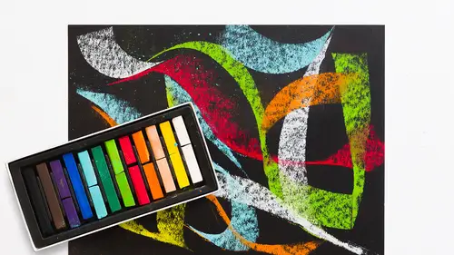
06:15 2Colors and Types of Pastels
05:20 3Demo: Blending Pastels
12:23 4Demo: Surfaces and Papers For Pastels
10:55 5Demo: Layer Pastels on Smooth Bristol Paper
07:20 6Demo: Oil and Dry Pastels on Tracing Paper
04:29 7Demo: Colored Paper With Pastels
03:22 8Demo: Pastels on Premium Mounted Boards
05:03Lesson Info
Class Introduction
So, my name is Mary Jane Begin, I'm an author, illustrator, and professor at Rhode Island School of Design. Now this course is designed to help introduce the properties and the materials used in exploring and developing drawings with pastels. I'll review the various types of pastels, both oil and dry stick. I'll talk about the papers and surfaces as well as the additional tools needed to create pastel drawings. I'll show some examples, demonstrate the properties of the materials I introduce, and answer questions about the materials and methods I show. Pastel comes in three types of forms, which is sticks, pencils, and oil pastels. Chalk pastels, like charcoal, sit on the top of the surface of the paper unless they're rubbed into the paper with fingers, rags, or stumps. Like charcoal, a fixative is needed to apply it to a surface. Oil pastels are held together with an oil base and react to a surface very differently than chalk pastel. The pastel pencils are used for smaller applications...
of color, and more detailed works of art. Like charcoals, pastels can cover a large area quickly and have traditionally been used for studies for larger works of art in other media, as well as finished pieces on their own right. So this is RISD graduate, her name is Marin Brennan, and she did this series when she was a senior. This is all pastel done on a toned paper, and basically what she did was she used that tone to kind of tell us about the coloration and the light of her piece. I'll show you some, I'll do some demonstrations on some color toned paper because pastels are beautiful on various tones and Canson paper is the paper that she chose. It's a series, and so she also decided to use a little bit of line work to kind of create the structure as well as this sort of light and shadow, and pastels are wonderful for creating a sense of light. They're really beautiful, they move very smoothly across a surface, and so she used some textural mark making but it's mostly a lot of blending and rendering. Now her pastels sit really high on the paper, so when you rub them in, they tend to neutralize into the tone of the paper, but Marin kept them pretty high key and solid in terms of shape of color. She also utilized some sort of rendering techniques with color where she chose to keep a lot of color in the shadow, and the shadow is reflecting the shirt, so there's beautiful color understanding in this series, partly because she was in a color class when she was doing this series. So when I work with pastels, I like to apply the color over also toned surfaces, but for me it was watercolor. The base of this was all a kind of raw umber watercolor, and then I did the pastels on top of that. And I start in by blocking in my shapes and then layering in the color, but this is a very sort of immediate and fast method. It's something that, it moves so directly and easily across a surface that it's not labor intensive. I find pastels to be kind of therapeutic because they are so immediate and easy to apply. Now I also tried to integrate a little bit of mixed media here, and that's something that I enjoy doing especially with pastels. I created a watercolor painting, then I did all of my pastel work, and then I dragged paint into the light of the clouds and this tree is all watercolor paint, and these little tiny flecks of light are also watercolor mixed with Chinese white, a kind of almost gouache like technique. So I do like to mix media with my pastels. I very rarely do a sort of pure pastel drawing. Now this is actually a really small painting, it's large here, but it's a study where I used predominantly pastel over a pink tonality of color, and so the pastel was chosen because it just reflected the kind of light and the cloud formation that I saw, and it kept this sort of soft modulation that pastels are absolutely beautiful for. You can create these really gentle transitions that in some media, like watercolor, can achieve, but not in quite the same sort of soft way that pastels do. Now this is the final painting for the scene I just showed you, and again I combined watercolor and pastel, and I experimented with layering, and again I tried this technique of painting on top of the pastel, and what I found was that I had to use a spray fixative, which is something I'll talk about later, to hold that powdered pigment onto the surface before I then touched it with this opaque watercolor paint. So there are certain things that you have to do for preparation for doing mixed media, but this was, this is quite a large picture, and again the pastel dominates this piece. This is all watercolor tonality, and this is all pastel, with just a few notes of the watercolor on top. And the same thing with this study. I enjoyed the piece before so much, and this series is a series I did of the bay that's right down the street from my house, so I would try to capture different times of day and different palettes, and so this was a study where I tried to neutralize the color, simplify it, and use pastel as the dominant voice for creating light and shadow. And this is much larger, it's 18 by 24, that study was to do this finish, and because I loved the softness of the pastel so much to describe the clouds, most of this is a watercolor base that's this tonality. This is a little bit of watercolor through here, and the rest of this is all pastel color to sort of beef up the color, but also keep it soft and really sort of a gentle gradation. I also went back into the watercolor, just pop up these transitions in the clouds. So pastel is a flexible medium, it's very immediate and fairly fast in application, and it's also beautiful for soft transitions. And if you're interested in following me, I would love it if you do. You can find me @mjbegin1 on Instagram or @Mary.JaneBegin.Art on Facebook.
Class Materials
Bonus Materials with Purchase
Ratings and Reviews
Janelle
This class is titled getting started for a reason. It tells you all the basics about material use for you to just get started and play with the medium. Enjoy the process!
Student Work
Related Classes
Illustration