Lessons
Class Introduction
06:15 2Colors and Types of Pastels
05:20 3Demo: Blending Pastels
12:23 4Demo: Surfaces and Papers For Pastels
10:55 5Demo: Layer Pastels on Smooth Bristol Paper
07:20 6Demo: Oil and Dry Pastels on Tracing Paper
04:29 7Demo: Colored Paper With Pastels
03:22 8Demo: Pastels on Premium Mounted Boards
05:03Lesson Info
Colors and Types of Pastels
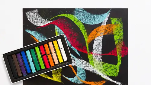
Today we're gonna talk about pastel and we're gonna talk about the different types of pastel and the application. And basically, there aren't really that many tools. You've got the chalk itself or pastel pencils. You also have these variations of oil to dry stick and so we'll talk about those and the colors you might choose to have in a palette. I'll talk about the other tools that you use to apply the color to the surface and then I'm gonna show you some different surfaces that one might work on with pastel. So the first thing I wanna show you is these are three different sets of pastel and what's nice about buying pastels is you can buy individual colors if you want, but you can also get them in what I would describe as like a little mini kit and these are pressed together so they look like they're all one, but these are three different kits from Blick Materials and basically, like art materials, it's a variety pack of assorted colors. This is what they call portrait colors. There ar...
e a lot more sort of skin tone colors and then this is what they call landscape colors. I don't usually define colors in quite that way. I think of them more in terms of a variety of reds, yellows and blues, your primary tonalities, and having a nice variation of yellows, reds and blues. I'll pull up some color here to show you and you can see here, basically what I did was I plucked from these various sets, different kinds of yellows and reds and blues. Here we have our primary yellow which is a lemon yellow. Another primary, cad yellow, and then some yellows that are similar but not exactly the same as the other two. The top two are really probably your nicest variation to have. One is really warm and one is kind of lemony, or cool. I also have some variation of reds. This almost looks like it's orange but this is cad red and then you have like a deep Indian red and this is a kind of orangey red. So having a variation of those as well, makes sense, and again, the blues, another primary. This is very light blue, it's sort of greenish. These are darker, these are more purple. So by having a variety of primary colors in your pastel sticks and you can sort of see them here. They actually come, this set is really quite nice, this is the assorted color pack, there are 24 colors. You've got that variation of yellows and reds and blues and then some secondary colors, some greens and oranges. Green is over here, and some purples. So this is a really good, I would start with this kit and then maybe augment and add with these others, but this has a good variation of your primaries and a couple of secondaries and it's called 24 assorted colors and it's Blick Pastels. So I'm also showing you here some of those secondaries and what I did here, was I just blended them with my finger so you could see what the various colors are. Sometimes it's hard to know. You just look at the stick and it's really vibrant. Testing it on the paper really helps to get to know the colors better. And another method that I'm a huge fan of is getting to know color with a color chart. Now this I actually made with the oil pastels. So here are what are called dry stick. They're compressed pigment, very much like charcoal. There's no sort of binder to them. These, this set here, this set here and this and this are all dry stick pastels. The difference between these and these are basically their shape. This is rounded like a chalk you would use on a chalkboard in school, well maybe a long time ago, not so much today, and then you have your square application. And they're both great, it's just depending on the shapes you might wanna make with pastel. If you're leaving the color sitting on the surface, you might wanna round versus a square. The other kind of pastel is called oil pastel and it behaves very differently than the dry pastels. The reason why is that you have quite literally oil in that pigment so it's got a tackiness or stickiness about it and it's blendable but in a really different way. So one is powdery, I'll just show you on the side of my chart here. One is literally a powder. The more I press, you can see that's a powder, you know, I can blow that away. If I take the same color in the oil pastel or similar color and then I do the same thing, nothing. It's all almost like a, I'll show you the stick, like a lipstick but a little bit harder and so it's blendable but it blends in a way that's very, very different in application and look, then I'll use a different finger, than this. This is powdery, it moves a little bit more easily, and it's dry. It feels dry to the touch whereas this feels damp to the touch. It's also, the oil pastel has more density. It doesn't let as much of the paper come through if you push it around. It's much more concentrated. I would call it more of an opaque color. An opaque just means that you can't really see the paper or the surface below easily unless you really apply it very lightly.
Class Materials
Bonus Materials with Purchase
Ratings and Reviews
Janelle
This class is titled getting started for a reason. It tells you all the basics about material use for you to just get started and play with the medium. Enjoy the process!
Student Work
Related Classes
Illustration