Gouache Illustration Board
Lesson 11 from: Getting Started with Watercolor & Gouache PaintsMary Jane Begin
Gouache Illustration Board
Lesson 11 from: Getting Started with Watercolor & Gouache PaintsMary Jane Begin
Lessons
Class Introduction
06:26 2Materials For Watercolor and Gouache Paintings
14:06 3Opacity and Transparency of Color
08:48 4Natural Man Made Synthetic Sponges
07:34 5Demo
07:40 6Brushes and Other Tools For Watercolors
15:34 7Watercolor Tools and Supplies Q&A
14:25 8Soaking and Stretching Watercolor Paper
07:08Lesson Info
Gouache Illustration Board
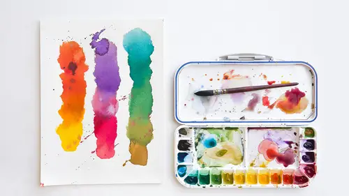
We've talked about dry brush, we've talked about edges, we've talked about a gradient. I would very much like to show you a couple more surfaces and then I want to do a little test with a ball and a square and maybe work on a picture and take some questions. But, the thing I talked about previously was that you can get loose watercolor paper. This is actually a Canson. I believe this is Coal Crafts. So it doesn't have to be stretched. It's thick enough that you don't have to stretch it. But if you wet it a lot it might buckle a little. But this is a nice way to go as well if you want to have you know, just free sheets, not in a block. But the other surface that people work on. And again this isn't one I've worked on it, but it's not something I use as much. Is what's called illustration board. And there's three surfaces here. They're not dramatically different like watercolor paper, but this is sort of a more textured. These two are more textured. I would call this coal press. This wou...
ld be closer to rough. And this is very smooth, very slick. A great surface for water coloring on and using colored pencil. But it's going to react differently than the papers that we've stretched because it's a board. It's made by Crescent, this is you know, it's a board. It's not going to bend too much because it's really stiff. But it's not going to take the color in the same way. And I want you to see that. Let's just test it with, we'll use our purple again. With our wash. Do you see how, if you think about like a counter top, the Formica counter top. The color is pooling. It's just sitting on that surface in a way that's different than the color you just saw. Now let's try wet into wet on this surface. Because it's going to react a little bit differently. Partly because it's you know, like a hot press, it's really smooth. Partly because it has no texture. Literally no texture at all. And I think you can see that. If you want a super smooth surface that you're working on, the illustration board is about as smooth as you're ever going to get. Now let's see how it looks when I try to do a little gradiation. Now it pools the same way but again there's no texture to the paper. It does the bloom. But then what's happening here, and this brush has some loose hairs, which are splaying. That's where I would tape the edges. The difference here is that the color will eventually sink in to this surface. But right now, it's mostly sitting right on the surface. So it's almost like if you were painting on Formica. It's sliding all over the place. So it literally feels different, and it has a slightly different look in terms of the lack of texture much like hot press. You don't have to stretch it. The absorbency level is a little different than regular paper. I think it absorbs the color a little bit less. And that's one of the reasons why I use it less than straight on watercolor paper. But some people love illustration board. And again, this is going to take it a little bit differently because we'll do a little dry brush. This is a textured surface. It still by comparison to your rough or your cold press, I think you could probably see it. It's pretty smooth. It's slick. And if you like that, then this is a good surface for you. I'll try a little dry brush. There's no tooth to this paper. So the texture you see is entirely from the fibers, the hairs on the brush. And that can be, you know, it's all about control and what you want. And again if you test it, you try it. You say I like this or I don't like that. It becomes quite subjective. It's about what you enjoy. What feels good, what feels right. So, that's why I say try it all. And see what feels right to you. So these two are very, very similar. They're called cold press and rough but they don't really, they don't really react very differently I'll show you. You have basically the same kind of paper. And again, very very smooth in terms of application. There's no what I call resist with this. Okay, so that's those two surfaces. Now let's see here. I want to talk about a few other things. I'd like to show, do a little bit of the demonstration with a ball and a cube. To kind of walk through how you would make a form that has a gradient versus how you would make a form that has more flat shape and edge. So we're gonna do that. But, Kenna did we have any questions that we wanted before I jump into this? Anything you want? Question from Kevin was in terms of the charts that you're making. Is there any light fastness of the charts? Should those be covered up? Should you keep them away from light? Typically most watercolors should not be in direct sunlight. Because it will fade, and it will fade pretty fast. It's not what they call lightfast or colorfast as a medium. So, if you go to a museum, you often see watercolors in one of the darkest, you know the darkest rooms. It doesn't mean it has to be in a dark room. It's just that if you have a studio space, don't put it in a space where the light's going to hit it. You want to put if out of, you can put it in a space that's not ever going to get direct sunlight. So that would be my recommendation. I usually put my stuff on walls which won't be hit with direct light. It doesn't matter if you have a light on it. It's the sunlight that makes the difference. Okay great, we had a question earlier about dust. And a lot of working environments can be dusty for artists. Is that something to be concerned about with watercolor? Typically with watercolor, you don't have to worry about the issue of dust because it doesn't use, watercolor has, gum arabic is binding the color. But it's the dust, any dust that lands on it, can literally be brushed out. With acrylics, they tend to attract dust. Oils attract dust and those particles of dust get in to the paint on the surface and often times create like a little bit of a texture. So you don't want to be in a dusty room when you're using acrylics or oils. Watercolor doesn't have that issue. Mostly because there's no binder of oil or a plastic that's sort of grabbing onto that dust that's in the air. I've never had an issue with that. And if you see any dust floating around and landing on your picture, you literally take a brush and brush it off or use your hand. So it's not going to hold to the paint itself.
Ratings and Reviews
shoney
I really enjoy Mary Jane Begin's style of teaching--I have a degree in Fine Art and have been painting for years, but think she does such a good job of building on the basics and encouraging play. Get your supplies ready ahead of time, if like me you want to play along. Thank you!
Kelly LaFrance
Awesome class! Awesome instructor! Exactly what I was looking for, and highly recommended. :-)
user-b0a82a
Fantastic class - so informative and inspiring. After watching the lessons, I picked up my watercolors and started playing around with some of the covered techniques. Highly recommended!
Student Work
Related Classes
Design Inspiration