Lessons
Day 1
1Day 1 Pre-Show
06:09 2Four Secrets for Great Design
49:25 3Morning Q&A
26:05 4Morning Recap
18:39 5Striking Images
34:14 6Faces in Design
17:24 7Layering and Simplifying
21:33Introduction to Typography
51:51 9Typographic Offenses
35:15 10Formatting Text
29:10 11Formatting Text in Different Programs
19:30 12Day 1 Wrap-Up
03:40Day 2
13Day 2 Pre-Show
08:07 14Designing Logos: Fonts and Text
1:27:39 15Editing Text in Adobe Illustrator/Photoshop
54:50 16Taking Control of Color
46:26 17Creating Business Cards
49:07 18Business Card Makeover
1:04:37 19Day 2 Wrap-Up
03:24Day 3
20Day 3 Pre-Show
03:53 21Designing Magazine Ads
1:20:03 22Designing Postcards & Event Posters
1:16:44 23Creating Your Own Patterns
1:14:18 24Creating Custom Photo Books
1:25:21 25Day 3 Wrap-Up
04:18Lesson Info
Business Card Makeover
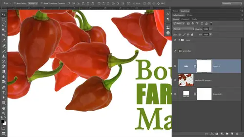
what we're gonna do here is looking a couple of photos. That ball was kind enough to give to us. Okay, so the 1st 1 is this photo right here. Very nice. Okay, so we've got a lot of yellows and we've got nice perspective and leading lines. Beautiful model, beautiful background, all of the mountains back here. It's nice. So let's look at the other photo that he gave to us. There's this one beautiful portrait's gorgeous shout at the field. This one's going to be really great to use, because if we go with the tried and treat principle for your business card that the photo or images on the left and the Texas on the right, Bob's leading a potential client right to his contact information because of his subjects, eyes are gonna be looking right at it. So that's a prime candidate for using on the front of the card. Right? Okay, Now what we need to do is we need to build the document. Now. I mentioned that I love designing cards with the full belief, which means we're gonna let the photo hang o...
ff all the edges that it touches. And the photo that goes on the back is gonna hang off all four sides. Okay, So to do that, you need to design with a larger document than is actually going to be printed. Okay, so I have those measurements for you, So we're going to start out in Photoshopped. You could just as easily do this, an in design or I would do than in designer photo shop. I wouldn't do it in Illustrator Sets. Illustrator wasn't built to handle photographs. So we'll start out in photo shop and will create a new document by choosing file new or pressing commander control in. And we're gonna just press the tab key to highlight the next field down and in the wind field because we're going to design a standard size horizontal card. Lisa Lee hoard on the front. We're gonna type in 3.6 to 7 for with because that is just enough of an extra size. Just enough larger that when the printer printed it and trims it to 3.5. Then you know that your arts hanging off all the edges. So the document is to be a hair bigger than the printed size 3.6 to 7 inches press tab, but none of the height field and we're type in 2.1 to 7. We're gonna type in the golden standard rule for tiny dots so tiny that you're not going to be able to see them when they're reproduced, you won't see them individually, and that is a resolution, which is a fancy way of saying pixel size. I wish it said pixel size 300. Okay, just memorize that and go with it. Kaledin, we're gonna be in the RGB color mode now. I'm an RGB color mode, so I'm not talking about this for just a minute. And I'm really not gonna go down the color mode rabbit hole for a long time. But just for a second it used to be that any time you hired a professional printer, you pretty much needed to use inks Cyan, magenta, yellow and black. OK, these days there's a lot of digital presses out there that are happy to convert RGB colors which are comprised, comprised of red, green and blue into those Sam like a inks. So it used to be that if you're a printed piece needed to be in seem like A. You always had to start out there. That's not so much the case these days. Okay, now, again, this is graphic design for everyone, not advanced theories and principles for bringing experts in art directors. So if in your job you're being forced to work and see him like a well, then you're being forced to work and see him like a. There's not a whole lot of difference between on RGB. Value in the equivalent seemed like a value, except that some colors that were really bright and really highly saturated. An RGB will look a little bit more dull once they're printed and seem like a seem like a. You don't have as wide a range of colors as you do with the RGB color space, so we can make more colors and more vibrant colors from mixing red, green and blue. Then we can, from mixing science, yellow and magenta think okay, so just because you may have to end up and see him like a does not necessarily mean you have to start out there. You've got a wider range of colors and RGB. Like I said, Ah, lot of printers these days prefer to convert from one color space to another. Them cells that much rather have their equipment do it, then task you with doing it. Okay, So as photographers were an RGB mode anyway, all day, every day, right? That's what our pictures are being captured in. And so why not just design? There's fine, you're comfortable there. So the first step when designing your own business card is to figure out who's in a printed and yes, you could do it yourself. But again, I challenge you to figure out your hourly rate and how long you're going to spend doing that yourself. And I bet you you're gonna be making, like, a back an hour. It's gonna be awful. Your me losing money like crazy. So let somebody else do the printing for you. There's a bunch of folks out there that do it, call them or look on their website and see what their specifications are. Nine times out of 10 if you're using an online printer, they're gonna have a business card template that you can download and pop right open and the software of your choice. Okay, so do that. Your printer wants to help you. Your printer wants you to have a successful printing experience. Your printer wants to get paid, so find out exactly what size document the printer wants. What file format The printer wants nine times out of 10 and will be a pdf. Okay, and find out what color space they want or if they want to do the conversion, so on and so forth. So we're just going to stay in RGB mode for the moment. And here's our card. Ah, all right Now let's start bringing in Bob's images because we're gonna let Bob's images rule are our initial color choice selection. So let's go ahead and place our images in a way that they're going to retain maximum quality so that if I decide to experiment with different sizes of these images, I won't be degrading the quality of them. So that means we're going to bring in his photographs as smart objects because photo shop, you can think of it as Photo Shop is storing and instance of that image in its brain, and each time you resize that same image, Photo shop is recalling that original instance so that if you bringing in a large size and make it tiny and then say, Oh, Dad, give it. I need to make it big again. Then you can do that with a smart object and not worry about destroying pixels and losing quality. Okay, so that's what we're gonna do, said she's file place navigates where the images live. We talked a little bit yesterday about final management. Of course, at this point you would have made a folder for this client's business card so I could make a folder Bob's business card, and I would have put his images in that folder okay into another folder called Images. So a good file organization so navigate towards images live in our case there on the desktop in photos from students. Here's Bob's folder right here. So I'm gonna go ahead and navigate to the first image. Doesn't matter to me which one I bring in first because we're going to do the front and the back in the same Photoshopped document will just save them out as two separate files and will use the layer visibility eyeball to toggle those often on. So we're gonna place the image. Okay, so this is one that I think would work well on the back so we could rotate this photo. OK, so we'll just start out here. I don't know that we'll end up with this design, but well, to start out with it, cause it is a formula that works when you place an image is a smart object. Photo shop automatically seems you need to resize it, so it gives you these handy re sizing handles all the way around the image. You don't even have to summon the free transform tool. So if you position your cursor or point your cursor just a hair away from any of the corner points, I'll zoom in so you can see it. See how it changes from diagonal arrows to a curved arrow. When she see that curved arrow, you can rotate the image. That's what we're gonna do. I'm gonna hold down the shift key someone to make sure that I rotated in 90 degree increments. I want to make sure it's perfectly vertical when we lay it down inside here. There we go. I need to make this image a little bit larger. When you're doing this home on your own images do start out with the with your large size, high quality J peg or smart object. If you have processed this image in photo shop, Okay, then you could just create a smart object out of all the different layers it's comprised of, and then bring the smart object into this document that way kind of functions as a single layer. So we're gonna go ahead, make it bigger. Ideally, you wouldn't have to make it bigger, but photo shop is getting so good at enlarging and interpret waiting or making up pixels that weren't there, that an enlargement of this degree is not going to tear up the quality of the image. But for the purists out there Do you start with a larger pixel to mention image so you don't have to enlarge it? So we're going to go ahead and hold down a couple of modifier keys while we're enlarging this photo, we're gonna hold down the shift key to make sure that we don't make it wa p job. So we don't want to stretch her or squish her in any way. So Helena shift. He's gonna maintain the aspect ratio of the original and holding on the option key on a Mac or alter on the PC is going to resize from the inside out that way. All four corners are, you know, changing at one time. So I don't have to go around and drag out each corner handle. That would be a drag. Oh, come on with that. Okay, so we're going up in size and again. Ideally, you would not have to enlarge this much because you start out with a little bit more of a larger pixel to mention image. So I'm gonna go ahead and press return to let Photoshopped know that I'm finished changing the size of that photo because it has a one track mind. Photoshopped will squawk it. You've tried to do anything else. What has an active bounding box re sizing box. Now let's press V to grab the move tool, and we're gonna scoop this image down a little bit. It's okay if a little bit of her jacket is cut off. Arguably be okay for a little bit of her back was cut off, but we don't want to cut off her hands. Their people tend to get a little bit uncomfortable and squirmy. If body parts were missing like we could chop her back in half and not have a problem. But we want to keep that hand otherwise that this kind of gets a little bit weird and we could keep not all of the hand to try to get more of her foot in there. But this is really the important part of the image. So I'm in a position it about here, and in doing so, we were closely follow the rule of thirds. So we put our vanishing point on one of those intersecting lines. If we were to superimpose a tick tack toe grid over there, so just kind of, you know, use your photography juju. You all have all got it. Great eyes to position your photos on the card like this. Okay, so that's looking pretty good. So we're gonna name this layer back because that may end up being the back of our car. Now we're gonna temporarily turn that off by toppling its visibility. Eyeball off. Now let's bring in another photo file. Place navigate to where the images live. Will go back down here to Bob's folder, and we'll get his other image. Press return. Father shot brings it in with re sizing handles. Let's go ahead and make it a hair bigger. Just so we make sure that it really does hang off the edges of the card press return when you're finished. Now, let's grab the move, tool. And let's scoot it over as far as we can. But we don't want to cut off much of the pretty lady over here. Okay, so this is kind of gonna kind of determine the logo that we make for Bob. Because if we really do want to use this image on the front and I'd like Teoh, then I can't make a very wide logo. See why I kind of need to start out with your best of the best images. They can save you a lot of time and experimentation. If you know that photo is gonna take up 2/3 of the car than your logo. Treatment needs to end up being rather narrow. Okay, so now let's fade that photo into the card. Okay, So what we're gonna do is add that you could do it two different ways. You could add a layer mask to this existing photo, or you could add a solid color. Fill layer and use the layer mask that comes along with that. Okay, so let's go ahead and and a layer mask to the photo by clicking the circle within the square icon at the bottom of the layers panel. And now we're going to fill that layer mask with a Grady int that goes from black to white. Because why we're gonna do that in the realm of the layer mask, black conceals and why, it reveals. So if we paint with Grady in tool inside the layer mask and our radiant colors are set to black and white, we're going to get a soft fade from that photo into this area over here, which may or may not remain. Why, I don't know yet, so let's go ahead and grab. Argh! Radiant tool. You can either press G or you can grab the tool. Listen, your tools panel looks like a greedy int. So Grady in it's just a soft fade from one color to another. And let's talk to the Options bar and make sure we've got a black to white Grady and active. So click the little Grady Int preset picker, and then you want to click that third preset that's in that top list that will always be a black to white. Grading it now, the radiant tool immediately looks at your foreground a background color chips when you activate it. So since my color chips just happened to be black and wide, I would have gotten a black and white Grady in any way. But your color chips may not be black and white, and this technique won't work if they're not black. So you wanna click that liberating and preset picker in the options bar and then click that third grade Ian. Okay, so now we want to make sure that we have a linear Grady Int style active in it. Probably this button will probably be active unless you've changed it. See how it's dark around the edges that lets you know that it's activated its pressed into the interface. So unless you mess with ease, it's still gonna be set on linear. So now we're ready to make our ingredient. So if we've got a black to white radiant in black conceals and white reveals, I need to click and drag from the right to the lift cakes is gonna put black on the right and wide on the left, which is what I want, and we get a nice fade. And, of course, if you are nonplussed with your first professional grade Ian dragging attempt, you can just keep dragging until you get something that looks good to you. Now. The longer the line that you drag or the longer the distance you drag with ingredient tool, the softer the transition will be from one color to the next. And when you're using that inside of a layer mask, you can control the softness of the width of that that fade. So you just want to make sure that you don't end up with a hard edge if your photo doesn't go all the way across the business card, so I'm gonna start my drag a little bit to the left of the edge of the image. And then, depending upon how soft I want that fade to be, I will either not drag very far with ingredient or drag crowd of ways to make it really soft. So for this particular card, it seems like it's a rather soft photo has got a nice soft background in romantic and in soft, happy people. So I think a softer transition works better than a more hard edged transition. So now let's start thinking about what we're gonna do with Bob's logo. Remember, we're gonna start out in black and white, right? Cause if it works in black and white, that'll working color. Well, since we started with the photo, how much space do we have to work with really? About this much right here. So if I turn on my rulers by choosing view rulers or by pressing commander control are, then I can come over here to the ruler, self drag out a guide, and I really don't want anything to be wider than about that. Somewhere in there, I can always change that fade. All right, so this is really the area we're working with. It's okay if some of the background for the photo is visible on top of the logo because that can also help connect the two. We did that on Dorothy. Tarbox is card. Where we let a little bit of that toy that the girl had show up, you know, just slightly behind her name. So we could do that here. Teoh if we wanted. All right, Now let's start playing with logo. So we're gonna go ahead and press T to grab the text tool and let's go ahead and click in our document. I'm gonna click and drag Teoh draw a text box just cause I have an idea for the text. I'm not sure if it'll work, but we'll see. So it involves stacking the type. So I'm gonna go ahead and just click and drag to draw Boggs. I like to leave about 1/4 inch of space in between text and the end of the card, just to make sure that it doesn't get trimmed or chopped off. If you download templates from card companies like overnight prints dot com and places like that ville, they'll give you a J pig that's got guides in it. So you they tell you what the safe zone is like. Don't let your text, you know, go past this guide. Or it could get clipped off during the training process because these printing companies like this or printing Bunches and Bunches and Bunches and Bunches of cards, and they've got automatic paper cutters, card cutters, and if something goes wrong, and that paper gets, you know, shifted just a little bit. You do have to allow for a little bit of shift, because that can happen. So I always leave about 1/4 inch for my texas because I don't want it to get chopped off. And if you're gonna do rounded edges, which we did on, uh, Dorothy Tarbox is card. We did rounded edges because we had a nice round it fun for her name. You also need to leave a little bit more space in the corners because that rounding to make it happen, they're cutting into the card a little bit. So you just want to make sure you don't get too close to the edge. So let's start entering Bob's name. So we've got Do you want Robert or Bob on your business cards? Great. I'm gonna use that. Okay, let's go ahead and start out with robber. And I've got a lot of tracking going on because the last time I used the text tool, we increased the tracking and any settings that you change and Photoshopped stay change or any of the creative suite programs. They stay changed until you change them back Okay, so let's go ahead and select all and decrease the tracking with our keyboard shortcut, which is command option left arrow on a Mac or control all left arrow on a PC. Okay, so that decrease the tracking. Now, I need to go down and probably need to go down in font size, but I don't know yet. Solis, Let's keep on typing. I'm trying to get my cursor back. There we go. So I'm gonna press return family type in Robert's last name. Okay, I think this stacking technique is gonna work because his first name and last name are kind of similar in letter count. So I think it will work. Work pretty well. And now it's come down here, and Bob's website is R w photo studio dot com. Okay, so we could either we could continue the stack and type photo studio. But knowing that three pieces of information works better than four, I'm tempted to lop off photo just initially. So we'll type in robber, is it Woodrow, or why? Why drew? Okay, studio or photos? So you can play around with that just a little bit. So now let's go ahead and tighten up the leading. So let's select all again by pressing Commander Control A and we'll use our keyboard. Shortcut of command option up Arrow to decrease letting or control Ault apparel on a PC. We're going to get it kind of close together. Okay, so now let's talk about building in contrast. Okay? So we could go with something like this if we wanted Teoh. Okay. If I really going to do that, I would make Robert a little smaller. Perhaps let Woodrow be a little bit bigger. Studio a little bit smaller. See, Just says I'm playing with this alignment is occurring to me. Naturally. I can see immediately that now. Since I've done that, I could tuck studio right up in here between the dissenter of the why and the right margin that I've set for myself. I can also easily see that Robert would fit quite nicely nestled between the W and the Ascender of the D. Okay, so this is just one possibility of a bazillion. Okay, This kind of rounded happy font really goes with this photo. Bob, you look very friendly. Very approachable. So that's something that we need. Teoh, communicate through your card right. We don't want any all caps, scary attorney stuff going on. Since we need contrast, I'm gonna bring down Robert just a little bit more. And because I'm going to be very specific where I tuck these words in together, I'm gonna split them up on two different type players just because gonna be easier for me to get precise positioning. OK, so I'm gonna go ahead and coffee or cut rather shift click to force photo shop into another text layer, and we're gonna sit his first name, right? Appear I need to go down in size a little bit more to increase my contrast. Okay? And I could probably track it out a little bit. Now, let's come down here and liberate studio because we want to be a little bit specifically where we put that was shift Click somewhere else. So now that I know what I'm gonna do, at least with the first go with this card, I didn't have to do a text box. But whatever, Sudan, let's scoot studio over here, and we're gonna make that small as well. And if I add a little bit of tracking, go down and font size a little bit more. Then we began to get something quite interesting. I might be tempted to go down in point size of his name just a little bit more, maybe a little bit more, and track it out just a little bit. Interesting, huh? Now, if I want to make the whole mess a little bit bigger, not that it's miss. Then I'm gonna activate all the layers. Think that are concerned here by shift clicking the bottom one because they're all next to each other, They're consecutive. And now I'm gonna summon the free transform tool by pressing Commander Control T. And I'm just going to make the whole mass a little bit larger. Press return when you're finished. Now we can add are other information. Okay, so we've got that text box going on, so we may as well use it and just gonna make another text layer a little bit easier. Okay, so now that another text layer and drag it over here and now we can start adding his contact information. I don't know his contact information, so I'm gonna go ahead and make it up, so I'm gonna type his phone number so well, to say two of six. We'll put a bunch of zeros in there. Okay, let's drag that over and let's go way down in size. Highlight everything. Now, when you're dealing with phone numbers like this and a big fat fun, especially like future light here they appear larger next to other text. The numbers do so sometimes I go down in point size on the numbers if it's gonna appear next to text. So now we need to add his name. Okay, so we've got his name. So let's add his e mail address, which would be I don't know what it is, but let's say it's Bob at art of you. Photo is it Get choice? Yes, that's what it is. Okay, so let's go ahead and decrease the leading. Now, would you prefer that people contact you via email or phone? Which do you prefer? You know, I would prefer email. Very good. So when we do get to adding color, we're gonna at a little bit of emphasis on the email. But right now, let's try it up to the font style and then you. And let's bowl that email address. It's probably not the size it's gonna end up. But let's go ahead and bold it so that it stands out. I'm gonna choose The bold might be a little too bold in this particular fund, so I'm gonna choose a medium, so that's a little bit heavier than the light version of text we were using, but not as thick and weight as bold. Okay, so now we're gonna go ahead and go down in size on this whole text block. I don't want to do that, though, because glancing at my point size, I'm at nine points and I said earlier, We don't really want to go below nine points is it's hard to read. So let's go ahead and leave that the way it is and see if we can make it work in some other way. What we could do is decrease the width of the fade here so that his email address is still quite visible. Okay, So really, that's all we would have to add to the front of this card. So now we need to talk about color. I'm gonna go down in, and then she and do 1/2 a point off of this phone number just because this particular fund is kind of big. Okay, it's X height is larger. Hey, so now let's start thinking about color. What kind of color can we pick up from this image? Well, we could pick up the red, but if we look at our color and emotion to cheat, I can look at Red, which is at the top lift, and it means wild Bob doesn't feel like a particularly wild person to me as he's frowning him. You know, he loves full of surprises over there so I can look at the other Red, which is a little bit in the magenta round at the end of this will cheat sheet here, and I can see that it exudes a feeling of danger, excitement, fame in vitality. Okay, So depending upon the kind of clients that Bob wants to attract to his business, he may or may not choose to pick up that rid. Okay, what other colors were dominant in this in this photo? Well, let's look at it in comparison to our color will. I'm seeing predominantly Ah, whole lot of greens. So if I wanted, I could try to match the green and let that determine what color on the color will that I would choose for all of his information. Or I could simply go with a neutral. I could go with a nice charcoal gray. If your image has a whole lot of color in it, you can get away with a neutral color for your taste. That would just bring back more emphasis on the photo than the actual text. But in this image, it's looking predominantly in the blue greenish round, kind of in between. It's somewhere in between yellow, green, green and blue green, which means that I could use anything in the red violet realm, the red round like a like a bird or are not a burnt orange, but kind of a rusty red or a deep red. And if I focus on the blue greens in the image again, spinning my color wheel, then I'm in the red orange round, which also includes brown tones and brown tones, would look really nice because this lady has a really pretty brown eyes and we've got lots of brown hair going on. And since we've got a photo that has nature in the background, you know, Woods involved in there. So we've got browns and nature. So Brown's would work will, too. So let's go ahead and sample one of those greens by using our eye dropper one of the predominant greens. We could also go with Green, since it's just in the photo. OK, we could do that to you. So I clicked on the eyedropper. You press, I'd activated. And then when you click within the photo, whatever colors underneath that cursor when you click, it's loaded as your foreground color. Okay, so you could do that if you hadn't set the type yet, you know, and then you just be set to go on. Your type would be that color, but we've already said our time. So let's go ahead and activate all the different font layers her text layers. Rather, now let's activate the text tool, and now let's change the color of all of them in one fell swoop. So we're going to click the little color swatch at the top of the interface, the Options bar. And since we activated all of those text layers, when we change the color of one text layer, they're all going to change. Okay, so now we could mass away from the color picker and we could go sample that green and it is changing on screen. But the tones and I'm clicking on a pretty dark Or maybe it's not changing on screen. We'll look in a second. Okay, so now it's like, OK, there we go. So it changed. So that's what the text would look like if we stuck with those greens. Okay, so let's try something else. Let's click on that little color swatch and let's come over here and shoes agreeing. That's a little bit darker, and I like that. It really picks up on the nature. Green is complementary to rid, so we've got that going on in the image, so that's wonderful. Now let's say we're OK with that color. Let's come back over here. Let's change the fade of that image. Okay, so let's click within the layer mask that we added, And let's press the geeky to go back to the radiant tool and let's to start our fade a little bit farther into the image. So I'm gonna click with my mouse button, hold down the shift key to keep my Grady int perfectly vertical in nature, so it doesn't look angled. And then we can begin to experiment with a different fade level to fit the information that we've got. And since my email address is still a little bit too wide, that tells me that I need to perhaps find a condensed version of that font. Teoh fit it into the place that I want to fit it into. So if I double click it to highlight it, just gonna highlight that one line of Texas. I don't want to alter the phone number just yet. Now let's come up to our style menu and see if we've got any kind of condensed options in that fund to make this work for us. So we have got a light condensed. We really don't want to do that because Bob prefers to be contacted by email, right? So that needs to be emphasized. So let's go ahead and keep going down. We've got a medium condensed and what else do we have here? We've got a bold condensed, and while I wouldn't have chosen the regular bold option before the bold light version because it was just too thick, this might actually work for us and we've got some nice contrast between the thickness of that line of text and the phone number underneath it. But since we had to go down a point size on that phone number, let's go ahead and see what another version of that might look like. So if we used bold condensed on his email address, what if we used light condensed on the phone number? If we did that, we could make it a little bit larger, so that might be another option for you. Okay, so you can see that very quickly. I'll turn off the guides here for just a second. Very quickly. We came up with a typographic logo that works. And again, if we had more time, we could go on and on on on and on and do all kinds of fun things. And just by experimenting with the font formatting options and Photoshopped, I came across an idea that I didn't even think about initially. Now, if you were doing this for real, you'd be sketching, and maybe you would have thought of that have, But it's really needs. So let's take a look at the back of the card here, so What I'm gonna do first is I'm gonna go ahead and put all of these layers that I've used on the front side of the card in a folder. So let's go ahead and click to activate them. And now I'm gonna come down to the last layer that's involved on this side of the card, and we're going to shift click to activate everything in between. Then we're going to click the little fly out menu top right of the layers, panel and shoes. New group from layers. That's just gonna stuff him in a folder. Photo shops gonna ask us what we want to name it, and we're gonna cleverly call this anybody anybody sprint. So now the beauty of doing that is I can quickly turn off the front versus the back to take a look at sea. She how this is gonna feel and there's are back now looking at that, let's go ahead and bring him in our slideshow. Okay, so let's choose file save as, and any time you're preparing visuals for the, uh for a slideshow, choose Ping PNG, and it will be down towards the bottom third of the format. Pop up menu. So I'm just gonna throw this on the desktop, and we're going to say Bob back, that's fine. And never turn off the back. Turn on the front. And we're gonna choose file save as she's paying from the pop up menu because we're going to a slide show and we're gonna save up front. And this is gonna be an easy way for us to see them side by side, see what we think. So now we're gonna pop back over to keynote, come back over here on this blank slide that I already made, and we're gonna place those two images navigates where the images live, activate them. Both will come in together, go down in size anything. And Kino is You don't even have to hold down the shift key to resize proportionately. Now we're gonna rotate. Do you need to grab the inspector for that? Go to my graphics inspector or the measurement inspector Rather, and then we're gonna rotate. Now we're going to decrease the size of the back so we can see them kind of together. And then if we push play, then we can see a new card that we came up with very, very quickly. Okay. I e can't believe how quickly you do, Bob. How do you feel that all this lying is terrific? Um, I really like what you did. Was the typographical logo there? I thought that was I've been playing around with those words for a good many years. Wait, Um that had never occurred to me. So that was That was really, really cool. So yeah, I really liking it. Excellent. And it's wonderful example. And you couldn't have set me up any more perfectly than you did with this particular image that you chose to give. So what we did, folks, is we had everybody in the studio audience here provide at least two or three images. I think two is what we asked for of their best of the best. And Bob, not knowing what I was going to do nor knowing that he was gonna be the recipient of this very fast makeover, gave me a perfect image when we were talking about faces yesterday. Remember how you were saying that nothing communicates with another face like a face. And if you're wanting, wanting to connect with the viewer, if it's if it's yourself that you're selling then or a service that a human provides, and you want that face to be looking at whoever is holding the card. So if you're selling a product, you want the face to be looking at the product in the ad will. Bob has perfectly set me up here with one photo that does both, so I'm connecting on two levels here. I'm connecting with the person that's holding the card, and the direction that the gentleman is looking is directing me right at Bob's name, which is also his logo. So it's perfect. So that's another example. And then the photo on the back is perfect again cause you flip it over and you've got this gorgeous lady looking at us. Bob probably didn't even think to try to match color palettes between the two photos that he gave us to work with. But because he evidently like shooting Portrait's in nature, they both go together because they both got green. They both got trees. They've both got leaves. They've got Earth tombs in there, and that's also why the green of his name and contact information works. But we could have just as easily used a brown so we could continue to experiment with that. So, yeah. Questions. Yeah, Yeah, I'm so relieved that part's over. I was a little nervous in a little bit. Were you like that just to do it live? Yeah. Good job, Happy customer. So we have about 20 minutes before the end of the day. So do you have more content that you want to go into or can we take a couple questions that's taking questions and then lets um, trot back over and talk about shooting your own textures? Okay, Because when we get into developing, adds, we talked about the power of layering in the power of having at least three graphical elements in your ad. Now, when it comes to photographic business cards, less is more Okay, so you don't have to have that other textured element in your business card so much as you do in advertisements. When you hand somebody a business card, you've got their attention, right? But when you when you're designing an ad that's unsolicited, you're trying to really grab attention. Teoh draw the viewer's eye away from everything else. That may be on that same page to your specific ads. So that's why layering and always including at least three graphical elements in your ads. It's so important. But to do that, you need to know a little bit about textures and ideas for shooting textures. Yes, you can buy them from stock agencies all day long, but, ah, lot of your photographers and you can shoot your own. And then you can sell your textures at stock. Yeah, so let's take a few questions and then we'll talk a little bit about textures. A couple quick questions. So Sam Cox wonders about the radiant there. Hey, says Lisa, Does the great have radiant fade on Bob's card? Need to be vertical? Can it be at an angle on his own card, or does that look amateurish? That is a fabulous question. Thank you. In this particular situation, the fade needs to be perfectly vertical. Why is that? Because that's part of our linemen. So while you could absolutely do an angled fade, but that fate is gonna leave the viewer's eye a little bit. Our eyes because of Bob subject in the photo, our eyes were already a top right, so our eyes want to slide straight down. They just want to you and with the right alignment that we've chosen for all the text were reinforcing that because we've got that strong ride. Alignment and angled fade would not work as well on this photo, and it would feel clunky that you wouldn't necessarily know why I felt clunky. So that left kind of faded ever so slightly. Line ever so visible line that we see there from that fade helps the viewers. I also, we've made Bob's email address exactly the same in with as his overall logo, and so that kind of gives us an imaginary lift alignment on that side. So we need to keep the fade vertical to match it. Question. From Michael A. TL from Atlanta. If your name is in the name of the business, you don't find it necessary to repeat it anywhere else on the card. Even though he's Bob and it's Robert. When people get that, if it's clear, I would err on the side of less is more because it makes the card, in my opinion, a little bit, you know, easier. Friendlier, not is overwhelming the lesson for the fewer pieces of information you have the friendlier, more approachable, it's gonna seem. But we could. This is easily put Robert, right above his email address down there, put it a little bit larger. We could repeat his name there, but I don't think in this particular situation that we necessarily have to. I really don't. Nor do I think we have to include the word photo in his logo. I mean, it's pretty obvious that it's photography, so that kind of depends on what your name is and what is in your business title. If it's not incredibly clear what your name is, and absolutely, you need to have that name or if you've got assistance, you know, handing out cards and what have you is situational basis. But in my personal opinion on this particular card, we really don't need to repeat business. People understand that Bob is short for Robert in. He's probably gonna be the one handing out the cards, so I think folks would get that. But yeah, we could add it. And even if we added it, it would. It would kind of weigh out what kind of balance? The bottom of the card a little bit, because it would be three pieces of information, so we could easily add it. Okay. Back to you, Lisa. Under today. Okay, so let's pop back out of keynote here. Hide it. Well, actually, I wanted to stay in it. That's where my textures are. Okay? Yes, I plan to do that. So here we are, creating your own textures. This, incidentally, is another great business card design. So if you're specializing in things like this textures and stuff, you could make the photo really, really large. Full size in the business card. You could add yourself a safe space for text by adding a color block. Where you going to add that color block? If you think of the magic formula that on business cards but your image on the left in your text on the right, then your color block creating a safe space for text goes at the bottom right. This is also a great postcard design, and we'll see that tomorrow in action. So here we go, creating your own textures. Textures are fabulous. You can purchase them from stock agencies. But if you're wielding a camera anyway, why not just go ahead and capture textures so textures can be used for all kinds of things. So this is a fake little hoo ha that I did fear living in East taxes. This is a photograph of wood, a cross section of wood that I made into a high contrast image using a threshold adjustment in photo shop and brought it in, added a layer mask to the text layer and copied and pasted the high contrast, which is a black and white image of the wood cross section into the layer mask of the text. Therefore, it looks like my text is all textured now. Why did I use a cross section of wood in a text that mentions East Texas? Did you know that East Texas largest business is logging? Because it's the piney woods, right? Logging is the big industry in East Texas. So in my little demented brain, that piece of wood as texture in the title actually makes sense. Maybe only me, but nevertheless, So you're not texting. Are your position know I e No, I don't know. Yeah, for forward. Okay. Actually, Mansfield. But nobody knows from Mansfield. It's always a say forward. People get accent went right over my head. Yeah, my Mama lives in these Texas, you said Mama. So that way, I am a M A. Its way. It's supposed to be spilled. Not Mommy, not Mother. It's Mama. Okay, so it textures you can see can be used in a lot of different ways. Designers love this kind of stuff, adds dip to their pieces, just like you photographers know that. So this is an example of texture used in text. And here's the image you can sell this stuff like crazy. That is another tip for how to make money shooting stock, which is actually the class that I'm teaching at the Professional Professional Photographers of Canada Conference in April. How to make many shooting micro stocks. Specifically, this kind of stuff makes great money. Other examples of great textures that you can capture, things that are rusty stream close ups of things like ice crystals on your car. That's what the photo is in the left as a windshield that's frosted. Can you imagine? You think you have to leave your house to do the photo shoot? Maybe not. May be used. Walk outside on a cold morning. All of these things are rich with lines and angles, and I can imagine this kind of rusty thing on the right. Only know what it is, but all of those lines are leading us, so that would be great for a business card. If you are in the business of shooting textures and put your contact information towards the top right or your logo up there, contact information below it and those lines have led the viewer's eye right to it. So there's all kinds of wonderful things that you can do with textures, things that you wouldn't think about shooting a photo of. Here's another example, this broken windshield or broken piece of glass, whatever it is on the left, is a fabulous for texture. Imagine it used on the movie poster as a texture in the background. It almost looks like a gunshot, right? So all kinds of things or break in or a robbery it just a 1,000,000 different emotions of this conveys, and therefore the texture could be useful in all kinds of different things. Another great idea for shooting textures is fabrics, extreme close ups of fabrics. Imagine if I were a fabric store. This will be a perfect business card for me, or advertisement, put my logo and company name. You know this is just one example of fabrics that we cells. There's all kinds of opportunities with this, but that's also a fabulous texture just for texture sake. So design your ad, pop the texture into the background, play where play around with layer blend modes. That way, the other layers of your composition remain visible and drop the opacity way back and we'll add just in the depth. So if I were designing an ad for Ah fabric store or a feed store, maybe that sells all their things in these kind of burlap E sacks situation. That'd be a great opportunity for a texture. The photo on the right might be useful in an ad for window repair or windshield repair things along that line, Or or, uh, a house alarm company. Put that in the background kind of faint kind of there, but not would add a lot of death, and the texture would be related to the content of the ad. These kinds of shots are invaluable to designers, and we're going to see a couple of these kind of shots and action. Let me get to the magazine ads, and they're just great for adding a little bit of pop in the background. So out of focus lights, blurry lights like this are really great, and you can sell the heck out of him on stock agencies. And the great thing about a lot of the stock agencies is you could sign up with all of them. You don't have to limit yourself. You don't have to be exclusive with any one of them. You could have pictures on multiple water. Reflections are also great textures. And again, you don't have to go shoot these things yourself. You can purchase them. But if you got a camera, why not shoot? So this kind of texture would be great in any kind of ad about summertime or pool service on and on and on. Textures like this are really valuable because they were not really sending a message per se in the item. But they've got depth just because of the the tactile feeling that's conveyed here. And this one is one that I use all the time, all the time. So what is It looks like a concrete floor to me that the photographer has added a dark edge of and yet around the outside of it, that's what it looks like a cracked for So, you know, move stuff out of the way in your garage and shoot the floor. Here's another example. This looks like maybe courts, or it's a kind of a a rock that can easily be flaked. So all kinds of wonderful things. Here's another good one that looks like old chipped paint on a wall. Fabulous texture. Fabulous texture. Imagine putting that in any kind of advertisement that you want to exude a feeling of grunge or and dark things like that. Where do you get textures if you're not gonna shoot them? I mentioned the stock photography agencies that we've talked about folks like I sought photo looks like for Tolia folks like shutter stock. But you can also get a bunch of textures from a great company called Graphic Authority, and we talked about them a little bit earlier. We gave away a really nice prize, but that's what this company does is they sell textures and frames and borders and embellishment items so you can see just a few of the many resource is they have here template collections so you could use some of those in your own portfolio books. See the nice texture that's coming through at the bottom left of this website. You can see how the designer has laid out their portfolio book on top of a texture, which gives it just a little bit more at a death. Okay, so we've got design. Resource is we've got, ah, sports collection. So if you're taking pictures of any kind of team sports as a photographer, this will be a great place to G O to create some templates, and that gives you another sellable item for your client. So if you're shooting like a team shot and then an individual shot of of one person, you could gain those up in one of these pre made templates and that's another sellable item, and that's not evil. Yes, you purchased it, and you're gonna market up quite a bit, but it's your expertise that led you to this knowledge, and that's valuable information worth paying for. So don't feel badly at all about taking advantage of a resource like this and marking it up and selling it to your client. Your client wouldn't know what to do with that. Your client does not have these skills. So those air skills that they're happy to pay you for, and as long as you're not, you know, going way overboard and you know so to the point where they won't purchase it, it's totally fine to do this. It gives you more salable products, and I've talked about this and other glasses. It's hard to be a photographer right now. Everybody is doing it. Digital cameras are incredibly cheap. Everybody thinks they can do it. This stop photography has plummeted in price, and it's, you know, crazy, affordable for everybody. Competition is incredibly stiff, so you need all the tricks you can possibly have appear. Sleeve Teoh have successful business, and this is just one of many. So that is a little ditty on textures. So let me pop into Photoshopped real quick, and we'll take a look at one. We'll go ahead and save Bob's card file, save as I save it as a Photoshopped document. Why? So we keep all of our layers in tact case. We want to go back and edit them later. We don't have start over, so we're going to keep this in Hiss folder, and we can say C l make over final That would be captured that Now let's come back over here and pop up in a photo to play with real quick. So here we are in the delicious look at this first ad right here, actually on the field and not look at the first ad. Let's take a look at this Karaki bar. Add real quick here. Who's really got just a few minutes and we're gonna pop him open. And we'll just take a look at how this file is set up in the coming in the morning. We're going to start building these things together. So what we've got here is, if we look in our layers panel, we've got a solid color feel layer. That's where the predominant yellow tones air coming from in this ad, how did I pick a yellow tune? Well, I've got some nice yellows in the photo. And again, if you choose a base color from the photo, you're assured that it's gonna match the photo because it's in the photo. What else do we have in this ad? We've got this nice shot. In fact, turn everything off except for that, and bring the opacity up so you can actually see what it looked like in its original form. These things were so great for adding texture. Drop the opacity back, turn on everything else and there's our text of the top. So what have we got going on? We've got several texts. Layers. We've got our original image that we started out with. We've got a levels adjustment layer, which is bringing the color and lining back in line of that original image, and we have shoved both the levels adjustment layer and the image through a shape. That's where that frame is coming from. That frame is a stock element of a stock illustration. So then, to finish it off with our at least three graphical elements, we've got a photo. We've got it framed and something that's kind of fun and has high energy. It gives you a feeling of movement and action because of the splatter and the dripping, and then we've got our solid color in the background, and then we've got our texture layer here. So without that texture layer, still a nice ad, but it's even better with the additional depth that adding a texture builds in just like you need a foreground, middle ground background and your pictures. You need depth in your designs as well. So on that note, we'll stop and take a few questions for just a few minutes. And then when we come in in the morning, we'll dive into magazine ads and newspaper as and posters. And then we're going to dive headfirst into creating the most fabulous branded, personally branded affordable photo books you can imagine. So I just want to let you know that after my Texas comment, the lounge has actually blown up. You don't know she was from Texas, Probably Where have you been? And now everyone's going into all y'all's. And speaking of y'all, where's the apostrophe gok? This goes back to our typographic offenses. Unfortunate apostrophes. What about all yours? Where does the upset your role is a contraction of you also? Of course, the apostrophe goes after the why not day? I was gonna get that just for the record, so let's see. We have time, probably for just a couple of questions today. It's flown by, by the way, it's kind of crazy, but Stevens. Mm. From New Jersey. Says, how would you save out Bob's logo from the business card to use another promotional pieces? Can you do that? Oh, yeah. Super easy. So we're gonna open up Hiss card. So there it is. So if I wanted to say that out, I would turn off the visibility of the fade, the faded photo just because I don't want to accidentally get a little touch of it in the logo file. So it's going and toggle the visibility of that off. He was simply press see to grab the crop tool, and you would draw a box around the part that you wanted to save. So what we're gonna do is crop the logo out of this card, But we're not going to save over the original document, so we don't lose everything else that we did. Now, doing this way is gonna leave the logo with a white background. Well, if you want that logo to be transparent, all you have to do is turn off the visibility of the color layer. Okay, so we're gonna go ahead and press escape. Teoh, temporarily get out of that crop box and we're going to come down here to the background layer, which is where our that white is coming from. And let's turn the visibility off. Now when we draw a box around Bob's logo when we press return to accept the crop and we wait a moment now we're going to save this out and the format that supports transparency so that Bob can put this on top of whatever he wants and the color of the background will show through the text. So we're on choose file save as this is a great question, really glad that it was asked. And then from the format menu, we're gonna choose one of two formats that supports transparency. There's only 21 of them is pain P and G, which is very high quality lossless. So it means that you're not losing inequality file format that also supports transparency. The other one is Jif. It is a very lossy formats. You're gonna lose quality, so you do not want to choose that in this situation. So we're gonna go back down to paying, and then we would say, Bob logo and you could put transparent in there if you want it, But to me being pretty much says, Hey, it's transparent but you could do something like that. And now you've got a separate file that you could use on a website or what? Happy? Okay, there's quite a few people who are asking about using textured backgrounds on a business card. What do you What do you think about that? You think that money is up the card? Is that too much? Or do you do like textures on your marketing materials? I would say on the business card, less is more because it's so small. And if you choose any kind of textured stock to print that thing on any kind of paper, that has. When we were looking at Jefferies Card, I don't know if you can see it on screen, but it was printed on a textured paper. Now, if you if you're using a photo, you probably wouldn't be printing on texture paper. But pretty on texture. Paper does give you another level of depth without actually having to add another graphical element. If you were to be holding this card in your hand, you would see that there tiny little flicks, almost like this, was printed on recycled paper. OK, so that's one way to add more depth into a card that's logo based. But if you're creating a car that is photo based like we've been doing, then I would say less is more cause it's so little. And if the photo that you've chosen as one of your cream of the crop so it should have a lot of depth in it. So you kind of get that dip in that visual interest from the photo itself, not so much the background or texture of the card. So in an ad situation, you're dealing with a larger space, and the ad may or may not be photo based predominantly, so you need other tricks to get that depth in there. So I'd say I wouldn't add it if it's a photo based card
Class Materials
bonus material with purchase
Ratings and Reviews
a Creativelive Student
… exactly what I needed for current and upcoming projects! Actually, it was much MORE than I thought I needed. Once it all sank in, I realized just how much I didn’t know, but needed to know. The training is top-notch and very effective, and just to top that off with a cherry, Lesa Snider is the most engaging instructor with whom I’ve had the privilege to learn. I can’t recommend this course, Graphic Design for Everyone enough. … talk about “clicking” with an instructor… A self-professed Southern geek/nerd with a sense of humor is a darned near perfect click between that instructor and this student. I love to learn anyway, but Lesa Snider’s classes are a wonderful blend of fun that runs throughout the entire course of technically advanced concepts and application. Where do you find a course where you laugh as much as you learn (both massively)? … a Lesa Snider course. I’ve already put the course material to good use and look forward to using the class info and skills even more in future projects.
Adrienne
I've been a fan of CreativeLive for along time. I've attended many classes, but this is one of my most favorite sessions. I think Lesa is a great trainer and find I am learning a great deal. I liked it so much I actually purchased this course. I would watch any course she was part of. Great graphics design course and wonderful tips.
a Creativelive Student
I enjoyed it very much. However, I hated that I could not pause or rewind,,,so I had no choice, had to purchase. :)Lesa is a terrific Instructor. She takes the hardship out of the learning process with her wonderful ever so friendly personality. She instead turns it into a joy and I enjoy very much her courses! Thank You Lesa!