Lesson Info
14. Designing Logos: Fonts and Text
Lessons
Day 1
1Day 1 Pre-Show
06:09 2Four Secrets for Great Design
49:25 3Morning Q&A
26:05 4Morning Recap
18:39 5Striking Images
34:14 6Faces in Design
17:24 7Layering and Simplifying
21:33Introduction to Typography
51:51 9Typographic Offenses
35:15 10Formatting Text
29:10 11Formatting Text in Different Programs
19:30 12Day 1 Wrap-Up
03:40Day 2
13Day 2 Pre-Show
08:07 14Designing Logos: Fonts and Text
1:27:39 15Editing Text in Adobe Illustrator/Photoshop
54:50 16Taking Control of Color
46:26 17Creating Business Cards
49:07 18Business Card Makeover
1:04:37 19Day 2 Wrap-Up
03:24Day 3
20Day 3 Pre-Show
03:53 21Designing Magazine Ads
1:20:03 22Designing Postcards & Event Posters
1:16:44 23Creating Your Own Patterns
1:14:18 24Creating Custom Photo Books
1:25:21 25Day 3 Wrap-Up
04:18Lesson Info
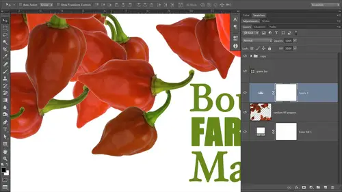
Designing Logos: Fonts and Text
one of the reasons that I was so anxious to teach this graphic design course for everybody is it's wonderful when you feel like you can take control of your own visuals. It's very empowering, and it's wonderful to be able to create professional looking visuals. Teoh get more business and keep the business that you've got so we're going to start out with logos and logo is really your visual signature, if you will. That's how it seems to me, your visual signature. So we're gonna talk about logos that have graphics in them. We're gonna talk about logos that don't have graphics in them when they were going to create a whole bunch together today during class and putting them into use on business cards. So the first ones that we're gonna talk about are those that have graphics and them are mainly graphic based, and you might have seen these guys. So we've got Apple on the left. We've got Twitter in the middle, and then we've got Nike on the right. These are some of the best examples of graph...
ic based logos that you'll find around there. Very simple. They're very clean, and as a result, they reproduce really well at small sizes, which is also important if you think about all the different places that you'll use a logo. It may need to be pretty small if you need to have it on letterhead. Or, you know, there's so many situations where it would need to reproduce well, a very small sizes. Business cards to are pretty small. Okay, so about 2.5 inches by three inches or so. So these were some of the best logo's around. You'll notice that two of them also in for motion. Okay, so if you look at the Twitter logo in the centre, that bird is tilted up just a little. Its body is curved in such a way that it infers action in first flying or taking off. So that's kind of an interesting thing. The Nike logo as well infers a little bit of movement or motion. So these were some of the best ones around, not needed to say we're not affiliated with these guys at all, just using their logos ASM for illustrative purposes. So these are some of the best ones around Now. If you can't draw graphical elements like that yourself. Course you can purchase them from stock image companies. The thing about doing that is, while you do, the different stock companies have different policies on if they allow the usage of their illustrative art to be used as part of your logo. The folks over at Istock photo say that the art cannot be recognizable in the form you use it as its old form. So it has to look very different from the original art that you download okay for you to use, and then then you can use it. The folks over at faux Tolia are okay with using their illustrations in your logo. However, you cannot trade market a register it. Okay, so that would be the caveat to that. So if you can't draw some kind of a graphical icons like this, then you can always purchase it. But do you realize that if unless you change it and it doesn't recognize what it used to look like at all, then you just can't trade market. But is that a big deal? I'd say no. We talked about that a little bit yesterday, and unless you're on the same level as some of the logo's we looked at a moment ago. Apple, Nike, those kinds of things you're probably not gonna need to trade market. Where that comes in is if you think there's somebody else in the market space that will try to make it look like there you are, that they're they're your product. So if that is not a big concern for you, and I say for photographers, it's probably not really And that's just my humble opinion. I wouldn't worry about it too much. That said, you can always put that little tion that stands for Trade Mart next to your logo. Anyway, if you don't go through the process of trademarking it, basically what you're saying when you do that is Hey, this is mine. Don't take it kind of sends that message now whether somebody will still rip off your logo. That's you know who knows about that. But for photographers and in most businesses, smaller to medium businesses, I wouldn't worry about it so much now. This is not the class for advanced theories and principles for branding experts and art directors. Okay, Obviously this class is called graphic design for everyone, so I'm not talking about big companies. Okay, so if you're doing a big Brandon Cain campaign for a large company, then there are different concerns. Okay, so we're talking about making your own designs for your own companies and your own products. All right, so this is an example of some of the art that you can download from for Tolia dot com. And what I did was I just typed in a camera and I made sure that I turned on their illustration database. So I got back vector artwork. So artwork that's been created in programs like Adobe Illustrator or FREEHAND. And so it's not photographic. Okay, So these kinds of things would work well in your logos, if you would like so just a little bit about that. So no matter how much I would love to do it, I could not trade marker register this logo. I could use it. I think it would be great for a heavy metal concert photography business. I would really like to do that. So this is an icon from Istock photo, actually the one on the left so I could trademark the name part of it, the text part of it. But I could not include the little hand as much as I would live to you. So now has talk a little bit about typographic logos, typographic logos or actually my favorite kinds. They are timeless. You don't have to worry about the style of art that you use in your logo. Going out of of style or looking out of date typography is timeless if you do it right. And we learned so many principles yesterday that we're gonna put into practice today. And I think you'll be amazed at how easy it's gonna be for you to produce beautiful, typographic logos for yourself and for other clients. So let's take a look at a few of those. When my favorites is FedEx, it's clean. It's simple. I'm not positive what font this is. It could be an aerial rounded situation. Can anybody see the movement that's being in for in this logo? Anybody in the studio raise your hand? If you Susan, do you see the movement? Yes, there's an arrow. Very good. I think there might be more than one arrow. Is there more than one arrow? I think there's one okay. Yeah, as Susan wisely pointed out, there is an arrow. So look between the E and the eggs and it's beautiful. It's natural, and it's subtle in its. So perfect for FedEx because what do they do? They move packages so inferring movement just type a graphically is quite brilliant. Okay, so you would recognize this logo anywhere, and that really is the point of having a logo like this is brand recognition. So you want people to know who you are recognizing when they see it and trust it. We talked about visuals are visuals or what people use for their first indicator of trust. So this is a nice, rounded, happy, friendly fun. Okay, so it's happy it's clean. Okay? It's also thick, so you get a sense of stability. Boldness, you know, like it's FedEx is going to be around a while. Nice big thick funds tend to send that message. So this is one that I really love. Another one that you have probably seen is the Coca Cola logo. Okay, now, in this situation, it isn't extremely important for them to be able trademark and registered this because you don't want to be drinking some other product that has a similar logo because it wouldn't be the same thing. This one is interesting because it's a custom type situation. So some white probably drew that and then created it so it could either be something that you've drawn and then digitize. So custom text is not something that anybody else would be able to come up with because it's something that you've drawn or you can take a fun and you can customize it yourself. And we're gonna take a look at how to do that a little bit later today, and you won't believe how easy that is. So even if you don't want to go the route of creating a completely custom text situation like this, all you have to do is change the existing fun just a little bit. So start out with a font. You can turn it into outlines in Illustrator or Photoshopped, and then you can tweak certain parts of it. Now this logo is fake for the maintainers, but it might look similar to a movie franchise that was quite popular called the Transformers. Okay, so the Transformers logo that's copyrighted by Paramount Pictures and Hasbro all the designer did for the movie posters was what I've reproduced here on this fake logo, and that is, they started out with a fine. They turned it into outlines, which means they turned it into an edible piece of art. And all they did was they grabbed the little bottom of the M the and they drag that descending part down and they clipped it off in an angle and they did the same thing on the tea, and that's it. So it's very easy for you to do this kind of thing in your own logo's, so we'll take a look at how to do that today as well. So this would not be nearly as difficult to free as the Coca Cola logo that, like I said, was either drawn by hand and then created as a piece of art. Or was some kind of custom, you know, tech situation that they had made for them. So we'll take a look at how to do this file, and that's just a texture that I added in there. It's actually a picture that I download. I think that one came from Istock photo so that I just clipped the texture so that it's being pushed through the text, so it makes it looks like it's made of a metal. I thought that was kind of clever. So Transformers, What's the opposite of transforming? Maintaining the major chairs? I have to entertain myself somehow. So this is another custom text logo or custom type logo. So we're talking about fonts that have been tweaked. So you start out with a font turned into pieces are and then you customize it. So this is one that my husband, Jay Nelson, made for very special couple very special friends of IRS been Wilmore and his new wife care and will more. So been, doesn't teaching here at creative life. And we wanted to make a logo for them as a married couple and and we have our own logo. And so what we did was we took a being a K. We looked for a fun that kind of resonated with with them, and they have a vintage bus that live on, and it's quite curvy in its nature, rounded and they just the roundness just kind of fit with them as a couple of very happy. So we looked for around fun and we found one, and we turned it into outlines. And then what we did was we flipped the B and then we tucked it over on top of the that first part of the K. And then we made because that made it too thick There in the center, once we overlapped those two pieces and then we just made that that centerpiece thinner or now are okay. And then we took the K, and we touched that in a little bit, so kind of squished it this a little bit. And once we were finished, we had something like this. So, uh, put it inside of a circle and we made ah, lovely business card for them and presented it to them. And they just love this. And now they have a business card to give out, you know, for their personal married life, which was really neat. So we'll take a look at how to create this logo in class as well. Some of the simplest logos, however, to make our typographic in nature. And as you can see here, I just use my own name. One of my name's and I quickly came up, like in the span of about minutes with 12 different logos. These all exude a different feeling, a different message. So let's talk a little bit about them, the one at the top left. So we've got good contrast going on here. Because Nelson is so small in comparison to the word photography here, that's good contrast. The reason this works so well is because there is such a huge size difference. If the word photography were a little bit smaller, it wouldn't work as well, cause there wouldn't be enough contrast. In contrast, is one of the principles that we talked about yesterday, and I shared with you that it was often times my most challenging. It is challenging sometimes to build in enough contrast, because you really do have to be brave. It kind of gets you out of your comfort zone. Um, so you need to be able to go large with one of the words and very small with the other word. In order for that to work, that's the exact same fun. It's in that oneness future a light and the Nelson part of It's about 38 point and the other parts about 82 points. So there's quite a big difference between the sizes of those two words, and we're gonna take a look at how to create these as well a little bit later on. So let's move down. One, and also when you're using Futura, which is what the first least the 1st 2 in the first column are based on, is a very round happy fine. So you get happy feelings, and it's clean and clear and trustworthy and visually pleasing. So the next one down is based on the same font, so future as well, but using a bold version up next to a light version that also build in contrast between the thickness of the first word and the thinness of the second word. And that's what allows you to shove them together, where it looks like a single word. And that's why it works. Okay, but if that if the Nelson, if that were any less bold or weighty than it would not work against that thin fun. So the contrast part of this is really, really important, and you need to be brave and be willing. Teoh, try out even black versions, so a black version of future would be a little bit heavier in nature than the bold version. Okay, so it may be a little bit uncomfortable make you might make you a little bit squirmy. You know, making safe photography in the first logo at the top. Left that big? Maybe a little bit uncomfortable for you, but the contrast is necessary for its work. So let's keep going down. So the, uh, the script version. So we're looking at the 3rd 1 down in the first column. This one is a bit more classy, is a bit more elegant. It exudes a feeling of grace a little bit. So it all just depends on what resonates with your target audience. What kind of customer do you want to attract to your photography business or whatever business it is? It really is worth spending some time thinking about that. That doesn't necessarily mean that the clients you have are the clients you want. You want to design to the clients that you want. You know what kind of what kind of visuals resonates with that person? Do they need something very clean and clear? Do they need something that's cursive or script? Ian Nature. So the script version here on the left 3rd 1 down. No surprise. That's my favorite for the audios script. Prue is the open type thought that we looked at yesterday, and if you highlight the end, then you could change it to a different contextual alternate or one of those swash examples that we saw that had the extra flourish on it. Just to kind of pop this up another notch. Or, like Immoral says, you know, kick it up a notch. So the script at a large size works very well, even though it's thin in nature and the word photography underneath. It is also thin in nature. But again, what makes it work is that the script is so different from the plain version underneath it. And I believe that's also future of light underneath the scripts there. I love future light. Well, the whole family and future is just fabulous. You get so much mileage out of it because it's got a light version. Bold Black, Simi, Bold. I mean, it's just wonderful. So what makes this work is the size of the script against this smallness of the lower case letters of photography, and I've also added some tracking here, so photography has been spaced out a little bit. Now let's talk about the one at the bottom left. The bottom row is really type stacks and stacking type. In this way, it works incredibly well, and it could be engaging. It gives you a nice, strong focal point on whatever visual that you place this on, whether it's an ad or if it's a business card. Since the type is kind of stacked together and kind of weighty than its, it'll draw the eye right to it, which is great. And even though I've rotated the word studio so that it's kind of tucked up against the right hand side of Nelson and Portrait is still very readable because studio is this is a short word. So if photography needed to be that piece that was rotated, it wouldn't work as well, because that's a longer word. So if we're going to do this kind of little rotation stacking or you can think of it is building blocks. It's kind of what it feels like, because I tried to kind of nestle it in. You'll notice how the s in studio kind of tucks into the space that the tea creates at the end of the word portrait. Can you guys see that? It's kind of tucked in there a little bit, but but they're not overlapping and touching. So this this could be a fun exercise. And for that when you really would need the text in, you need at least two text boxes If you're doing this and in design or a couple of different type players. If you're doing this in photo shop because you need to be able to rotate studio, you could get away with Nelson and portrait on the same type player. Same text box. But you'd have to do a separate one for studio just to rotate it. So by experimenting with size and these different words again, three words, right? Not for because three is more visually pleasing and for okay, Then you can play around with the sizes and just kind of see how the tight blocks can fit together naturally. So I didn't know exactly how that was gonna fit together until I started playing with it. And then I saw the S and the team. I thought, Oh, that's pretty cool. Oh, yeah, and it's exciting. It does wonders for your confidence in your self esteem. When you can create these kinds of visuals that you are assured are sending the right message for your company feels really good. It feels like you're taking control of it and you're on top of it. And that's good. So now let's talk about the second columns that we're back up to the top of the screen here, this one. So we've got Nelson at quite a large size carriage with photography in a very small size gin where we're building in contrast, in the the weight of the fonts here, thick versus thin as well as initial caps, with all our case that's giving us an extra boost. Of contrast is Will. So this one would almost make me think that he was a newspaper photographer, right? Because of the fallen that we used here that far is American typewriter, and it kind of looks like a typewriter, right? We talked about that a little bit yesterday, so you can see how these air sending messages and communicating. So you need to think about what message do you want to send when you're choosing your funds so that one would definitely definitely make me think. Newspaper photography or reporter? Okay, at the 2nd 1 down makes me think of somebody who shoots outdoors because the font which I think is Kazel on antique. But all tell you when we get into this file and start creating these things. So a couple of things were going on with that once or in second column. 2nd down is a distressed font, which means it has a little bit of texture in it. Okay, actually, the edges are a little bit uneven. It makes me think outdoors, It makes me think possibly Western. It's also angled just a touch which gives it a feeling of roughness or edginess. All that's just coming from a fine. I didn't customize this fun anyway, I didn't turn into outlines. Do anything, Teoh. That's just the fun itself. So you can see the power that funds can have. So we've got contrast again. Not only in font wait, so the thickness of Nelson compared with the thinness of photography. But we've also got contrast in in the use of initial caps for Nelson and all caps for photography. And this time photography is not tracked out and I use the same fun. So Castellan, I believe that's what that is. Casslyn has a several different styles within its font family, so I just used a version that didn't have that distressed edge on it. And it pairs very nicely with Nelson. And we've also got contrast in these slight rotation of Nelson between the perfectly horizontal photography. So let's look at the next one down. We've got again thin, paired with Vic and which words should you do in the thick weight or the bold Wait, whichever one you want to stand out just a little bit more than the other. So since there might be a lot of leases out there, I felt that the last name in this particular logo needed to be weighty. So that's why bold it or used a black version style for Nelson and again. So we've got contrast between thin and thick, and then we've got contrast between size of the Lisa Nelson Block and the photography word, and it's also tracked out, probably using future light as well. Now the next one down, I have squished together with leading all right, so we talked about that yesterday. Leading is the control that lets you manage the space between lines. And if you go into the negative leading values than your text will start crashing into each other, and it can be a useful design element now, if these words were any longer, it probably wouldn't work as well. But it works because these words are short. So if your words that you're using for your logo are relatively short like that, then you might try this squished together negative, letting look to see what it would be like. So let's hop up to the right top right of the slide here. So again, we've got contrast in the thick and thin. Everything is right aligned. This logo might make me think Childrens photography. It's kind of happy and rounds and approachable doesn't feel formal in any way, so that works out. We've also got it's all lower case, so that's very approachable. Don't be afraid to use lower case. Lower case is in vogue right now. Really, really is quite popular now, the next logo down. So we're in the third column, 2nd 1 down. I love this font so much. Does it look familiar to anybody? Anybody in the studio, Todd shaking his head. Yes, over here this fall is based on a Star Trek. Yeah, it's called Federation, and I cannot tell you where I got it from, but I haven't and it's very bold and doesn't exude motion. Doesn't it feel active just the way that that logo is? So that's another look. You know, it kind of conveys the feeling of fast Young, full of energy, that kind of thing. So the contrast is coming in here with size. OK, we've got similar wage, though, because Nelson is so large in comparison to photography, it looks like its way to your, but it's really not its exact same that there's only one style of federation fun. So and then I reduce the leading so that the two words air crashing into each other just a little bit. And when I add color to this and we're gonna do that a little bit later on, then you'll see the top of that word. Photography is laying on top of Nelson just a little bit, so if we did two different colors for those two different words than that would be a really need effect. So again it's all about what message you want to send the next one down. Is ah, really spaced out or tracked out? As designers, we call that this one to me, exudes a feeling of grandeur and spaciousness. A very, very responsible, very trustworthy, very classy. You know, I probably want to dress up. They probably don't take a lot of kids photos, see how the message is kind of come through. So this far is called copper Plate, and it's it's a great one, Uh, because it's kind of narrow, So it's really great for spreading out like this and making it very wide. So what I did is I said it in all caps, and I just added a lot of tracking to it to spread that out. So we've are Contrast is coming from the size of Nelson in comparison to the size of studios. And so Nelson has said it about 45 points and studios is about 20 points, so there's about a 20 point difference there in the type sizes, and again, it's the contrast. If you're going to get it from size, it has to be extreme or it won't work. OK, so when we're creating these a little bit later, we're gonna look at that, so I'll show you the difference so well, we'll make Nelson kind of big and studios a kind of little, but you'll see that it won't. The contrast won't quite be there, and you just need to go bigger. That's the bravery. That's where that comes in. Is you got to be brave, a little bit uncomfortable. Is that too big? Probably not, probably were just fine. The next one down is set in. I think that maybe Helvetica Newey and I never know how to say that word, but anyway, it's a very thin, very clean, crisp, austere font, and I would probably expect to walk into that studio. So we're talking about the one of the the bottom right. I expect a lot of stainless steel, to be honest. At effect. I respect the studio to be very crisp, very clean white. Not a lot of comfort. Not a lot of cushions hanging around kind of, you know, minimalistic. So the contrast here there's not a whole lot of contrast. But if we put that logo on a business card in that business card had quite a lot of white space around it. That would be your contrast. So the contrast would be between the block of text and then the free space or the negative space. But it's very clean, very clear. I respect that. To be family friendly, happy, friendly, approachable, probably affordable. I would expect the one at the bottom right to be more affordable than the one above it. See what I mean about that? So you can kind of you can send the message about your rates as well. What What's the other one in here? What would you expect the the other, more expensive studio to be in these examples. Anybody have any ideas, Todd? Yeah. I think the most expensive studio would be on the left hand column the 3rd 1 down yet the script? Definitely. Yeah. Isn't it fascinating? All the different messages that you can send with these things. And most of these fonts are on your system. You know, most of them have been installed with the adobe programs. If you've got any of those, you've got some of these fonts already. And if you purchase the course, she will get this file as a layered Photoshopped file. So that will help you, you know, re engineer some of these things that I've done for you on your own. You know, even without having to go back and watch this particular segment, which you could do also, if he purchased the course. Does anybody know why these were all in black and white? While we don't have any color going on, anybody want to take a guess on that? Yes, Bill, You want to make sure that it's printable on or using one of variety of ways. First, also in black and white, you can see better the balance that you've been talking about in the contrast between the elements. And then you can add color later if you're gonna put him for color. Absolutely. So we can see if the contrast is there. If enough of the contrast is there, the big thing is that if it works in black and white, it will work even better in color. So if you can get something that you like in black and why and I always start out in black and white, then if you're happy with it there, then when you add color, you're gonna be even happier with it. So always start out with black and white, no matter what you're designing. I had the color last, Okay? After I've seen oh, set the text for that. Another reason is that it is likely that you will use this in newsprint. You know, pretty likely this lets you know that it's absolutely gonna work in newsprint. Okay, so all of these would work Well, the only one that I'd be a little bit scared about putting a newsprint, but I think its large and if it would work, is the one on the bottom, right? And that's simply because the letter forms air so thin and newsprint has an absorptive quality, and you just wouldn't want the characters to kind of get lost on the newsprint. Okay, it's just paper. So when you're designing ads for a magazine or a coffee table book or tomorrow, we're gonna design some branding for a photo book, a portfolio. When you're doing that kind of thing, you know that you're gonna be using what's called coated paper and coated paper. Just has a quality to that keeps the ink from absorbing into it. Okay, so you don't have to worry about the ain't kind of bleeding out a little bit. Newsprint is typically printed on uncoated paper, so it doesn't have that quality, so expect the ink to bleed a little bit, so you want to be careful using really, really thin characters. Also, I think tomorrow morning is when we're going to get into designing for newspapers, but you want to be careful of reversing type. So yesterday we saw a couple of ads that had a color bar at the bottom, and we reverse the type that made it white instead of black. That's why we're saying we reversed it. You'd need a bold font anytime you do that, because there's so much ink in that one space in the the text being white, it would need to be quite thick toe hold up so that you are insured, that whatever is in that that color block is still legible. And if it's your you are, l. That's pretty dadgum important. So we'll talk about some specific concerns for newsprint. But designing in black and white really lets us focus on the shape of the logo, the shape of the thought that we've chosen the message without adding color into the mix, which at this point in the design process can be a little bit distracting. I also tend to start out with sketches, super rough thumbnail sketches, and I've got some examples here for you. I just use a graph pad of paper. Can I show this around the other side here in a second? And I just start out really, really rough with pencil drawings just to kind of get a nine dia. And then I moved to the computer. So my sketches are really, really hoops really, really rough. So it's It's a great way for me just to kind of start out and see what won't work. So I can quickly eliminate a few possibilities. If I don't like the look or if I don't like the shape that I'm seeing, then I don't have to bother creating those on the computer. But to be quite honest, you can be very fast creating lots of different typographic logos on the computer now the the graphic based logos that takes a whole lot more time and I would definitely start out with sketches, and I would get the sketches pretty tight. So that I knew what I was created because otherwise first, what? You're gonna be faster with pencil and paper. And I know some of the photographers out there going I don't draw. I'm not gonna do this. It's fun because you're so fast at just little rough thumbnail sketches, you're gonna be more creative. Things were going to come to you ideas that won't come to you if you didn't have a pencil in your hand in the piece of paper underneath that ideas will come to you that you would have never come across on the computer. It's just a different medium, and it stimulates your brain in different ways. So that's what I always do. So we're gonna add color to these guys here in a little bit and see what we can create from them. The third kind of locus that I want to talk about. Our logos that have that are mostly typographic in nature but also have a graphic element show will call those a little of both. This is a logo that I did for a a large coaching company. So not really psychotherapy, but a little bit psychotherapy in base. So coaching people had a work together, you know, so big corporations will bring in this company and they will teach all the employees had a work better as a team. Okay, so one idea that I came up with again starting out in black and white. So this was post thumbnail sketches on graph paper, and I used graph paper just because it's easy to kind of line things up. I prefer graph paper rather than paper that doesn't have any lines. So it's a real handy. So we started out with the one on the left, and this is another idea. So once you get your logo, most of it typographic Lee set, then you could be clever with the last word of it if you're using kind of like a tight block. So this is another example of a stacking type, and it works so well because it's equal in width. So any time you've got words that are kind of similar in link, they don't have to be exactly that kind of similar in length. Then you could experiment with this kind of treatment. It works very well. We've got contrast with the thinness of camera and the thickness of the weight of coaching. And then we've got contrast with the upper case of center and the lower case of comm era and the fitness of center versus the thickness of coaching. So what we did to kind of balance out or anchor that block of text, if you will, is to add a color block behind it in reverse, the type. So we reversed it from black to white, and it really anchors that. Doesn't that black box to you make you feel like that? Cos a bit more solid that it's gonna be around. It's got a good base, it's strong. So that's another thing that you can dio so that adds a little bit of a graphical element. Another idea in the one that they ended up going with was the one on the right, so I couldn't believe it that the eye is so perfect to swap out for this little stick person, right? Because the eye with a dye on it will. The stick person with the DOT is the hit. It works actually perfectly, and it even helps convey what the company is all about. Obviously a company that is at working with people. It's all about people. So if you can put a little graphic element in your logo is, well, then it can often times work extremely well. And that particular graphic is a built in shape in Photoshop. Really, there's a slew of built in shapes, and I'll show you how to find that you have to load them. They're not all turned on or visible by default, so I'll show you how to turn that on. So this is a good example of adding a graphic element to a mostly typographic logo that works very well. All of these would produce very well, a small sizes, so that's also good. Here's another example. This is part of the new branding campaign that I did for our favorite restaurant on Pearl Street in Boulder. So I don't know if you've ever had this happen to you. If you haven't, you probably will have it happened. Now, once you learn a few rules about typography and the way things are supposed to be versus the way a lot of things are when we see them, imagine going into your favorite restaurant over and over and over again, and just being so appalled by the menus that you just can't take it anymore. That's what happened to me. So our favorite restaurant, we've gotten to be very good friends with Shift, and I just couldn't handle it. I said, Guillermo, I'm gonna redo all of your visuals in your menus and your logo and everything because I just can't take it anymore. I mean, it was really, really kind of frustrating and upsetting because it was reflecting negatively on his business. I mean, it really was awful. And, you know, it is expensive to pay rent on Pearl Street and Boulder. It's the pedestrian mall, so there's a lot of foot traffic. So all the restaurants, you know they want to be right there, and the rent is insane. It's like $10,000 a month, so you've got to be pulling in a lot of money to be able. Teoh, pay your wait staff, pay on your cooks, pay all of that stuff and remain open like that. Then there's a lot of restaurants on that strip. So it made me sad that I didn't feel like he was bringing in the business that he could, because his visuals were so bad and I mean awful menus done inward that had no alignment. Microsoft Word, you know, just really terrible. So what we did was I sat down with him. He had me come out for lunch when it was real slow. One day in the summer time. It's so went in about 1 30 and this is also a great way to get free meals. Great tip. Here. I will never have to favor anything. This restaurant again. So anyway, we sat down and I had my graph paper, and I just started asking some questions, you know? So the owner and chefs name is Guillermo Casa Ruby is, and he's Mexican trained in France, cooking Italian food. So just try to wrap your brain around that. Anyway, he's very, very proud. And I started asking him I was like, Tell me why you're doing this. Just started asking him some questions, and before long it came out that he makes everything fresh. There is all homemade. Everything you get there, the pasta's homemade. His wife is the pastry chef. Everything is made there with love. And then I started asking him why Italian, you know. Why are you doing this and why not Mexican food? Why not French food? And he said, Italian is just so rich and it's all about family because in Italy sitting down to a meal is a huge deal, and it is a long affair in time, you know, to our 23 hour thing. And so this family sent started coming out. He loves feeding people, and he kept saying the word fresh. And so then I asked him, Well, because he has some fairly simplistic items on his menu. Why are you doing that, Guillermo, tell me a little bit about the items that you're offering. Well, I just wanted to be approachable, is not too heavy. It's not is stuff that you can eat every day. So I was listening, and I was kind of riding down little notes that he was saying Whatever I intuited that I needed to write down. I was writing down, and when I came home, I started looking at everything and the word fresh just popped right out, me right out at me. The word every day just popped right out at me, so that's when I started to sit down and do some sketches So we came up with his tagline For him that is very descriptive about what you're gonna get. Should you choose to eat at this restaurant everyday Italian. So that makes it approachable, right? It's not. Do so feeling you could only here once a month, and then the other important thing to him made fresh here. That's very important. That sends a really big message, and that sets him apart from Antica Roma, which is the other Italian restaurant that's on the next block in Jay's pasta, which is like a fast food Italian place. It's probably as Italian is olive garden. So that's the logic behind in the kind of the questions that I asked him to get to this point. So then what colors am I gonna you start thinking about colors? Well, what's in the Italian flag? Red, white and green? That's done next. So then I went into Font Explorer. We looked at that yesterday, fought management software. I typed in treachery on Pearl, and then I just started tapping my down arrow key to go through everything I knew I wanted a serif font because I wanted to give it that solid feeling with a base. You know, he's solid. That restaurant's gonna be there is not gonna disappear in a month. And I wanted a rounded based Sarah. So I found this fun. It worked perfectly. He loves sunflowers. The whole restaurant is decorated in sunflower paintings from a local artists that are quite beautiful and sunflowers air kind of indicative of Italy. So I wanted Teoh bring that in something with a little color. So I found the piece of art that was the sunflower inside of it was an illustration, but it had a hole, a lot of other elements with it. So an illustrator, I just picked out the face of the sunflower and it had just a huge a plethora of colors already in this piece of art. And you pop it onto the I and you've got a beautiful Logan. At least what, in my humble opinion, is a beautiful logo. So we've done a holy branding campaign with it. So his men user, all new signings is all new business cards were on the and that restaurant has a lot more business than it used to like to say I only have to pay to either again just wait till I get my food photography business going in Boulder. I'll never ratified. Eat anywhere. That's Michael. So if I just wanted to pop in and say that we had a question a little bit earlier before you started talking about this from Benj Cooper from England and he was like, You know, is it ever too late to change your logo? And I think you just answered the question. That's a great point. Thank you so much for for asking that it's never too late to change your logo. It's really not. It's really not. Not my opinion. Okay, Your target audience may change, you know, And just like people update their websites fairly frequently, feel free to update your logo. Give it a give it a refresh, a fresh coat of paint or fluff it up a little bit. So that is totally fine to do. Just when you do that, when you alter, just make sure that you do update everywhere. It appears so that you don't have two different versions out there that would be a bit confusing and send conflicting messages. Here's another example of a mostly typographic logo with a little bit of art. So Digital camera conference, which that big piece are in the background. It's an aperture, right? Cheddar, you know, pretty illustrative of what that company or that conference is going to be about. You know, it's gonna be about cameras. So on that note, do we have any questions from the audience for additional questions from the Internet about what we've been talking about in logos so far? Graphic based and typographic based? Yeah, I have a question in the graph where we had all your logos on one page back to that in the contrast that were there were point here. You're emphasizing, and you have so many logos that you've done it several different ways where you've emphasized photography or you vent exercise. Nelson, In doing that, I mean, Nelson isn't exactly Madonna. You know where you emphasize that one word, and people would flock to you. Um, but I assume if you're handing your card to somebody, they already know your photographer, Um, how do you decide what emphasis you want to place is that it is important, as I think I'm making it be? Not quite, but it's good that you're thinking that way So what I would do if your photographer is find your two best images and you're gonna put that on the card at a large size, so it's going to be quite obvious what you do. So you pair the photo, which is sends a message right along with one of these logos and people are gonna understand. It's gonna be quite obvious that your photographer so I would let the image speak louder in this case specifically for photographers or real estate agents. I would let the image speak louder than the logo itself. But they need Teoh, you know, go together. And we'll look at several examples of that. Yeah, So if you weren't going to use an image on your business card and I'm not real sure why you wouldn't if your photographer. But let's say you don't want Teoh or if you really want to make a statement, you could put that logo with the top lift on the front and then have you know a couple of your prize winning images on the back. You know, how many would you put on the back? Either one or three? All right, so that would be another uh, another way to do it. And if you did put the one of the top left on a business card on the front dead center, you're gonna have a whole another level of contrast. Because of the white space that's all around it. So it just depends on what kind of feeling and message that you want to send with it. Any other questions? Yeah. Um, actually, it's perfect that you're on this slide a lot of questions specifically about this. So it's pretty clear that a lot of people were also watching yesterday because this question proves it. Let's see, we've got Henry's photo Mom and Lena Regina asking about the vertical studio word there on the bottom left. And they're saying yesterday, she said, No vertical type. Does she consider the word studio done vertically vertical type. Really, that's a great question, and I'm so glad that that came up. It's not really vertical type is just rotated. So the type that we looked at yesterday was vertical. So had I done that, the S would have been on top, and then you would have been underneath that and, you know, the tea and then the U D I O that way. This to me is just rotated horizontal type. Okay, it works because it's paired with the other type that has not been rotated. And that carries the way that the studio is an afterthought. You know, that's not the most important piece of information. If you were doing this for a restaurant, and it was, um, Guillermo's Mexican food, if you rotated food, it's That's not the most important word. So it's OK if it takes the viewers brain a little bit longer to read that. But again, this is rotated horizontal type. Not true vertical type. But I'm glad that came up. Okay, there are so many good questions. Um, so a question from Adrian, far from England and then Sam Cox also asked about and people in the lounge for talking about How do you pick one? So Adrian Forest says, if 80% of people you ask like your logo and find it easy enough to read, but 20% find it difficult to read or they don't like it, should you keep spending time trying to please everyone or just go with the majority? And then Sam asked, If you've come up with several candidate logos. How do you go about selecting the best one? Do you get help? Maybe pass around, Ask for help. Great questions, Thank you for for asking those. The person that you need to worry about pleasing is yourself. You're never gonna be able to please anybody. It's never gonna happen, and you'll drive yourself crazy trying to do so. But that's not to say that it's not useful to get some feedback. So I would ask close family and friends. But also do some tests yourself. Let's say you had several of these logos that you thought would work. Try it. Now do a little fake business card and printed on your own printer at home. Cut it out, stick it in your pocket and walk around with it. Live with it for a week and see how you feel about it. But really, you are the one who started. Your company fits your company is you that you need to please. Only you know the kind of message in the field that you wanna send. You could also let's say I was trying Teoh to pick myself between all of these logos. I might set. This is my background screen on my computer and, you know, live with it that way for a few days. Or have this on your screen and just walk around your studio. Just kind of look at it from from different angles. You will be drawn, Teoh. A precious few of these at some point, you spent enough time looking at them. Okay? So I wouldn't worry so much about the 20%. That is always gonna fuss because people always fest they like to test. So you can't please everybody but printed out small. See how, if you're having trouble deciding between a couple of them, then you might see how they reproduce at small sizes to kind of help you narrow down the choice. One of them might be a little bit more legible at a small size than the other ones. So that would also help you determine which one might work better for you. Be a little bit more versatile. Any other questions? Yeah, a lot of questions Exactly. We can go from looking okay. Um, e g photography asks. Is it possible to have a logo? Be fun and classy? Slash Expensive at the same time? Absolutely. And in my opinion, the one at the top left does that. I think it's the roundness. The extreme round this of it makes it very friendly and fun, I think, and it's also classy, thin. So it's got that elegant feel going on. Anything that's thin has that elegant feel. So if you pair thin with round your good, so the one at the bottom right to me also feels like it could be a little bit a little bit more expensive. Yeah, I'd say, Yeah, just look for a fun. That's got a lot of round is to go with future futurists. Fabulous. This is future a light. It's a great fun. Can't go wrong with. So NL Design says hello, this is Chris from New York City. I just wanted to tell Lisa if our ask you what you think of buying stock art photo for your logo. If it's such a good idea when basically everyone can have your logo if they know where to get stock from, and it kind of makes me wonder even about fonts that everyone uses, how how much effort you put into being original versus just having a really good look. That's a great question. I'm gonna say something that's gonna make you a little uncomfortable. I wouldn't worry about being original with your logo. Quiet. So much. Worry about being original with your photography, and you're gonna put that big picture or two big pictures on your business card, and that is going to carry most of the weight. You want your logo to be clean and clear and legible as far as using stock imagery as part of your logo. There is so much stock imagery that you know how hard somebody would have to work to try to find the exact piece of art that you may have used in your logo. So I wouldn't worry about that being used in the same space and think about where your advertising became. Most photographers. Where are you trying to get clients from its a local situation. So the chances of another photographer in your geographic area coming across the same piece of our or using the same fun or even if they did use the fun, you know they didn't watch this class, so you're looking like a lot better than theirs anyway, so I wouldn't worry about it so much. Now, on the part of the question regarding funds that other people have access to and could be overused. What you do with ease finds is going to be unique. Okay, there's not a whole lot of people doing this kind of thing that you see on screen here. So what you do with it, it's gonna have your own little personal individual spin on it and or it may be unique in color. But these fonts, they work because their tried and true and they're really, really good. So I just wouldn't worry about coming across the body heals that used the same fund in particular in your business, cause that's not what's really, really important in this situation. Cool. Yes, Bill. You talk about roundness of the pots and how that comes as more playful and more approachable are their feelings about tall excites that also you some kind of meaning implicitly. Yeah, we talked about Ex High. It's just a little bit yesterday, so in case you didn't tune in an X height is referring Teoh the vertical height of the the big part of the letters. So, for example, if we look at the logo at the top, left in the word photography. The X height is the height of the O okay, or the round part of the G or the are or the A OK. It doesn't include the D sender and the D Centers has is the little tail that's on the P, the G, the P and the why or the A center, which is the tall part of the H, or both ages, rather in photography. So excise talking about the middle section, the meat of the the letter form, if you will. Our character that bigger the X height is, the easier it is to read the font, and that's where the feeling of approachability comes from. Is your brain's interpreting the He's reading it that's transferred to the content, just like if you use a font that you can't read or you set your logo in some kind of crazy decorative thing that's incredibly difficult to read. Then people will transfer that feeling. Teoh the content to your studio or your business or whatever it is. So that's the main reason that the one at the top left looks so friendly as well as the one at the bottom right is because those have a little bit bigger X height, so just readability. Really? Yeah. Does that help? Yeah. You had mentioned about the readability yesterday. I was, I guess I was trying to translate that into the general. The sort of emotional feeling it might land. And when you're doing right, Yeah, Just friendly, easy, approachable round things do that. So there are a ton of really, really good questions. I'm just gonna kind of bring up something that I'm seeing a lot of coming up in the chat rooms, which is people are wondering if you're available for critiquing their local. They were to talk about that right now because I think we're going to get a lot of that today. So, yeah. JJ 22 wants to know if they can contact you for fatigue and see Welch. Photo is asking if there's a there a place where they can go. Maybe maybe not you specifically. But is there a community out there that you think you could refer? People Teoh bounce ideas off of? I'm not having a resource pop into my mind. Of course you're welcome. Teoh. Email me. Do you understand? I get about 1000 emails a day and so I can't oftentimes get back to use quickly, as you may need Teoh. Um, I do have ah, little donation button on my website photo lisa dot com. And if you were to make a $5 donation or something like that, then I'd be happy to look at your logo. But I don't have a whole lot of free time, so I can't just do endless critiques. Unfortunately, because you guys wouldn't work for free, would you? So yeah, the thing about so I'm hearing this question come up, you know, in a few different ways is extreme concern about what everybody else thinks. I really wouldn't go down that rabbit hole quite so much. It obviously needs to be ledge a ble, and it needs to send the right message. If you feel like it's legend, Bill and you feel like it sends the right message and you have put into practice the principles that we looked out yesterday and that IHS contrast repetition, alignment, proximity. Okay, otherwise, your designs, you're gonna like what cr ap. If you put those into practice as well as the typographic do's and dont's that we looked at yesterday. You're going to come up with something nice if it looks remotely like any of these examples that I've got here in. This is by no means the only things that you could do with these funds. I mean, it's endless because there's a bazillion fonts out there in a while. I think it's gonna look good. So pass it around your immediate your trusted circle of friends of family. The problem with putting something like this up on the Internet is people will be so incredibly mean to you. You will not even believe it. You just will not even believe how incredibly mean people will be online because it's an anonymous situation. So if you can take that kind of feedback, the feedback that you're going to get from your trusted circle of friends and family is going to be critical feedback because those people care about you and they want you to succeed. You cannot say that about anonymous people on the Internet as awful as that is to point out. So I would never put something up on the Internet and asked for feedback on it like that because I'm not sure that what you get back is gonna be useful. Well, like she said, we have a ton of questions, but I think we're ready to move on. We get an ask you questions for great. So let's pop over into photo shop. And I'm just gonna use photo shops and endless photographers have that the techniques that I'm gonna be using, like I pointed out yesterday as faras formatting, or exactly the same an illustrator and in design. So it's pop on over to those programs and let's create a few of these guys, and we're not gonna worry about adding color just yet. When we come back from Break your pretty Soon. Then we're going to dive into some color theory, and we're not gonna go too deeply into it. But we're going to go into deep enough for you will be able to pick a color palette that works well together and sends the message that you want to attract the clients that you're trying to get. And again, that doesn't necessarily mean that's the clients you currently have were targeting the clients. We want to spend some time thinking about that. So let's pop out of this right here and again. If you purchase the course, you're going to get all of these files in their wonderful edible goodness, can you explain that a little bit more? What you mean by that? I would love to show. What I'm gonna do is I've prepared a bunch of files for you so well to start out with E custom text logo that we made for our opposite of transformers. Maybe the maintainers. So when? I mean, when I say edible goodness, I'll zoom in here to my layers panel so you can see it. You're gonna get the edit herbal file. So all of these files air layered. So you're going to be able to reverse engineer what I've done. So, for example, here you can see that I've got a solid color background layer going on. Okay, here we are in photo shop, and I'll expand my layers panel Just a touch so I can talk about what we've got here at the bottom of the layers panel. We've got a solid color feel layer. That's where our black background this is going on above it. We've got a text layer that is turned off at the moment, so it's not visible. The reason you have that is because that's the original text that I started out with so that you can see what I started out with. So if I turned all the other layers off and I turned this one on, I'm gonna do that with a keyboard shortcut in its option on a Mac or Ault on a PC. Hold down that modifier. He And if you click the little visibility icon to the left of the layer, that will toggle all the rest of them off and only leave on the one that you option are all too clipped on. So that's not a nice old tip free. So if I zoom back out, you can see the original text that I started out with, and you can double click it to see what fine I used. You could see up here at the top lift that this is Stone Sands, I t. C. And if you don't have that fun, you will get an air Mr saying, Hey, we can't find that far on your system. It's gonna be substituted. You don't have to substitute If you don't edit it, it'll still open and look nice. So you could at least if you wanted to go find and purchase that fun. And you know what the heck it waas. But this is really just to illustrate how this is done so that you can do it yourself. So I always try toe provide quite a few exercise files. We got a bunch that are downloadable for today and tomorrow, and I do encourage you to keep those hanging around. So if you open up these layered files and you play around with it, just don't save over that file because it would be good if you kept these. Because if you forget a little something and you're trying to do this technique yourself and it's not quite working out, then you can go back to my files and you can figure out if you missed a step. So what we've got here is just a word in all caps, the maintainers case, all semen just a little bit more. So what we're gonna do now is we're gonna convert that text into outlines, and you can also do this. An illustrator on the next example will use illustrators. You can see how you do it there. Ah, Photoshopped Text used to print out really terribly because it wasn't truly vector and nature vector meaning it's based on points and path so it won't picks away if you increase its size. But Photoshopped text has been vector for several versions. So doing it here is the equivalent of doing an illustrator. So if you're more comfortable in one program over the other one, that's pretty much the same. So what we're gonna do is we're gonna create outlines out of this text. So we're gonna trot up to the type men you know, the type menus new in CS six. So if you're running CS five, you're not gonna have this menu, but the same option is going to appear in the layer menu. Okay, so CS five and earlier looking the layer menu, CIA six looking the type menu. So we're gonna come down, Teoh, be convert to shape, option and watch what happens on my screen to my text when I do this. Okay? Capes. I meant to say the layers panel. There we go. So photo shop created a vector layer out of that text. Okay, so if you're doing this at home, you want to duplicate that type player first, because you want to be able to get back to. So I missed that step. So let's undo by pressing Command Z on a Mac or control Z on a PC. And let's go ahead and duplicate that layer and was easy to duplicate a layer. Photoshopped just press command J I think of that. As for jump, I'm gonna jump this content onto another layer control J on the PC. So let's go ahead and do that. Now we've got our text still fully edible because when you turn it into art, you turn it into outlines, you lose the ability to edit it. So I'm a little bit lazy, so I like to duplicate that layer so I don't have to re type it again. Not that it would take me longer type maintainers, but anyway, so we'll go ahead and do that again so we'll trot back up to the type menu and CS six or the layer menu in earlier versions, and we're gonna tell foot a shop to convert it to a shape. And over here in our layers panel. We can see that photo shop did indeed create a vector out of our text. And we know it's a vector because it has that special little icon on it, which is indicating that the contents of this layer is now made from points and pads in between the points which gives it the infinite scalability without the edges getting all pixelated. So now what we can do is use photo shops, vector editing tools to change it up. Okay, so what we can do is come over here to the tools panel and we're going to grab the direct selection tool. Okay, is the white arrow So just look down your tools panel and photo shopped till you find the t for the text layer in the three to the vector tools are underneath that. So you want the little white arrow, not the dark arrow and all demons. You can see that a little bit. So you want this guy right here the dregs selection tool. So if you click and hold your mouse button on these tools that have that tiny little triangle to the bottom right, that lets you know that there's other tools hidden inside that tool set. So just hold down your mouse button and that little menu will appear, and then you can just choose direct selection. So now we're gonna come apparels in back out, and I'm gonna seem into the text only so we can see And I'm pressing command plus or control Plus to zoom in. So if I click on the bottom portion of that m see how now I've got points and pads. So what I can do is I can click and drag. I'm gonna hold my shift key down because I don't want to swing the the him around. I want to constrain my drag to be perfectly vertical. Okay, I'm just gonna click and pull it down. There we go. Now I'm gonna scoot over, and now we're gonna scroll. So we get to the other, the tea right here, and I'm gonna click and then click and drag while holding the shift key. Damn word. Okay, now the other thing, I'll zoom back out so you can see what we've got so far. There we go. So as I'm clicking with that tool, I'm able to edit a piece of the letter form. Okay, so I could do that with the into if I wanted. Or maybe the our space it out Little bits. Let's grab our kids. Hold down the shift key because you don't want to have that going on. Hey, hey. With the letter to still be recognizable is what it is. And then just pull it down like that. You can also space these guys out. The reason we're using the annals of back out so you can see the tools panel. I'll zoom back out so you can see the tools handle. Very. You know, the reason we're using the direct selection tool instead of the path selection tool is that the past selection tool is gonna grab the whole letter spicing back in a little bit. For example, if I click the tea with the path selection tool, then I can affect the whole letter. But in extending that piece of the letter former character, rather, I only want to affect one little piece of it. So to grab one little piece of it, you need to use the other arrow tool, the direct selection tool that lets you affect just one part of it. instead of the whole thing. Okay, so passed selection tool. If you want to grab the whole letter and let's say move it around, You know, if you wanna create a little bit of a stacking effect, which would be terribly hard to read, but for this one, I could use that pass selection tool to select the whole path and then scooted around. So since I've turned this type in the outlines or into a shape rather, I can't Kurnit like we did yesterday with the current and controls the current controls only work with edible texts that this has ceased to be edible text at this point so you could adjust the spacing between the letters by using the path selection tool and just happen the arrow keys on your keyboard. Okay, so, like, the S is much too close to the are, so I could space that out, but again, to alter the letter forms themselves for a piece of them, Then you need to grab the direct selection tool. Now, the other thing that we can do to make this look more like the Transformers logo is we need to grab this little corner of the new dissenters that we made, and we need to drag it inward a little bit so that it makes an angle out of that part. So let's go ahead and zoom in a little bit more to our are here, since we're over on that side of the logo anyway. So again, with our direct selection tool Okay, the white arrow, we're going to click that corner point and then just drag it inward a little bit, or drag it up rather so that it forms an angle case. It will scoot over and we'll do that on the other dissenters that we made. There we go. So I'm just going to click the corner point in, drag it upward, and you could press and hold the shift key on this one as well to keep from making it thinner. Unless that's the look that you're going for. Okay, so if you shift drag, then you can't alter it. You'd have to try really hard and move your mouth a whole lot to be able to alter the with of it. Okay, so that's all that the designers did. Can you imagine getting that job? Can you imagine how much the designer got paid for that Transformers logo, and this is all they did that is working smarter, Not harder. So this is another option for you? Oops. So OK, I did this on purpose. She says, Oh, that grid is terrible. Okay, so what happened here is I grabbed hold of the control handle instead of the actual point. So that's why I'm getting this curve situation going on right here. But that could be an interesting thing to I'll go ahead and press command Z or control Z on a pc to undo that move. That lets me undo the the last thing that I did. But if I add the option key are all too that combination I get about 25 levels of undo. Okay, So command Option Z on a Mac control Ault Z on the PC and that lets you keep stepping back for however long you hold down those modifier keys and could keep tapping the Z key on your keyboard. It's really a keyboard shortcut. First step backward in your history panel. That's all it is. So here again, we've still got the direct selection tool active, and we're just going to click on that point and press and hold our shift key to drag it straight up. And then we've got that slant. Pretty amazing, huh? The last thing I did and I will do this all again together. The last thing I did was go grab some texture. This one is from FA Tolia, so I'll go ahead and use our options are all clicking the visibility. I trick to turn off everything else and turn on the texture so you can see it. And now we can't see it for some reason because it's clipped to the other one. Okay, there we go. There's the texture that I found on Fa Tolia and I shoved through our transformers text. Now, this is something that we're gonna do a couple more times later in the afternoon, so I'll just go ahead and undo what I did. There we go. So I brought in that texture and I shoved it through my newly custom text that we made here. And I did that by simply grouping those two layers together. So undo it against you can see what I did. So all I did was bring in the texture place it above the item that you want to shove it through. This is how you place photo inside of a text or any shape abreast. Sure, he could be anything. So you just want to pay attention to your layer stacking order. Make sure the texture or the photo that you want to push through the shape is above the shape layer. Okay, and then all you have to do is press and hold the option key on a Mac or all on the PC. And when you do any point your cursor at that dividing line between those two layers, see how it changes Teoh a square with a little down pointing Aargh that lets you know that should you click while that icon is visible that whatever is on that layer is going to be pushed through the shape of whatever is on the layer underneath it, whether it's text, whether it's ah, vector layers we have here or if it's a brushstroke on a transparent layer is gonna be shoved through in CS five in earlier, that icon is two intersecting circles. They changed it to be a little bit more illustrative of what's gonna occur in CS six, which is knife nice as soon as you click on the dividing line between those two layers. Again, we're holding down the option key on a Mac or halt on the PC. Then the layer itself scoots over to the right, and you get a downward pointing arrow right here on the left side of it. Lets you know that Hey, I am clipped to or grouped to connect to attach Teoh what's underneath me? That's what's going on here and to liberate whatever is on this layer so that it is not shoved through the shape of whatever is on the layer below. Then you just do the exact same thing again. Hold down option on the Mac or Altana PC. And this time, when you point your cursor at that dividing line between the two layers, you get a little slash to the arrow that lets you know Hey, you're fixing to unclip Foran Group this from the other layer, so you just give it a click and then it pops back over to the to the other side. And then last but not least, you can see here that I added a layer effect earlier style I added a stroke just to kind of finish off the letter forms because there are some parts of that pattern that are pretty light or pretty dark, rather in nature. And we talked about that a little bit yesterday, as if you're pitting texture or a photo into text. If part of that texture or photo is similar to the background color, it can leave the letter forum looking like it's open. So all this turn off the stroke here. So it see how some parts of that s kind of disappear because the background is similar in color to that piece of the texture. That's why I like to add a stroke when I do this. So it just finishes off those letter forms so they don't feel like they're open and, like, this is awful bleeding out. Oh, it's terrible. So But when I do that, I will decrease the opacity Quite a bit of that stroke, just so it's settled. It's not enough to kind of finish off those those letter forms. You can see here that I've lowered the stroke to about 50% or so, so it's a thin stroke and it's quite see through, so that's why it works. So let's take a look at this one more time. So it's a handy one. I highly recommend doing this, you know, you're sitting at home. Whatever. Just play. Type your name in a font, turn into an outline in the start, grabbing it and pull it around. Interesting things will happen. Okay, So let's turn off these layers that I made for you. And let's go ahead and delete the extra layer that I made a moment ago so that we're back to our original text now, what are we gonna do? The first thing we're gonna do is duplicate that type player because we're lazy. We don't want to have to re type it or remember what fun we started out with. So let's press command J on the Mac or control J on a PC. And then let's turn off the visibility eye of the original edit herbal text layer. Now, with the copy active, we're gonna trot up to the type menu and CS six or the layers menu in earlier versions, and then we're gonna choose convert to shape, and that is going to turn all of our text into an outline. It may be hard to see on screen, but as soon as you do, that photo shot puts a thin grey outline all way around the text. Those humans, you can see it. You can kind of see it here on the end, and that's just letting you know. Hey, this is a path that doesn't print, so don't worry about it. You cannot get rid of it if you try to get rid of it. It's just photo shops way of letting you know that that's a path. So now we can scoot over to one of the letters that we want to alter, so we'll start with the end. And we want to go down toward the bottom like the bottom third of your tools panel to where you see an aero. And if you've not used these tools before, you'll likely see the Black Arrow cells human this a little bit so you can see that this guy right here on the left click and hold down on that icon and choose direct selection tool. Now we're going to come up to the area that we want to change, so just give it a click Hold on your shift key and then grab the portion that you want to alter. So if we wanted to, we could grab this part of the M and do something completely different. So it's very, very easy. Teoh Edit text in this way. Okay, so I'll end. Do that by pressing Command Z, and we'll make it look like the Transformers logo again. Actually, I grab this part of the bring it down. Now, if I was doing this for real, I would trouble I would probably turn on my rulers and in photo shop, and I would drag a guide down. So that way I would make each of these new, new and newly enhanced dissenters even horizontally. Okay, so now I'm gonna go ahead and grab the the point at the bottom, right? Hold down the shift key again, and we're gonna drag it up to create that angle. So now let's come over here to the team. So we're going to give it a click, press and hold the shift key and then click and drag down, and then we're gonna click that right bottom point, hold down the shift key and again, that's just constraining are dragged to be perfectly vertical or horizontal. Whichever way Trevor direction, we're dragging it and pull it up, and now it's Zoom back out and see what we've got. Command or control minus. Let's say we like the look of that. So now we can come in here and start spacing those letters out so we could grab the path selection tool because we to do spacing. We want to grab the whole path. So then we can click to activate RM and just use our arrow keys on your keyboard to space out these letters so that they're not crashing into each other unless you want him to crash into each other. So let's click in. Move the tea over a little bit of the eye over a little bit. There we go. Let's call that good. Then the last thing that we did was we brought in some texture, and I provided that file for you. So let's go ahead and place that, like you would if you're doing this for real. So you go to the file menu, choose place, and then you would navigate So where the file lives thes files that were working with right now are in the logos folder and it looks like I lied to you. Looks like I didn't actually give you that texture file, So sorry about that. But we're it here. We would just be ableto click and drag it in. I'll go one more place and see if I happen to include it. I did not. Okay, so you would just place whatever texture file you want. Let's pretend like this one just came right in. Okay, so let's pretend it came in right above our text layer. If he didn't just make sure that the texture file is above the text layer. Because whatever you want to push through, the type has to be on a layer above it, not below. It won't work at all, so here we go. So let's say the texture just came in. And now let's hold down our option key on a Mac or Altana PC and point your cursor at the dividing line between those two layers and give it a swift click, and the texture comes right through the type. Now, if you wanted to resize the texture you can, so we disseminator free transform tool so we could trot up to the edit menu and shoes trans free transform or just use its keyboard shortcut, which is command t on a macro control T on the PC. And now we've got our transform handles around that texture because we want to make it a little bit smaller because the texture is a little bit too large inside the letters right now. But arguably, it's hard to grab those corner handles if you cannot see them. So this is a fabulous keyboard shortcut for you. So if you don't remember anything else about today, this will make it worth the money is command zero on a Mac or control zero on a PC and photo shop will resize your artwork just enough so that you can see all for corner handles so that you can grab them. So now I'm gonna resize this texture. I want to keep it proportional, so I want to preserve the aspect ratio by pressing and holding the shift key. And then I want to resize from the center point so that all for my corner handles air going in at the same time, and you can do that by pressing and holding the option key on a Mac or Altana PC. So I'm holding down shift option on the Mac or shift all on a PC. And then we're just gonna grab any corner handle and dragon inward to make that a little bit smaller. And then I'll release the modifier keys and move it over a little bit. Press return when you're finished, and then you can press command zero or control zero on a PC again, and Photoshopped will resize the screen once more. And that's just the keyboard shortcut for choosing view. Fit on screen, that's all. But that's the easy one to remember. There you go, and then the last thing that we did was add a stroke. So let's go ahead and do that by clicking the tiny little effects button at the bottom of the layers panel. Choose stroke. Now, if you're using CS six, she will notice that these items in this layer styles or affects menu have been rearranged. So if the order on my screen is different in the order on your screen, don't let that throw you. That's just they re arrange them in CS six, so go ahead and choose stroke. And now what we could do is zoom into our image just a little bit. And for stroke color, we could pick up a color that already exists in the texture. Okay, so I'd go down and stroke size that make it a pretty small, maybe two or so and then to change the color. Let's go ahead and click the little color Will, which opens the color picker. But if you mouse away from an open color picker, then you can steal any color that lives in your image case. I might pick up one of these lighter blue colors or something like that. Click okay, and then let's drop the opacity down quite a bit to maybe 50% or so. And I'm not seeing that show up on my text layer. Why? Because I had the texture layer active when I added that so you have to do is click and drag the stroke down to the layer. You actually want to apply it, Teoh. If that happens, Teoh Ah, lot of people don't know that those layer styles you can drag them from one layer to another. You just click and drag on the name themselves or the name itself. You can also copy them between layers. So to copy this stroke to another layer, I would just hold down the option key on a Mac or off on the PC and then dragged that stroke to the other layer that I wanted to add it to you. In that way, you can be assured that your let's say you had a second word that you were doing this effect, you would be assured that the stroke is exactly the same has the same attributes, says the original one.
Class Materials
bonus material with purchase
Ratings and Reviews
a Creativelive Student
… exactly what I needed for current and upcoming projects! Actually, it was much MORE than I thought I needed. Once it all sank in, I realized just how much I didn’t know, but needed to know. The training is top-notch and very effective, and just to top that off with a cherry, Lesa Snider is the most engaging instructor with whom I’ve had the privilege to learn. I can’t recommend this course, Graphic Design for Everyone enough. … talk about “clicking” with an instructor… A self-professed Southern geek/nerd with a sense of humor is a darned near perfect click between that instructor and this student. I love to learn anyway, but Lesa Snider’s classes are a wonderful blend of fun that runs throughout the entire course of technically advanced concepts and application. Where do you find a course where you laugh as much as you learn (both massively)? … a Lesa Snider course. I’ve already put the course material to good use and look forward to using the class info and skills even more in future projects.
Adrienne
I've been a fan of CreativeLive for along time. I've attended many classes, but this is one of my most favorite sessions. I think Lesa is a great trainer and find I am learning a great deal. I liked it so much I actually purchased this course. I would watch any course she was part of. Great graphics design course and wonderful tips.
a Creativelive Student
I enjoyed it very much. However, I hated that I could not pause or rewind,,,so I had no choice, had to purchase. :)Lesa is a terrific Instructor. She takes the hardship out of the learning process with her wonderful ever so friendly personality. She instead turns it into a joy and I enjoy very much her courses! Thank You Lesa!