Lessons
Day 1
1Day 1 Pre-Show
06:09 2Four Secrets for Great Design
49:25 3Morning Q&A
26:05 4Morning Recap
18:39 5Striking Images
34:14 6Faces in Design
17:24 7Layering and Simplifying
21:33Introduction to Typography
51:51 9Typographic Offenses
35:15 10Formatting Text
29:10 11Formatting Text in Different Programs
19:30 12Day 1 Wrap-Up
03:40Day 2
13Day 2 Pre-Show
08:07 14Designing Logos: Fonts and Text
1:27:39 15Editing Text in Adobe Illustrator/Photoshop
54:50 16Taking Control of Color
46:26 17Creating Business Cards
49:07 18Business Card Makeover
1:04:37 19Day 2 Wrap-Up
03:24Day 3
20Day 3 Pre-Show
03:53 21Designing Magazine Ads
1:20:03 22Designing Postcards & Event Posters
1:16:44 23Creating Your Own Patterns
1:14:18 24Creating Custom Photo Books
1:25:21 25Day 3 Wrap-Up
04:18Lesson Info
Faces in Design
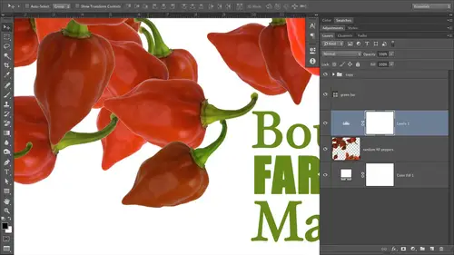
number six is used faces in your promotional materials. Nothing communicates you're captures attention of another face like face. The reason that's happening is several different reasons. If you put a face in your promotional material, people can see themselves as that person or in that situation, it's more approachable. Okay, so use faces whenever you can because they really do form an emotional connection. Case in point. This is a fake ad that I made that we're gonna build together tomorrow. Who fenced? Uh, yeah, I love doing this. These are three employees actually buy stock photo and the guy on the right, Kelly Thompson was actually one of the original founders. Don't think any of these guys they're still there anymore. But anyway, they're all they're all lots of fun. So these Air three Portrait's and this is a fake ad for a portrait studio. So what have we got going on here who have got three faces better? Funny, they're big. They're large in comparison with the other things that ...
are on this layout, and they kind of speak to us emotionally. All three of these images have very different facial expressions, so their attention grabbing their funny, and they're attractive in their own special way. So put faces in your ads. If you're a portrait studio and you want to take more portrait but portrait in your ads, OK, try to find a face that represents the different segments of your target market or your target audience. Who do you want to take pictures of? If this photography studio specialized in senior portrait, it's they would not use these faces, right. They would use faces and senior. So put a face in the ad or on the business card. Or what have you put a face that you want to have is a client and you will get those people will be drawn right to you like a magnet. If this was a studio focusing on Children's portrait's, these guys wouldn't be in the image. Norwood seniors. It would be Children pet for Tyra Fee. Put your pants in there. We've got the power of three, and they're right because odd numbers are more visually pleasing than even numbers. So if you're trying to decide how Maney images to put in an ad, pick three and call it then and then get outside. So the power of three. We've got contrast. They're big now. What have we got going on in the logo? The logo? I say This isn't a logo. It is that it's not vivid portrait that's also totally fake. And if you start a business call that, then I'd like a little kickback. See, that'd be really great. So we've got a really small type paired with really big type is exact. Same fun, though Vivid is set in a light, I think I think it's setting a light style of that fonts. It's a little bit thinner, and I think Portrait's regular or I'm completely lying to you know the same thing. Porter's just looks thicker, since it's at a larger size, but we'll find that out tomorrow. So with that contrast going there, we follow Good I flow. We've also got a picture path going on here, don't we? So we start with left, move right and then down Band. There's the company name. Very clear what this company offers portrait's and then at the bottom. We've got repetition in the color bar. We've got contrast between the color bar and the white or reversed text that we've set on top of it. We've got very minimal amounts of text on here. The pictures are selling the service for you. So put your target audience in the ad or on the business card. At one mortal fun thing that we've got going on in this ad is. Can you all see the background that's on the white bar behind Vivid Portrait? It's why do we have that background in there as a little bit of death? Where'd it come from, Right? Sure right, Absolutely. From our studio audience. Uh, we've gotten the answer that comes from the guy's shirt. So that's repetition, right? Makes the middle part feel related to the top part. So there's all kinds of things that you can snatch from your images. Those images ruled the color palette and the background shapes that we've got going on there because of what was in that guy's shirt. Okay, so I catching striking imagery used faces because they communicate with other faces. This is also fabulous. Fake ad Nelson, based on you know, my second last name. Seven Hilson waiting Israel life captures. I thought that was gonna cool. So striking image, something that's unexpected, something that has the face in it that you would like to be shooting. Put your customer in your ads because they can see themselves using your service or buying your product. Animal will take a look at this ad and all of its glory tomorrow. Faces on a hospital bill board. This is also fake, but it could be real text arcana. General, we could help y'all. Yeah. Notice the color palette. Fall clean, sterile light blue No crazy orange colors or crazy red which would evoke a different emotional response. We've got calming blue. Everything's gonna be OK. You're at the hospital now. Will take care of you. Friendly faces also crossing different ethnicities. Okay, so this ad is sending a message just by the people will forget about the text for a moment that Hey, we take care of everybody. We're friendly. Were young, not too young because we've been through med school, right? You wouldn't want people much younger than this in the hospital at because people would think Oh, my gosh, It's students were gonna do my, you know, appendix removal or what have you. So all of these different people the Hispanic community is represented here? May be the guy on the left Asian are not sure in nature. We've got African Americans represented on the right. We've got a nice mix of men and women. So that ad is fabulous because all those different people can now see themselves coming to text or can a general office? There's another hospital, competing hospital in texture can. I can't imagine that there is that. If there were, then they would go to your hospital, not the other one. Okay, so put your target audience in your pictures or in your promotional materials. There's another bake, one that I did. Are you hiding from the iris? Very scary, but funny, right? So with this one, we've put a face a face of somebody who's kind of scared hiding. So come let us help come into our accounting officer, what have you and you won't be scared of the iris anymore. So if you've got somebody who's feeling a bit worried that you confined imagery or go shoot imagery that conveys that feeling, another great idea for making money shooting stock photography is to shoot the seven basic emotions you know, fear, joy, contempt, anger all those kinds of things because people will use them in their promotional materials. Another great tip for using faces in your ads. If you're selling a product point the eyes of the face to the product. This is a huge secret in one that, um is really, really useful for getting people to take the action of purchasing. Whatever that product is is to have that face. Look at it in the ad itself. Another great opportunity for you start photographers out there so we'll see this original image whose will create this tomorrow together and you'll see that the images a shot on a white background and she's just looking up into the ether, just looking at absolutely nothing. That's a great way to make money shooting stock because then you've got designers who were going to download this stuff and use it just like I did here. So have your face. Look at your product. If you're selling a product, if you're not selling a product, you're selling a service, then have the face looking at the person you want to take action. So just like the eyes here are looking straight out at the viewer because we're selling a service, not a product. Now if this were instead, if she were looking up and maybe I was selling Oh, TurboTax the software, then I would have her looking up at the software package that I wanted you to buy. But in this particular situation, it's a service. So she's looking straight at, uh, the person that's supposed to take action, which is you. If you're a speaker, then your picture needs to be honking big, Okay, because you are the product. So in this one, I made this one a t learning to love the iris. I must have made these kind of early in the year when taxes were on my mind. But here again, the speaker is looking at you a nice, friendly face. You actually go that similar Mars free or is $10 But you get lunch. Hey, he's he's not. He seems nice, and surely he could help me. He looks like he looks like my neighbor son. Or what have you put the people? You want to come to your event into the image here, and that's the last one on that particular secret. So communicating with faces. So we'll take a couple of questions if we've got any, and then we'll break for lunch. Yeah. Um, does the studio audience have any questions in the The girl who was looking at the product up in the upper right hand corner? There you go. From a stock photography standpoint. Do they shoot people looking in all different directions? And so if I like that particular model, there's a probably pretty chance I have her looking where I needed to look. Yeah, absolutely. That's a great point, Todd. When you've got hold of the model like that, have him look every which way. Because right here from what you're seeing, she's facing upper, Right? Okay, I could shoot that same model. I could tell her to look the other direction, maybe change her arm position. You know, its changed her body language ever so slightly. So she's looking the other position. Then I might even have her looking down or straight out. Now, how maney stock images sellable stock images have you just created out of the same sitting with the same model? Everything. Now you've got 45 sellable images instead of one. So while Photoshopped, druggies and in design jockeys, an illustrator, jockeys all over the world know how to flip images around. OK, so you could you could flip this image. In fact, I think I did. I think she was facing the other way and I flipped it using the free transform tools and Photoshopped flip horizontal. A lot of people don't know how to do that. You can sell that other image. Absolutely. Because you cannot expect that everybody he's downloading stock imagery knows how to use Photoshopped. No, a great number of them don't. They don't know how to have made black and wides. So let's say you were gonna put this ad in a newspaper and you weren't printing for color newspaper and a lot of them just print black and white. Then you could also sell the black and white version of this image s stock because then that designer doesn't know how to make that black. And White has what she needs for the newspaper ads situation. Great question we have We have many more. I'll just pick one here. This'll in you. I kind of thought was funny. Whirlwind graphics. Who is from Lafayette, Colorado, which is outside of Boulder. They call it East Tofu, Colorado. Oh, Yeah, little inside Colorado joke for you guys. The Boulders West have. So they're asking, Do you feel that quote marks should be used with taglines in your graphic design? And I feel like I see that a lot like Lisa Snyder, Photoshopped educator. Yeah, that's a really great question, one that I don't have a definitive answer for it if the font that I'm using if I want that title under really stand out and you know air, quote it like that because that's what you're doing in print is your the equivalent of a recording. She's a expert, so, to me, kinda reduces the validity of the message a little bit. But that could just beat the way my brain works, because I, I hear it said sarcastically, when I see quotes like that, so I would say, Err on the side of not using them. But if you're gonna use them, make sure that you use riel quotes and they are curly. They're not in smart. So if I'm designing with a font that doesn't have pretty riel, curly quotes in photo shops, preferences in designs, preferences, illustrated preferences, you have a smart quotes option. You've got it inward as well. Okay may have to dig a little bit to find it, but you can turn on smart quotes, which the program is supposed to look at. The incident of the usage meaning is your quote next to a number. Is it next to Texas next to text? Smart quotes is supposed to insanity, and it's supposed to make him currently because those quotes really are curly. If those quotes appear next to a number, then they will be straight, like a foot mark or an inch mark. But some fonts don't have don't have the currently quote built in or it's not visually attractive. So if I'm gonna add the quotes and then the fun I'm using the quotes, don't look right then I will definitely not used the quote, so you probably don't need to use them. And if you are going to use and make sure that they are really quotes meaning curly and if that thought that you're using doesn't have that, then leave them off. What are your thoughts on non square, odd shaped or designing the card? Vertical versus horizontal? Oh, that's a great, great question. We're gonna die pretty deeply into that tomorrow. Keep your cards at the standard size, which is like 3.5 by two inches. Hey, believe it or not, there are a lot of people who put business cards in plastic sheet protectors that are built for that size of the card. So if you design a car that is outside of the standard dimensions, let's say you got clever and you did a square card, perfectly square card, which I've got one to show you tomorrow. Then it won't fit into those sleeves. The other thing is that, believe it or not, people still use rolled exes. I know it's hard Leave is really hardly so. That is, if you're, you know, under 20. So there used to be this thing called a role addicts, and it was circular in nature, and it had these little cards and you could turn this little handle and flipped through them, and they were divvied up by, you know, the alphabet and so on and so forth. People still use those things so they'll take our blank card that's in a realistic style. Staple a business card to it. If your card is funky and size then that doesn't work anymore. As far as horizontal versus vertical, I always air on the side of horizontal because it's expected it's standard. And when it comes to the business card, do you really want to strap somebody a potential client with the oddness of the shape of your card? No, you really want them to remember you because that's the whole point of giving them the card to begin with, so I would stick with horizontal. That said, vertical is not offensive in any way, and that can be nice. But what I usually end up doing and what I advice I give to my clients is go with horizontal on the front, and then you can do vertical things on the back if you want, so it keeps it kind of standard but also lets you get a little bit creative. It it really is so tempting to break all the rules when it comes to business cards, but that's one opportunity that you don't want to pass up. So that's not really the place Teoh to break all the rules, so I would stick with horizontal in a vertical image on that specialize a great formally for photographers, horizontal and then on the back. Put that portrait, you know, orientation image. So that kind of answers a question that I was gonna ask next, which was from Lisa and from Maryland, who says for promotional material like postcards, Will people really look at the back of a postcard? If she sends one out to people, actually flip it over. That's a really great question. They will only flip it over if they if their attention has been captured by the image on the front. So when we get into postcard designed tomorrow, we're gonna do quite a few of them. Big honkin image on the front striking. Capture their attention. Make it funny if you can make it vibrant, highly saturated in color, and then people will actually pick it up and flip it over, but only if they're captured by the image.
Class Materials
bonus material with purchase
Ratings and Reviews
a Creativelive Student
… exactly what I needed for current and upcoming projects! Actually, it was much MORE than I thought I needed. Once it all sank in, I realized just how much I didn’t know, but needed to know. The training is top-notch and very effective, and just to top that off with a cherry, Lesa Snider is the most engaging instructor with whom I’ve had the privilege to learn. I can’t recommend this course, Graphic Design for Everyone enough. … talk about “clicking” with an instructor… A self-professed Southern geek/nerd with a sense of humor is a darned near perfect click between that instructor and this student. I love to learn anyway, but Lesa Snider’s classes are a wonderful blend of fun that runs throughout the entire course of technically advanced concepts and application. Where do you find a course where you laugh as much as you learn (both massively)? … a Lesa Snider course. I’ve already put the course material to good use and look forward to using the class info and skills even more in future projects.
Adrienne
I've been a fan of CreativeLive for along time. I've attended many classes, but this is one of my most favorite sessions. I think Lesa is a great trainer and find I am learning a great deal. I liked it so much I actually purchased this course. I would watch any course she was part of. Great graphics design course and wonderful tips.
a Creativelive Student
I enjoyed it very much. However, I hated that I could not pause or rewind,,,so I had no choice, had to purchase. :)Lesa is a terrific Instructor. She takes the hardship out of the learning process with her wonderful ever so friendly personality. She instead turns it into a joy and I enjoy very much her courses! Thank You Lesa!