Class Introduction & The Psychology of Color
Lesson 1 from: Design Fundamentals: ColorJustin Seeley
Class Introduction & The Psychology of Color
Lesson 1 from: Design Fundamentals: ColorJustin Seeley
Lessons
Lesson Info
Class Introduction & The Psychology of Color
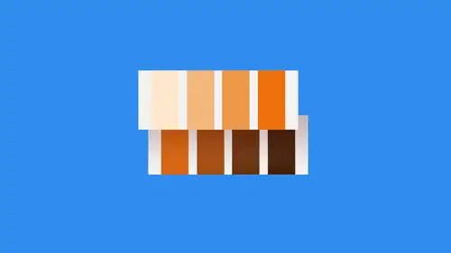
Hey, I'm Justin Seeley. And welcome to this section on color. We're gonna be talking a lot about color here. We're gonna be talking about color theory. We're gonna be talking about how to use color in your designs. And I'm also gonna talk to you a little bit about how I come up with my own color palette when and if I have to do so. So, first of all, I think when we're talking about color, it's important to understand what a lot of people call the psychology of color. How color affects our brains and our emotions. How do people use it to evoke these emotions from us? What goes into that? How does that work? Let's take a look. So here are a bunch of different colors that are represented here on your screen and underneath each one of them, we have a different word that represents the overall emotion that's generally associative each one of these colors. So, for instance, over on the far left hand side, we have yellow. Yellow is a color that's generally associated with things like optimism...
, happiness and general lighthearted field. Orange is more friendly. It's kind of a warmer color. You'll notice as we move from left to right that we start warm and we move our way over to cool. And so the warmer colors generally evoke mawr of an excited type of reaction, whereas the cooler colors are a little bit more subdued, a little bit more serious, that kind of thing. So orange friendly, very easy going kind of thing. It can also be used as like a gentle, alert type of color red. That's excitement, right? Everybody sees red. They're like, Oh, you know, it's It's kind of jarring in away and also read could be used as a warning sign. You see, stop signs are red. Red lights at traffic intersections are red. Why? Because that's something. It's Ah, it's an exciting thing. It's something that jars you and says, Hey, you need to pay attention to this purple. It's more of a creative color. So a lot of people associate this, And when I first started doing research about color three, I didn't really understand that because purple to me, doesn't seem like a very creative color. I mean, after all, it's just kind of a mixture of Fred and Blue. So what exactly what exactly is creative about it? Well, in a lot of the research that I did it basically just it evokes that emotion of creativity. A lot of people associate it with being more of a fun energetic, um, just very creative type color, which I think is pretty interesting. Blue. Now blue is the color that we're gonna talk a lot about, especially in these first few sections of the color theory section, because that blew the number one emotion that it evokes is trust. And I think this is very important to remember the fact that most research that you read says that blue is associated with trust. And when we start talking here in just a minute about the real world applications of color, you'll see exactly why Blue is an extremely important color for a lot of different reasons in a lot of different companies. So these are all of the different emotions that are evoked by color. We have optimism, friendliness, excitement, creativity and trust. When you look at these colors, what emotion comes to mind when you're walking down the street and you see something that's yellow? Are you happy? Excited? What happens I challenge you to go out into the world or just simply pick up a book or go to a website or something like that? Take a look at the colors that they're using on any of those things and see if you think the emotion that is triggered in your brain or the response that you have think about whether or not that emotion or response is what they intended you to have. If it is, then they've done their job. If not, they might have sent you a mixed signal or an incorrect color. You never know. So I would just recommend doing that. It's pretty cool to go out and check those things out. So we have to understand why we choose certain colors. And this is something that you know a lot of people don't understand. They look it. They look at a finished piece, a lot of clients and up and coming designers. They look at something I've done and then they go, Well, I Why did you choose that color? Why, why? Why did you do that? Well, the reasons that we choose certain colors are pretty simple, really. First and foremost, we want Teoh evoke a certain emotion from our audience. So if I'm designing something for, let's say, a wedding invitation, right, I'm not gonna use colors that are associated with death and anger. You want stuff to be light hearted and happy, very joyous occasion getting married, right? Same thing for birthday invitations, or, you know, whatever it might be. You also want to make sure that the colors you use adhere to any existing brand guidelines. That's something that's also often overlooked because you're not always going to be. The person is coming up with the color palette. You might be forced into a controlled situation where you have to work within the boundaries of an existing style guide. So if you are, that means you're gonna have to work within the color system that's already there for you. You don't get to pick it. You just have to work within it. Sometimes that's even harder than coming up with the colors yourself, because what if the company itself uses things like black and red? But they sell something like toys. I mean, you have to find a way to maneuver around those things and figure out a way to convey the message you want through the colors you have. You also might want to use color to draw attention to certain objects on a page or on a screen. So, for instance, if I want someone to look at a specific section of a printed piece, maybe the rest of the Prince of Peace is somewhat subdued. And the thing I want them to look at his bright red or bright blue. Something like that. You may also want to emphasize words within a paragraph. So maybe you make those boulder and read or bolder and green just to help draw people's eyes. Basically, what you're wanting to do is guide the viewer through your design. Now there are other things that you can use to do that, like repetitions and patterns and rhythm and things like that. But for the most part, color is the driving force behind what people look at, because that's one of the first things they noticed before. They notice shape and form and layout on it. They see color color is one of the most easily recognisable things in the world. I remember when I was driving on vacation with my parents and my parents were always used to tell me that I was very angry unless I got fed. Imagine that, and so we would be driving. And as a little kid, I didn't really understand the signs. They didn't say anything to me, right, cause I couldn't really read them. But I knew that red and to yellow arches meant there was food of the head. And so I recognize those colors very instantly. And that's something that I think has helped me in my career is understanding that color has a great way of making people instantly recognize what's going on and then finally ensuring the readability of your work. If somebody can't read or see or understand what you've done, you haven't done your job. So using color to create contrast between elements or make things more readable is an essential part of the creative process and one that people should spend a lot more time on Now. In some cases, people will create what I call mixed messages with their colors because some people just they don't adhere to color rules. They don't understand them, or they simply think that the rules are made to be broken and In some cases that might be true, but for the most part, sticking to those rules. Make sure that you are creating a script that people actually want to read. So let's take a look at these right here. So warm vs cool. When we talk about warm colors, we're talking about red, yellow, orange, everything on that side of the spectrum. And then for Blue. We're talking about blue, green, violet, that kind of thing. Everything on the on the other side and basically cool and warm have two totally different meetings When we think about a photograph, for instance, if it's a warm photo, it's probably a happy photo. It's in the sunshine, and you can just picture like an animal frolicking through a field or something like that, right? But if you're talking about a cool photo like a cold photo, it's winter. It's dark, it's got rain. Or maybe it's somebody to dark nighttime seen something like that. And so those are two Very conflicting seems to very conflicting emotions. And by combining these together, sometimes it can create a mixed message for people. So if you are using, for instance, let's say, um, let's say you're designing a brochure, and the brochure is for somewhere in the Bahamas or somewhere tropical, and you continue using sort of dark blue grey, that kind of thing for the tone. You're sending a mixed message because in some cases the photos you use will be bright and sunny and happy and warm. But then everything else that you do is gonna be blue and gray and boring. That's not exactly what you want to do. You want to make sure that the colors you use in the aesthetic elements that accompany whatever it is you're designing always match the overall theme and emotion that you want to go into that piece. Same thing for the warm section. Let's say that you know you're doing something. It's a It's an invitation to a ah winter party, maybe a holiday party of some kind, right? You would expect there to be some light blues white snow type colors in there. But if you start incorporating things like harsh reds or greens or oranges and things like that, that can really bleed over into that, and they can also overpower those other colors. And if the motions are true, that are evoked by those colors. Maybe that's gonna go against you. Don't want somebody to be on warning about your holiday party, right? You want them to be excited about it. So maybe instead of like a jarring red, you think about a more muted yellow that could easily be incorporated. Just thinking in terms of the emotional response that you're gonna get from people can go a long way to helping you create better color palettes and make sure that you're not sending mixed signals. Take a look at this one, for example. So we've got an exciting thing happening on the left, and we've got sort of a peaceful thing. We didn't go into green, but Green is usually associate it with peace, and it's very earthy. And it's also just kind of calm, right? Well, if you got exciting and calm, it's, you know, it's very confusing to a lot of people people don't really understand. OK, Am I supposed to be, like, really hyped up about this or am I supposed to be meditating about this? I don't really understand. And so you want to make sure again that you're creating a message that sends a very consistent script for people to read, and that's all in the colors that you choose. Okay, Now, let's talk about color in the real world for a second. And for this, I'm actually gonna have my phone where you can see it on screen. But if you're watching this, what I want you to do is I want you to take out your phone or your mobile device. I want you to do that right now and with your phone or mobile device. What I want you to do is just unlock it, just unlocked the device. I'll unlock mine, and I want you to go to the home screen. I don't want you to do any fancy searches or anything like that. I just want you to go to the home screen. And remember when I talked earlier about Blue being a significant color, one that I think is very important. What I'm going to do here is I'm gonna take a look at the icons on my home screen and on those icons I want you to note and on yours as well. I want you to note how many of those icons use blue in some way shape or form in their icon. I'm willing to bet that a vast majority of them have blue, a shade of blue or a mixture of blue in them. For instance, if we take a look at the top row of my home screen here, we've got the safari icon for Apple's Web browser. It's got a big blue compass right in the middle of it, right? The photos app has blue light blue green, of course, the apse in the second row that I have your tweet bought Facebook Instagram Facebook Messenger. All of those applications have blue in the icon at some point, and if you go down the list, it goes on and on and on. Even on my second page of APS, there are a ton that have blue in them as well. So why is this? I think it's two reasons. One. A lot of these obviously have blue in their brand guidelines, which OK, that's fine. But at the same time, that doesn't necessarily mean that they have to use that color is their app icon. I've seen companies use completely different colors on their app icon, So why do these people think that they need to put blue on, There's I'll tell you it's because Blue is a trustworthy color. And in today's day and age, there is nothing more important to us as technology users than our security and our privacy and the trust that we have to put in the company's that maintain all of that. So when we're looking at our phones, looking at these blue tones gives us a sense of trust, gives us a sense of everything's gonna be okay. And so that is something I found very fascinating. I went through the APP store and I looked there several pages of APS, especially APs that are related to social networking, business banking, work, any of those things. Ah, lot of those companies incorporate blue or some shade or version of blue in their icon, or at least in their screenshots or marketing collateral. And I believe that they do that because blue is a very soothing, trustworthy color. Now, you also notice in some of these applications that there are some that don't use blue at all. But they do use colors that represent the overall theme of what they're going for. For instance, YouTube YouTube uses a lot of red in their app icons. And YouTube is a very exciting places where a lot of people goto watch really cool, funny, exciting, happy videos. So red is an exciting color, so they're using red. They're also creating contrast in their applications with the white background. That's a stark contrast from just about any background that you would have on your phone, right, cause you don't have a solid white background, so that's automatically going to stand out. And then the red pops off of that. So it's like two layers of contrast, which is very effective. You've got things like the overcast at which is my favorite podcasting application. Podcasting is something that I thoroughly enjoyed. I think most people that go to the trouble of downloading their own broadcast at um are gonna be pretty stoked about listening to a podcast. So orange is the choice of icon there, and I think that kind of goes along with being happy podcast or something usually relaxed to listen to in the car on the train. And so the same thing kind of applies there. So I would just challenge you to go through your phone and take a look at some of the icons that you have and see if you think that the company made a conscious decision to use that color not just because of their branding but because of the fact that they wanted to evoke some sort of emotion or trigger some sort of response from you in some way, shape or form. I think nine times out of 10 that's exactly what's going on because it was mind boggling to me how dominant the color blue was across all of these platforms, and I think that once you start exploring it, you'll feel the same way. So take that little exercise, do that on your own, and then just tweet me at Justin Seeley if you think I'm correct.
Ratings and Reviews
Natalie Santana
Great discussion about the creation and use of color pallettes.
a Creativelive Student
Jolanda van Meringen
Student Work
Related Classes
Color Theory