Lessons
Lesson Info
Color Modes & Models
Now that we understand a little bit about how color affects our mood in our brain, we're going to dive deep into how color works and the different models and modes that you might run into when you're working with color. So, first and foremost, of course, we have the two main color modes that you're gonna be working with. See him like a an rgb C M Y K stands for science magenta, yellow and key or black and RGB stands for red, green and blue. Now you'll notice here on the slide that it says that C N y que is a subtracted color and it's created with ink. RGB is an additive color, and it's created with light. And so, basically, if you look at these two representations of the colors the C M y que up the top C M y que. All of those mixed together form the color black. In the middle of that little, it's almost like a Venn diagram, and then on the bottom right. The RGB colors mixed together form white, and that's in the middle of that as well. And so that's an interesting contrast between the ...
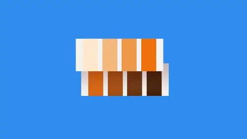
two. You can also see that the colors mixed together can create just about any color in the spectrum. C M y Que does have a limited gamut, as opposed to RGB, which has a very large gamut. And that's why you do see some color shift when you go between the two color modes. In photo Shopper Illustrator You will often see that seem like a is a lot more muted than an RGB because it just simply cannot produce the different tones that RGB can produce now, in terms of where you use these in general, the rule of thumb is that C M Y que issues for print and RGB issues for Web or screen, however, in modern digital printing techniques, especially things like digital inkjet, the new T shirt, which is direct to garment D TG printing. Ah, lot of those applications are starting to use RGB as opposed to see M. I. K. But traditional print like offset or Web offset or flex Ah, graffiti, any of those different types of things. Those are all going to use cm like a, which means you're gonna have a printing plate of some sort created for each individual color. They will be laid onto the substrate and then combined together to make whatever color you're trying to. Yet same for RGB those things we're gonna have not necessarily a printing plate, but they're going to mix those inks together so they're gonna lay down the red, lay down the green and lay down the blue. That percentage of each one is going to be based off of the light values from 0 to 2 55 So if you have zero, that means it's black. We have 55 That means it's white, so everything in between means it's gonna be sort of like a shade of that particular color. And so, based on the amount of light you're introducing, those air combined together to form just about any color in the spectrum. All right, the color types. We're talking about color types for talking about what color's actually exist. So the first color type is, of course, the primary colors and the primary colors are red, yellow and blue, these air colors that cannot be mixed. They exist naturally, meaning they are the base colors for every other color in the spectrum. And as it sees a successor on this slide. All of these colors are derived. Excuse me. All other colors are derived from these three specific Hughes. So red, yellow and blue make up every other color that there is. So these air, your primary colors and the ones that are outlined in white on this color will that we're looking at here. Secondary colors are green, orange and purple. Basically, these air formed by mixing the primary colors together. If you take a look at the colors on the color wheel, you can see the different combinations of these and how they were generated the secondary colors. So they're just mixing the original colors that we just talked about there and again. Those air green, orange and purple and the tertiary colors thes are basically mixtures of color, so they're gonna have, like, half and half names, like yellow, orange, red, orange, red, purple, blue, purple, blue, green, yellow, green. All those were outlined in white as well, and basically those were formed by mixing a primary and a secondary color together. So as you look at the color wheel, you can see each one of the individual colors how it's created. Of course, the primaries are not created using anything else, but secondary and tertiary are used by creating excuse me, used by mixing combinations of the existing colors on the wheel. And so these are the different colors that are available to you on the standard color will primary, secondary and tertiary. And that's how they are created now in terms of color schemes. How do we come up with which colors go Where and how are they related to each other? Well, the easiest way to create a harmonious relationship between colors is to use something called complementary colors. Complementary colors refers to on a color wheel to colors that are exactly opposite of each other. So in this example that we're looking at here, the main color is blue. The complementary color would be orange because they lie directly across from each other on that particular color wheel. If we were to look at one of the other ones here and we don't have it highlighted, but just look at something like green and then going across it would be something like violent or magenta. Whatever you would call that color there, same thing for yellow. That would be purple and so forth. So all you have to do when you're using a color wheel. If you want to use the complementary relationship to create a color harmony, you should just take whatever your target color is your main color, and you go straight across either way, any direction, and you'll always hit the complementary color as long as you stay in a straight line. The analogous color. This is where you take a main color aqui color, and then you take the colors on either side of it, basically. And so, for instance, here we have Blue. Let's say that's the primary and then to the left, we have sort of a blue green and into the right. We have a purple, and so that is the analogous relationship between those three. And if you line those up, you would see that they do actually go together. Which makes sense. All of these things look like they fit together when you use these rules, and that's because these rules are color harmony rules, so it make sure everything goes together, sounds and looks like it's in sync. It's like a It's like a choir all being in the same tune pretty much try addict. This is a little bit different. Try Attic relationship is sort of like a triangle that goes across, and so basically they're evenly spaced across the wheel. You start off with a color of main color, and then you go down and over a certain degree. That's color number two down and over the same amount of degrees in the opposite direction, and you've got the second. And so here the the color is blue, the triad of colors that go along with it are yellow and then the pinkish purple color there. And so those come together to form a very harmonious relationship. It also try attic is a great way to create contrast most of the time. So, for instance, here we've got to darker colors, right. The blue and the purple color and then the yellow really create some stark contrast between those two. So if you're looking to have a contrast ID look, chances are try. Attic is gonna be a great way to do that, because at least one of them is going to be very far outside of the normal color range that the other two are in split, complementary this is pretty interesting. This is not one of the common color rules that we see, but split Compliment is a color scheme. It's a variation of the complementary color scheme that we talked about earlier, where it's just one across from the other. But in addition to the base color it uses to colors that are adjacent to it, so it's basically two colors that are adjacent to its complement. And so, if you look at this, it almost looks like the analogous rule mixed with complimentary. It's almost the exact same thing, and so this is can be used to create a bigger color palette than just the three colors that we looked at earlier, or just the two colors from the complementary. So this is a great way to say Okay, we need three colors that are very similar and them one to create stark contrast. It's pretty interesting way to go about it. I really like the split complementary rule. It can create some really good color harmonies for you, double complementary. This is another cool one because of the fact that it relies on just using those complementary colors again, right across from each other. so you would basically picked two key colors or to base colors here. So let's say that I picked blue and green well. The other colors to go along with that are purple and orange, and so all of those combined together would be my color theme that I would use in whatever it was that I was working on. So the double complementary works just like that. All right, The last one is obviously the easiest one. Monochromatic, monochromatic can never go wrong. It's one color. You picked the base color, whichever one you want. Now you can create different shades and hues and tints of this particular color, and there are always going to be in harmony with it because they're just variations of that specific color. Now, here in a little while, we'll talk about working with hues and tints and shades because you might not know what those are yet, and that's okay. But just understand that this monochromatic approach is a great way to ensure you're always in harmony, and you're using one color as opposed to many colors, which can even reduce the cost of a printed job. It can make it easier when you're displaying stuff to clients because everything just kind of looks like it fits together without having to worry about the color rules and and all that kind of stuff so monochromatic can be a big advantage, but it is the simplest one, as you see.
Ratings and Reviews
Natalie Santana
Great discussion about the creation and use of color pallettes.
a Creativelive Student
Jolanda van Meringen
Student Work
Related Classes
Color Theory