Lessons
Lesson Info
Demo: Creating a Color Palette
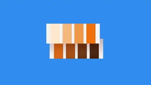
self start out here and I just start applying these colors so there's one to three for and five. So there's all the colors that I have. I can see those in relationship to one another. I can kind of play with those and take a look. This is oftentimes what I'll do. I'll create just a basic shape that has lots of different, like rings or layers or something like that. I'll put the color theme on top of it to see exactly what it looks like. Make sure everything meshes well together because in some cases when you create a theme, especially if you use the adobe capture application or a photograph, those colors might not always go together. And I use the color wheel a lot with those relationships. Complementary. Try attic All that stuff. I use that a lot to make sure that everything goes together, but occasionally I just get really hung up on Man. I love that blue and I love that green. And so I bring him in here to make sure that everything works, and that's something you have to consider. N...
o matter how much you like a color, does it actually work, and that's something that may not always be the case. So it's close this up and let's talk a little bit about actually applying a color theme to something that you've created. So what I'm gonna do here is, actually you know what? Let's just create a brand new document. Could new document Doesn't matter how big or how small it is. Create yourself a new document. We've already got our color themes saved. If you don't have a color theme, that's okay, go online and create yourself one and then come back. You can work with there. So I've still got my bonfire color theme here. And so what I have to do is I have to determine inside my color theme the hierarchy of the colors. And by that I mean, which colors are gonna be my main or base colors. Which one are gonna be accents? Which one are gonna be emphasis, that kind of thing. And so that's all. Something that I work out ahead of time. And this is something that it doesn't even have to have really any meaningful content around it. Just as long as you understand the relationships to the objects that you're working with me. Show you what I mean by that. So first and foremost, let's say that we're working on, um maybe an ad like a banner ad or something like that. So I'll grab this rectangle tool and we're just gonna draw something out here kind of Web banner ish 7 75 by 7 And then I'm going to apply one of these colors to it, and I have to consider which one of these colors is going to be the main color. And for me, I think because of the fact that these two orange colors on the end, those are more like accents because they don't really go with the rest of these colors. I think that we're not going to use those is like the base or main color. I'm going to use probably this mid tone green right here, kind of a blue green. That's gonna be my main color. And so maybe this is like the background element of this. And then let's say that I need some text in there as well. Now, chances are I'm not going to use orange as the body text of anything because orange is just very hard to read. So I would actually have to add a white color to this. And I would probably replace one of the orange colors with White just because of the fact that these air so close together in appearance that I don't think it matters. So in this case, though, what I'm gonna do is just type out headline and let's increase that so you can see it and then we'll go here and we'll fill that with placeholder text. So we've got a little bit, you know, produce sat down, and I'll put that as the white color I want to use Bring my swatches panel again. The headline is going to be bright orange. Commit to those changes, command, return, move that in kind of like that. And so this is what I do. I start to plan things out. I start to see exactly how the relationships are going to go. I think that this is pretty good because we've got the headline in a boulder color that really draws your attention to the headline. I think maybe the white stands out a little bit more than I would want it to So what I might do here is used the white but create almost like a tent of the white. So maybe take that down in opacity a bit, something like that. I could also just kind of dull it out a little bit if I wanted to. So, for instance, just kind of move it down in the gray spectrum a little bit. Never go a little bit better. And so now I've got my headline, I've got the body and now I need to figure out like if I wanted to create some sort of call to action or an emphasis point, what would I use there? So let's grab our rectangle tool and then go back to my bonfire. And now I have to pick one of these. Well, the problem here is that I don't have a whole lot of contrast in the main colors here, so the greens don't have a lot of contrasts by select this green color here, you'll notice that's not really a great called action, so I might actually have to repeat that, right? So that's gonna be my main emphasis color. I think the orange and that's what I'm going to use it for. And so that's the process I go through to determine. Okay, so orange is gonna be my main emphasis color. This is gonna be my main base, The white or the light. Gray is going to be just the regular body copy, you know, normal text. And then the only other thing that I have really is the lighter green color. And so what is the lighter green? Going to be fourth lighter. Green can be a lot of things. It could be a Nikon that goes on top of some of this stuff. It could be just about anything. But that's what we're gonna call an accent color. So we've got our main color. We've got our emphasis color, and we've got our accent color. And then in between, all of those is like your body copy or your what I call main text color. And so that's what you do. You develop a visual hierarchy for the colors, and then what I like to do is create a pallet based on that in the order that I wanted to be in. So I'll just take this. And so we've got 1234 and then white. So five. So we just need to duplicate this five times. One, 234 So 12345 there again and I'll just start off. This is my base. That's my emphasis color right there. This is going to be my accent. This will be the main dark. And actually, you know what? Let's switch those because accent just needs to be one of those smaller ones and then swatches. We'll just go with white and standardize this a little bit. I'll tell you what. Let's do hex code of E C E C E c. I know this is sort of a really light gray, and so there is my color palette and the hierarchy of what I want to use it for. And so what this basically does is it makes it really easy for me to come back and use this again later. So if I keep that over there or even keep it in a separate file, what I can do then is any time I'm working on something, it makes it super simple for me to start applying color to it. So, for instance, let me go out here and I was just create something kind of interesting. So just draw out a box and don't make that circle come over here. Go and then duplicate this. And I'm just using basic shapes. For this is something I do all the time. Teoh, create what I call complex artwork, which is not really all that complex. And so let's do this right here. I'm gonna grab some called the shaper tool and remove that and whoops. Select these objects up here. Move that and all I'm doing when I'm doing this is holding down the option key on the Mac, the old key on the PC and scribbling across. Here we go. Yeah, I can see what I'm going for. And so now move this in and object path, offset path. And let's do a negative. Make this with a smaller, Duplicated the group. Let's expand that appearance. Object, Pat offset path every year. All right, Very good. Okay, so now I've got this little apple illustration here, and what I want to do is I want to create something out of it. Maybe it's a logo. Maybe it's an ad or something like that. And so I'm gonna use my color palette to do this. And so the base color is going to be obviously the green and so going to use that green colors, the main color, the background. Here we want that to be one of the other green colors. Maybe one of the kind of light background, accent colors, same thing here going to use this almost like creating some depth with this thing. So you and then out to the left here will type. Give me an example. How do young Company name Don't necessarily have to have specific font involved here, but and then we will make that no orange kind like that. And you could work in even some more of that if you want to. So to kind of give it a little bit more cohesion. So offset path. And let's do this by 20 pixels rebuild and then, Oh, something kind of like that. And so you see, here I use the hierarchy of my colors to determine base accents, shadows And then, of course, my main text right there. I could have also used the lighter text for that or darker works Well also and so just play around with that determined the color hierarchy determined all of the things that you need for the palate itself and then just go from there. It's very simple, but also a very fun way of figuring out where things go in terms of color. So all right, let's close that up. And let's talk about one other way that I like Teoh, go about using color. And that is to emphasize, like I said earlier direction, Right? So let's open this up and okay, so here is an example of a brochure, and this brochure has a very limited color palette. There's not a whole lot going on in here. It's basically orange and dark gray, so there's not a whole lot of color information to use. But the use of color in this design is very, very powerful because of the fact that it's minimalism mixed with very punchy contrast. Id bright colors and these bright colors take us on a journey through the whole thing. So if you take a look at this initial page right here, this initial page at the very beginning, the main thing that you focus on immediately when you look at this page is the big orange stripe right over here on the left hand side. And what this is doing is it's drawing you in and pointing. You hear that saying Hey, look here first, What's over there? Oh, the headline is over there. So I'm directing your attention to the headline up in the top right corner. From there, there's a black line that goes down like this so it's actually a map goes left and then down and down is where all of the information pieces go. As you get to the bottom and you've read through all of that, you'll see right here this guy comes into focus over here on the right. That's another arrow, basically saying, Hey, look over here. There's the headline and it goes up. So we're using bright colors to immediately draw your attention somewhere. And then we're using the black contrast to control your movements within the printed page. And so I think that's a very powerful use of color, simply because there's there's so little going on in here. So in order to be able to direct people's attention using only one or two colors, that's a very, very powerful thing. If you take a look at that, in contrast with the other brochure that we were looking at before. There is so much information in this other brochure, and there's so many colors. They have to really emphasize this gold and make sure it's not being used anywhere else inside of the design in order to pull this off. There's no way that all these colors mesh together. If it's not for the stark contrast of that golden ribbon that goes all the way through here. You have green over here, Red over here, Purple over here. So it's very easy to kind of create a rhythmic pattern that follows here. You've got some contrast ID elements in the interior here, but not really. I mean, the only the only major contrast is the gold. Compare that to this. So much simpler, so much cleaner, so much more white space. And they do such a great job of directing your attention inward, controlling the motions after they get you in and then guiding your way through. I mean, it goes through the whole thing. If you take a look at this full example everything, it takes you on a ride somewhere. That brochure this one relies mainly on rhythm right and Marines on the on the flow of everything that goes through it. The contrast helps, but it's certainly not the only point of emphasis that you have here. Everything draws your attention somewhere, and that's very difficult at times to read. But this very straightforward, very easy. So that's one of the ways that I like to emphasize color as well as to make sure that it is. It's almost like a road sign that you have to follow going through.
Ratings and Reviews
Natalie Santana
Great discussion about the creation and use of color pallettes.
a Creativelive Student
Jolanda van Meringen
Student Work
Related Classes
Color Theory