Lesson Info
5. Bringing it All Together
Lessons
Lesson Info
Bringing it All Together
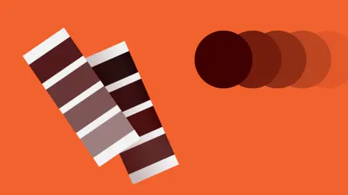
And so, since we're talking about bringing it all together, that means that I'm bringing it all together now. Always remember: the fundamentals are forever. They never go away. You will always encounter them, you'll always have to think about them. 70 years from now, while you're still working and creating beautiful and expressive compelling design communications over and over again you'll be remembering. A couple of tips to work by: always keep your image options open. Don't just assume that a photograph or a certain kind of illustration is the best way to go in order to achieve what you need. Think about how interesting the range of possibilities for imagery and form are. Use color decisively, choose it on purpose, define a palette, and use it for visual purposes to be compelling and beautiful, but also for meaning. To be evocative, metaphorical, to support the communication. You need to know the ins and outs of types really really well, because you are working with an element in tha...
t case that is very functional and that can suffer a tremendous deal, or can suffer greatly, if the relationship between its visual expression and its verbal utility are not tightly controlled, and you really have to be aware of how those elements work with each other. Spacing, the counterforms, alignment relationships, groupings, and so on. And the last thing is, you always want to keep in mind and take a look at your layouts as you're going through them. Test out different kinds of variations in how you might organize the same stuff, because sometimes if you just do things for the sake of seeing the difference, you find a much clearer and much more dynamic relationship than you might have thought in advance. So don't preconceive, and make sure that all the parts of the layout, whether it's for a webpage or for a poster, for architectural signage, for a book or a brochure, they're all working together, talking to each other to create a dynamic totality. And now, again, get out there and do it. Thank you very much. (applause) If you'd like to find out more, you can visit my website at timothysamara.com, and if you're interested in purchasing any of my books, many of which talk about these kinds of issues in different ways, there are two different websites you can go to to do a search to find my books there. I encourage you to go through all this information and I hope you get a lot out of it.
Ratings and Reviews
fbuser 2574504b
This class is totally on trend. I can see it being VERY popular. CreativeLive obviously loves him & his (awesome) topics, as his classes are often available for limited time (for free). Speaker is well versed/uber knowledgeable on the subject/techniques; obviously very passionate & a creative/visionary. I would suggest for him on future verbal teachings, to work on the elimination of the verbal tick of saying "uhh" so very often. Otherwise, A++++. Thank you.
Gary Harding
I've studied color in various ways (for both graphics and painting) for 15 years and I can recognize this is really good information. That said, it's only a high-level overview; it's not meant to teach you everything you know, but rather cover the highlights only of color theory. It's still a good class. Timothy is a great lecturer, but this is not a hands-on deep dive, which would take hours, if not days.
Øyvind Hermans
Precise, clear and interesting course. The course gave me the insight I was looking for, I love it.
Student Work
Related Classes
Design Projects