Lessons
Lesson Info
Color Identity
Color tends to either freak people out and confuse them, or make them kind of uncomfortable because a lot of what happens with color is so subjective and we come to the kind of perceiving and thinking about color from very very personal viewpoints and so very often, designers are sort of totally at a loss for where to go or how to even think about color whether it's at the starting point of a project or down the road once the basic kind of form and messaging, imaging ideas have been kind of sussed out so we're going to talk about that. What we're going to do first is to become familiar with color identity. That is, how do you name a color? How do you describe a color? And then we're going to understand-- look to understand relationships between colors. How colors change in juxtaposition. After that, we're going to talk a little bit about how to think about going about defining a palette. That is, a selection of colors to use for a particular project and we'll be talking a little bit al...
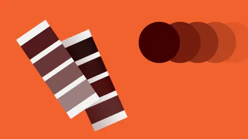
so about how color can be used as a system and we'll end up by talking about how color can be not just a really amazing visual experience but how can it can also be useful for enhancing meaning, delivering narrative, and so on. So let's go. It's a very interesting question, this. Which is it? Is it blue, blue, or blue? The answer is that these are all blue and that you can't really define a color out of any context in your own head until you can see it in some world, juxtaposed with others. But even so, even if you were looking only at one swatch of blue, you might register it as blue but you really wouldn't have any other kind of framework in which to consider, what is the real kind of quality or the identity of that particular blue? So we have to sort of understand how one might define, or describe, a particular color. And there are four attributes that every color exhibits or presents that we can use to kind of get a handle on what its color is really about. The first one is hue. The term hue refers to a distinction between identities of color as defined by their wavelengths. Color is light, or it's reflected or refracted light and when you're looking at something of a particular color what's happening is that the certain refracted wavelength that you're perceiving off of an object because of its chemical or physical makeup is striking certain areas of your optical system, your retina and you are perceiving just that particular wavelength and that's what we think of as hue. So a hue is, in simpler terms, not to get all science-y on you, is the difference, for example, between orange and blue. This is an orange hue, this is a blue hue. So once we've determined whether or not we're looking at orange or blue, and we're looking at blue now, we have to think about or understand whether or not we're looking at a very vibrant or vivid or bold kind of presentation of that color, or whether or not that color, that hue is kind of... Kind of diminished, kind of dulled out or grayed out, a little smoky. And we describe that difference in vividness, or brilliance and desaturation or neutrality with the term saturation. That is, we say that a color which is very, very intense we would describe as being saturated or supersaturated, full with that color, full strength, and a hue that is kind of grayish, a little bit more neutral, not so intense, we would refer to as dull or desaturated. We can also describe a color in term of how it feels with regard to a kind of perceived temperature. All colors are perceived, for one reason or another, usually because of an association with something in the world that is that color, as being relatively either cool or warm and so we can also take a look at these two blues and compare them and we would say that the lower blue is a warmer blue because we can sense a little bit of green or yellow in it and in comparison to the blue above, that blue is cooler as we can sense a little bit of violet in it and it's really only when two colors that are this subtly different from each other are directly juxtaposed that you can really sense the different between them, and sometimes, you know, of course you can make that difference in temperature quite extreme if you'd like but it can also be quite subtle. And last, we can describe a color as being either relatively light or relatively dark, and the term that we use to describe that quality is value and it refers to the tonality relative to or in comparison to the tonalities of black, which are also called gray. So the blue swatch at the top we would say is a darker value than the blue at the bottom. You'll notice that this light value blue also appears to be somewhat less intense than the darker value blue above it and so what we're going to find out is that changing the attributes, the individual attributes of a particular hue will often affect the other attributes in some way. So of course, we're first familiar with kind of a categorizing of colors based on their kind of relative simplicity and that really has to do with where they exist in the spectrum, and so we all became familiar with the primary colors as children, red, blue, and yellow, and nobody probably ever really told you why they're called primary and basically it's because those three wavelengths, the wavelengths of each of the primary colors, of red, of yellow, and of blue, are as far apart from each other on the visible range of the spectrum as can possibly be, and their wavelengths cannot be confused with each other at all. That is also because their individual wavelengths only strike particular rods or cones in the retina of the eye, and that there's no confusion on the part of the visual system as to which wavelength is being absorbed and then interpreted. So we call those colors kind of primary because they're kind of therefore a little bit basic. Wavelengths that occur in between, we give different names to, so the wavelength-- the color wavelength or the hue wavelength that exists exactly evenly between the wavelength of yellow and the wavelength of red we refer to as orange, and it is a secondary color, as violet is a secondary wavelength between the primary red and the primary blue, and the secondary green is-- or green is the secondary wavelength between the primary yellow and the primary blue. Some colors have specific kinds of intrinsic properties. In particular, value. Depending on where the color falls on the spectrum it will be intrinsically of a darker value or of a lighter value in its kind of native and full strength, fully saturated state. So yellow always can only be really perceived as a light value color in its pure state. Violet is intrinsically a dark value hue. The value of a color affects its saturation but does not necessarily affect the identity of the hue itself. So these we would both categorize as red. The top swatch is an intense red of medium value and the lower swatch is a darker value red. You'll also notice again that the intensity of the red of this particular red is less than the intensity of the upper swatch red. And last, changes in value can also affect-- and changes in value can also affect our perception of a color's temperature. So in the top swatch, the relatively light value blue seems a little bit warmer, a little bit greener and the darker value swatch of the same blue seems a little bit cooler. So sometimes when a color deepens in value it also shifts a little bit in its temperature. So you'll always have to be kind of watching as you change one of the attributes of a color to make sure that it still retains the identity that you're intending or that you started out with. So saturation, again, refers to relative vividness or brilliance versus dullness or desaturation and these are just kind of examples of a very, very highly saturated color palette, very, very intense magenta or red-violet and intense yellow and intense blue-green. Here, on the other hand, these are bookspreads that use very desaturated colors. You see that there is a little bit of intensity that occurs in the photography where the oranges and yellows and some of the greens appear closer to full strength. You'll see that the vast majority of the surrounding area in the images around the food as well as the color applied to typography and the page surface have been sort of translated from those basic colors, kinds of greens, kinds of yellows, kinds of oranges that have all been desaturated, have had the color dulled out of them in order to quiet them down and to not allow those text elements to really compete with the photography, and even within the photograph itself, the image has been art directed so that the prop setting and the use of light focuses the intensity of color on the food and diminishes its intensity, desaturates it in the surrounding background elements and that, again, is kind of a strategy for providing a kind of a rich and sort of sensuous, very, very tactile, very physical almost taste-like sensation for the food. So again, here's just a comparison of an intense hue, in this case green, and a kind of a desaturated version which begins to become a little bit gray. We say that this green has been somewhat neutralized, or subdued. Some colors, some hues have also, in the same way that they have intrinsically sort of a value identity, many of the hues also have an intrinsic relative saturation identity. In almost all cases, a primary yellow at full saturation will always be more intense than any of the other hues in particular blue, which generally has a kind of a mid-level saturation relative to other colors. In general, warm temperature colors tend to be perceived as more intense or more saturated than cool temperature colors. And last is just again another look at how a change in value, that is, by lightening the value of that green swatch that its intensity, or its saturation, also appears to diminish. Then we can talk about value, which is the relationship between relative lightness and relative darkness. Generally, we talk about that in relationship to black that, at its strongest, any hue has a particular value difference from black. Black is the ultimate in deep value. It is the darkest value achievable. Essentially, it is the absence of reflected light. So violet, or blue-violets, have a very, very deep or dark value intrinsically in their kind of pure, saturated form but there is no violet, no matter how dark it gets, at full saturation that can come close to achieving the darkness value of black. Colors of different temperature often exhibit also intrinsic differences in value as we said before, so this particular green-blue which is the sort of pure spectral green-blue, a tertiary color, and this yellow-green have an intrinsic value difference. That is, the green-blue, or rather the blue-green, will always be darker than the corresponding pure yellow-green. That's really simply because this hue being closer to yellow is drawing upon the intrinsic light value of yellow as part of its identity whereas this hue, being closer to blue in the spectrum, is being influenced by blue's intrinsic darkness. So colors can be sort of registered or compared to levels of gray and what's happening here, interestingly, is that the orange is a very, very intense color, but it is the same value as the gray swatch below it. That is if you were to take a black and white photograph or a black and white scan of this combination, what you would end up with is one large rectangle of a continuous gray. There would be no boundary visible here. So that means that the values are equivalent. They are the same relative lightness or darkness. Different things happen sometimes when you begin to color shift, in terms of temperature. Also, you will also tend to get a change in value, especially at full strength. As you lighten that secondary hue or change its intensity, it will become even more different in value than the swatch previously. And then, this is just a comparison of two blues. One of an intrinsically darker value and one of a lighter value. Also, there is a temperature shift here. Cooler on this side, warmer on this side. But you see, so there's a really stark boundary that your eyes are traversing. You're very conscious of the division between the two swatches. As the values of these two squares become similar to each other, that boundary appears to vibrate or to blur or to disappear. And again, similar to the sort of large fold-out example on the far right, if you were to take a black and white scan or a black and white photograph of this swatch pairing, you would essentially end up with a horizontal block of one continuous gray. There's an example here of how value is used to call attention to elements in a typographic hierarchy, that is, using darker values which tend to advance towards us in space against lighter values which tend to recede from us in space or they're perceived that way in order to create a specific ordering that allows the reader to navigate in a clear and direct and decisive way despite the fact that the typography is formed in a kind of randomized kind of cluster. If all of these typographic elements, if all of these words were the same value, the large one would likely read first because it is so much larger than the remaining text but once you got past that point, the similarity in size and the equivalence in value would make it very difficult to determine which of these things to read first and in what order. So value, as we're going to see this afternoon, plays a very, very critical role in enhancing legibility and readability in typography. You can completely destroy a very legible, easily navigable typographic layout by misapplying color relationships to text and you can also enhance it tremendously, and you can also play some interesting games as this one does. Typically, we're often... it's sort of true that the largest object, the largest visual element in a field, in a composition will be the most pronounced, will dominate the others and will be read first, especially if it's typed. In this particular case, you see that in the background is that this word mark, Royal Court, has been repeated at a tremendous size which is really, really quite large and yet it's the last thing that we're able to read and what's happening here is that the difference in value contrast has been diminished to almost none. These two colors are the same value and they are overall lighter together at that value and therefore have more contrast than any of the other elements do in this particular group. So even the white text that is knocking out or reversing from that colored field has more contrast against that background than the gigantic text does against the background so by pulling the values of the huge visual element and the background that it's resting on very close together and making that value as different as possible from the relative values of the other elements in a grouping it's possible to cause a very, very large and potentially interfering typographic element to become nearly invisible, and to read last in the hierarchy. Temperature, again, is about the perception of coolness and warmth. Here's an image in which two very, very complex photographs of architectural interiors that have a lot of detail, a lot of repetitive visual forms, linearity, a lot of movement, curves, angles, small dot elements conceptually might be competing with each other or in this particular layout, could have been almost too repetitive of each other and somewhat monotonous. Since there's a similar degree of activity, a similar degree of complexity, a similar degree of scale elements, is that there's not really that much visual differentiation in the form language in these two images. The thing that offsets that is the temperature shift. In this particular image, the temperature is concentrated in the cool range. That is, almost all of the elements here exhibit a temperature that is somewhat cool in the kind of blue, blue-violet, blue-green, and is also-- all those hues are also relatively desaturated. On this side, however, there's a very, very strong pronounced element, which is warm. And it's that warmth in this particular image even in the lighting in the background of the interior that allows this image and this image not to fight with each other, but still to kind of talk to each other in their kind of relative complexity. So colors have intrinsic kind of temperature attributes. Red, oranges, and yellows are intrinsically warm and blues, violets, and greens are intrinsically cool. As a color or a hue shifts from one wavelength to another it will very often change temperature. Temperature is intrinsically kind of one of the bases of the hue wavelength so a change in temperature is essentially a change in hue starting with a kind of more orange-yellow of the same value as a more intense yellow and then the same value of a yellow-green. So we're going here in a kind of a progression from warmer to cooler. Here, what you're looking at, the color on the monitor as I'm seeing it is quite different but here you have two very, very desaturated colors that will read, initially, and especially if they were separated from each other as gray with having almost no kind of chromatic appearance whatsoever. As soon as they're brought into juxtaposition, the subtlety of those two colors becomes apparent. This is an absolute neutral gray. That is, it is a tint of black. It is a tonality of black, or a value of black. So it offers absolutely no chromatic information. It's only by bringing this other gray swatch into direct juxtaposition with it, by butting them together that this particular swatch, which formerly read as gray in comparison now reads as cool and may even begin to be interpreted as blue and as you start to look at the two hues back and forth that apparent difference, which is completely an illusion, begins to become exaggerated. The neutral swatch on the top will become-- will take on the appearance of being warm and may even start to appear to be orange. Isn't color fun?
Ratings and Reviews
fbuser 2574504b
This class is totally on trend. I can see it being VERY popular. CreativeLive obviously loves him & his (awesome) topics, as his classes are often available for limited time (for free). Speaker is well versed/uber knowledgeable on the subject/techniques; obviously very passionate & a creative/visionary. I would suggest for him on future verbal teachings, to work on the elimination of the verbal tick of saying "uhh" so very often. Otherwise, A++++. Thank you.
Gary Harding
I've studied color in various ways (for both graphics and painting) for 15 years and I can recognize this is really good information. That said, it's only a high-level overview; it's not meant to teach you everything you know, but rather cover the highlights only of color theory. It's still a good class. Timothy is a great lecturer, but this is not a hands-on deep dive, which would take hours, if not days.
Øyvind Hermans
Precise, clear and interesting course. The course gave me the insight I was looking for, I love it.
Student Work
Related Classes
Design Projects