Lessons
Lesson Info
Color Relationships
So it's these kinds of interrelationships that we have to be able to think about and understand how they work so that we can choose to create clear relationships between the colors and finding relationships between hue and saturation and value and temperature. It's really the kind of the first step of defining a palette. So first, we wanna go take a look at how colors are related to each other. And this is a model for that sort of overall relationship or model of the relationship of the hues and their wavelengths in the spectrum. Rather than being represented as a linear, horizontal line, the visible spectrum in this model, designed by Albert Munsell in the 1890s, has been wrapped in on itself, as there is correspondence in how some of the wavelengths of the secondary colors between the primaries red and yellow affect similar and different rods and cones. So by creating this wheel, it creates a kind of a circle of sort of interdependent relationships that is very, very helpful to under...
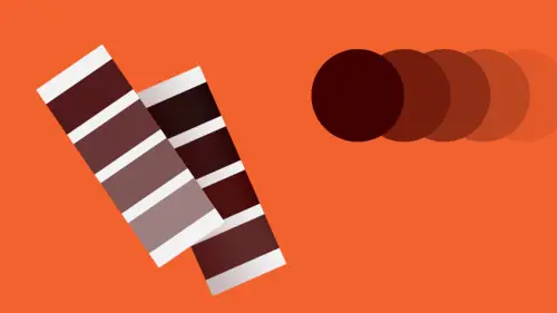
stand. So you have, over here, on the color wheel, the warmer hues. Over here, the cooler hues. So generally, coolness is defined by a component of blue in the hue and warmth is defined by a component of yellow and red in the hue. As they intermix, the relative, the temperature shifts also kind of in between. The color wheel's actually a kind of a cylinder in real life, if there is such a thing for diagrams. In that what you're really looking at here is a kind of cross-section of a cylinder on top. And the cylinder as seen from the side, if you take slices, you'd be looking at a relationship of each of the hues and we're looking at kind of this cross-cut here, from, if you turn this this way from the side, is that the color wheel or the color cylinder also maps a value relationship that is at the bottom, the deepest value of those colors across from each other and at the top, the lightest value, eventually approaching white, which is invisible against a white page. And then, from the center, it maps saturation with complete de-saturation or absolute neutral, neutrality of the color or grayness at the center, with absolute and pure saturation or intensity at the outer edges. There are two overall kinds of systems of color that you have to be kind of aware of, depending on what medium you're working with. If you're working with light and it's on a screen or with projection, what you're dealing with is something that's called the additive color model. And that is that the colors, the wavelengths of colors, as they aggregate and build up on each other, eventually result in the perception of pure, white light. The opposite of that is the color model upon which inks or pigments or paints are based. It's a chemical model, rather than a light-based model. And that's the subtractive color model. And in that model, which is what you have to think about when you're dealing with print, because print uses inks on top of each other much like paint, is that as you're adding the reflective quality of colors in layers on top of each other, is that eventually, as they aggregate, you'll lose any reflective light and you will achieve black, the absence of color. Just so you know. Fun facts. So these are kind of the relationships and we're gonna talk about each of the main attributes and relationships that are kind of attendant to them. So first, there are relationships between hues that you can establish. And there are three basic kinds. First is the analogous relationship. Analogous means similar and that refers to a relationship between colors that are directly next to each other on the color wheel. And you can get kind of a range in between. The next relationship is that of the complement or the complementary relationship. And that exists between colors that are directly opposite each other on the color wheel. The thing about complementary colors is that because they are at those particular wavelengths and sort of diametrically opposed to each other on the wheel is that they cancel each other out when they are mixed together in even amounts. And so, if you were looking at a light-based model or an additive model, seeing red and green light simultaneously, you would see white light. In a subtractive model that is ink or paint, by mixing them together, you get, in theory, a true neutral gray, but the chemical components of inks and pigments will generally yield a kind of a muddy brown-gray. And last is the triadic relationship and that is also referred to as split complement. Beginning again with the green that we use to establish a complementary relationship with red, the split complement or the color triad of green involves colors that are at 120 degrees from each other. That is, from the true complement, outward to the secondaries. Which can create a very, very interesting color palette all by itself. This is probably not an organization of colors that you or many people often choose on a regular basis. But it is an interesting place to look, particularly for that reason. Now there's something about these two that's very important. The complementary relationship is the most powerful and the most dynamic optical relationship that you can achieve with color. And it's often a really good place to start when you're trying to define a palette, because essentially, what's happening is that you're getting in color terms, the same kind of powerful visual contrast that you get between black and white, except that in this case, it has to deal with, it has to do with light, with hue. So what happens is that the wavelengths of complements of any pair actually fire off opposing cones and rods in the optical system. And as a result of seeing one complement, the brain tires very, very quickly of seeing that particular color and then, will automatically fire off the opposing rods or cones in order to compensate for the intensity of that color experience. And you will see a kind of phantom image of the first seen color's complement. So whenever you're looking at green, you're actually also trying to see red or your brain is trying to make you see red, which causes that green then to become much more intense and you become aware of that kind of activity, not in a kind of an intellectual sense, but your brain feels that kind of tension between them. You have a question. So do complementary colors each come in the same value? Like, would a green and a red, is there some value that are the same? Is that more powerful to use the same value or not? That's an excellent question that we're going to talk about more, but I will answer it now. So in their pure form, the complements are likely to have different intrinsic values, so that one is always going to be lighter or darker and the exception there is the red-green complementary pair. Red and green share the same value. If you put a pure red, a pure primary red and a pure secondary green next to each other, you take a black and white photograph, you're gonna get a gray rectangle. Odd things happen is that the optical intensity that's produced by the complementaries in juxtaposition actually intensifies when the value of those complements is altered to make them the same, which we're gonna see in a minute. The last kind of relationship between hues is that of extension, which is about the relative volume of each one. And how much of one hue your eye requires compared to another, in order to feel like neither color is dominant over the other one, that each one is kind of balancing the other one out, which is a kind of a weird thing to think about. And it really depends on how faraway the colors are from each other on the color wheel. And we're looking here to two sets of complements. Again, the red-green. So the red-green, the extension of red and the extension of green required for these two complements to appear in a kind of optical stasis, in balance, where neither red nor green feels more present, feels more powerful, seems dominant over the other one, is about 50-50. When you get to the violet-yellow combination however, and these are also complements because violet is directly opposite yellow on the color wheel, the intrinsic super-saturation of yellow and the intrinsic, as well as its intrinsic light value, in comparison to the intrinsic, lesser saturation of violet and violet's intrinsic natural deeper value means that you actually need a lot more violet to compensate and balance out a small amount of yellow. We also wanna talk about here about simultaneous contrast, which is, it's a change in the perception of color or perceived change in color when it confronts other kinds of colors, in particular hues. So I'm not gonna deal with this for a very, very long time, but in looking at this same blue juxtaposed or surrounded by a field of different kinds of colors, you're likely to be seeing that these blues actually look like they're different colors. And that is, it's only because the effect of the exterior color, because of its hue, because of its wavelength and its relative relationship to that of the blue that it is surrounding, causes the blue to react in a different way or our eyes to react to that blue in a much different way. And this kind of idea that one color can be changed, can contrast itself depending on what it's surrounded by in different environments, is called simultaneous contrast. It exists as an attribute or a relationship among all the primary attributes of color. Hue, saturation, value, and temperature. Relationships of saturation also follow some similar kinds of terminology and thinking. Here's the analogous sort of relationship that is that all of these hues are about the same intensity. Even though they're different temperatures and they're different values, none of them really is perceivably more saturated or less saturated than the others. Or their saturation levels are very, very close. This relationship of diametric opposition is really about extremes. That is, balancing super-saturation with its de-saturation version. Or something that is so close to being a neutral gray and yet is still recognizable as the same hue identity that you get a very, very profound kind of intensity build-up on the left side. As you start to compare back and forth between the de-saturated version and the fully saturated version is that the intensity, the saturation of the blue will appear to increase. It's an illusion. And as a result of this color's de-saturation, it will actually start to color shift. It will start to appear warmer than it really is, even though this is literally the same hue with simply black added and white added to it. That becomes even more intense, that relationship, when the two hues are the same value. And so here, there's no value difference between these two versions of the same hue. This is the super de-saturated or neutralized version of this yellow-green. Is this yellow-green? Yes. And as you start to look at it, it'll start to warm up. It'll start to also become a little bit bluer. Or it'll start to cool off, sorry, a little bit bluer. And if this were to shift towards, because of the yellow component, which is very, very hot, the cooler this yellow-green gets, that is, the more green it gets, the warmer this side would become. Next is extension. In the same way, the amount of two de-saturated colors that you need to balance each other out is different than the amount of de-saturated and super-saturated colors that you need to balance each other out, which can be also a very, very interesting game to play. And then, the split opposition is really kind of looking at the triad. Again, the split complement of hues. And once the split complements of the green that is orange and violet have been defined, is then playing with the saturation level of those split complement or triadic elements against the saturated pure green. Here is another example of simultaneous contrast in which the intensity of the blue square in the center will appear to change. Relationships of value again follow a similar kind of situation. You can have a relationship which is progressive. That is, in a palette of colors or a selection of colors, is that the colors are moving from one value state to another in more or less even steps. That is, from darker to light or from light to dark with even changes in value between each. Analogous, again, similarity in value. This is an extension, this is what it would be called rhythmic extension. That is, the values correspond to the amount of each color that is used to balance them out. That is, you have darker value elements that you need a lot more extension for in order to balance out smaller amounts of lighter value elements. Is that lighter value colors always seem to require a lot more balancing out. Is that they're very, very strong. We perceive them as strong. They're very luminous. And this is what you were asking about earlier. So the complementary relationship is very, very strong between red and green in particular, because there is no value distinction between them. And that becomes intensified when the values as well as the saturation of the two swatches are adjusted. So as this color becomes less intense and more neutral, the boundary between the intense orange and the de-saturated orange will appear to actually blur and sometimes vibrate. And what will also happen is as the more neutral this becomes in its saturation, you'll begin to see the complement of orange. This will begin to take on the quality of blue. And again, simultaneous contrast among, in which the value of the central blue square appears to change, most notably you will perceive this as being very, very light and this as being very, very dark relative to the background. And yet, they are mathematically the same color. Temperature relationships. Again, the relationships between the relative warmth and coolness of colors. This is what we would call a closed relationship. That is, they're essentially slightly temperature shifted versions of the same hue. Analogous, in which there is an actual perceptible shift. Whereas here, we identify these all as blue, the temperature shift here actually leads us from one hue to another, but still very, very close in. So we would say that these are close enough to each other on a color wheel, that their temperature is, we would say is similarly warm. On the other hand, you can also have a progressive relationship, where the hues within the palette actually transition from one state of temperature that is warmer to another state which is cooler. By extension, the relative warmth or coolness of the hues in juxtaposition will require different volumes in order to balance each other out. And when you flip those relationships, you get some very different kinds of qualities, is that here you begin feel that the violet becomes a little bit more intense, because there's less of it, and it's being kind of compressed by this amount of blue. So it'll also take on the quality of being warmer than the violet that you see here. And these are in fact the same violet. This is the same blue. And as you see, the blue compressed between the two swatches of violet, you are likely to perceive that this blue is actually becoming a little bit warmer, that there's a little bit of green in there also. And again, the simultaneous contrast, this time using a green square, where not only the apparent value appears to change, but also the intensity and temperature. Color does things in space. And basically, warm colors appear to advance towards us, towards you. And cool colors tend to appear as though they are receding in space. It's a very, very useful concept for applying color to graphical elements when you want to emphasize one. Give it a warm hue. When you want to de-emphasize background or push an element into the back, give it a cool hue. You can also reverse that, which becomes very interesting. Red actually appears stationary and as though it is on the surface of whatever object or interface you're looking at. Which is referred to as the picture plane. That's the invisible membrane between your world and the world inside the design object or image. Colors will appear to change their intensity and their value depending on how much of them there are, how much of the color is present, and on what kind of background it appears. So this is all the same orange. When you're looking at the line, because there's so little of it, there's so little color present in physical amount against a very stark, light value, ultimate bright value background, that the orange actually looks darker and less intense here than it does when it's reversed from a field of absolute black. As the amount of the color or the weight of that line increases and more color is present, the shift in difference becomes less apparent. When the color's completely surrounded, you get also another kind of change. The orange square at the bottom is likely to appear larger in size than, when it's set on a black background than when it's set on a white background. So as this color, in the same way that this is diminishing, that this is diminishing in intensity and also, in value, it is because it's against white that optically affects our perception of the size of the elements. As it takes on the appearance of greater darkness and less intensity, it optically will appear to shrink in comparison to this one, which will begin to kind of expand in size.
Ratings and Reviews
fbuser 2574504b
This class is totally on trend. I can see it being VERY popular. CreativeLive obviously loves him & his (awesome) topics, as his classes are often available for limited time (for free). Speaker is well versed/uber knowledgeable on the subject/techniques; obviously very passionate & a creative/visionary. I would suggest for him on future verbal teachings, to work on the elimination of the verbal tick of saying "uhh" so very often. Otherwise, A++++. Thank you.
Gary Harding
I've studied color in various ways (for both graphics and painting) for 15 years and I can recognize this is really good information. That said, it's only a high-level overview; it's not meant to teach you everything you know, but rather cover the highlights only of color theory. It's still a good class. Timothy is a great lecturer, but this is not a hands-on deep dive, which would take hours, if not days.
Øyvind Hermans
Precise, clear and interesting course. The course gave me the insight I was looking for, I love it.
Student Work
Related Classes
Design Projects